Today we released some improvements to the People and Permission screens in Basecamp. We’ve improved the process for adding new people to a company within a project and we redesigned the Permissions screen with a number of subtle usability improvements. You’ll also find a new Administrators screen to easily control which people in the account holder’s company have Administrator powers. Check out the video below to see the changes.
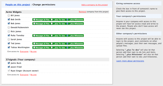
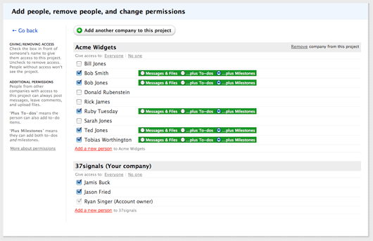
The redesigned Permissions screen wasn’t really a redesign. 90% of the screen looks and works the same. We worked a lot with subtle changes in text size, positioning, and color in order to bring more clarity and spaciousness to the screen.
Here’s the old version:
And the new redesign:
Some quick highlights:
- The old screen has red links scattered all over. It made the page feel messy. The new design only uses red for the “Add a new person” links.
- We replaced the red “Add a company” link with a graphic button. We reused some code from Highrise to smoothly transition between the button and the “Add a company” form.
- The old screen loosely employed a tab metaphor in the blue header. The phrases “People on this project” and “Change permissions” always appeared in the header, and one phrase would be linked while the other was regular black text depending on the page you were viewing. In the redesign, we decided to think of “Change permissions” as a process you enter and leave. We renamed that action to “Add people, remove people, and change permissions.” Now the entire blue header is devoted to this action, and there is a blue “Go back” link below the header to return to “People on this project.”
- We bumped up the font size on peoples’ names and wrapped them in <label> tags. Now each name is a generous mouse target. We did the same for the radio buttons that appear to the right of people with access to the project. Clicking around is much nicer now.
We played with a number of wilder revisions before settling on these very subtle changes. Sometimes the hardest part of redesigning something is realizing where you had it right in the first place. We hope you like the changes.


David Andersen
on 17 Jul 08For a reason I can’t articulate, I like that in the new design the instructive content is now on the left and the action area is on the right. Seems more natural to me. I instinctively want to look to the left for instruction or clarification and then work on the right.
Shane
on 17 Jul 08I agree with Dave.
I can’t say it’s the ONLY reason, but for me I think it’s the proximity of the instructions to the action-section of the screen.
My eye gravitates to the list of people and the checkboxes to the left of their names.
It’s just a minor re-focus to see the instructions.
When they’re on the right side, I have o trek all the way across the green permissions sections, thru a vast white space, and THEN there’s instructions.
They seem very remote and not attached to the functionality of the screen.
Keith
on 17 Jul 08I like it!
(I know everyone was waiting for my blessing on this change too…)
Any time you can condense functionality on to the screen where people will legitmately need access to it is going to make folks happy even if they liked the old way!
steve
on 17 Jul 08There’s a lot of visual distance between the permissions radio button widget and the relevant instructions on the left. If everyone with access can see messages and files by default, why not remove this choice and give me two checkboxes instead: one to add permissions for To-dos and another to add permissions for Milestones. I can think of plenty of instances where I’d want people on the client side to see milestones but not to-dos.
Rich
on 17 Jul 08So why doesn’t the new administrator scheme follow the same style with the help area on the left and the action area on the right (BTW it should read “Administrators can … create and edit projects …”)
JF
on 17 Jul 08Rich: Because there’s more to say when it comes to explaining administrators. The sidebar style for the left is too narrow to accommodate this level of bulleted description. Context over consistency.
The spelling error has been fixed. It will be pushed with the next deploy.
Rich
on 17 Jul 08Thanks, JF. I was curious about the design decision.
John
on 17 Jul 08We just started using Basecamp yesterday, and it is probably the easiest program I have ever used. Intuitive is an understatement. I didn’t really feel like I had to look for stuff, it was just where I expected it to be. I wish all my programs were like this.
roger katz
on 18 Jul 08what screen capture software are you using. Very effective.
JF
on 18 Jul 08We just started using Basecamp yesterday, and it is probably the easiest program I have ever used. Intuitive is an understatement. I didn’t really feel like I had to look for stuff, it was just where I expected it to be. I wish all my programs were like this.
That made our day, thanks John! We’re so glad you like it.
Pelle
on 18 Jul 08Is it just me or do anyone else without the almighty admin-powers in a Basecamp-account also see the link to the administrator list from the peoples page?
I see it but when I click it it won’t show – probably because I’m not allowed in there – but hey – you don’t have to tease me because of my lack of admin-powers ;)
RS
on 18 Jul 08Good catch Pelle. Thanks for the tip. We’re fixing that.
This discussion is closed.