A couple weeks ago on Twitter I said: “I still maintain the Drudge Report is one of the best designed sites on the web. Has been for years.” A few people agreed, but most didn’t. Some thought it was a joke. I wasn’t kidding.
To clarify, my definition of design goes beyond aesthetic qualities and into areas of maintenance, cost, profitability, speed, and purpose. However, I still think that the Drudge Report is an aesthetic masterpiece even though I also consider it ugly. Can good design also be ugly? I think Drudge proves it can.
Here are a few reasons, in no particular order, why I think The Drudge Report is one of the best designed sites on the web.
Staying power
People talk about timeless design all the time. But most things people point to that are timeless end up being time stamped. The Drudge Report, on the other hand, has proven timeless. It’s generic list of links, black and white monospaced font, and ALL CAPS headlines have survived every trend, every fad, every movement, every era, every design do or don’t. It doesn’t look old and it doesn’t look new — it looks Drudge. It hasn’t changed since at least 1997, and I believe the design goes back even further. How many sites can survive — and thrive — unchanged for a decade? That’s special.
It’s straightforward
There are no tricks, no sections, no deep linking, no special technology required. It’s all right there on one page. “But it’s a mess!” you could say. I’d say “it’s straightforward mess.” I wouldn’t underestimate the merit in that.
It’s unique
When you’re on the Drudge Report you’re on the Drudge Report. There’s no question where you are. The design has become iconic. How many other news sites can claim that? If you pull the logo off some of the other major news sites/networks (CNN, MSNBC, FOX News, ABC News, CBS News, etc.) you may have a hard time distinguishing them from one another. They all sorta blend into the same standard news-site look and feel. There are a few standouts, but even the NYT and the WSJ aren’t that unique. Drudge’s design stands alone.
This is important
Many news sites have lost their balls. They’re afraid to really call out one big story. They may have a leading headline, but it’s not all that obvious or different from the others. It may be a font size or two bigger, but it’s not confident. They hedge. Drudge, on the other hand, says “this is the story of the moment” with a huge headline. This is what’s important in the news right now and nothing else even comes close. Drudge isn’t afraid to be an opinionated editor and his site design perfectly emphasizes that. It’s bold, it’s risky, and it’s pure Drudge design.
It’s good cluttered
The Drudge Report usually leads with a “font size=+7” ALL CAPS headline in Arial. Sometimes it’s italicized. Sometimes, for something big big, he’ll cap it off with the infamous siren.
After that you have three columns. Some headlines are sentence case, some are ALL CAPS. Some have photos, some are just a plain text headline. Sometimes more controversial or sensational headlines are colored red. There’s usually a big ad at the top and a few other ads sprinkled among the columns.
Stories aren’t grouped or organized except probably more interesting ones up top. And that’s it. Your eye darts all over the place looking around for something that looks interesting. The design encourages wandering and random discovery.
The site feels like a chaotic newsroom with the cutting room floor exposed. I think that’s part of the excitement — and good design.
Breaking news is breaking news
Have you seen “breaking news” on MSNBC or CNN lately? Almost anything can pass for breaking news now. “So and so speaks to the press about this or that” is now breaking news. Breaking news used to mean something seriously big and important or spectacular just happened. But the major news sites have watered it way down. When I hit MSNBC or CNN, and they have a “breaking news” bar (red/yellow usually), it’s easy to ignore because they’ve cried wolf one too many times. But when you see a big honking red ALL CAPS headline with the flashing siren on Drudge, you know it’s newsworthy.
One guy can run it
The site is run by Matt Drudge full time with help from an occasional part-time contributor. If the site was 5 pages or 10 pages or 30 pages, he’d likely need additional people and technology to manage it all.
No news is the news
The Drudge Report is a headline site. There’s no “content” on the site. Yet, that’s news. The headlines themselves can be news. Drudge breaks stories without writing stories. In fact, The Drudge Report may be one of the only sites on the web that can break a story with just a headline or a photo. That’s baked right into the design.
It sends people away to keep them coming back
There’s actually no content on the Drudge Report. Well, sometimes he will post an email or a memo on his site, but it’s 99% links out to other news sources. His site is designed to send you away to bring you back. The more often you hit his site to go somewhere else the more often you’ll return to go somewhere else again. You visit the Drudge Report more because you leave the Drudge Report more. This is one of the secrets to building traffic: The more you send people away the more they’ll come back.
It’s fast
When you visit The Drudge Report, you get the Drudge report. There are no interstitial ads. There’s no load time. There’s no buffering. There’s nothing but instant content. The Drudge Report is Google-fast and Craigslist fast — quite a feat for a site that does 3,000,000 uniques a month run by one guy. BTW: Those 3,000,000 uniques a month translate into hundreds of millions of visits a month (source: CNN).
It’s cheap to maintain
The design of the Drudge Report doesn’t require a fancy CMS or, in fact, any CMS at all. It’s edited by hand. His overhead is probably a couple grand a month max. A few thousand bucks a year in overhead that generates a few million a year in revenue. That’s good design.
It’s one page
The Drudge Report is one page. Every visit and every visitor is focused on that one page with a headline and three columns. He knows exactly what people are going to see, he knows exactly how people are going to see it. There’s no mystery page here that hasn’t been redesigned or mystery page there that’s throwing an error. It’s one page to look at at one page to work on. It is what it is. It doesn’t try too hard to be something it’s not.
It makes him a great living
Based on published ad rates and traffic numbers, it’s estimated that Matt Drudge makes “over a million a year.” Not bad for a single black and white page on the internet.
So these are some of the reasons why I think The Drudge Report is one of the best designed sites on the web. Swing away.
Patrick Algrim
on 19 Nov 08Put plainly, ugly can be an art form. Ugly Dolls are ugly, but everyone loves them. There are ugly dogs, but everyone loves them. I see way too much duplicated material on the Web, and sometimes going completely radical is refreshing. Reminds of me of indexhibit Web sites. Good write up! Love the in depth view of design that most people don’t understand. Aesthetics are not everything.
Jeffrey Mills
on 19 Nov 08Great writeup Jason. Can’t say I disagree with you at all. The site isn’t what some of us graphic artists would call pleasing to the eye, but it definitely accomplishes more than most other sites on the net. I visit Drudge at least 6-10 times a day and swear by it. Clean, simple, does the job for me.
Dan Levengood
on 19 Nov 08Absolutely agree. It’s brilliant.
The Drudge Report has been on my main link toolbar for over 10 years now. Rarely is there a day I don’t visit.
Drudge also manages to get “breaking news” up on his site as fast, or faster than CNN, NYTimes, etc. even if it means just a headline with no links.
Paul Erickson
on 19 Nov 08You nailed it, J.
Nailed. It.
Eric Fields
on 19 Nov 08— Sagmeister (AIGA.org)
Brian Burridge
on 19 Nov 08I agree with your assessment of his site. I check it daily (have since 97), and I often think, “wow this site is so plain and boring”, but, that’s also why it’s so effective. It makes for a great case study on style vs function. I always prefer both, but sometimes style really can get in the way. In this case, Drudge is extremely functional, and I have a feeling that very few other styles could result in the same usefulness and uniqueness he has now.
cmar
on 19 Nov 08I’ve spent years teasing my mother about her daily reading of the Drudge Report. I argued there are better options for news websites. I trivialized the news from Drudge based on the site design. How can a legitimate news source use such a simple layout?
Your article made me reconsider my suppositions. Maybe, my mother had it right all along. As a technical person, I look for the latest and greatest innovations in a websites. I overlooked the simplicity of Drudge’s design; while my mother appreciated it.
I thought your original tweet was a joke. Thank you for helping me rethink the simplicity and effectiveness of the Drudge Report.
GeeIWonder
on 19 Nov 08If the Drudge Report’s ephemeral duration becomes the litmus test of ‘timeless’, we’re all properly and utterly screwed.
Attention span, people.
Kevin
on 19 Nov 08Are we confusing “utility” with “style” with “well designed”?
The Drudge site definitely has utility.
Well designed? Perhaps.
Has style? I vote no.
Anonymous Coward
on 19 Nov 08I think it absolutely has style. I would say style is something that’s unique. People who are said to have style usually don’t dress or act like everyone else. They stand out. Drudge stands out. Drudge is like someone who can pull off an outfit that no one else can. It looks good on them, but on everyone else it looks stupid. That’s style, that’s Drudge.
Jason Z
on 19 Nov 08I think what Matt has demonstrated more than anything with the Drudge Report is restraint. JF talks often about saying, “no”, well I think Drudge has clearly said “no” many times.
If you think back, lots of websites looked something like this 10 years ago. Probably even CNN. The difference is that the major news sites all got bigger, better, more sophisticated, more complicated, more ad-driven, partnership-ized, busy, crazy. I mean, CNN has headlines from The Onion on their home page now. What?!?
What Drudge has done is nothing. He found something that worked and stuck with it even when the rest of the web was “passing him by”. He resisted the urge to make his website into something it isn’t and something that isn’t him. Drudge, more than anything, still represents a genuine single voice. Why does he have to be anything more than that?
I have to applaud the guy. I can only imagine the crazy, and probably lucrative, offers he’s turned down.
Trevor Turk
on 19 Nov 08I think it’s incredibly ugly, but you can’t argue with its effectiveness. No other site on the web has my eyes darting around like it does. There’s just something about it that makes you want to scan the whole page. It’s that “newsroom floor” feeling you’re talking about. There’s almost an energy about it.
Iamzozo
on 19 Nov 08It could be better if they (he) don’t use underline on links or brighter. Hard to read and see the separations. But i like simplicity :)
Kevin
on 19 Nov 08Perhaps the Drudge site does have style. Style in the same way “PC guy” has style as compared to the style of “Mac guy”.
Perhaps the question is style vs. taste?
Justin Reese
on 19 Nov 08Only a designer (or a design aficionado) already knows that aesthetics are only a subset of design, so it’s not unexpected that laypeople (or bad designers) would be confused by your comment.
I have a very good friend who I love dearly, but who drives me absolutely batty at times because he is an aesthetic, and doesn’t much care about the cerebral aspects of design. I argue against hiding vital information behind rollovers, he argues that it “looks better” and “people will end up moving their mouse over it anyway”. I argue for clean and versatile layouts, he argues for grungy and organic layouts. (Can you tell which of us makes the PSDs and which makes the websites?)
Our relationship mirrors, to me, the dual aspects of design itself: the utility and the pretty. Some people (like me) find unvarnished utility to be pretty, and some people will accept unintuitive so long as it brings the looks. Nirvana is when the two can meet.
You can tell you’re there when both sides love it, laypeople find it curiously attractive, and John C. Dvorak says it’ll never work.
justin heideman
on 19 Nov 08The Drudge Report survives and has staying power because Matt Drudge is a demagogue and digs up filth that people want to read. So I suppose from a certain perspective, it does serve the utility of being the right-wing national enquirer of the web. But as Kevin pointed out, that is certainly not good design.
If you want to look at a utilitarian, and almost well-designed site, the old cryptome.org site is pretty good.
I posit that a well designed version of drudge would do even better. Still wouldn’t improve the content, though.
Joe Sak
on 19 Nov 08I like how you evaluate the design not solely on aesthetics and trends but on things that last:
business goals profitability speed maintainability cost/overhead etc
I love how 37signals looks at the world.
Mike
on 19 Nov 08I think what you said boils down to this: the Drudge Report is the only news website that has managed to approximate the feel of a newspaper in the web medium. It doesn’t imitate a newspaper, but it surfaces the single feature that has proven elusive to replicate online: the ability to scan with your eyes and pick out what’s really important or interesting. No other news website has managed a design that comes close to achieving this.
CJ Curtis
on 19 Nov 08Drudge Page view statistics 500 million page views monthly 1.95 billion ad impressions monthly 12 million unique visitors monthly 1.75 million daily unique visitors (weekday) 1 million daily unique visitors (weekend day)
WOW.
but seriously…yuck. useit.com reeks of style in comparison.
i think he might find that being touted as a “design god” as rather humorous.
he laughs all the way to the bank.
Mugen
on 19 Nov 08Count me in with the group that thought it was a joke. I have visited Drudge Report several times, and just cannot manage to spend even five minutes on that site.
To me it looks disorganized, cluttered, and amateur. Since I personally feel that Drudge is one of the most horrible and disingenuous people in that arena, I nearly always go there following a link from a blog that mentions something on his site, and the vast majority of the time once I’ve arrived I have a very difficult time finding whatever it was that was mentioned on the referring site. Most times I give up completely.
I respect your opinion, and you surely know what you are talking about most of the time, but this is one instance where I shall completely disagree with you.
/rant on
And… Design, aside, the content of that site is usually just horrendous.
“But when you see a big honking red ALL CAPS headline with the flashing siren on Drudge, you know it’s newsworthy.”
No… That’s not been my experience at all. The flashing siren means nothing more than the fact that Drudge wants to call attention to it. I have yet to see it be something newsworthy that was not also completely biased.
/rant off
Will
on 19 Nov 08It’s a shame that the quality of “news” on the Drudge Report doesn’t come anywhere close to the perceived quality of layout.
Drudge is about the worst source of information I can think of. But I guess we can all agree it’s a quick, efficient way to get it.
The real brilliance of the Drudge Report, if it can be said there is any, is that there’s so much awful, worthless nonsense strewn throughout it that it forces the reader to look at most of it just to find anything worth actually reading.
Which is why I stopped visiting it years ago.
John D
on 19 Nov 08If 37signals was to customer support what Drudge is to journalistic integrity, you’d be out of business.
Evan
on 19 Nov 08Reading Jason’s points I tend to agree with him – looks aside, certain elements of the site are examples of smart design – but I suppose my actual indifference towards the Drudge Report speaks the loudest. I’ve seen the site several times, but it’s never hooked me.
I think it’s that the design of the site, and the fact I know that it’s just one guy’s collection of headlines, fails to signal credibility. It feels like kind of a cardboard cutout of a news site, or a “who cares what this guy wants me to see.”
Don Schenck
on 19 Nov 08As much as I’d like to agree with you, Jason, there’s just no way I’ll ever say anything even remotely nice about Drudge or his site.
JF
on 19 Nov 08This isn’t a post about opinions on journalistic integrity or Matt Drudge’s political leanings. Let’s keep the politics out of this. Let’s keep the comments on topic — design, effectiveness, communication, etc. Thank you.
Chris
on 19 Nov 08Jason, this type of head above the parapet analysis is why I love visiting SvN so much. You get the feeling that popular but “ugly” sites (Ebay, Craigslist, Myspace pages etc) were started with no clue about aesthetics but to simply to deliver something the creator wanted to deliver RIGHT AWAY. I’m guessing Matt Drudge has never been a web designer and his site works because what he does is more important to him than how he does it.
Keith
on 19 Nov 08I don’t find Drudge’s site anything other than a relic. I was pretty surprised it was still around. In a time that predated Reddit, Digg, Fark, & their clones it was more innovative.
Quite honestly, I think if the last 5 years have shown anything it is that people prefer a variety of contributors. Look at the top blogs, websites, etc. So it may not have changed and may still do what Matt wants splendidly. It does not, however, reflect the utility that other news aggregation sites provide.
Interesting look at a site from a design standpoint that probably wouldn’t ever get that treatment though!
Jay
on 19 Nov 08I have thought the same things many times. It is interesting how such an “ugly” site can really be considered good design. It serves it’s purpose and serves it well.
Gary
on 19 Nov 08Wanting to keep ‘politics’ out of the design discussion is admirable (although the comment seemed a bit rude). However, the original post implied that it was the design that has allowed the Drudge site to endure. By making that claim – it would seem only reasonable to expect people to challenge that. I happen to agree with the challenge – I have serious doubts that the website design has anything to do with the persistant popularity of the Drudge website…
Brade
on 19 Nov 08People blathering on about integrity are totally missing the point. Drudge posts headlines that will grab your attention. It’s up to YOU to decide whether the content has “integrity,” and that’s easy enough to do based on the reputation of the site that is linked to. And most of the links tend to be AP stories, which are supposedly neutral, right?
Michael
on 19 Nov 08Yes, limits! I used to read Drudge, and I didn’t like how news would disappear when he replaced a headline with another headline. What kind of site had no archives? But I realized that was part of his secret – stay light and fast, and keep the readers constantly visiting so they don’t miss anything.
(I don’t read Drudge anymore, but that’s I only read the Lex column these days.)
Joshua Go
on 19 Nov 08Maybe because the Drudge Report’s layout is so ugly, it also stays unique because nobody wants to copy it. If something works well and looks good, people are going to copy it. Just look at how many newspaper websites rip off the design of the New York Times, or how many project management webapps end up looking like Basecamp.
Ugliness serves as protective mechanism. “It works really well, but it’s so damn ugly! Let’s look for something else to copy.”
Chris J
on 19 Nov 08While I agree with many of the points made, let’s keep in mind that being successful because of your design and being successful despite your design are two different things.
Do you think it’s the ugly look that is the reason it’s so oft visited or that it made a name for itself by breaking some huge stories in the 90’s while most news sites barely even knew what the web was?
Drudge fails in one key area: It doesn’t evolve. He has no permalinks, no archive, and gets little search-traffic because of it.
Yes that keeps his maintenance costs down, but it also means that his traffic has been flatline for a long time, while other more “webby” sites like Huff Post soar.
Even the New Yorker seems positively progressive (design-wise) compared to Drudge.
CJ Curtis
on 19 Nov 08What if it wasn’t called the “Drudge” Report?
What if it were the “Smith” Report?
Again, I don’t pretend to know the secret to its success. But two things come to mind…the name, and the consistency.
The name suggests great news gossip, so I agree that the “politics” of the site it totally fair game. And when you have had a following for so long on a site that has always looked a certain way…no need to redesign the thing. In fact, that’s the last thing you should do.
However, there are a million other “news” sites out there that aren’t as popular as Drudge. If you were to come across Drudge or something similar today for the first time, I wonder if you would be seeing its praises.
Ryan Evans
on 19 Nov 08I’m wondering if a site design like this can only grow organically from non-design or if any ‘titled’ graphic designers out there would have the guts to design ‘ugly’.
Antonio
on 19 Nov 08Sorry but I disagree Jason. I think you use of the words “design” is your mistake. You definitely list some valid points as to why works in some areas but aesthetically it’s appalling. The point of a site like this is to clearly display content in a clear and legibly manner. This site fails in both areas. The typography, hierarchy and layout of the site are amateurish at best and make it difficult to take in the content. There are many more reasons why this site isn’t even close to being the best “designed” site on the web. One simple fact is that the main content ends up being below the fold on my screens. There is a ton of real estate taken up at the top of the site for an ad and a misplaced article. I’m also not sure how “It’s cheap to maintain” it’s proof that it’s a well “designed” site. Again, I think your use of the word design is what’s throwing people off. I agree that design goes further than just aesthetics but you can’t claim it’s the best designed site and then leave out the aesthetic aspect of it.
KDR
on 19 Nov 08Honestly, I’ve never understood the attraction of Drudge’s site. The layout has always repelled me. I find the whole Drudge Report experience unpleasant and easily ignored.
Stephen Fleming
on 19 Nov 08Sooner or later, Drudge will buy an iPhone, then realize how badly his three-column layout breaks on the iPhone browser.
Simple design is good, but he needs to have an alternative display for smaller devices.
Yes, there is the companion site ‘idrudgereport’, but it doesn’t work well.
Michael
on 19 Nov 08Chris J, the Huffington Post is not profitable, and the Drudge Report is profitable with high margins.
Jody
on 19 Nov 08Hire a great visual designer redesign the thing, say maybe 3 other versions. Put the 4 designs in front of a group of Drudge users. Test the readability, click timing, eye tracking, ad clicks, page file size, time spent on site (or whatever factors you believe determine the effectiveness of the site). Compare your data across the 4 different designs.
THEN you can more closely determine if the current site is “well designed” or “best”—when you have something concrete to objectively compare it to. You MAY determine that it is horribly designed. Otherwise, you’re just spitting useless (except for conversation stirring) subjective statements here, JF.
Ryan Graves
on 19 Nov 08You can’t argue with the facts. It may be ugly but people love it and Matt is getting rich.
Win – Win.
Anonymous
on 19 Nov 08I don’t think you can separate his politics from the design of the site. Its my opinion that the simplicity/ugliness of the design is supposed to convey an everyman appeal. It is supposed to make the reader feel superior, which is exactly what his readers (who tend to have a particular political view) want.
Jemaleddin
on 19 Nov 08I think we should be clear on our terminology since “ugly” is such a loaded word. When I say that the Drudge Report is ugly, I mean that
a) it’s almost painful to look at, AND b) it’s full of lies, distortions and bullshit.
Let’s not leave that part out.
David Andersen
on 19 Nov 08“Drudge is about the worst source of information I can think of.”
This is funny since all he does is link to every other online source of media; thus I’d have to agree.
Good posting.
What kind of site had no archives?
There are archives – apparently you haven’t look too hard.
Petey
on 19 Nov 08“The Drudge Report survives and has staying power because Matt Drudge is a demagogue and digs up filth that people want to read. So I suppose from a certain perspective, it does serve the utility of being the right-wing national enquirer of the web. But as Kevin pointed out, that is certainly not good design.”
Then why, as a lefty Dem, do I constantly visit the site?
Drudge is to the web as the NY Post is to print – tasty and bite-sized.
And FWIW, design is synonymous with utility.
Philip Dhingra
on 19 Nov 08Re: the iPhone comment
I usually prefer going to Drudge on an iPhone vs. HuffingtonPost because I know that drudge will reliably load faster and is less likely to crass mobile Safari.
Cory
on 19 Nov 08I agree that Drudge has some positive design features working in its favor. But I also think any barebones design serving strong content can be effective.
It’s like Lots of:
And you can’t dismiss Drudge’s content when you’re talking about that site’s success—they feed people bias and people love that. FOX News Channel does the same thing with huge ratings and they do not hold the same design principles in any way. People want to read supporting “evidence” of the opinion they already have.
If you think I’m just spouting liberal excuses, there’s a liberal site called Rawstory.com that has tried to emulate Drudge. And, afaik, they have not been nearly as successful. For them, I think the equation is more like:
Their site is full of ads and broken HTML and, therefore, it doesn’t work the same way. It’s ugly but it’s also difficult to scan and a lot of the programming features don’t work. But it’s certainly not dead in the water either … the content pulled a lot of people through the last 8 years.David Andersen
on 19 Nov 08JF – my apologies for veering off topic, but really! It appears that the commenters who are ranting about the politics, distortion, lies, etc. of the DR rarely read it, have bought in to whatever their peers are saying about it and have closed their minds.
Go look at it now with an open mind. It’s no more distorted, politically biased, or full of lies than any other media site. Stop making assumptions based on your tribe and think.
Eric
on 19 Nov 08Engineers might consider his site well-designed. I still remember his right-wing demagogic rants of the past and avoid his site religiously.
Working well and being aesthetically appealing is better than working well and looking ugly. It’s an indication of a lack of effort to get both aspects correct. Lazy.
Brooks Jordan
on 19 Nov 08Great post because I don’t want to like it or believe it’s successful design, but all of your points convince.
That he’s pulling a mil down per year is definitely a good indicator that the approach is effective.
Scott
on 19 Nov 08It seems that the discussion is focusing on debating whether or not consistency, functionality, and efficiency are characteristics of good “design.” My notion of “design,” though, has two components: functionality and aesthetics. Drudge is functional but not, in my opinion aesthetically pleasing. In my mind, therefore, it has only one of the components of “design.” To that extent, I don’t think it’s good “design,” despite being functional.
MattD
on 19 Nov 08What I don’t get is, why does anyone think that The Drudge Report has been “designed” at all. Sadly, the idea of “design” has been cheapened and misused by a bunch of overly righteous computer geeks (such as Jason here). I’m sorry I read this blog post, and I’m even more sorry that I’m wasting more time commenting on it. But the fact is, The Drudge Report is messy, poorly laid out, hard to read, and ugly. There’s not need to try and re-define the idea of design (as Jason does) just for the sake of sounding like you are so thoughtful and forward thinking.
Drudge is essentially a feed-reader with some annoying ads, a few pics, and one main story (tabloid style). Big f’in deal.
David Andersen
on 19 Nov 08“Working well and being aesthetically appealing is better than working well and looking ugly.”
Is it? Why, if it’s working well? Is it going to work better than well? Are you arguing that the site would be even better, draw more traffic?
Will
on 19 Nov 08Jason, you’re the one who described Drudge as a more honest arbiter of breaking news>
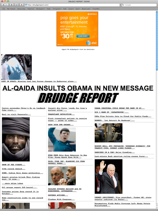
emphasis mineLet’s compare. As of right now, here’s Drudge’s breaking news headline: “TRASH TALK: AL-QAIDA INSULTS OBAMA IN NEW MESSAGE”
And here’s MSBNC’s: “BREAKING NEWS: NBC reports, citing Democratic sources, that Obama offers HHS job to Daschle”
Hell, even Fox News is running with this as their breaking news: “FOX News Confirms Daschle Offered Health and Human Services Secretary”
You really want to make the case that the Drudge one is important and truly newsworthy just because it’s big all caps text on Drudge, but MSNBC’s isn’t? MSNBC and CNN have cried wolf too many times, but Drudge is just the consumate straight shooter? Are you kidding me?
That’s not a discussion of design, that’s a discussion of the site’s editorial merit, and when you discuss the editorial merit of the Drudge Report, you are unavoidable discussing politics as the Drudge Report is an unabashedly partisan source of information.
I apologize for being off topic, but you passed judgement on the worth of certain sources in your original post, so comments discussing those positions should be as expected as comments discussings the merits of the design/layout.
If you don’t want a conversation to veer towards politics, then don’t pick a hyper-partisan example to demonstrate your point, and don’t make comments about one news source being more accurate than others, and then expect people to ignore your comments.
Anonymous Coward
on 19 Nov 08Will, there’s nothing in your quote (from Jason) about accuracy.
Nate Tharp
on 19 Nov 08I’ll preface this by saying that I am a schooled and experienced graphic and web designer. Now whether I agree or disagree with Drudge’s content is irrelevant to me. Because the only thing I find offensive here is The Drudge Report being described as “well designed” not to mention calling it “one of the best designed sites on the web”.
No one can argue that the fact that The Drudge Report can be easily maintained by one person, is cheap to maintain and that it provides Matt Drudge with a great living are all admirable qualities for a website, they’re completely irrelevant to a discussion about the level of quality of the sites design.
The premise of this discussion is equally as ridiculous if I was to say “The Ford Focus is the most tasty piece of fruit someone can buy. Now let me clarify my definition of tasty fruit. My definition of fruit goes beyond tastiness and into areas of fuel mileage, acceleration, passenger room, trunk space and cost of ownership. However, I still think that the Ford Focus is a tasty piece of fruit even though I consider it to be a car. Can a car also be a tasty piece of fruit? I think the Ford Focus proves that it can.”
On the web, the line between design and development are often blurred. So I could understand someone discussing load time, text size and amount of content all in the same discussion about “quality of design”.
So if you want to talk about The Drudge Report as a well developed site, or a functional success, go right ahead, and I’ll back that up. But “design” is an aesthetic term, so please leave it out of a discussion about the Drudge Report unless it’s in the context of “the Drudge report has a reprehensibly poor design.” That doesn’t mean the site is anything short of an undeniable success. It just means it’s poorly designed and yes, ugly.
Ben Clemens
on 19 Nov 08I can’t agree. I don’t mind primitive, utilitarian design choices; design is not style-dependent. However, beyond pointing that out, your arguments boil down simply to ‘people like and use it, therefore it’s good design.’ This is akin to making design choices by what is familiar (‘intuitive’ is a synonym that sounds better but is the same thing), and has led to less influence for design in interactive media (engineers have actually done most of the design innovation). Design exists because of the belief that things can be made better. If that isn’t true, we don’t really need designers, just craftspeople. Apologies for being blunt, but I think you’re just being provocative, not really insightful. That’s valuable, but not necessarily accurate.
sunflower
on 19 Nov 08I don’t read Drudge, but agree the format is very usable. In the tech news theregister.co.uk comes the closest, albiet a little more stylized. I often read the breaking tech news there wondering why there are no real tech news sites in the US?
One of the worst sites that offer style over substance in my opinion is espn. Stuff going everywhere, and but real content is very difficult to find… very annoying.
Joe
on 19 Nov 08But it’s so hideous to look at??? I suppose a software engineer can love an ugly duck based on function alone. My eyes won’t let my brain make that leap.
Martial
on 19 Nov 08Let’s not forget who Drudge sees as his audience: the news media. For that crew, the design choices Drudge has made are perfect. Style is a marker of culture. The style of Drudge, with its ugly wire service feel, is “old time journalism”.
That signifies all sorts of bad old things: we know what stories are important (look at that headline!), we get down and dirty in the muck to get those stories, we are the only ones with the skills to cut through the flood of information, we have the courage to speak the truth even when it isn’t pretty, etc. These are the things journalists would like to believe about themselves.
Also, with the links out to their stuff, Drudge feeds this sense of self.
Style? The site has it in spades. But most of us aren’t the audience.
Mister Snitch
on 19 Nov 08I completely agree with this post. Also, just about everything here could be equally applied to Instapundit.
Guatejon
on 19 Nov 08I more or less agree but I wish he would fix his title tag it reads DRUDGE REPORT 2009
David Andersen
on 19 Nov 08@Nate Tharp
“But “design” is an aesthetic term…”
No, it’s not.
Can you not design a screw? A chemical compound? A theory? A process? What do aesthetics have to do with any of these? A design is a willful construction of something. Aesthetics may or may not be part of that.
Will
on 19 Nov 08AC – maybe accuracy wasn’t the right word. Veracity, seriousness, gravity…?
Jason’s point seemed to be that “breaking news” on the big media sites is trivial, while on Drudge it isn’t. I would disagree.
Then again, the example I pointed out for Drudge (the alQaeda thing) isn’t actually “breaking news” – red with the light and all that jazz. So maybe the point about “breaking news” is that the “mainstream” sites treat any recent, developing story as breaking news whereas Drudge only gives it the big red treatment if it’s actually earth-shaking. But if it’s earth shaking, the other sites usually make it seem such too.
I don’t disagree with the point Jason is making about the effectiveness of the Drudge report as a straightforward collection of links that are free of the distractions that a full-fledged news website generally entails. I just interpreted some of Jason’s comments as making the case that Drudge was a BETTER source of news because of this, which I think is terribly subjective and in many cases demonstrably false.
Nobody beats Drudge in the salacious headline department. Sure it’s popular and profitable, but it is so because it’s sensational, not because it’s the best news source out there. I don’t think it’s hugely popular and profitable because of it’s simplicity. I think it’s editorial voice and choices appeal to a lot of people.
I would argue that the Drudge Report would be equally successful in any format because it fills a niche.
mike
on 19 Nov 08Couldn’t agree more – everyone else in the news world is trying to figure out how to build an online brand, and this guys been successfully maintaining one for 10 plus years. Really impressive.
Andy Gadiel
on 19 Nov 08I recently relaunched my Phish fan site (about the band, not the banking schemes) at http://gadiel.com/phish
I’ve always kept it plain white, basic with links. Get people the information they want as quickly as possible and get out of the way.
I retired it when the band retired, and relaunched it right before they just came back. People have been emailing me asking me not to change the design. I have no plans for an alteration.
Simple wins, every time.
Gerrit van Aaken
on 19 Nov 08... and it doesn’t even validate, OMG!
;-)
Graham
on 19 Nov 08I think the site is profitable because its clearly Drudge’s creation. No “real” news site could use this layout because it is clearly designed by someone who’s not a professional journalist or designer. If CNN’s site looks like a 3rd grader did it, then I will immediately distrust it. If an individual’s site looks the site, I might give them some leeway.
If Drudge’s site looked slick and polished, then his readers might get the sense that he’s part of the “establishment” and would feel like they were viewing something that came from a committee instead of Drudge himself.
Yes, the site IS well designed, as much as it pains me to say it, because the design of the site reinforces the message that the author is trying to convey. Which is: “hey I’m not a big-time news conglomerate and if you agree with my politics then you can trust me.”
That’s the ultimate (and only) goal of design anyway.
Anonymous Coward
on 19 Nov 08Let’s compare. As of right now, here’s Drudge’s breaking news headline
That’s not a BREAKING NEWS headline on Drudge, it’s just a headline. A BREAKING NEWS headline on drudge is used very sparingly. It has a siren, it’s often italic, and it’s red.
David Andersen
on 19 Nov 08Isn’t ‘good’ design dependent on the relationship between intent (what the intended result/effect is) and outcome (what really happens)?
itchy
on 19 Nov 08Jason, I understand that your definition of design covers graphic aesthetic as well as architecture, efficiency (for both the site maintainer and the user), etc.
But I contend that Drudge’s popularity and staying power has little to do with its design and even less to do with its graphic aesthetic. Yes, there’s a bit of the “this is a crazy site full of crazy stuff” to the look, which is appropriate for the content. But it’s an overstatement to say this was a deliberative process.
If the site had cookie-cutter graphics, if it was easier to read, it would be just as popular and not any harder to maintain and probably not much longer to load.
As for the “application design” of getting users to return, sure, there’s as much there as there is in any overly sensational media outlet. And if the site had the same design, but lost the over-the-top gossip and sensationalism, it would fail.
I frequently go out with old shirts with holes in them. Some might say this is my “look,” that it’s an anti-style. It’s not. I give no thought to it, just like Drudge. I do not attribute the fact that I’ve always done this to the “staying power of my vision.” There is no vision.
Drudge is not a noble savage.
Evan
on 19 Nov 08@Joe: Hey, we software engineers have both hemispheres of the brain too. At least the ones I would want to work with do.
You’re right, though, about the Drudge Report’s looks. You don’t connote as much credibility when your site is disorganized and looks like an MS Paint mockup.
Correlation = Not Causation
on 19 Nov 08Drudge is successful because 1) he has a loyal and niche audience 2) he had first mover advantage to grab them (his site originally started as a mailing list) and 3) he keeps at it as passionately today as he did when he first started. Note that none of these things has anything to do whatsoever with its design. All other points listed in the post are moot and border on post hoc fallacy. A liberal could write a post on why Huffington Post owes its success to its use of comments. Bill Gates and Warren Buffett are super-rich because they both wear glasses. You get my point. Correlation is not causation.
Anonymous Coward
on 19 Nov 08Yeah, it’s the site design that gets people there. Just like how O’Reilly gets high ratings because of his well designed set.
out of here
on 19 Nov 08You can’t say that the site isn’t well-designed, simply because it commands a large audience among its angry, scared and mentally lazy target demographic.
Rush Limbaugh has a big audience, etc.; but no one - including, I imagine, rush himself - would ever say he wears well-designed suits, or that he speaks thoughtfully and carefully. He’s sensationalist, and appeals to a certain group of people, partially because he helps them justify their fears and insecurities. (It’s the same impulse that nationalist right-wing demagogues often prey upon, IMO.)
Anonymous Coward
on 19 Nov 08whoops, I meant, you can’t say that the site IS well-designed simply because it commands a large audience….
Ted
on 19 Nov 08How can you someone call Drudge’s 810,000,000+ /month audience “niche”?
Drudge is successful because of the content he provides easy access to. People have come to trust/appreciate his judgement. Most people would rather spend 5 minutes a day on his site getting the stories that matter, than spend spend 20x that time on the other news sites/the net looking for the worthwhile stories of the day.
Those who don’t understand the beauty in his design (and by design, I mean the page aesthetic, the way it is constructed, the way it is maintained, etc.) will take their shots at him. And he’ll just keep on laughing all the way to the bank.
B. Ackles
on 19 Nov 08The Drudge Report has to value the banner ads which like all other images on the page. I bet they get great click through rates (black hat?)!
I think the Drudge Reports success is only attributable to loyal readership/community and free old media press (i.e. Fox News).
At one of the Ruby Conf BoF’s I heard someone claim that Craigslist is has an ingenious (chaotic) UI…I laughed. Whoever said this had a point though and their assertion is based on the same design philosophy.
I’m sure Craig would be disappointed to be compared to the Drudge…Sorry!
BJ Nemeth
on 19 Nov 08As a few others have already mentioned, the design of DrudgeReport.com reinforces its overall message: “These are the stories the mainstream media doesn’t want to tell you.”
It feels more like a rumor site than a news site, and I think that is part of its appeal. (Not to me, but to others.) But since the readers are redirected to news stories written by other, more mainstream media outlets, everything is still seen as trustworthy by his readers. (Readers wouldn’t feel that way if he were writing a blog, for example.)
I haven’t thought about it before reading Jason’s thoughts, but I agree that the Drudge Report does have an effective design. Beautiful? Not at all. Could it still be improved? Almost certainly. But not the way most graphic designers think when they first see it.
rvr
on 19 Nov 08isn’t it possible that a site like this turns out to be effective largely by accident, as far as the presentation/implementation is concerned? clearly, the content is what drives his traffic and brings success. to me ‘design’ implies intent. so how can it be good design if the design is not intentional? the design may stay out of the way of the site being effective, but does that make it good? i think that’s a good starting point for any design, and many fall short of that simple accomplishment. but it’s a pretty modest accomplishment, design-wise. i hope we’re all aiming higher.
Michael
on 19 Nov 08The Drudge Report takes a very straightforward idea (linking to news items) and presents it in a complicated and difficult to follow way. That’s not good design, it’s a mess.
David Andersen
on 19 Nov 08@Itchy
“I frequently go out with old shirts with holes in them. Some might say this is my “look,” that it’s an anti-style. It’s not. I give no thought to it, just like Drudge.”
If you give no thought to it, why are you recalling it and using it to make a point? The fact that you are aware of it means it’s a conscious choice. Ditto for Drudge. His continued choice to leave the site as it always has been is a design decision.
RobertG
on 19 Nov 08I would love to see some Drudge Report makeovers using other news website layouts as the template.
Also, David Anderson, I loved your response here!
“Drudge is about the worst source of information I can think of.”
This is funny since all he does is link to every other online source of media; thus I’d have to agree.
David Andersen
on 19 Nov 08“As a few others have already mentioned, the design of DrudgeReport.com reinforces its overall message: “These are the stories the mainstream media doesn’t want to tell you.”
I don’t see how this is its message. Right now, of the first 18 links on the site, they are almost all mainstream media. 3 AP stories, 3 AFP stories, 2 Reuters stories, and 1 each from NY Times, ABC, BBC, The Sun, The Telegraph, The Independent, The Times (UK), The Observer, NY Post, and the Jerusalem Post.
This whole right-wing, non-mainstream media meme is ridiculous. Where’s the critical thinking?
Bob
on 19 Nov 08I think he gets it from his Dad:
refdesk.com
Though the story goes that it was Matt who encouraged his Dad to get online many years ago.
Rick
on 19 Nov 08Great post jason! Thx for taking the time to talk about it.
Sebhelyesfarku
on 19 Nov 08This is pure bullshit. It’s popular despite it looks like crap because the content and habitual reasons. Bad typography is necessary for usability? Give me a break.
Jonathan
on 19 Nov 08I think the bold simplicity of the headlines and lead stories is a design decision is worth noting, as is the judgement to eschew new features and expanding the site beyond the core offering, which may have been tempting.
If you think about it though, the simplicity of the site architecture was (likely) not a design decision per se - he didn’t choose between hand coding his site and a Vignette install back in 1997 - he just did what he could afford and knew, and stuck with it as it has worked for him.
The things that set the Drudge Report apart are mostly editorial and management decisions, not design decisions. I agree that the design has some (clunky) merits, but I think you’re taking the whole “design is how it works” mentality and conflating management with design.
Most relevant, as far as the staying power of the site goes, is the fact that he got in very early in the game in the intersection between online and mainstream media, and had a blockbuster product (Lewinsky) at just the right time. That means a lot. You can’t tell someone who wants to be an electric guitarist “What you want to do is plan to break out around 1966 or so, and work from there.”
He’s since done a good job of Not Growing, Not Changing, and Personally Getting Rich. I don’t know if that sets such a compelling example for people looking to grow or establish companies and products. But the editorial ballsiness is a great example for other media sites.
Demetrius Ford
on 19 Nov 08I finally went to the Drudge Report after hearing so much about it. I was flabbergasted:(....my personal thoughts about the design and some of its content are utter rubbish! How this man makes 1 million dollars a year is probably the same reason why some people actually think Sarah Palin is intelligent.
JM
on 19 Nov 08This is like saying McDonald’s has the best food because they sell the most of it.
Successful != good, and other people have correctly pointed out the alternate causes above.
AB
on 19 Nov 08If fugly is your thing, then it’s great to be sure.
Fred
on 19 Nov 08timeless: and that’s why i digg popurls.com
Tor Damian
on 19 Nov 08I agree with everything except the font; it’s really hard on my eyes, and I don’t have a particularly bad vision. Then again, it’s so easy to supply your own style and the page still works fine, so that in itself is a good thing.
Anonymous Coward
on 19 Nov 08@David Anderson
I’ll rephrase, “design”, as Jason used it, is an aesthetic term. Yes, it is.
A design (noun) is in fact a “willful construction of something”. But when used as a verb, with an object, like Jason did it is an aesthetically-related term. Please find me a definition that conflicts with that. And if you want to tell me that I’m making assumptions about Jason’s intent and usage, read the first sentence of his second paragraph.
“To clarify, my definition of design goes beyond aesthetic qualities..”
So the base/core/beginning of his evaluation is quality of design, as it relates to aesthetics.
Nate Tharp
on 19 Nov 08/\ That’s my comment above.
I’m not the anonymous coward I was portrayed to be. Just a commenter who forgot to enter their name.
David Andersen
on 19 Nov 08Nate – I’m not following. He clearly says, in your own quote, that “design goes beyond aesthetic qualities…” To say, then, that he is only using it as an aesthetic term is a direct contradiction of his words.
Grant
on 19 Nov 08I don’t know about “aesthetic masterpiece”, but I agree it’s good design. Functional design. We often tie the word design too closely with how things look or how they make us feel when we see them. But I like your broader definition of design. It’s much more accurate.
Anonymous Coward
on 19 Nov 08@JM -
“This is like saying McDonald’s has the best food because they sell the most of it.”
This is a false analogy. “Best” is subjective and contextual. There is no absolute ‘best’ for all people at all times. Designers, who argue all the time about what is ‘best’, should be more aware of that than most.
T. H.
on 19 Nov 08you should check out Bourque.com as well, it’s focused on Canadian news, but arranged in a similarly sensible way.
James Hudnall
on 19 Nov 08Less is more is always the best approach. Drudge gives you essential links to other news sites. It cuts through the BS to give you the bottom line on stories that he finds interesting. His tastes may not always be yours, but he seems to have a good eye, because people keep coming back to read what he thinks is hot.
Personally, I think he sets a great example to all us web people, because one man takes on the powerful in his own way and makes them sit up and take notice. How many of us can do that? Raise your hands.
Whether you agree with his politics or not, I think he’s a web pioneer.
Just
on 19 Nov 08you can sell any shit here but people just buy it
Webnov8
on 19 Nov 08I like the minimal approach this website takes. I give it 10/10 for content, 10/10 for ease of use, but 5/10 for aesthetics. I definitely think it can be aesthetically better.
Nate Tharp
on 19 Nov 08@David Anderson
I noticed you’re not following. I clearly said that his quote states that “design” is the base/core/beginning/start/origin (I don’t know how else to say this more clearly) of his evaluation criteria. I don’t believe that I said that it was his ONLY criteria.
Therefore “design” and “aesthetics” are intrinsically linked, by Jason’s own admission, in the way design is being used in this discussion.
So have you found a definition of “design” as it pertains to designing a website that doesn’t relate the word to aesthetics?
judson
on 19 Nov 08It’s just a fast food menu. What if the whole web looked like that?
Don
on 19 Nov 08There are two keys to Drudge’s success. The first, as you accurately point out, is its speed and utility. It doesn’t change. It’s easy to navigate. It’s fast to load. These are all great things.
However, you can’t ignore that it also selectively chooses what it highlights, often totally misrepresenting the content of the articles it links to and even printing headlines a few days apart that contradict each other. Opinions get the same treatment-a headline and a link-as a thoroughly documented and fact-checked article, giving the impression to readers that they are of the same value.
In short, it was his political agenda-including the arrogance of never acknowledging or apologizing for the presentation of errors or outright lies-combined with an easy-to-use and fast design, that brought success.
If one has no ethics, it is possible to make money off of fools. Combine a lack of journalistic ethics with a lack of design skills and you can make a lot of money. Spammers do a great job and if they didn’t make money would be out of existence, too.
David Andersen
on 19 Nov 08@Nate –
You wrote design is an aesthetic term. I said it's not, that it's more than just that. You are apparently saying that too, now. I've never claimed that design can't include aesthetics, but there are certainly cases where aesthetics don't matter in design, including web pages.emma
on 19 Nov 08you should re-title this post to something along the lines “pretentious designers fawn over crap!” drudge is a parasite.
Anonymous Coward
on 19 Nov 08One of the worst designed sites on the web. www.phatclub.co.nz
agi
on 19 Nov 08emma – so true.
Cant really find anything good or exciting about the drudge report. 100% fluid layouts should be banned as they’re never used properly, ridiculous amount of white space at the top of the page (on a 1024 screen, only 1 link can be seen), no consistency in the line height… plainly it just farked.
Problem is, its like a car wreck. People cant look away…
Felipe Fermin
on 19 Nov 08Okay everyone, here’s the deal:
Let’s redesign the Drudge Report! But let’s keep it’s same layout in order for it to be just as fast when loading.
I am talking about making the website just a little bit more pleasing to the eye while maintaining the ‘ingredients’ that have it made it so succesful.
CSS to the minimum. Just little changes in font, background, animated GIFs (ugh! ugly ulgy siren), etc. Anything that would make it more easy on the eye when reading it headlines.
What do you think? What are your recommendations?
Drew
on 19 Nov 08I don’t think simplicity has to come at the sacrifice of readability or sanity. Good design seems like it’s the ability to deliver the right functionality through the right visual presentation. While the Drudge Report may be some things, I’d never call it good design…
Honestly this seems like it’s the same claim Adobe tries to make with it’s “Ps”/”Ai”/”Id” icons. Since when is being lazy held with such high regard?
I prefer to think of good design as things like the iPod wheel, or the way the new MacBook latch works, or how iTunes doesn’t have a “Now Playing” list (remember how all the original MP3 apps did it?) or a delete/remove button in the window.
Also how Safari replaces the refresh button with the stop button, and has no Go button or browser throbber. Now these are examples of good simplicity. Not underlined and poorly shadowed all-uppercase italic typography…......
itchy
on 19 Nov 08@David:
OK, you’re right. (A commenter admitting he’s wrong?!?)
I don’t doubt that he’s had critics/supporters asking him to change/alter/update the design over the years, and it’s clear he’s refused because he likes it the way it is.
I still contend that there are far more obvious reasons for the success of the site than the design choice to keep it “the way it is”—and, in fact, the design choices he’s made (or not made) are just as likely to have hindered the site’s success as to have contributed to it.
Scott
on 19 Nov 08I don’t buy your argument.
Drudge’s site is just butt ugly. It could be simple yet attractive without much work.
But even if it were “beautiful” to look at it wouldn’t matter much either.
It’s still from Matt Drudge.
‘nuff said.
david Putney
on 19 Nov 08I always took a different lesson away from drudgereport—people come to his site because of the content. If your content is good, then it doesn’t matter what you look like.
Charlie
on 19 Nov 08Google News. That’s brilliant design.
Drudge report – I stayed 10 seconds the first time I heard of it 5 years ago and never went back, entirely based on how hard it is to read and evaluate the sources.
AJ
on 19 Nov 08Yes, you cannot correlate Drudge’s success with the un-designed nature of his site. Not entirely, anyway. It is, to a great degree, dependent on the content and the way he spins it.
A similar liberal site would be BuzzFlash.com, by the way, which is just marginally better designed. And Duncan Black’s Eschaton has had the same terrible template for ages (Blogger 1.0 site, still using Haloscan for comments!)...so the answer is really that content and editorial direction still matter. ThinkProgress has great amounts of both AND good design, so the two are not mutually exclusive.
As a former print news designer turned web guy, Drudge’s failure, to me, is less one of design in an aesthetic sense, but one of information architecture. As noted above, opinion and news are freely blended (intentionally?) on his site and not labelled as such. This may sucker the rubes, but not more sophisticated readers.
decksta
on 19 Nov 08Check out this pretty good feed of Drudge that actually includes images, related links, headline styling, etc.
http://drudgereportfeed.com
jon
on 19 Nov 08techmeme>drudge
Tory
on 19 Nov 08I couldn’t agree more. Drudge is by far the best news site in terms of both content and design.
Ugly Betty
on 19 Nov 08Ugly Sites Rock!. There are hundreds of examples like craigslist.org, officialhomepage.org etc
P_rock
on 20 Nov 08Looking at Drudge, it is important that one guy can run it - as in, it’s simple enough for one guy to run - but I think it’s equally important that one guy DOES run it. There’s a clear vision coming from a single person, and the lack of internal discord is evident. Many designed-by-committee, run-by-committee sites end up with a kind of kitchen-sink approach to design and layout.
warren Colbert
on 20 Nov 08I’m going to have to disagree. I think the site is hideous.
Mark
on 20 Nov 08It might not be full of eye candy and crazy cool looking stuff like other sites, but drudgereport makes it’s money from the sheer simplicity of the site layout which is why I always go there and will continue to do so.
Scott
on 20 Nov 08I just wish he would time stamp his stories so that I could more easily scan the page for newly posted items. Drudgereport.com is my favorite website, though.
retrometa
on 20 Nov 08As Drudge would say, “adabadabada and all the rest…...”
Andrimitum
on 20 Nov 08I do not like the looks of the site, But I can always find something interesting and right now it is the only place on the web to find unbiased truth. I have long given up on the lies of the mainstream media and had given up on news alltogether untill I found Drudge. For me it is the fact that I can find the stuff the liberal controled media does not want me to see that makes me come back not the style.
Mhr!q
on 20 Nov 08Drudge Report looks like a GeoCities personal web page circa 1996. The subjects he has been choosing to post of late seem to stay there until their impact stales, when those stories aren’t already days old already. He’s been late to the game on most stories over the summer, versus blogs. And hey let’s not forget Ashley’B-Face’ Todd and how eager Drudge was to go to bat for this lying loony and her “Obama-inspired ‘attack’ ”.
Brian in WV
on 20 Nov 08If a site is poorly designed but is useful and usable (like Drudge Report), it isn’t poorly designed.
András Puiz
on 20 Nov 08Drudge Report is one of the worst-designed sites on the web. It’s iconic since it has achieved some unique type of notoriety, but that’s about it.
Your argument boils down to “It’s popular, so it’s gotta be good.”
Wrong. It’s god-awful. As I’m foreign, I was introduced to this site way too late. When I first opened it, my reaction was, “WTF is this horrible, confused mess?!” My second reaction was similar. So was the third. And the fourth. And the fifth. And the three hundredth.
The design of that site just plain sucks. There are the headlines, alright, I get that part. Then there are sections, links, in a seemingly random layout, without a word of explanation on what the hell they are.
The site is a usability nightmare. It’s not clear what the hell is going on where.
If you’re just there to click on the headlines (like I guess most readers are), then you don’t mind the bad design, you just click away. But the design is still bad.
That is, unless you define design as “the various ways in which the Drudge Report is a cool site.” I think saying that the Drudge Report is a well-designed site is an act of intellectual corruption in the pursuit of coming up with a catchy headline. I disapprove.
Anonymous Coward
on 20 Nov 08Oh look it’s an article whoring for hits.
Jack K.
on 20 Nov 08Stop, you’re killing me! No, really: stop.
Drudge’s site is barely designed at all. And what design there is is bare-bones utilitarian and un-great. He got famous for content: that’s it. The format could be called “I learned just enough html to scrape by”; it’s primitive. If his success depended on the design, he would have perished when web features like that spinning siren disappeared from the rest of the web, circa 1997.
No, he’s made good despite the lack of design, by having good content. He made a name by daring to focus on the stories that left-leaning MSM editors spiked and declared “non-news”. It’s the content that people went wild for and still do, because somehow, the MSM dinosaurs (like Detroit car makers) are unable to respond to the appetite of consumers; they don’t get it, and Drudge patently does.
Margaret Ozment
on 20 Nov 08I agree that the Drudge site is not a pretty site but it provides the information you need. I have found another site that I am beginning to likely equally as much. It is raivreport.com and is actually better organized than the Drudge site. It auto updates and is chocked full of information. I have it in my bookmarks along with Drudge. In fact, there is a link to Drudge on raivreport along with many other links.
peteee
on 20 Nov 08where to begin? cnn, fox, msnbc, cbs, nbc, abc throw around millions of dollars, perhaps billions to present what they call news. all style, no substance. drudge, love him, or hate him, is only the messenger. most of what is on his site is links to the real story, sometimes matt will break a story of his own. granted he only presents headlines of what interests him, and he is a liberitarian, he is for freedom. so he likes to show stories of how and where liberty is lost. also he tries to show stories of the topic of the day. it is my homepage, and is the homepage of anybody i send there. they like the low frills all substance of his site. most major columnists are there, most worldwide news sites are listed there. but no cross promotional stories are there, kinda like c-span. most news broadcasts cross promote their network(s), and make news out of promotions. i think newspapers, and networks can stop looking at his site, and start immitating it, and they might see a increase in viewers, or readers. i stopped my newspaper for drudge, i get just what i want, without the hype.
Neil B
on 20 Nov 08Maybe Drudge Report is a well-designed website, but as “news” it’s crap. He didn’t report e.g. on the fake Sarkozy call to Palin for example even though that’s just up his alley. Drudge won’t offer a formal retraction or apology for a deflated story, like his claim in 2004 that Kerry was having an affair with an Intern.
Bonnie
on 20 Nov 08I am a fan of Drudge, but for the articles. I find it not only ugly, but a pain to read. So I use a Google widget. I don’t enjoy picking and weeding through the titles. Just another opinion. We all got one! ;-)
DAG
on 20 Nov 08I go the DRUDGEREPORT several times a day, It has great links to many very good sites and very diverse they are. Matt Drudge is not afraid to take a shot at anybody and I love that.
PS. I also visit daily his fathers site: www.refdesk.com
Chris
on 20 Nov 08The simplest things are the best. How long has the wheel been in style? One shape baby.
harry
on 20 Nov 08Drudge is crisp,quick and usually to the point however his headlines often refer to a small portion of the story and not the storys main point. fark.com is a great companion to drudge.
Thomas Reitz
on 20 Nov 08I agree with Jason. Most people simply don’t believe that LESS really means MORE on the web… 37signals does the same thing and that is why your products rock! I only have one client that understands that less is more because he runs a grocery store and has done thousands upon thousands upon thousands of tests on products!
Joe T
on 20 Nov 08Drudge is the original blogger. However, instead of writing he uses news stories that matter to him to reflect his views and people still love it.
Absolutely agree with you on this. I keep coming back because it is easy to use, navigate, and I can quickly scan to see if there is anything worthwhile to read about. I wish that the other news sites would be so easy.
redfish
on 20 Nov 08There are good aspects of the design that haven’t been replicated by other news sites. The stories are simply and smartly arranged to catch the viewers’ eyeballs. But that’s something largely creditable to the way the site works—with a single editor who is controlling all of the content.
However, when you say that the ugliness is part of the good design of the site, you’re also saying that the site wouldn’t be better if it were less ugly. The site design may be iconic, but if it were originally designed in Arial with nice spacing and margins instead of Courier with bad spacing it wouldn’t be any less iconic. It’s iconic because of the format of the site, not because of the font and spacing. Drudge may have choose Courier because he wanted it to appear like a news sheet.. but that doesn’t mean its the appeal of the site.
Drudge could also make editing the site a lot easier for himself if he based the site design on CSS or even an XSL transform, something that wasn’t really an option when he started the site. You’d understand if you ever tried to parse the Drudge Report HTML—it’s a complete mess.
I’ve gone through that myself—-making my own user style with Firefox’s Stylish extension:
http://i216.photobucket.com/albums/cc189/brianshapiro/drudgereport_styled_clip.jpg
http://i216.photobucket.com/albums/cc189/brianshapiro/drudgereport_styled.jpg
If users had the option between an ugly Drudge site and a pretty Drudge site-everything else being equal-and 95/100 chose the pretty Drudge site, would that mean 95% of people have bad taste according to you?
Next you’ll say that the annoying flash advertisements ad to the ‘charm’ of the site.
Josh
on 20 Nov 08way to get free traffic by kissing ass!
Jim
on 20 Nov 08I started reading Drudge 96’ish and recognized it as art immediately, maybe my first visit. As a computer programmer, and I’d say 80% of the best sites are designed by site owners with no technical or graphic design experience. They just have a straightforward message they are focused in getting across.
Tim C
on 20 Nov 08It’s vomit ugly. But I still visit it about 30 times a day.
Proves content is king.
A. Lendel
on 20 Nov 08I agree. Drudge clears the muck and speaks clearly.
Simple is beautiful.
Jim
on 20 Nov 08redfish get another line of work if you’re in web design. The only thing sacred is getting the message across.
inkblot
on 20 Nov 08I love the Drudge Report because it’s EASY TO READ! The fonts are big. On CNN, MSNBC, Newsmax.com etc. they all look alike with their teeny fonts that you can barely read. Important articles all look the same. The best about Drudge’s sight is that the fonts are big and bold and you just click on what you want to read. I love it, it’s like shopping for your favorite things, you just click away.
vlj
on 20 Nov 08I think Drudge is a master of studying the news and what is being presented by the major media outlets, and then providing links to stories or developing stories himself that fill in the missing parts. I watch the major media outlets, and check Drudge, and between the two I get the full picture and can make up my own mind. Without Drudge, we only get the liberal slant. I am usually amazed at what the regular media outlets don’t report.
Jeff Savage
on 20 Nov 08Your assesment is Drudgey itself! Your impressions of DR is a lot like the site itself: to the point, no fluff, substantive and accurate.
I check DR as soon as my feet hit the floor in the morning, several times an hour (or throughout the day) as I have viewed it constantly and daily since the 90’s. I reccommend it, but, do not spend much time trying to sell it to those unfamiliar with it, because “pop-culturists” need color, fluff and bull ** and DR tends not to fall into such catagories.
What was most interesting, if not somewhat frustrating, it was impossible to detect a political slant of Drudge by viewing his page during the most recent election season.
I find his photographs MOST impressive and I rarely see them anywhere else. WHERE DOES DRUDGE GET THOSE PHOTOS?
Keep up the fantastic work Matt (Drudge.)
redfish
on 20 Nov 08Jeff,
One thing don’t like about his site is the photos never have links to the original source—-many times I wanted to see the photos larger, but wasn’t able to. I’d like the photos to have links.
Jim - Does it make me a bad web design guy for suggesting that? No, obviously Drudge can do things to make his site better.
Joe Schmoe
on 20 Nov 08I don’t care if it is the best designed, best looking web site out there… if it refreshes out from under me before I can even read through the titles it is PURE GARBAGE.
Why in the world does he have to have it refresh every couple minutes… that is pure stupidity. It’s not as if the articles are updated every single minute… jeezus, I can refresh the stinking screen when I want new data, give me a break and get rid of the stupid auto refresh!!!!!
TexGEOas
on 20 Nov 08Drudge is the design winner!
Drudge manages to make all the eye candy… to be all the things we WANT to see (content). All the other sites make the eye candy what THEY want you to see (crap).
I love it. Drudge’s plain vanilla site inspired me to design my commercial website (products) in a similar, plain, straight up style.
Viva Drudge. Timeless….
Anonymous Coward
on 20 Nov 08My favorite moranic comments I have seen so far:
“I stayed 10 seconds the first time I heard of it 5 years ago and never went back, entirely based on how hard it is to read and evaluate the sources.”
—-Ummm, yeah, stayed ten seconds, could not evaluate. Did you even click on a link to another site?
“As noted above, opinion and news are freely blended (intentionally?) on his site and not labelled as such. This may sucker the rubes, but not more sophisticated readers”
—-Well yeah, if the reader can’t tell they are being “linked” to another site, another source, well, they need to get back into web 101.
“The real brilliance of the Drudge Report, if it can be said there is any, is that there’s so much awful, worthless nonsense strewn throughout it that it forces the reader to look at most of it just to find anything worth actually reading.”
—Yes thank you! I agree with you. That damn breitbart site that he links to. Yes that AP garbage that that guy pulls news from. Yeah, that AP stuff is absolutely trash!
The Ronin Edge
on 20 Nov 08I have been a graphic artist for 18 years and I am laughing my butt off right now at all of these pretious people who are letting their personal opinions of Matt Drudges percieved politics impact their opinions. Take off the lib-goggles. I see a site that is prectically free to operate, that a simpleton running Adobe Pagemill 1.0 could update, and is simple enough that my computer illiterate mother can navigate without me holding her hand. And it’s making more than $1,000,000.00 a year in profit.
The success of the site is the final arbiter of it’s design merits. Why?
Function > Form
I have always believed this. Your design should never start to impede the functionality of a product, and if it starts to, then you have failed in the most important aspect of your work, be it a beer can logo, letterhead, or a web page.
Example: That pretty flash banner is nice the first time you visit a site. It’s just slowing you down every single time after that. It becomes a nusance. Another 458k to download every time you hit the page. Unneccessary fly-out windows, (curse you son of suckerfish!!!!), large header files, slowly populating ajax or .php form data that takes forever to load make sites a pain to manuever through on anything short of an OC3.
This is why web 2.0 was and is still so popular. It remembers that first and formost, you MUST have a functional product, and that must temper any artistic impulses you have.
Save the wild javascript, ajax, and flash goodness for your portfolio or your personal website. Wow them at the interview, but for god sakes, keep a functional site minimalistic. Wikipedia, Google, Drudge, Youtube, and a host of other “content” driven sites realize this.
The Japanese woodblock printers understood this principle. Compare the woodcuts of the Japanese masters to the copper plates of gothic europe.
When 1 simple line will do… why clutter it up with a bunch of cross hatching and multiple acid etches? Soft. Less is more.
Success is what I see when I look at Drudge’s site. If only the bulky, slow to load, expensive site we just built for GoG, for tens of thousands of dollars would see a fraction of the traffic. Sure, it has a giant flash animation, google adds poping up every time someone mouses over every other word, and in my opinion, the site drowns in it’s own list of features.
Like I said, unless your creative impulses are going to signifigantly improve the use of the product, reign them in.
People are not buying your graphic design work. They are buying/using a product, and your job is to enhance it’s appeal, while at the same time, staying the hell out of it’s way.
thedeac
on 20 Nov 08Jason:
Congratulations on a well constructed essay on a very legitimate and credible subject.
It is no surprise that some dolt from the Looney Left dropped by and sent out the alarm.
What arrogance and hipocrisy.
John
Heidi B
on 20 Nov 08This article was spot-on! Everything you wrote is exactly how I feel about Drudge. I can not get enough of it either!
Paula
on 20 Nov 08I love this article for having the guts to tell it like it is. We need more websites with the practical design shown by Drudge. It is great to find a website that clearly shows that content means more than “cute” or “pretty” or whatever is “in” this week. I vote for a goodbye to chic-chic cutie websites and let’s get on with information distribution. Also, his website was designed to fit into any shape monitor unlike those web designers who are forcing everyone to use their horizontal scroll bars just because “they” purchased landscape shaped monitors. Designers don’t read the news anyway, they are too busy looking in the mirror and going to design shows, so what do they know about people who like to read and quickly scan pages for the latest information? 3 big cheers for Drudge!!!
Lee Dumond
on 20 Nov 08Brilliant post… really, really brilliant.
But, you forgot one of the most basic tenets of his appeal—the man has a nose for news. And no one but NO ONE, has the influence he has over the national news cycle. Read Drudge in the morning, then listen to talk radio during the day and then cable TV news that night, and you’ll immediately see what I mean.
P.P.S. - You must have a killer server cluster, because a link from Drudge can take down a small site in seconds. ;)
Karmi
on 20 Nov 08Great article! Nailed it over and over and over again.
Chas Holloway
on 20 Nov 08We might also add that Drudge has become the most influential news source in the world. Every “mainstream” newsroom is in his wake.
Roving Karl
on 20 Nov 08This article nails it. The answer to newspaper-Web convergence is right there in front of them, but the industry execs are too stupid to jot down the answer.
Arch
on 20 Nov 08I find it funny, when i’ve read some of these comments, and see “I can’t find anything, it’s so disorganized, the layout is horrible”. People, it’s three columns. Three simple areas of anywhere from 8-12 or so links. You scan down the first column, up the second, down the third. Bam! Done. If you see something interesting to you, click on the link! I visit Drudge 5-7 times a day. Down, Up, Down, done for another 3-4 hours. So easy, so perfect. Kudo’s to drudge.
John
on 20 Nov 08I have never understood why people say they don’t visit Drudge because he is bias.. he doesn’t write anything he just links to other bias news media. LOL
Mike, St. Louis
on 20 Nov 08This is an excellent write up. I have always liked the Drudge Report. You including some things that I didn’t even think about. My major annoyance with other websites is that they are too cluttered with random stuff that it just annoys me. With Drudge, it is straight forward. I also love the fact that they have links to not only hundreds of columnists, both right leaning and left leaning, but tons of links to other news sights.
Kevin
on 20 Nov 08Somewhere out there, Jakob Nielsen is reading this and shedding a tear…
scott
on 20 Nov 08Drudge is a good snapshot and I often check it once or twice a day. My complaint is that with dial-up connection (rural) the page tries to “reload” before it has time to fully load. And the reload is BS way to up your “hits” count.
Rich San Diego
on 20 Nov 08I was having this exact conversaton with someone and they told me I was crazy for saying this is the best designed site on the web. There are no navigational issues. There aren’t 1,252 boxes that want to do this or that. You don’t have to sign in, touch your nose, or try to figure out what its doing. He could care less about sticky. He knows you’re not going to be there long. All the traditonal media did on the web was take their regular crappy designs and make an even bigger mess online. Somebody gets it.
Maggie
on 20 Nov 08Go Drudge. Simple layout, easy to navigate. Get my news from Drudge and raivreport.com. It too is simple and easy to navigate. News is current, no hype and commercial free. I like that. Watch out Drudge.
Michael W
on 20 Nov 08If you don’t like the content of The Drudge Report that is your problem. The article is about the format of the web page. I agree this is a great web page. It’s clean, concise and straight forward. I use it as my home page. I find that easiest because I go to this page several times each day. My only problem with The Drudge Report page is it refreshes itself every few minutes on it’s own. I would prefer to do this myself.
Tim H.
on 20 Nov 08As a blind individual, Drudge offers a layout that provides brainless navigating for those that must rely on screen readers.
paul
on 20 Nov 08people who don’t like the style must not like the old fashioned newspaper, because imho, drudge’s website design is simply designed as a newspaper. but instead of having 2 or 3 or 4 articles start on page one…drudge’s site consists of nothing but links…
blaster
on 20 Nov 08Drudge is my homepage. I used to check out Huffington’s site too everyday, but haven’t touched that site in over a year. I’ve tried other news outlets like Yahoo!, Google, Lycos, but don’t use them anymore.
Plenty of news sources like wapo, ny times, etc., but you can count on Drudge getting something you want to read that the other popular news sites won’t have.
Never realized he made so much money. Good for him.
JMann
on 20 Nov 08What some graphic artist think is pleasing to the eye kills us users. I don’t want color or anything that flashes or pops up. I want a little color and headlines.
Graphic artist should look at USA Today and Drudge’s success and see this is what people want. As best I can remember USA Today has only updated their look once back in the early 90’s and though it is acceptable I still prefer the original.
I doubt I’m in a minority when I say simple, clean and easy to use it what I want. Not to say sites like ESPN don’t have their place but if I want quick news I go to Drudge. If I want a newspaper I buy local or USA Today.
johnny
on 20 Nov 08Absolutely the site is well-designed. It has not changed in ten years. Any web designer who thinks it is ugly has a sick sense of beauty. In particular he is likely to think it is ugly because it is low maintenance and he can’t think of a way to make much money in implementing it. The site works.
jc
on 20 Nov 08Drudge Report looks great when viewed in Firefox with Adblock Plus to block the ads and also Element Hiding Helper to block the whitespace, etc.
Greg
on 20 Nov 08The site is good because it is reliable and it is bleeding edge breaking. That’s what people come back for, the up-to-the-second content. That’s great, and I applaud Drudge for that and wish him many more millions…
But, that is done in spite of the (lack of) design.
It is not iconic because it hasn’t changed since 1997. It’s a relic. That’s not great branding. That’s de-prioritized design, because it’s a site of topical links.
It’s not great because it doesn’t require a CMS, that’s the bi-product of the business decision to limit to one page of topical links. Since when is a site’s CMS-ness become a barometer of it’s design greatness anyway?
jojo
on 20 Nov 08Excellent post. Thanks.
“Drudge is about the worst source of information I can think of.”
Are you nuts? He links to everything from the New York Times to NewsMax. Name a better source. DailyKos (gag)? HuffingtonPost? Your blog roll? Tell me. I honestly want to know.
JMann
on 20 Nov 08Not to mention you don’t have to try and type in something like ‘MPlam872rr SiCKloO’ with line crossed through it to look at the site. Usually I’m told to try again when I try and figure that crap out.
ryno
on 20 Nov 08I hate the design of the Drudge Report.
1. Why not sort the articles into columns by topics? Politics, economy, international or other.
2. Ditch the pictures unless they’re important. They just add unnecessary clutter.
3. Clearly separate ads from content. This would become moot if #2 was observed as a picture would be assumed an ad. Also, put a horizontal divider across the bottom of the article links to set apart the links to other homepages.
4. Add some sort of timestamp so I don’t have to read every headline when I’ve already read half of them before. Some sort of color coding that indicates the age of the headline could be used or a horizontal line that divides into two-hour sections. Better yet, just change the font color of headlines that were downloaded before.
Just because the site is uniquely ugly and disorganized doesn’t mean its a great site.
That all said, I visit the Drudge 5-10 times a day. Its definately a love/hate thing.
I also check the site 5-10 times a day.
John Doe
on 20 Nov 08I use DrudgeReport as my HomePage. It is fast loading, complete and easy to read.
William
on 20 Nov 08Drudge is a news dashboard that is familiar and reliable.
His take on headlines is refreshing, as he can write an editorial in just a few words:
“Senate youth movement?: 90-year-old Byrd replaced by ‘slightly younger’ 84-year-old Inouye on committee…”
His “flashbacks” are clever and stinging and without writing an article, he manages to show how lazy and forgetful the press has become.
“ROBIN WILLIAMS TO REHAB…
FLASHBACK: Mocked Limbaugh Addiction in July…”
whobet
on 20 Nov 08DrudgeReport is successful, cause he is the only one who determines what to post.
It let’s him be nimble, and be a Journalist, which we all know he is, and exceptional one.
He puts headlines up only, the newest with pictures,
and the simple web design let’s him be a news man, not a web/computer guy,
I go there to see the headlines, and then read the articles, he is usually guicker posting these headlines then any other news source, he dosen’t have to justifiy why he is posting what he posts. And Millions trust his judgement, it’s that simple.
Fishsnot
on 20 Nov 08The DRUDGE REPORT is the first item of business I turn to, it is a remarkable place to be.
twinstick
on 20 Nov 08So many blowhards cannot stand Drudge simply because of the fact that he is now doing what the mainstream media used to do: report the news. If you notice, his page is entirely links to other news sites. He just uses headlines to call attention to them. Some call it ugly. Some call it boring. I just call it effective and efficient. Also, one of the best things about his site is the fact that below the news links are links to other columnists and publications in alphabetical order from around the world. What more could you want?
patrick
on 20 Nov 08This post made it as a link on Drudge!
Anonymous Coward
on 20 Nov 08I’ve have seen enough, I am going to drudge to scan headlines like I do about 8 times a day.
mary grossman
on 20 Nov 08I have been a Drudgehead for over a decade. To me, Matt is an artist; that is the only way I can describe what he does. The whole page should be viewed like a canvas, a painting; and taken in in its entirety. The entire page is how Matt sees life as it is this very moment. Like an photographer who reveals the brutal honesty of the moment, Matt knows when to click.
BJEBJE
on 20 Nov 08AHHHHHHHH…
THE KISS PRINCIPLE…
KEEP IT SIMPLE STUPID…
A MARINE THING…
Maggie
on 20 Nov 08Hey Ryno. The raivreport sections are titled the way you say. They have photos but not the same ones all the time. It also does not update on its own. Have a lot of stock news to.
BJEBJE
on 20 Nov 08a couple of years ago…
Drudge posted a 9.8 earthquake…
“somewhere in the Pacific”...
I thought…”someone is going to get wet…”
then…
there’s
“the rest of the story…”
Dudes in Indonesia…
Shoulda been readin’ DRUDGE>>>>
Michael
on 20 Nov 08It’s a load of bollocks, and one in a stream of “hey, let’s take a widely criticized site, call it awesome, and everyone will praise how witty and insightful we are.” It’s as if everyone thinks they can be hailed as geniuses if they rebel against the norm.
Design is not synonymous with utility, and the Drudge Report fails horribly at both.
I’ve included a screenshot. THIS IS WHAT I SEE WHEN I LOAD THE PAGE.
http://img.photobucket.com/albums/v252/Kadjar/shit.jpg
It’s patently absurd to call this good design. from first load, I don’t even know what the page is.
Sites that are successful yet have bad design aren’t necessarily successful BECAUSE of bad design (therefore making it good?), but IN SPITE of. This is the same reason Fox is #1 in viewership despite their utter lack of journalistic integrity, taste, and quality. Fox isn’t #1 because it’s good news, it’s #1 because right-wingers have nowhere else to go. The Drudge Report isn’t popular because of it’s piss poor design, it’s popular because right-wingers surf it religiously.
The Drudge Report hasn’t changed the design, ever. This could mean that the first design was perfect. It could also mean that Matt Drudge simply doesn’t care. It doesn’t mean that the users love the design… they could be sticking around because no other site has the content they desire.
“There are no tricks, no sections, no deep linking, no special technology required. It’s all right there on one page. “But it’s a mess!” you could say. I’d say “it’s straightforward mess.” I wouldn’t underestimate the merit in that.”
There ARE sections… if you can suffer to scroll down far enough. Straightforward = good. Mess = bad. Straightforward + mess = good & bad. Straightforward + non-mess = good & good, i.e., better design.
It’s unique. Certainly. So is every dump I’ve squeezed out of my anus. There’s a REASON the news sites look alike. They WANT to look alike. When you go to CNN.com, without even seeing content, the users say, “oh, this is a news site.” Is it bad to have a news site look like a news site? Saying it’s unique and therefore good is flawed logic – you and i have discussed this before.
It’s important. Drudge isn’t afraid to be noisy. Sure. That’s an appeal of the Drudge Report, and is totally irrelevant to the design. The argument here is for the philosophy of the site, which 37S claims to be good and extraordinary. Fine. Keep the philosophy. Keep a super noisy headline – the site could have top-notch design, and a screaming headline…(get this)... AT THE SAME TIME.
It’s cluttered. It’s messy, and there’s no good flow to the information. “Jason” thinks that constitutes… good design? The design doesn’t “encourage wandering,” it just requires effort to plow through. It’s successful because the users feel that the plowing is worth it. Just because it functions now doesn’t mean it couldn’t be improved. I wonder how many people don’t visit the site for specifically that reason.
Breaking news. Once again, this is a philosophy of the Drudge Report, and not one of the website design. This could be maintained, regardless of design.
One guy can run it. That’s a plus. One guy can also make a myspace page, or a geocities home. That doesn’t make good design, and is more a question of web authoring tools. With tools powerful enough, one guy could nearly run any site on the web. The design could be significantly improved, and still have one guy do it.
No news… once again, Drudge philosophy and concept. Not design. The design is the implementation of the concept, and not having direct info isn’t implementation in this case – it IS the concept.
Sending people away… see above.
It’s fast. That’s definitely a plus. I’ll grant that. However, with a little organization, better fonts, and better layout, the design could be improved without sacrificing speed. It’s cheap. See above. It’s one page. See above.
It makes him a great living – A site’s success can be completely irrelevant to design. See above discussion of Fox.
All in all, it’s bad design. It may function. It may serve a purpose. However, Drudge’s design limps blindly on like the buffoon in the White House he was so fond of.
Jack Elliot
on 20 Nov 08Umm, I wonder if there are even any web professionals in this comment section.
Drudge could dramatically increase portability and decrease the page filesize with a little bit of CSS and the dropping of the table tag.
Also, WHY NO RSS?! This is my main beef with the site.
Travis
on 20 Nov 08Drudge IS one of the best designed sites, and I really think it’s a huge factor in it’s success. Most web sites are buried in a deluge of flashy graphics, automatically loading video that’s, java applets, etc. It can make it difficult to even find what you’re looking for. With Drudge there’s very little hype or BS, at most a major story is in red lettering. And when Drudge puts something in red, you KNOW it’s important.
Cody
on 20 Nov 08They need to implement RSS. I’m a huge fan of the site, but it’s absolutely ridiculous that they haven’t implemented RSS yet.
They could EASILY do this without affecting the site’s simplicity or ease of maintenance.
Paul J
on 20 Nov 08A car that is beautifully designed but does not work fails its purpose and is useless.
One cannot completely separate design from function. In this busy, ultra-competitive world, Drudge works. He respects the visitor’s time and delivers clean, clear links to information in a clear, quickly downloadable format.
Stan
on 20 Nov 08Works for me. I wish all my vendors web sites were this plain vanilla, functional, see everything at once. MAybe when he gets more info to post, hell add a tab or two. Most artistically designed sites are a pain to use, takes forever to get any information. And 20 years ago they all said, make sure you use fonts and colors sensibly and a week later everyone was using anything but. I like plain vanilla fonts. Oh and the artist geniuses make web pages unreadable by putting pictures under the text. Reall groovy…
Lowranger
on 20 Nov 08“Your design should never start to impede the functionality of a product, and if it starts to, then you have failed in the most important aspect of your work, be it a beer can logo, letterhead, or a web page” I agree completely. If your a person that sees beauty in a Jeep( or better still a Toyota Landcruiser), or a Snocat, or a Steerman then you probably get Drudge.
Michael de Angelos
on 20 Nov 08I agree totally-even though I can’t stand Drudge’s obvious political stance and skewered presentation( which at least he doesn’t hide), it’s a must visit everyday.
Alan Smith
on 20 Nov 08I’ve really never thought about the design of the site. You’re absolutely right. All I know is that I have used it as my home page since it first launched all those many years ago. I can’t even begin to imagine how many visits I have made to the site.
Andrew
on 20 Nov 08Another thing I think you overlooked is that it’s accurate. By which I mena I’ve never found a bad link or faulty headline. What you see is what you get. Too many times with news sites, content is only accessible by signing up for something (even if free), links don’t work, or something is awry in the content. I was on one site the other day for Houston, I believe, where the article was about Obama’s Cabinet picks and the photos were of some high school football game.
Questen
on 20 Nov 08Drudge has been the first page I go to in the morning and the last one I check before bed daily for over 10 years, and I check it several times a day from my mobile, too. I’m a news junkie, I read more than 100 different newspapers a week from around the world online, but Drudge remains my 1st stop because unlike so many others he is all about content. It’s not his content most of the time, but it’s content.
I want news. I want to read it instead of watching video. I don’t want a lot of flashy graphics, and I certainly don’t want anything coming out my computer speakers while I’m reading unless I choose to load it. I want it to load fast and quietly without unnecessary graphics, scripts, popups, and logins or any other distractions.
I never go to CNN, Fox, MSNBC, etc unless I want to read something Drudge linked because of these preferences. Even though I read so many news sources online I find he nearly always gets headlines before I do, and he finds the best versions of the stories. For instance, there might be an AP story on thousands of pages on the net, but Drudge always links to the one with the one that focuses on content instead of distractions – fewer ads, faster loads, less bandwidth, same news.
He gets it. It’s why he’s the best. I agree with every single thing you said. I do wish it didn’t refresh as often as it does though. Sometimes when on my mobile it’s still loading the page when it refreshes. AHHHHH I didn’t make it to the bottom yet and now I’m back at the top. Frustrating…
BigTime
on 20 Nov 08It’s simple and addictive. I used to think it conjured up the best of the old-school journalist ‘style’, but for the last few years it’s been developing a ‘mood’ or ‘tone’ (yeah, without original content) that depresses the hell out of me. I couldn’t be happier with Matt’s success, however. God knows he’s worked hard for it.
RWA
on 20 Nov 08Michael said Drudge has no archives? Look again.
jennifer
on 20 Nov 08I definitely don’t agree and I frequent the site. I agree with the op when they said design 3 sites and let the users choose which interface is more usable. Right now there is nothing to compare the site to so of course is well designed, thats’ wall way know and old is comfortable.
Bill Lothian
on 20 Nov 08I kind of like the HinesSight—the Anti-Drudge better…
http://www.hinessight.com
Matt Travis
on 20 Nov 08There’s no b/s with it. You go there to get what you want (headline leads) and you’re not bothered with any b/s that gets in your way. “The facts ma’am, just the facts” It’s elegeance in simplicity, but it’s 100% functional simplicity.. designed to get a job done and does it well. My only complaint would be the big ad at the top (which gets Matt $$$$$$$$$$$$ each month) but even it’s become kind of iconic and you almost get curious about what ad will be there next. Today it was “Hillary Swank” to which I thought “whatthe…”
Dan Empfield
on 20 Nov 08I used to hate the Drudge Report, but I have come to realize its genius.
I truly realized it was non-partisan in the last year or so when they defended Hillary Clinton, and I now bookmark Drudge ever morning.
john smith
on 20 Nov 08Amen!
jas wats
on 20 Nov 08You know, I’m a big DR fan. And I am certainly no designer or critic of design. And I’m not really very political. I call myself a fiscally conservative, social liberal. And the biggest thing I appreciate about DR is that while he may be personally biased, he obviously is willing to destroy either side. And he doesn’t inject his bias into every link. But as I have read this post up to here, I have looked at all of the alternative sites that have been suggested. An example is buzzflash. Right now on DR there are no derogatory comments against Dems. BF on the otherhand has wildly glowing titles on lefties or insulting headlines on righties. Every one. Their purpose is clear. DR is willing to give you all the dirt. If that’s not integrity then what is. He doesn’t care who he destroys merely by pointing. He just let’s everyone else do it for him. And if that’s not style…
Phylis Chase
on 20 Nov 08You’ve attached the word ugly to the Drudge site. Unadorned is not ugly…it makes it easier to get to the point and hit the headlines without a lot of loading time for graphic hoohaas that take the focus off the news. I think the DrudgeReport is beautiful in its simplicity. I could do without the red siren…it scares me to death… red siren should only mean WORLD ENDING in my book, and you can be sure I write to Matt Drudge and tell him that yearly…..
catherine
on 20 Nov 08god I LOVE THE DRUDGE.
I remember the day I knew he was the toast of the news world.
Mike Isikoff had the goods, he was breaking the Monica (right wing extremists made me do it) Slewinsky (mispelled on purpose) story and he worked at Newsweek.
The true people like myself had already breathed the wonderful oxygen that Drudge gave us, it was amazing a class act news service that gave us BOTH SIDES, we had never seen that before,
but when Newsweek threatened to fire Mike for breaking the biggest story in history on “their” guy
DRUDGE BROKE THE MONICA STORY AND HE WAS A STAR
Although for years the “serious” “classy” newsman like (Mr. Lying, Make-up-the facts) Dan Rather said that he wasn’t vetted, no one went behind and checked his facts, blah blah blah, all the while they were tingling over the liberals.
The stats are out, his site beats em all together, congratulation Matt, you became great when it wasn’t cool, keep it up, you deserve everything!
Slowly but surely the world trusts Drudge more than ABCNBCCBSPBSPBRCNBCCNNMSNBC and if it ain’t on Drudge
IT JUST AIN’T THE NEWS
jas wats
on 20 Nov 08One last thing, If you can’t skim thru all the headlines in a couple of minutes before the site refreshes, you obviously don’t get how it works.
Ben Gray
on 20 Nov 08As best I can tell, your argument goes thus: If you sit on a big enough pile of crap for long enough, it hardens, and all of a sudden you’re on top of a mountain. I disagree.
Isaac Garcia
on 20 Nov 08Drudge rocks – for years. Sure he is political – who the f-ck isn’t?
BTW, Jason, I found this post via DrudgeReport – he is linking to this article.
Look at the left column nav:
http://www.drudgereportarchives.com/data/2008/11/20/20081120_013824.htm
bildix
on 20 Nov 08I accept the UGLY design as a reflection of the site’s political leanings.
jas wats
on 20 Nov 08Isaac, how do you think I got here!
casm
on 20 Nov 08I love DR and I have it set for my home page and have since I started going online about 10 years ago. I’ve tried setting a couple of other favorites as home but I know it is Drudge that I want to check each time I go up. btw, I find it easy to negotiate as I know where I am on it and where to go for my favorites, which I have long ago stopped bookmarking because DR has already done that for me. THANKS Drudge Report!!!!!
Amanda
on 20 Nov 08I agree and it’s one of the key reasons drudge is my primary news source. I find the classification of news and/or verbose headlines on all other sites and aggregators to be inefficient. I can hit up drudge and within 10 seconds know if there is anything meaningful I’ve missed.
DustyGriswall
on 20 Nov 08I love DrudgeReport. I give annual DrudgeReport gift subscriptions to my liberal in-laws. They in turn feel a need to reciprocate and give me socks for Christmas.
Yes, timely news and free socks, courtesy of Drudge and really stupid in-laws.
TREN
on 20 Nov 08DRUDGE IS THE VERY BEST WE CAN GO ANYWHERE IN THE WORLD FROM DRUDGE LOVE IT!!!
Bob Arnold
on 20 Nov 08I always thought it was ugly but I can’t stay away from it. I visit the website daily, in fact, most days I visit it several times. One gets all the news not just the managed news reports. I love it!
aahe18
on 20 Nov 08It’s almost addictive. It’s easy, fast, and to the point without the talking points. I don’t trust the regular media outlets. My wife thought I was a freak cause I would check it at least twice a day, then she got hooked too. Any site that can get 37,000,000 hits in a month is doing something right.
Paul
on 20 Nov 08I like Drudge Report but I hate the meta refresh. Most in the industry know page “impressions” are a broken metric. Remove the meta refresh and the numbers go down. It will still be a popular site and deservedly so but please make it stop.
paulwall
on 20 Nov 08Someone earlier made the comment that drudge’s content is not actually legitimate or reliable. How the crap is CNN, MSNBC, CBS, ABC or any other of those biased news stations actually delivering actual quality journalism? They’re not. This past election was proof of how journalism, especially in America, is headed down the toilet. How can over 80% of news stories run on Obama be positive, while only around 7% run on McCain were? It’s ludicrous. I think every civilian wants the opportunity to hear and view quality, unbiased reporting. Can I get an Amen?
Btw, I check the Drudge at least once a day and love the content. Keep up the good work.
Some Guy
on 20 Nov 08Wait, do people really not read Drudge because it “looks” bad? Ha! I could seriously care less how a website looks if it has content that interest me.
Do you only watch movies for the special effects and CGI as well?
jpd
on 20 Nov 08Sorry, but I skimmed these comments. I may be repeating something already said.
Drudge is a page that WORKS. It functions. There are no whirling icons leading you to widgets and plug-ins and other cross-marketing hoo-ha that dominates the rest of the web. When you click a link on Drudge, you normally GET the content you REQUESTED.
That’s an abnormal concept for most web designers. I have to guess they are paid by the “click,” because it takes a thousand clicks these days just to perform a simple function like getting your email or reading other news outlet.
Over-design is the going to be the death of the internet. The user wants fast, quick and simple results to their searches. Google is another perfect example of good design.
The rest of the internet sucks… GarageBand.com? MySpace? Yahoo? It takes ten-thousand clicks displaying whirling advertising banners for products you will never buy, just to figure-out your way through the login process..
There is no need to bury the information, to make your webpage more “sexy” looking and cool.
But what to I know?
jpd
askmepc
on 20 Nov 08I love Drudge because it is like reading the front page of the paper. I get to go there, glance around, pick what interests me and read it with my morning coffee. Then I usually check it once more at night. I love the international stories he features. I now read London papers more the U.S papers online. (they seem more balanced and they don’t feel so busy and like they are “shouting”.) One point you made is how generic and alike the websites like CNN and MSNBC look, and also they are so cluttered and annoying with their ticker tape style “headlines” that aren’t really headlines at all. Good assessment, thanks!
Sam Nelson
on 20 Nov 08STOP THE META-REFRESH…
Can’t stand a site that thinks they know better than me when I want to refresh the screen… that’s idiotic.
Boris Nicoloff
on 20 Nov 08You are absolutely right. And thank you for saying so in no uncertain terms.
Nate
on 20 Nov 08One thing not mentioned in the article is that the site broke the Monica Lewinsky and Bill Clinton relationship story that Newsweek decided not to run that week. Drudge Report is basically to the internet what early TV was to those who saw Lee Harvey Oswald get assassinated on TV. Once you see that, you don’t ever want to stop watching TV in case you might miss something good. The same thing now with the Drudge Report. The simple design is very good I think, it loads quick and offers links to other great news sites and stories. I prefer Google News these days which is somewhat based on the same premises, but it’s more organized and isn’t as political or partisan as Matt Drudge can be at times.
Anonymous Coward
on 20 Nov 08try opening it in a text browser and see that it is a horrible design.
Jerald P.
on 20 Nov 08Good, honest article. The Drudge Report is my internet home page. Considering all of the boiler-plate links Drudge has built into his site, and the constantly changing headlines, its perfect if you have a few minutes to kill and want to know what is going on.
Long live Matt Drudge !
joeb
on 20 Nov 08I agree i love the minimal rss reader feel to the site… however, i wish the mobile portal worked better to that most links could be enabled for mobile use..
Caractacus
on 20 Nov 08Refresh the page and triple to 100 times your hits..Its the money stupid..Now I am not going back to the main page cos Drudge boy has had his refresh from me today..and one he is going to get.. Ask yourself what happenens when you fall asleep on the settee watching CNN ..forgeting you have the Drudge page still of the screen…millions just millions
Michael V
on 20 Nov 08I’m “non-techie” but somewhat computer literate and I find myself bewildered by some of the conclusions and reasoning expressed here. I am especially surprised by all the “techies” who apparently didn’t or can’t understand the article.
The DR is successful because it works! It’s an easy to use freaking launch point! (sorry if that is NOT an approved techie term.) Headlines/links from ALL OVER THE MSM and not-so-MSM on top and links to papers, columnists and some handy reference sites below. I… the average Drudge reader… go there several times a day for quick headline review and to link to the several papers and columnists I check daily. It’s a great set of bookmarks for me AND I know how to page down. I know what’s there… figured that out upon my first visit years ago. Thanks, Matt, for Keeping It Simple.
It’s not pretty; it’s fast and EASY TO USE! It’s about the content; i.e. links to news/opinion sites on the web. It is all about function!!!!! Not pretty graphics, fonts, pop-ups or roll-over adds. I had a great looking coffee maker once; looked really pretty on the counter and garnered me a lot of compliments. I guess the fact that it made lousy coffee would be unimportant to some of the “web-designers” that responded here.
Then again… maybe I just have a severely underdeveloped sense of the “web aesthetic.” Those of us in the mouth-breathing, knuckle dragging and gun-toting populace of fly over country have an unfortunate habit of preferring the right tool for the job at hand.
Richard L.
on 20 Nov 08Good take. Drudge has been the first place I look since he began. I appreciate you pointing out why it’s so good. Unfortunately I don’t think there’s enough room for two black & white, ugly, 1 page new sites that nets over $1,000,000 a year for the 1 man operator.
An interesting comparison is Google’s “News”. Automatically generated and, at least to me, devoid of personality (logically enough) and Boring.
CharlieSmite
on 20 Nov 08The first few comments on this page were great, and then the comments degraded into pretentious partisanship from people who seemed to have never even read the site.
One commentator stated that Drudge maintained that newspaper feel online which is something many other newspaper web sites are unable to do, and I think that is an astute observation.
Drudge is very designed:
1) The choice of links over short descriptions or blurbs.
2) The choice of a three-column layout.
3) The choice of the black on white contrast.
4) The choice of grouping similar links together to create a theme over the course of several days.
5) The choice of auto-refreshing the page to make people stick around.
The elitists on this page who cannot see the design of Drudge because of their own bias are morons who will never be successful. They will continue to over design their websites and create flash and javascript menus (like the Huffington Post) that often don’t work and take precious seconds to load.
dan
on 20 Nov 08its good, but i hate the constant updating(every couple of minutes). even when theres nothing new it updates and takes you back to the top(very annoying).
Paul Fallavollita
on 20 Nov 08Definitely agree that the design of the Drudge Report is a model to emulate…it’s clean and simple and easy to maintain. If it ain’t broke, don’t fix it, as they say. Too many people seem eager to convert the Internet into a form of television. Drudge has staying power. I’d like to see him come out with another book, btw.
Benny Smith
on 20 Nov 08I think it’s great!
dan
on 20 Nov 08jas wats, anyone can scan in a couple of minutes, unless we’re doing other stuff, ie. multi-tasking. So i still say drop the meta-refresh and its great.
j stuart
on 20 Nov 08RE:heideman
“The Drudge Report survives and has staying power because Matt Drudge is a demagogue and digs up filth that people want to read. So I suppose from a certain perspective, it does serve the utility of being the right-wing national enquirer of the web. But as Kevin pointed out, that is certainly not good design.”
This is a great example of the reason why the left wing needs a dose of reality. The filth, Democrats, leftists, marxists and communists want to read can be found on PBS, ABC, NBC, CBS, and all of them should be renamed the Democrat Channels.
Drudge wins because he keeps his editorial effort in short descriptions and choice of subject and makes no effort to pretend otherwise. This makes him one of a kind among the news media.
His design is like great weapon design. The only thing that matters is results and his is unquestionable.
I classify Drudge as the purveyor of an art form.
LM
on 20 Nov 08I agree. One of the reasons I view drudgereport.com multiple times daily is for the news others underreport. There are several other sites included here, like the nranews.com and government legislation status websites. But drudge is the format I perfer.
Eric
on 20 Nov 08”... my definition of design goes beyond aesthetic qualities and into areas of maintenance, cost, profitability, speed, and purpose.”
Good design includes both the aesthetic and the functional. It includes all of those things. As you say, the things Drudge Report excels at are maintenance, cost, profitability, speed, and purpose. What Drudge Report is is superbly functional.
Lee
on 20 Nov 08His masthead is like an old friend. You know what you’re going to get – without the glitz!
News.
Now!
Unbiased!
Sleazy at times, but usually pretty accurate.
And he’s been doing this since 1995 (or since he was part of the AOL empire, which he separated from after the Blumenthal affair).
He also posts some of the best, funny, pictures of prominent figures that I’ve ever seen!
Jean
on 20 Nov 08Love Drudge. I can scan those headlines and see right away what I want to read. Invaluable.
Mugsy
on 20 Nov 08Why are those who don’t like the Drudge Report reading it? I don’t care how it looks – I just want to be able to skim through the headlines, read further the ones that interest me and do it all quickly. I check it several times a day to see if or what new items have been added. I think it is darn near perfect and appreciate the effort put into it. Thanks Mr. Drudge.
Gordon
on 20 Nov 08The Drudge Report RULES MY WORLD. I am an addict and check it throughout the day. It’s like heroin.
Katy
on 20 Nov 08When I want information at the office, I go to the file cabinet.
When I want information on the news, I go to Drudge’s file cabinet.
I am conservative, and although I find his cabinet loaded with liberal folders, I am bright enough to winnow out, sooner or later, the conservative columnists I want to read. I freely declare that I wouldn’t touch, for example, the Huffington Puffington Post with a 10-foot pole !! But then, I also find Ann Coulter a bit tedious now and then.
However, my objective in visiting Drudge’s web site is to find out what’s happening in the world, not what mud liberals and conservatives are slinging at each other. That is the main reason I go to Drudge rather than the web sites of the network news, the “leading” newspapers, or any magazine’s web sites. It’s a waste of my valuable time, trying to sift through their weather site, their classified site, their never-ending subscription promos, their “star” reporter’s profiles, etc., etc., etc., as well as having to decode under what category they may have placed the article which I am interested in reading.
The clear, crisp, concise design of Drudge’s page is a welcome relief from all the glitzy, cluttered, self-promoting drivel on the individual news agency’s web site.
Those of you who speak of design are similar to the Hollywood types who give awards to themselves, then sell the video to the networks for millions of dollars. They are of importance only to themselves. However, they must make a living somehow, as we all must, including the smug web site designers posting here.
Yes, smug. What is the matter with you people, to presume that you know what design is best, when I, the consumer, am busy deciding on my own behalf exactly what works best for me? I think I smell the acrid odor of jealousy in the air.
Drudge searches out the relevant, the humorous, the heart-warming, the absurd, the best … and sometimes the worst … reporting of the day.
I find his file cabinet of archived articles helpful when I need to find the reference for a particular quote I’m using in my work. His archive is very easy to locate on his web site … at least, I had no trouble locating it, but I don’t pretend to speak for everyone.
I’ll vote for clear, crisp, concise design every time. Prove to me that Drudge’s format is not a valid design strategy. It sure works for me !!
Here’s a tip, free of charge, for all you web site designers: I really, really, REALLY appreciate the large print used on Drudge’s web page. I have vision problems, so I need the larger print.
xesenta.com
on 20 Nov 08Matt is my buddy(sic). And he is a professional SIN-sationalist! I applaud all that with BOTH my design degrees.
BUT – there are certain low hanging fruit that he cannot TOUCH – and that’s where XESENTA comes in. I won’t spam you. U’ll haffi click my NAME to link to my site! careful! its PG-13! and u will love how DRUDGE like it is! ;)
MDJ
on 20 Nov 08As a web developer, I find most of this article’s points valid, but the third paragraph of the “good clutter” argument is preposterous, clearly going against tested usability principles. Bad usability and good design are mutually exclusive. That said, I follow the Drudge Report daily, but can only manage to follow his updates through a bootleg RSS feed. It’s very difficult to keep up otherwise, with the content randomly moving around. That equals bad design! It’s alarming that the highly-regarded 37Signals is lending credibility to that aspect of Drudge’s approach.
Questen
on 20 Nov 08Those of you who say “anyone can scan in a few seconds” are wrong. On broadband at home yes I can scan it quickly and even open several pages in tabs before it refreshes. However, when connected though many wireless networks and often with my mobile device or card i can’t even scroll from top to bottom before it refreshes.
And yes, I do mean simply scroll the headlines without stopping to open anything. It must be a nightmare for those who are on dial-up because I am using both 3G and EVDO for wireless and that’s usually faster than dial-up even with a bad signal. I travel a lot so I have lots of mobile connections and devices, and the difference in my Drudge experience between broadband and bad signal areas on my wireless networks is huge.
I like the meta refresh, I just wish it didn’t happen so quickly. Not everyone has broadband or good signals all the time, and a large percentage of his readers are in rural areas without access to fast connections, so I think it’s a serious issue he should address.
jacob
on 20 Nov 08I love the dorks who call the content of Drudge ‘BS’ or claim he lacks integrity. All he is providing are links to other sites on the web. When you consider that he is linking to the AP, Reuters, the NYT, etc … maybe saying the content is BS may be correct,
Rob Schneider
on 20 Nov 08The design has very little to do with Drudge’s success. Drudge’s success comes from the notion that he picks important stories to link to. He could have a design like, say, The Huffington Post, and his numbers would be the same or might even increase. It’s the content that drives the traffic, not this Microsoft Word layout that drives the traffic
And to say he doesn’t use a load of “tricks” is to refuse to acknowledge all the different ridiculous things he does color, photos, ALL CAPS, clip art sirens and multiple layering. There’s an awful lot of bad design in this design-free site.
And I don’t think it’s fair to call what Drudge does a news site. It’s a political spin site, not unlike RedState, DailyKos or other blogs. His job is to take things out of context, write headlines that aren’t true to the content of the story and make a political point with whatever Grade D celeb accidentally said about a GOP figure the night before.
care
on 20 Nov 08The Drudge site does have style. Style in the same way “PC guy” has style as compared to the style of “Mac guy”.
The huge different between style and taste.
I think you are agreed with me.
Questen
on 20 Nov 08<— This particular news junkie is radically liberal and loves Drudge. Whatever his politics may be, I find both sides on his site. I don’t understand why others can’t.
ppuloox
on 20 Nov 08You have absolutely no idea what you’re talking about. You are either a blog troll or a fucking idiot.
Damian7
on 20 Nov 08HEY GUYZ, I REACHED THE BOTTOM OF THIS FUCKING WEBSITE,
LOL!!!
freddy
on 20 Nov 08Your first mistake is when you keep referring to Drudge as a “news” site. It is no such thing. It is a propaganda site. Yes, Drudge will “take on” some big stories, but other big stories are conspicuously absent… the ones that hurt his political friends. That’s not news.
roflcopter
on 20 Nov 08You’re a fucking idiot.
Cecil
on 20 Nov 08I sent a message to druge several years ago imploring him to never change the look and/or feel of his site. So many sites go for form over function and, one look at his stie, you know its all function. Bravo!
mike
on 20 Nov 08jease – turn some paging onto your comments… some of us like to grab the scroll bar instead of click the arrow (or use crappy laptop scroll)... usability guys come on!
freddy
on 20 Nov 08jacob: the reason we call it BS is because it is selective choosing of which links he wants to build a (false) narrative, that then gets regurgitated in countless other places. He’s not just linking to other sites. There is (nefarious) purpose behind it.
Just WtF
on 20 Nov 08If a website is getting the same look as 1997, then it probably has the same fucking people. If you’ve been somewhere 10,000 times, you’ll always go back even if you don’t want to.
Jeremy Mathews
on 20 Nov 08I agree with some of your points, but you start off completely off base with this claim:
“The Drudge Report, on the other hand, has proven timeless. … It doesn’t look old and it doesn’t look new — it looks Drudge.”
As I read this, I thought, “What the hell is Mugsy talking about? It looks like one of those ugly early home pages from ‘96 or ‘97.” I had no idea when Drudge started, by the way. Well, lo and behold:
“It hasn’t changed since at least 1997, and I believe the design goes back even further. How many sites can survive — and thrive — unchanged for a decade? That’s special.”
It’s more inept than iconic. I mean, I give the man credit for choosing black-on-white (which has a newsy feel) rather than white-on-bright-green, and for designing something easily navigable with his less-than-outstanding coding skills, but I don’t think that makes the Report one of the best designed sites on the web.
The style worked for him and he kept it up, recognizing the allure of familiarity. More power to the man for being able to pull in a living working mostly alone while pimping weak news stories as the new big thing, but that doesn’t change the fact that his design sense is almost as bad as his journalism. If we are to judge the quality by generated income, then Beverly Hills Chihuahua would be an excellent film.
“But when you see a big honking red ALL CAPS headline with the flashing siren on Drudge, you know it’s newsworthy.”
Thanks for the laugh. Are you saying that visually, we know he wants us to think that it’s newsworthy? Because if you’re saying that a Drudge siren denotes something that’s actually newsworthy, well… I’d be more than happy to debate that topic.
PS I for one do not read the Drudge Report, so I can’t explain why those who don’t like it read it. I am turned off by Drudge’s crap journalism and sense of news whenever I come in contact with his site. The collection of news may very well be invaluable, but I have never gotten to those links it because I find the page ugly to look at and Drudge’s sense of news even uglier. The man has never done anything to earn my respect, and so I have never come to consider him a news source. Obviously he has many readers who feel otherwise. Cory mentioned The Raw Story, the left’s attempt to emulate Drudge, and that’s another user experience that doesn’t work for me (for different reasons).
Bryan
on 20 Nov 08And now you guys have completely lost it.
sam
on 20 Nov 08i see that some of you have called the drudge report a gossip site and then praised huffington post whose current top stories include rosie odonnels fued with barbara walters and the fact that obama surprised biden with cupcakes for his birthday…hardly newsworthy. i realize that drudge is directed towards my intelligent right wing views but why cant liberals see when their precious news sites are biased and just as wrong (CNN, MSNBC). have your own opinions on politics but please try not to sound so ignorant when you voice your opinion
enfo
on 20 Nov 08There are a lot of factors to why Drudge is successful, and the design is one of them. The design is beautiful in it’s own way and the OP spelled it out.
Fox News has the same politically-leaning, but is ugly as hell… it tries to copy the newsy website design and fails horribly.
NYTimes’s website on the other end of the political and design spectrum is beautiful as well, for the exact opposite reasons.
Most of everything else is exactly how the OP described. Take out the logotype and you wonder where you are.
FFF
on 20 Nov 08Form follows function.
Swissik
on 20 Nov 08This grandmother LOVES the Drudge Report. I check Drudge daily, ever since just before he broke the Lewinsky story that Newsweek was too chicken to publish. I particularly appreciate links to European news sources. Seems to me that a lot of the bloggers here are envious of Drudge’s success, so they can’t simply acknowledge that the site is terrific. Over the years I’ve heard the Drudge report mentioned by politicians, by talk show hosts, by newspapers etc. Even Clinton referred to Drudge. The site has something for everybody: show biz, politics, gossip, natural disasters, storm tracking, all kinds of world events. What is there to complain about?
There was a time when Drudge had a radio talk show on Sunday night but, much to my chagrin, it was discontinued. Hurrah for Matt Drudge! He is unique and so is his web site.
Chris
on 20 Nov 08Some people are NEVER going to give Drudge a compliment simply because he doesn’t solely provide the status quo liberal slant to every headline. Those people are obvious and offer ironic critiques about “content”.
That being said I once thought that drudge was plain…not so much “ugly”...however you quantify that…but I get so tired of the websites that clutter their pages with so much garbage as if they are competing for some sort of beauty pageant. That’s part of the problem with people today. If it ain’t pretty or if it doesn’t agree with the status quo then it CAN’T be legit. This is why they call us a dumb country. However in regards to the design…..PLEASE DONT CHANGE!!!!!!
Tim
on 20 Nov 08One page: the latest truly BREAKING news, one column with links to all of the prominent pundits, another with links to all of the prominent international newspapers. Is there a more compact, efficient way to find out what’s going on in the world?
In assessing Drudge’s relevance, don’t overlook the fact that, for the last eight years, his rightwing cheerleading has been rewarded with exclusive scoops (read: leaks) from the Bush Administration that occasionally put him out in front of the pack. And it was quite entertaining to watch Drudge cherry-pick outlying polls in October trying to convince us (and himself) that McCain was closing in for the kill.
Now that Obama et al are running things, Drudge will be chasing the news instead of defining it.
Steve Nelson
on 20 Nov 08Uggh I disagree. The Drudge Report ‘design’ is horrible. Just because it’s a successful business model doesn’t make the site a good design.
jimmy
on 20 Nov 08As a long time reader and as canadian news junkie,,, this site uses the kiss principal, with no fluff,,,,it works
Prophesser
on 20 Nov 08I have to disagree. I am sight impaired and have to use a software program to read the web pages. I only get a few pages read when the page refreshes. At that point I’m lost and have to start over at some previously known point. Many times by the time I get to the point I left off, the page refreshes again. In frustration, I usually just close it and go to another news source. It is definitely not a friendly site for those of us that are seeing handicapped.
edhoro
on 20 Nov 08Even though the site is simple and functional and makes all of the user’s eyes dart around the screen. That last bit is what makes the Drudge site impossible for ADD suffers.
I cannot stand to actually visit his site, I have to read his site from an RSS reader so that I don’t give myself a migraine.
Ryan
on 20 Nov 08I can’t like the design for one reason: The guy that runs it is huge douche.
sandpiper759
on 20 Nov 08DR is simple to use, try the msnbc site and avoid the videos. Simple fast links not only to the news but to the news sources. DR maybe biased, but DR shows you the link to the huffypost and all the lefts that have traffic. Looking for a newspaper site, go to DR first. Ask UPS if they need to change their brown trucks. New is not always better. It is also sad to see F* on any site. Respect is to be givin before it is received.
Clarke
on 20 Nov 08DRUDGE is the best source for news either online or in print!
Dave-O
on 20 Nov 08Name me one other site that has that many links to every major syndicated columnist from the right and the left as well as every major news site regardless of their politics right there in front of you and easy to navigate. I must also say, It is very informative. If you frequent the site and read the stories a few times a day, you will be 1000% more informed than 99.9% of the general population. You forgot to mention how the links are green on christmas until you click the link then that link is green..THAT’S AWESOME!!!! Behind the scenes, drudge can actually run that site from his car and keep it up from anywhere. I heard once he had a mustang GT with a computer that he could keep it rolling and always up to date..the tech behind it is called mp3car…..anyways. Thanks Drudge for all the knowledge you send my way!
John D
on 20 Nov 08It was only a matter of time before those of us who don’t like Drudge’s design were labeled as “elitists.”
J Frazier
on 20 Nov 08Very well put. I have gone away from Drudge as my home page a time or two, but always find myself back there. I just can’t seem to gleen as much from other sites as I can from Drudge. Very nice analysis on why it is so effective.
Kamilah
on 20 Nov 08Blind much?? What many above fail to realize is that Drudge has easy access to almost EVERY major news site (even some more obscure ones) as well as links to a wide variety of bloggers, and gossip sites from right and left. The first link on my list is DR and then I navigate to BBC news, AP, CNN, FOX, or any other bloody site I please… it’s all right there! Why even bookmark another news site? Although I often find myself reading Drudges headlines as over 5 years I’ve found his to be the most relevant of the day. Thanks Drudge!
Daniel
on 20 Nov 08Does the design matter when the site itself is known mostly as a rightwing propaganda machine? Drudge is not news.
Richie Deegan
on 20 Nov 08Stellar assessment, Jason…could not agree more. DRUDGE IS KING!
Anonymous Coward
on 20 Nov 08What seems to be rather broken is this site. In firefox, at least, this page (with all the comments) is so slow to scroll as to be unusable
TheTulsan
on 20 Nov 08Be sure to bookmark his pop’s site refdesk.com! There needs to be a Drudge forum.
heatherfeather
on 20 Nov 08KISS: Keep It Simple Stupid
Matt: I could KISS you ;-) Why wait for one of the other news sites to slooowly load all the celebrity links when I can get real news here. Kudos to links as to what Russia is doing. I like to keep an eye on those wily Russians!
clark
on 20 Nov 08I love Drudge! It’s my homepage and my newsource. I’ve disagreed with him at times, but I fundamentally agree with his vision.
Most of all, he has balls, and he brings me the news he knows that I want and need.
Well, except for the cloning…..........just kidding.
Hell, for the influence he weilds, he should be making 200 times the million he’s estimated to make. He should be making Rush Limbaugh or Oprah type of money.
Not to diminish it…....just saying Drudge is the best value in NEWS!
Clark
Rob
on 20 Nov 08Drudge is for the toilet. Honestly. Here is my daily ritual. (sorry if this is too much info) I get home, kiss the Mrs., grab my laptop and head straight for the one place I (sometimes) get a few cherished moments of peace and quiet. Straight to Drudge I go, where I get caught up on all that has happened that day, maybe, if it is a slow news day I will check my email, but sometimes that has to wait because she again found me on my porcelain throne; for a second I was king of my castle. Hopefully, she will not read this because then I will be in trouble for writing a run-on sentence. Thanks for the 10 minutes of peace and quiet, and information Matt, keep up the good work.
ll2t
on 20 Nov 08sounds like a lot of you are trying to justify all the things you’ve worked hard to put on your resume… css, jquery, ajax, php, actionscript, flash…
Smitty
on 20 Nov 08Wow. I’m actually a little worried for our liberal brethren out there. Could it be that public education has deteriorated to such a degree? It’s been said before, but allow me to reiterate. Drugde links to OTHER SITES, people! Sure he picks which to link to, but IT”S HIS FREAKIN’ SITE! And most of the sites he links to are the mainstream media sites, like Salon.com or nytimes.com. Where’s the bias? You’re free to read the headline and then click on the link! Honestly, I think that critical thinking and liberal thought are mutually exclusive sometimes! He doesn’t claim to be unbiased, he doesn’t claim to be a news source, HE DOESN’T CLAIM TO BE ANYTHING! It’s a website with links! Click on ‘em if you want! Don’t if you don’t! Land sakes a-living, these people are FOOLS! Sorry to get worked up, but these people get on my nerves. As for the design argument, the Keep It Simple Stupid credo is a good thing to adhere to as a general principle. In writing, the more BS you spin the less people will understand and/or care about what you’re saying. You don’t have to use flowery rhetoric in news blurbs; save it for poems. But make the refresh every hour not every 5 mins. 2 penny’s.
Witmer
on 20 Nov 08The site is totally bias to conservatives and rarely if never posts any retractions to its ” Breaking News ” which normally turns out to be false. It does a great job of informing you if your only interested in hearing from one side. I like to hear the full story which tends to tell the truth more often and Drudge isn’t good for that…
atxatx
on 20 Nov 08It is very ugly, poorly designed… I think this post is a hoax…
Rex
on 20 Nov 08Is and always will be my homepage (even before google). It’s the news.
Kev
on 20 Nov 08Hmm… impressive some of the needless thrashing of Drudge. It really is a strange thing to watch how politics clouds a mind. Do I need to repeat this? Drudge only links to other sites. He sets the agenda, but he doesn’t even comment. Of course there’s a bias; the person choosing the links is just that: one person. But if you’ve got some queer idea that some other news source isn’t biased, you’re living in the shadows my friend. Bias in news isn’t the problem. Don’t kid yourselves; there has loooooooong been bias in news. The problem is the readership not understand that there is bias in news and accepting it as gospel without suspicion.
Something that few in this comment thread seem to understand is that Drudge’s power isn’t necessarily in his laymen readers: it’s in his media industry readers. It’s been said over and over that nearly every worthwhile journalist checks his page at least a few times a day. He sets to the news agenda for the day. Check his page in the morning, you’ll see the same stuff later on CNN or FOX.
One of the bonuses to Drudge IS that he forces his visitors to read a diversity of news and commentary. He obviously has a worldview through which his links are filtered, but hasn’t yet limited himself to posting only those news story which bolster his opinion.
Jimbo
on 20 Nov 08I don’t see how anyone can say this site isn’t news when it is a bunch of links to news stories. anyone that says its a rightwing propaganda machine has never actually read DR. Go get your tingly feelings with Chris Mathews, the rest of us know where the real news is at!
louis
on 20 Nov 08what about the hilarious headlines??? Drudge’s ineffable sense of humor applied to his uncanny ability to read trends!!!! drudge is going to need secret service with this new clinton administration… oh wait, obama administration. God bless drudge. i want him back on the radio!!! and he gives you just the right amount of entertainment news, his own interests that shine through, always the first with breaking madonna news too! i mean who else is like that???
Jake L
on 20 Nov 08Although I agree with most of your points, there’s one important factor that this site lacks that keeps it from being well designed.
There is no flow.
A good design will attract the viewer’s eye to the focal point (in this case, the headline) and then guide them to the rest of the design.
The Drudge Report does not do this.
For starters, when I load the page, I only see the ad at the top. I have to scroll down to see the headline. This is bad: a good design should not make me search for what I want.
After I see the headline, my eye travels down to the content, but I don’t know where to go from there. There’s no distinguishing elements – just a confusing, jumbled mess. Saying that it “encourages wandering and random discovery” is like calling a bank robber a “wealth redistributor.”
dave
on 20 Nov 08“To clarify, my definition of design goes beyond aesthetic qualities and into areas of maintenance, cost, profitability, speed, and purpose”
Doesn’t that qualify as “utility” and not design?
Tyler Payne
on 20 Nov 08Aaaand this article is officially ON THE DRUDGE REPORT. Left column. Congratulations.
Kurtiss
on 20 Nov 08OK, you convinced me. I argued with the headline but all of the points were good. But this drives me up the wall:
The possessive of “it” is “its” WITHOUT AN APOSTROPHE! The apostrophe makes it a contraction; you have said “It is generic list of links….”
Gallaso
on 20 Nov 08My posting here is yet another example of what your article talks about. Yes! I went to Drudge and his link brought me here.
Very good write up on a topic that we all usually just take for granted.
Thanks
Chris
on 20 Nov 08I agree with a few others who would welcome an RSS feed for the site.
If you use the Adblock and Auto-Refresh blocker add-ons for Firefox the site is quite nice and loads even faster without having to wait for that first obnoxious banner to load. Unfortunately, I’m forced to use IE at when at work and it’s an eyesore.
Right now, Drudge has a red link to a story about the new G&R album right above a pic of Buffett with bitter beer face. Classic.
Joe Brownbag
on 20 Nov 08Re – Drudge Report is one of the best designed sites on the web
I enjoy reading Drudge, but wish it were more viewer friendly for me. I noticed them bragging up on all the many hits which they were getting and had to wonder if every time the page reloaded (like every 50 seconds) if that counted as a new hit each time it happened. If yes – and if the constant annoying reloading is happening to others – that would add up to a whole lot of false hits. I hope this practice is not a deliberate act on Drudges part just to falsely pad their hit count. If it is – How freaking Washington of them.
john
on 20 Nov 08It never even occurred to me to consider it ugly or pretty… but it’s easy. Simple, easy, fast, sensational. Those are popular things. Like the very plain NY Post, which has always has higher circulation than the others, you get a quick look at the top stories, including ones that are potentially inflamatory or embarrassing to our corporate overlords and their New Age OneWorld Brotherhood of Man ideology that’s constantly going to pieces.
jarek
on 20 Nov 08Well, I’ve never really read Drudge Report, so I checked it up yesterday after John Gruber linked to this post. I have nothing against ugly sites, but for a newcomer Drudge is just hard to use. I mean it’s very hard to see what is what, there is very, very little hierarchy there, no structure. I just stared at the page wondering WTF.
I think one could design a much more clear and usable, text-only, one-page headline collections. But as I say, this is only a first impression. Based on that, I wouldn’t call this site well designed.
clayusmcret
on 20 Nov 08It is the site to go to, that’s for sure. My one and only complaint about the site, and it’s been the same one for years is that about the time I get 3/4 – 4/5 done reading through the headlines the daggone page refreshes. I’d give your right arm to slow that down because after the refresh the reader has to start over (even if only scanning) to make sure he/she didn’t miss anything new. It’s not that I read slow but am constantly querying myself with “Interested? Care about that one? Want to check it out? Yes/No?” Almost done and REFRESH. Damn! :-)
Mike
on 20 Nov 08So Drudge is a right-wing fanatic??? Only the moonbats would think such.
How is Drudge any different than a classic newpaper layout, other than having to click the headline to get the story? Name me a newspaper that doesn’t have a political bias.
It works because the basic style has worked for centuries.
Kevin
on 20 Nov 08My favorite Drudge headline!
O. J.
Kevin Carroll
on 20 Nov 08I’ve been going to Drudge on a daily basis for years. It is a perfect design, a lot easier to scan over than some of the traditional sites mentioned in other comments. I even click an ad as a thanks to Matt on occasion.
who
on 20 Nov 08Seriously, there must be a subliminal message there that says you like this site… Because it’s ugly as hell…
Suelene
on 20 Nov 08I have been going to Drudge since the time he had maybe a million hits a day. This is what a newspaper should be, smatherings of news from all over the country and the world. It is simple, straightforward and you don’t have to remember how to search the site. I don’t understand why so many think he’s so horrid. All newspapers have an editorial board, he’s his own editorial board of one. I have always found that there is an amazing lack of world news on American newspapers and love the links that go to newspapers all over the world. This is the one site that you can go and then check everyone out. It is my homepage and can not imagine not going to Drudge multiple times a day.
jerry
on 20 Nov 08works for me. plus it is nonjudgemental. simplicity is the key.
Mark
on 20 Nov 08Function, not form. Utilitarian. That’s Matt’s site in a nutshell.
I agree, it ain’t pretty. The fonts are old school … like an old fashioned typewriter, serifs and all. But there’s no disputing it, it’s the first page I check in the morning and the last page before I pack it in for bedtime.
I use a Mac, and Safari as a browser. My favorite sites are listed alphabetically left to right—all except for that one space smack dab in in the middle, which is in all caps: DRUDGE.
When I travel internationally, and have very little time in which check what’s happening in the world, it’s Matt’s page I go to first.
Jason, as others have said: you nailed it!
Jimeee
on 20 Nov 08Some ok points – but the author is confused about what “design” actually is.
The sections: Breaking news is breaking news, One guy can run it, No news is the news, It’s cheap to maintain etc have absolutely nothing to do with design.
Clearly content (or links to content) is the driving force behind the site and why is is so popular. Not this perceived “genius” design.
Allen
on 20 Nov 08There’s a reason why The Drudge Report is my homepage, and why I always click No when a browser or program asks me if I want to set my homepage to msn, microsoft, yahoo, or google.
Victor Barney
on 20 Nov 08My only problem with the Drudge Report is that it keeps refreshing itself and I lose what I’m reading, etc.
Allen
on 20 Nov 08Re: Jimmee
“Clearly content (or links to content) is the driving force behind the site and why is is so popular. Not this perceived “genius” design.”
I don’t know Jimmee, I beg to differ. I can find content (the same content) on other sites, but I can’t find it as quickly.
The sight ‘design’ (I know you don’t want to think of it as being planned) lends to a quick no messing around give me the headlines way of doing business.
The design is a big part of why it’s so successful. Yahoo and Google and any other news site have the same news stories or links to the content but it’s not designed in a way as to make it easy to find.
Matt is a genius because he understands that newer and higher technology isn’t always better; sometimes simpler is better.
Orcaple
on 20 Nov 08Years ago, I decided to emulate exactly the format of The Drudge Report (www.orcaplex.com). I remember it being much more difficult than I had estimated. But it’s my all-time favorite for elegant simplicity and mash-up.
emma
on 20 Nov 08“and right now it is the only place on the web to find unbiased truth”
I just spit coffee all over my iMac!
This post basically pisses all over people, talented designers, information architects, that labour long and hard not only to create good designs for their users but also compelling content. Drudge, a dickhead in a stupid hat and nothing more, has created a link farm, a crap link farm.
It makes money! big deal, so does the mafia. what’s next, “the mob and the perfect business plan”, grow up!
Jim
on 20 Nov 08Been my homepage since Monica. Nothing beats it.
Bill Lothian
on 20 Nov 08Well, again, I think its counterpart HINESSIGHT has a much cleaner look, is more informative and seems to get the right stuff on at the right time. http://www.hinessight.com
Dan
on 20 Nov 08Great write-up. The Drudge Report has been my homepage almost from the beginning. It follows the KISS rule perfectly. Keep It Simple Stupid.
CharlieSmite
on 20 Nov 08The reasons Drudge has a short refresh rate is:
1) To give you a sense of urgency while reading the page.
2) To generate more ad views.
3) To keep the page current.
The proper way to reach The Drudge Report is to right click each interesting link and select “View in New Tab” until you have selected all the interesting stories.
Taijiguy
on 20 Nov 08It’s impeccably functional; loads fast, logically formatted and, contrary to what the leftists say, is politically balanced. Where else can you find links to virtually all the major columnists, no matter what their political slant? I use it most every day, even when I’m traveling in China.
Bemused
on 20 Nov 08Why is Google number one? Simplicity. Search and only search.
Drudge is similar—a singular focus on the site’s purpose, with no distracting bells or whistles.
Experiment 626
on 20 Nov 08It looks like a Newspaper.
I am me
on 20 Nov 08Personally my favorite part of the Drudge is when he posts unflattering pictures of politicians… I don’t know how many ugly pictures of Hillary, Pelosi, Bush, Obama and today Warren Buffet I have seen…. it’s great and it’s easy to navigate… I am a firm believer of it it ain’t broke then don’t fix it….
Jim
on 20 Nov 08Drudge has usability. Navigation is simple. Fast loading. Easy to find. It has access to all kinds of views.
Don’t change it.
CJ Curtis
on 20 Nov 08Emma makes a great point:
“It makes money! big deal, so does the mafia.”
There are a lot of posts on here to the effect of “it makes money, so it must be designed well, or he must be doing something right.”
I admittedly tend to think this way also.
But profitability doesn’t necessarily go hand in hand with good products, good business plan, or good anything. There are plenty of companies out there and make a killing by being the total opposite.
This post is about whether or not Drudge is one of the “best designed sites” on the web. And the answer to this question is a very simple “no.”
Victoria
on 20 Nov 08Balls? Come on, this site is propaganda and sucks and for every “breaking news” (with no link to verify usually which means it’s merely a rumor, not news) there are hundreds of links to stories in rags that are hardly news worthy; not to mention the majority of “headlines” used by Drudge are purely PR and often distort the source story or have no relation to the source story – so stop exaggerating. As you say no news is news – really? Not. It ain’t breaking if someone else already broke it, wrote it up, photographed it, etc.
As for his maintenance team and costs – pure speculation on your part – how about some facts, an interview with Drudge or something, some financials to back up your claims. Just because the design is simple doesn’t mean it’s cheap.
And you claim the design has been around since before 1997? Where? What web site was relevant before 1997? Netscape? A few others?
Then there is the bias, the propaganda, the complete nonsensical posts which are abundant.
One can’t deny his traffic numbers however and the only question that remains is that if his design and strategy are so good (and many believe a new form of ‘news’ delivery as newspapers die a slow death), will he have to adapt and change as many of his sources disappear? How will dying companies like the NYT and others leverage a Drudge like approach to survive or be born again? Offline news is dwindling. Television news has lost its objectivity (Drudge never had any but that’s not the point) and so online news is the future – the blogs or whatever name they take on next.
The one apparent difference – Drudge seems to be like the Islamic jihad – he isn’t in it for the money and has always had time on his side. He doesn’t care how long it takes to achieve whatever his goal is, he just keeps at it.
Mattonio
on 20 Nov 08I think the old marketing axiom can also apply to web design… KEEP IT SIMPLE STUPID.
I’m a designer and would love the world to appreciate websites on artistic measures but the world doesn’t. The truth is, as is the case with commercial design, the emphasis is on the purpose of the message. The Drudge Report sets up itself as the online equivalent of the newspaper daily scoop and it looks depicts that instantaneously. Brevity is the soul of wit and Mr. Drudge is quite witty with his choice of jumbo font sizes for breaking news and use of imagery to immediately attract viewers to certain headlines.
His web page style takes the shortest time of all websites to say exactly what it is. “DRUDGE HAS NEWS!”
Anonymous Coward
on 20 Nov 08Slick move. You ‘made’ the Drudge report by complimenting Drudge’s report style. See http://www.doomedreport.com
Scott
on 20 Nov 08All your points are valid, except non of them define ‘DESIGN’. If you submitted this site as one of your creative projects in school you would surely get an ‘F’.
When Drudge composed this site a decade ago I surely bet he wasn’t thinking about design.
Because it loads fast, visited by millions, and has immediate fresh content, and people depend on it like morning coffee doesn’t mean its a good design. It just means it WORKS.
CJ Curtis
on 20 Nov 08@Bemused: Google is number one because they made a better search engine FIRST.
Then they followed up their search engine with some of the coolest applications on the planet…most of which are free.
Their success cannot be pinned to “simple, uncluttered homepage.” And I think it’s ridiculous to put the Drudge in this category in the first place. It’s NOT simple to use…it’s NOT uncluttered…it’s a f**king mess. If you haven’t used it every day for the last 45 years, you don’t know what to do.
Chuck Coughlin
on 20 Nov 08Humility is the most valuable asset for excellence in every aspect of IT. Though now rare it used to be common when I began in IT in 1966.
Drudge has it and he delivers function rather than self.
Chuck B.
on 20 Nov 08I like Drudge Report every morning, but wish they would not ‘refresh’ automatically everytime I get to the bottom of the right column.
Jason H
on 20 Nov 08Function, not fashion. At the end of the day, that’s all the Drudge is. Work obligations tend to take up a majority of the day; however, the Drudge is always there, ready to keep me informed of events occurring beyond the walls of my cubicle. Fantastic write-up – critics will have a hard time drudging up any dirt. Keep the articles coming!
Paul
on 20 Nov 08“Its” (no apostrophe) is used to convey ownership by a non-personal pronouns, as in “Its generic list of links. . ..”
K in Denver
on 20 Nov 08CJ CURTIS: “If you haven’t used it every day for the last 45 years, you don’t know what to do.”
Are you kidding?? All you have to do is click the links. Any dummy can figure tht out. Every headline and news article that you want to read is on Drudge. I hate other news outlets sites. Stuff everywhere and too hard to find the important stories. Drudge has everything at your fingertips. I read it every day…twice!
keswan
on 20 Nov 08I find this all very interesting. It seems that most of the people posting to this think that the site is “Ugly, Disorganized, Biased, and Not well thought out”. But, ONE thing stands out the most, EVERYBODY knows about the site!!! @ András Puiz: If the site is SO HORRIBLE why do you keep going back?
To ALL of you that have posted about “Design” I guess that if it is not all FLASH and FANCY crap then it is not a good design? I have a site that I was asked to fix just one part of it (missing picture in a flash program) and because the company that did the site originally used SO MUCH FLASH that everything on the page was locked and could not be worked on, I had to rebuild the page from scratch. This page took over 30 seconds to load because of all the FLASH CRAP that was built into it. Was this a good “Design”? NO, But the company that built it thought it was because it was flashy and fun to watch(his web count was way down until I redid the page) Matt is usually very good at keeping up to date with what is current and relevant, and NOT biased as to what he puts on the site. All in all I think that the people who are slamming him for the sites looks need to get a life and go back to their Air America buddy Franken and leave us real people alone.
keswan
on 20 Nov 08ALSO you don’t get VOTED as one of the best sites by ALL the major Web and Computer magazines and sites if your not doing something right.
Janna
on 20 Nov 08Awsome details and right on guys!!!! Great story and YOU hit the nail on the head!!!
KimmyG
on 20 Nov 08Although I am a graphic designer, I am not too well versed in the intricacies and theories of web design. I will say though, that I do make a few trip daily to Drudge, because I find what I’m looking for quickly. It is clean, simple, and direct. It is effective in getting it’s point across, and isn’t that one of the main goals of a good design?
This would certainly not work for many areas, be it web or print, but in this case it works well. Good article!
Bob K
on 20 Nov 08Drudge is the best. News is current and not days old such is presented by TV and Radio.
Linking directly to the source of the news keeps it current. Many times I’ve watched the evening news and they have messed the story up and did not give the true story.
Keep it up Matt!
GHR
on 20 Nov 08Hey I like the site, but it is UGLY! Not in an anti aesthetic way, just real Ugly.
Don’t argue with me, I know more than you. After all, I have a Master’s degree in Art!
Ugly site – Good content.
Stanley
on 20 Nov 08Every time you click on a link, it replaces the current screen. In other words, he doesn’t open a new window for clicked links. This probably creates more views for him because when you go back to Drudge to see what else is there he gets another view. Is this correct?
Mike W
on 20 Nov 08I’d be willing to bet that most of the people that say Drudge is a poor designed site are web designer geeks that want to justify there jobs and salaries. If I want a quick synopsis of what is going on in the world, I go to Drudge, because it is fast, and it is actually laid out intuitively. It is the old “form or function” debate. Give me function any day. I drive an old beat up pickup truck because it is reliable and does what I need it to do. Is it pretty? Hell no, but who gives a damn? Give me Drudge over ESPN any day. I like the content on ESPN, but I have a hell of a time finding what I want, not to mention the damn ads that ghost on top of the page and the videos that play without me asking.
Gordo
on 20 Nov 08Brilliant. You brought things to my attention that I hadn’t considered about Drudge’s site even though I visit the site dozens of times every day. Excellent analysis and I agree with you wholeheartedly.
Michael Miller
on 20 Nov 08I agree with the basic premise of the article that the Drudge Report, as aesthetically pleasing as the website is not; certainly has one of the more functional layouts for its main page. As a designer the site is as ugly as ugly gets, but I am also the type of designer that believes in not only good visual design, but user friendly design as well. The Drudge Report provides quick access to fresh news stories and is great for that. It doesn’t include tons of slow flash, bloated navigation, banners or overbearing ads that get in the way of the content.
My one disagreement with the Drudge Report being easy to use is the one element that seems to have been either forgotten or neglected in this article, the archive area that you can get to by the hard to locate Recent Drudge Headlines link on the lower right of the front page. The site is truly not a ‘one page’ site, and maybe I am the only one out there that does this, but when I get home I like to share cools news stories with my wife. Usually, by that time, the story is no longer available on the main page due to the quick cycle of information. That requires me to visit the archive area, which quite frankly is the most difficult to use archive I have ever seen, repeats the same headline over and over, and sometimes makes it impossible to locate anything of value. Many times I have been unable to find a story that was on the main page only hours before in order to share that information with someone else. Though the site makes finding the freshest news stories quick and easy, it does not bode well for return visits to find the same information later. Maybe others can retain all that in memory, but mine isn’t that great, so a site that can’t provide easy access to all the information it has (and not only the most recent of the information) isn’t likely to bode as one of the best designed sites for me. Call me weird I suppose.
Mike Orton
on 20 Nov 08Been using DRUDGE report since it started. Its excellent, no advanced features that sap resources and bandwidth. Most other sites have added plenty of useless eye-candy. DRUDGE will still work on a dial up, which most of the world still has. It works on all browsers that I have tried, in 98se/xp/vista, OpenSuse, Ubuntu and Mandiva Linux. I wish more sites were like it. Most have been ruined by “Improvements” and useless updates that just use up bandwidth.
DrudgeIsSatan
on 20 Nov 08The only reason this person decided to write about Drudge is because he’s familar with Drudges overinflated ego. Any mention of him on the web garners you an exclusive link to the site. WHO CARES!
chris
on 20 Nov 08This is hilarious, reminds me of the whole “bad design is better/more effective than good design debate.
The author (wrongly) perceives Drudge’s popularity as some sort of testament to the - ahem - effectiveness of his website’s design. If you were to take the argument further, you might suppose that Internet Explorer 6 was the best designed browser. The real reason Drudge is popular, and followed, is not because of his design, but in spite of it. It does (contrary to others’ comments) have everything to do with political bias, and the fact that’s it’s reached the sort of popularity that’s easy to ride out. Let’s not be mistaken that many a popular celebrity are not worth looking up to as role models.
I hasten to assume that the same folks applauding 37 signals for their groundbreaking viewpoint are some of the same ones who jumped on board the whole gradient and round corners trend of a few years back. Is this generation of (web) designers really so spineless and short-sighted?
However, I applaud the 37 signals crew for finding yet another (waste of time) topic that stirs up some nice comment wars, but ultimately says nothing. Matt Drudge would be proud.
Well Designed
on 20 Nov 08I think it’s pretty clear by now that you don’t understand the definition of ‘design’. So kindly stfu
Mike W
on 20 Nov 08Michael Miller: Drudge does not own, operate, or have any connection with the archive site. He just links to it.
Cary
on 20 Nov 08I appreciate the fact that it doesn’t have all the extra junk.. Because of that its footprint is small (disk space wise) and therefore it loads fast. When I visit a news site I care about information, now how pretty it looks.
VictorJ
on 20 Nov 08It’s a fact of nature! If you have to “scream” at someone to gain their attention, then you really have nothing to offer. I think advertising has “screamed” too long and the audience has turned away since the audience sees that in most cases “it has nothing to offer”. Drudge is real and he has something to offer that’s real.
In nature, usually the best “mate” is someone who is “themselves” rather than trying to be someone who they aren’t.
Jodie
on 20 Nov 08Drudge is the first place I go in the morning and throughout the day. It’s no nonense news and I appreciate it.
Michael Miller
on 20 Nov 08Mike W – I am not trying to start arguments, just providing my point of view as a user. As a user who visits a site I am not concerned over who owns what and links to what. All I care about is ease of use for me. All I know is the archive is hard to use and I have seen many that are far better. As a website operater, if I was linking to an awful utility I would think of finding a better one, that would have ‘good design’ rather than continuing to link to one that does very little for the site users.
I am all for something being as user friendly as possible, which is why, despite the ugly look, the main page is great. I just saw a reference above to ESPN’s site as a bad example and it is a perfect bad example of a bloated layout that makes getting news slow and cumbersome. The reality is, whether linked to or not, the archive is cumbersome and would serve the user better if it functioned in some other way than it currently does.
CowboyLifer
on 20 Nov 08Bravo … on target … point on! My first (not my only) stop daily.
Rick T
on 20 Nov 08I continue to come to the Drudge Report to get links to important news as it develops. I don’t have time to wait for some insipidly pretentious website to open that’s all goobered up with slow loading Flash movies and cleverly hidden headlines and adverts for noodle enhancers. I also don’t have to depend on the politics of the editor to see a link to a timely story and be left wondering what wasn’t there that should have been. Because of the links taking me to a story I can scan the page rapidly to find what interests me rather than fighting my way through pages of blather.
Eric Schwartzman
on 20 Nov 08Clearly information architecture outweigh aesthetics, yet most organizations still value “good looking” site design over usability. Many people think Craigslist is ugly, but it still generates millions of dollars in revenue.
Gerald Weber
on 20 Nov 08This bring up the point sometimes simple is better.
CJ Curtis
on 20 Nov 08K in Denver:
Nope. Not kidding. And what I mean by that…
Right now, there are over 50 links down the middle column identified only by first and last name. Down the left column are over 100 links to other news sources (ABC, USA Today and so on). The rest of the links are scattered about with no rhyme or reason.
So I think for the vast majority of people that come across this site for the first time TODAY…they would experience a truly WTF? moment.
I find this whole conversation incredibly ironic anyway, given the fact that all the news outlets that are so “diluted” or “overly complex” are the ones that actually PRODUCE the news that he is selling.
Anyone with the time and inclination could produce this site. ANYONE. Yet since this happens to be the most popular one, he is heralded as a design genius and usability marvel. WHAT A JOKE.
MattD
on 20 Nov 08Another thing I like about Drudge: I have yet to ever notice a typo on his site.
For folks who think Drudge is an idealogue, take a good look at his headlines for a week, and also at the commentators that he links to. Ann Coulter? check. Maureen Dowd? ALSO check. For every Rush Limbaugh link, there’s a Frank Rich link. He uses Newsmax stories but also NY Times, WaPo and AP; any news source that breaks a story is eligible for a Drudge link.
Drudge was the first site to have the “Dick Cheney indicted” article. There were quite a few Republicans who thought Drudge was anti-McCain. I think people get confused because he just presents the news. He doesn’t comment on it. In a day when most news stories have quite a bit of spin in them, it can seem slanted to some folks when you see articles from different perspectives.
Last point – Drudge shapes the conversation. Try tracking the time between articles appearing on Drudge, and their appearance on other news outlets. He’s not following, he’s generally a day or two ahead of the CNN’s and Foxes of the world.
Bobby G
on 20 Nov 08Drudge has a perfect layout to get caught on the news of the day along with links to almost every publication/columnist that matters.
ESPN = terrible layout
Hateraide
on 20 Nov 08Fuck Drudge and his gay ass website.
Grainpaw
on 20 Nov 08Yes, he puts a lot of things together in one convenient place. BUT, the constant refreshing of the the page, before I can even finish one scan through the headlines, is a major annoyance which occurs on no other site I look at. I’m deleting my Drudge bookmark right now.
Dan
on 20 Nov 08Lot of disgust for either aesthetics or Matt Drudge himself…
... but really, can you argue with success?!
Drudge’s site (layout and content/links to content) is probably right behind Google in terms of use… and that can’t happen if there’s something wrong about it. It’s style is it’s own, instantly familiar, EXTREMELY user-friendly, no surprises/pop-ups/hiddenpages/confusing menus…
Like a plain navy blazer, a a simple white t-shirt or a pair of Chuck Taylor Converse lace-ups, it’s simplicity is it’s genius… you cannot argue with success!
Dave
on 20 Nov 08Anyone that gets their news from a recluse homosexual, pedophile Jew like Drudge should have their head examined.
steelfrog
on 20 Nov 08I’ll respectfully disagree with you. While I agree that the content is placed in an accessible form, it lacks proper separation. It’s extremely hard to discern one element from the next and makes browsing a strain and frustrating.
Being unique does not make you useful; and there are several other arguments that have no relevance to the site’s design. Some very minor work could make the site 100% better with little to no overhead.
It is pretty fast though.
ed sonner
on 20 Nov 08I have forever been a fan of Clean Fast-Loading Pages. I wish the news sources that Drudge links to… were as fast loading as his page is. No pop ups… or razzle dazzle that slows down my time on the net. great job.
Jed
on 20 Nov 08AMEN (to Jason’s post, lest people think I’m saying AMEN to “Dave,” the most recent commenter, who should calm down)
Mark
on 20 Nov 08Drudge is too busy sucking cock to work on his websites design.
Glitch
on 20 Nov 08Agree – Drudge has been home page for a decade at least…(well, alternating with google).
Amazing how some opinions here seem to be based on ideology rather than actual content or the article.
Drudge does what he does – and doesn’t hide the headlines that our “sensitive lib/socialist friends” get so upset about. (aka Kevin).
remember our Liberal Motto: “Diversity in all things…. EXCEPT thought” :)
george
on 20 Nov 08It isn’t ugly or pretty, it’s neither. It’s words and pictures on a page. I have no idea why it’s being called out as well designed or not. The site is an utilitarian item, like a dust rag. What’s great about the site is the headline and link writing. It’s like the Enquirer without flashy graphics and colors. It draws readers in for that reason alone, not for its design or lack of design. Seems to me that some feel a need to call it out as one or another but neither is why the site works.
Bemused
on 20 Nov 08CJ, do you work in the Dinosaur Media, a failing newspaper perhaps? You seem to have some resentments boiling under your skin against Drudge. Calm down!
Because millions more go to Drudge than the content providers’ sites is not a fair knock against Drudge. The reason people go to Drudge is that we’re busy. Because of him, we don’t have to sift through all the news sites’ endless content and distracting “well-designed” sites. His listing of newspapers and columnists says “come to me” if you want to find a paper or pundit. Most people can figure that out pretty quickly…notwithstanding an initial WTF reaction.
Drudge is a filter, collater and a time-saver, and his design remains laser focused on that purpose.
Whether anyone agrees with his news judgement (what he chooses to highlight/link), he is a force. Just as the editors of the New York Times used to strongly influence the content of the 3 nightly news shows by the stories it chose to print on the front page each morning, Drudge now strongly influences the 24/7 cable news cycle.
I agree with you that anyone can do what he does. But he leads because he figured it out first, and hasn’t lost his focus. He was the first mover and his purpose (time-saving) has become even more important as more and more content-providing websites proliferate. We need shortcuts like his now more than ever!
miamiwebdesign
on 20 Nov 08In the end, what matters is traffic. And if people keep coming back to a website, it is doing its job!
Rob
on 20 Nov 08Love the writeup. Think you hit 95% of it dead on.
MattD and Ted allude to something I think is the reason his site still generates the draw. He has the inane ability to sense which topics are relevant to the majority of people.
I saw a study on media bias that has CNN and CBS in the 30’s, and FoxNews in the 60’s (1-100, with 50 being completely moderate). Drudge was around 50. It doesn’t matter if it’s political, or child down the well, he seems to understand it’s relevance and promotes it.
Google tried to replicate this with their Google News experiment, but they don’t realize that when it comes to news, people seem to want some filtering or context.
I’d love to see how he identifies the hot stories. His page may not have changed, but he must be using some tools to find stuff online.
Anonymous Coward
on 20 Nov 08Michael 20 Nov 08 —I think you fear ideas other than your own. That fact is Drudge is successful and you are not.
John
on 20 Nov 08The term ‘Design’ in its purist sense implies utility; the traffic numbers trump all other arguments.
mycotype
on 20 Nov 08What a laugh – all these intense fellow travelers grousing about style when what they really don’t appreciate is any site that occaionally directs their attention to others that offend their left wing sensibilities. So many suffering from that stupidity is why our survival as a free and independent nation with responsible citizens is unlikely.
Greg
on 20 Nov 08I am one of those guys that’s one his site about 12 or so times a day. I’m addicted to it…
but the thing a REALLY HATE about the site is that it constantly reloads itself while your in the middle of reading a headline. That just drives me crazy. He could at at least set it to reposition the user to the spot on the page he was previously , or just have the reloading set as an option to be turned off by the user.
He also puts up new headlines that do not link to the article for quite some time. They just link back to the homepage.
Other than that. Its I love the site.
Aaron Irizarry
on 20 Nov 08I feel about the drudge site like i feel about the ugly dog at the pet adoption center… someone has to love it.. and that ugly dog could bring value to someones life….
I am just glad that someone is not me.
Some interesting points about layout, design, load times and usability. Good discussion going on.
but lets all be honest here… if he wasn’t who he is…. this discussion would be a lot different.
From the nice square ad at the top of the page… to the gifted logo, and left aligning “does this mean it’s to late” down to the jammed packed stuffed in and cluttered new, ads, and lists of links… what is not to love about this site?
everything is not to love.
MattD
on 20 Nov 08Lots of haters on here. Some folks who said they’ve never seen a retraction: name a story he posted that turned out to need a retraction.
There are folks on here who admit they’ve never read Drudge, and then tell us that his stories are slanted. What are you, psychic? Omniscient? Tell me how his link to the GnR album debut fits with the right-wing agenda, please. Did you know that the Chinese Democracy’s launch was being held on MySpace? That darned Salon link is just to right-wing for some folks, I guess.
Then there’s folks who say Drudge picks and chooses stories to suit his agenda. Name a story that he’s skipped. No really, just name 1.
Bottom line, I’m sure tons of “liberal” sites rely on Drudge for a majority of their new referrals. NYTimes should thank there stars that Drudge sends millions of users there way.
Nancy
on 20 Nov 08Matt Drudge is the Rush Limbaugh of the internet.
doug
on 20 Nov 08I think this assessment is spot on. However, the only thing, in my mind, that keeps Drudge from being considered one of the truly best sites ever is his total lack of impartiality. His thinly veiled, unabashed presentation of predominantly right-wing leaning news stories undermines his true potential for greatness.
Just imagine what the DR could become if he actually adopted more than just the superficial look of an old newspaper and newsman? You know, just the facts, balanced coverage…no editorializing. Now THAT would be a truly great achievement!
Sparkenickle
on 20 Nov 08Hi Matt. I know you read all the comments about yourself.
Nicol
on 20 Nov 08Toot your own horn much? Of course you would say that, but the fact of the matter is that no one else has said that. The Huffington Post is by far a much better designed site. And much better in terms of their point of view. You lose Mr Drudge, sir.
Mark
on 20 Nov 08I agree!! I like the design too simple easy and clean. I hate clutter automatic video I dont want to hear or see just give the news baby. If i am looking for entertainment I will find it, i dont need it dont want it when I am looking for the news. Besides drudge is nice because i know it is always work friendly with the lack of noise. (note the videos are why i hate the big three sites for their shows and ESPN).
Harvey
on 20 Nov 08Matt Drudge is a self hating jew. His mother and father must be ashamed that he has turned his back on the jewish community.
Jeff
on 20 Nov 08It would be a MUCH better site if that pointless auto-refresh would go away. What a PITA to have the site reload while I’m halfway through reading it on my phone.
idrudgereport.com FTW
Adrock
on 20 Nov 08I am a young person that likes to get his information from many places and then makes up his own mind about a story. I do this because media bias is everywhere (right and left). I found the Drudge Report a few years back, and am a daily visitor ever since. I am a visitor because I find alot of stories there that get buried by editors of other news agencies for various reasons. I consider the design easy and straightfoward. Keep up the good work Drudge!
rvr
on 20 Nov 08so dr is whatever you need it to be. it’s biased! it’s the only true source of news! it’s great design! it’s crap design!
1. for those claiming it’s not biased because all he does is link to other sites: just stop. you know that the way he writes a headline, what he decides to link to, which point he highlights, are all products of bias. all editorial decisions include some degree of bias.
2. for those claiming that he’s the only source for real news, as opposed to the liberal mainstream media: um, i just hope that you’re not the same people arguing that it’s not biased because all he does is link to other news sites. cuz, you know, that would be ridiculous. either the msm is liberal, elite, biased, evil, etc. or it’s good reliable journalism and drudge is credible because the msm is credible.
3. for those claiming drudge is doing what the msm wishes they could do, or what they used to do, or “real” journalism: again, let’s go back to the fact that his headlines are links, often to msm sites. so any “journalism” is actually done by other organizations, like the liberal-biased nyt or pbs or whatever. drudge is… what, a parasite?
i’m not sure anyone still cares at this point, but can we make up our minds about what he actually does?
Clare
on 20 Nov 08Very true! Drudge is so influential that he determines the news of the day. I worked for a national radio host and every morning we would look up Drudge and highlight stories for my boss to talk about on the air to millions of people. If it wasn’t on Drudge, my boss probably didn’t broadcast it.
pk
on 20 Nov 08I love Drudge, it has been my homepage for over 10 years. It’s great because (to quote John Madden,) “BOOM! It’s all there.” I can get the news and the columnists who I agree with and those I don’t. Newswires, major papers, the whole works…without annoying pop-ups.
Bemused
on 20 Nov 08Jew? Pedofile? Homosexual? F—- Drudge?
It is becoming very clear as you read comment sections these days that the Bush haters may have hated Bush for sure, but they hated first. Now that Bush is basically gone they need to spew that hate somewhere else, and more specifically onto someone else. Does it make you feel better somehow?
What pathetic lives these people must live. Join the Peace Corps or something and find a purpose in life beyond wallowing in your hate-filled misery!
Allan
on 20 Nov 08Interesting analysis. What I find interesting is how some people intend to turn this into a political discussion rather than a look at the design and functional merits of the website. People…separate your emotional reactions from your logical and professional judgment!
JC
on 20 Nov 08Auto refresh sucks. I visit several online news sites every day and Drudge seems to be the only one that uses auto refresh. I am on a dial up and get about half way thru the front page and then “Bam” it auto refreshes and I have to wait for it to down load again. Does Drudge update his site every thirty seconds or am I missing something. I know I should have high speed but it just won’t work in my situatuion. I guess I will just have to stick with WND where I think he gets most of his news anyhow.
MiamiMike
on 20 Nov 08I agree! It’s a pleasure to take 10 minutes and get what I need to read like a fast food buffet.
Also, I was always thought that the” RED” type was for stories broke by the Drudge staff.
Am I wrong?
Keep up the wonderful stuff.
Cancer
on 20 Nov 08Bemused,
Matt Drudge is a Jew and a Homosexual. The Pedophile comment was based on an “assumption” like a lot of the bullshit gossip he picks out for you to read.
If you don’t believe me, look for yourself…
http://en.wikipedia.org/wiki/Matt_Drudge
gl
on 20 Nov 08The only thing I don’t like about it is the refresh rate of the page. ...Type your response to this post slowly… I don’t read too quick…hehehehe Does anyone know how to turn that off!
CJ Curtis
on 20 Nov 08Bemused:
What I do is far removed from anything “journalistic.”
The thing that “boils under my skin” is how people can take a successful site or business and somehow attribute that success to a “deeper understanding” or some sort of “design genius.”
The Drudge Report is just like any other news site in a lot of ways. The way in which it delivers it’s content is very different from most others. It’s been around a long time. Its incredibly popular, I’m sure for many reasons. Therein lies its success.
He has taken design out of the equation. This is one of those sites where people LOOK PAST its ugliness because they like the headlines that it delivers. If that were not the case, he would just be another guy that produced a site that noone wants to read. Design, good or bad, would count for nothing.
Now, if you define his “design” in terms of the news he chooses to provide, then I can appreciate that. Just don’t define it in terms of usability or simplicity, or “timeless design.”
Larz
on 20 Nov 08I read Drudge every day. He finds the breaking stories and everybody else in the mainstream media follows shortly afterwards. It’s a herd mentality and whether they admit it or not, he is their leader. The site is designed perfectly for that purpose.
pugatch
on 20 Nov 08my all time fav:
www.toddpnyc.com
same aesthetic as drudge in some ways.
kvgrave
on 20 Nov 08The beauty of the Drudge report is in its simplicity. I’m glad you noticed~
-kv
Dwayne
on 20 Nov 08I like the design for many of the reasons Jason laid out. For me, it has the feel of an actual newspaper where I can easily scan around for what tempts me.
He doesn’t use a lot of ads nor does he have all the flashy design features which are often a distraction and an unnecessary burden on download time.
The titles of the links are often made up by Matt and won’t be found in the article itself… part of the brilliance although I could see how it may annoy lefties since they are often partisan in nature.
The use of white space and just enough pictures amongst the three columns of links is sheer brilliance in my opinion. I don’t understand how anyone finds it cluttered or hard to read. I find it very easy to scan, ignoring what I find boring, so I can get to what I really want to read.
The like the fact that he includes stories like the Monkey-Man scare in India and the Somali Pirates run amok. They have that TV episode kind of feel where you find yourself asking “Hey, I wonder if anyone fell off a roof today in India because they saw the Monkey-Man?” or “How many ships did those rascally Pirates hijack today?” Sometimes those ongoing story lines are campy and sometimes they have serious implications, but for me anyway, they always have me coming back for more.
I am software engineer by trade and I have done some website design although I am no expert. I find the design of the Drudge Report unique, easy to use, and devoid of the useless, pretty gadgets that career website designers overuse. I agree with the person that brought up ESPN. That website is so busy yet so useless in terms of readability. They should seriously fire whoever designed that crap. Every time that “make it better”, it makes it harder to find any real content.
Bemused
on 20 Nov 08Cancer, Nice name!
So Drudge is a Jew and a homosexual—and Wikipedia even says so, so it must be true. And your point is? Is that a two-fer in your book? Am I supposed to hate him now too?
But all he does is basically link to mainstream media news stories, so maybe it is indeed all bullshit gossip.
Calling him a pedophile is a nice, kindly touch. If it turns out to be true then I will join you in hating him, and buy you a beer.
But to veer back on point, I guess web design is like art, different people have different tastes. And if Drudge were a furniture-maker, he’d be a Shaker—he maintains a simple, elegant, functional design that stays true to form and shuns all the latest fads.
Ritchie
on 20 Nov 08Till seeing this article after a friend sent me the link (he sent it to me because I am a graphic designer, I think) I have never seen or visited drudgereoprt.com.(probably wont be back either) My initial thoughts after first and only visit…
After viewing the site for the first time and reading this article and the comments, I can seriously say it’s the most beautiful and well designed site I have ever seen in form and function! HA HA HA!!! I’m sorry but it’s an insult to anyone who spends more than a few moments conceptualizing and truly designing a website.
“The best DESIGNED SITE ON THE INTERNET” ? “Asthetic masterpiece! I have a big grin on my face. Can’t stop thinking of the absurdity of this comment.
Can anyone imagine the internet with only stuff like this. That would be a dream come true. Please forgive my sarcasm.
[The only thing I think Drudge is doing right and it’s not at all design related is that he knows those 3,000,000 unique visitors to this site don’t care about design]
BTW: What’s wrong with design changing over time and getting new look or facelift? You still have wooden paneling in your home circa the 70’s? What kinda phone you using these days?
Thanks for the morning laugh! I need that.
GBU!
DP
on 20 Nov 08I’ve clicked on every one of the alleged “better designed” sites or “Drudge look-a-like” sites in this comment area.
None of the supposed comparable sites look anything like the DR. I also have yet to see a linked-in site that is better designed.
I think some of you just want a few more hits to your own crumby sites or favorite stomping grounds.
Nate
on 20 Nov 08Drudge is simple and that’s why I like it… I don’t have to flush through a bunch of pictures, advertisements, floating advertisements, etc… to catch the headlines.
Blimpius
on 20 Nov 08Drudge has been my homepage since well before the Monica “blue dress” story broke. But he’s been ticking me off big time lately with his fear mongering stories about the stock market which I believe are causing even more fear. When the market rallies it gets little mention but when it drops 200 points it PLUNGES!! Cut it out, Drudge! Yes, it’s news…..but don’t add to the problem!!
rich
on 20 Nov 08drudge site truely beats tv or radio news – no stupid comercials !!!!! and he got ALL the news !!!!!!!
http://www.youtube.com/profile?user=goldieshome&view=videos
goldieshouse.piczo.com
TimA
on 20 Nov 08The title of the post is, “Why the Drudge Report is one of THE BEST DESIGNED SITES on the web”.
THE BEST DESIGNED SITES THE BEST DESIGNED SITES THE BEST DESIGNED SITES
Let me reiterate one more time, THE BEST DESIGNED SITES.
This is a load of crap that ANY level of web designer on the planet should take offense too. Design is not the same as functionality. I think Drudge has great functionality, BUT TERRIBLE DESIGN. Don’t confuse the two. Load of crap.
Mike
on 20 Nov 08Before everyone gets too excited (too late), I’d like to point out that the “wimpy” egalitarian approach to MSM site design nets more page views and longer stays by more unique visitors. I know this firsthand. For obvious reasons I can’t share the particulars with you, but I speak the truth.
Drudge’s approach might work up to a point (traffic, ad revenue, what have you), but beyond that it fails. And if a particular design philosophy doesn’t see eye-to-eye with the bottom line, only a fool calls it “better” or “best.”
Timothy Long
on 20 Nov 08This is a cultivating topic, whether you agree or disagree with 37’s controversial appraisal of what I would call one of the more frustrating, non-usable, archaic websites on the internet.
YET, I love the Drudge experience. And it’s a true grassroots effort. Who wants another Huffington Post or a Hot Air? It IS timeless and I hope we never see that change.
It’s nice to see the web community showing its convictions.
emma
on 20 Nov 08Drudge was made obsolete several years ago by…... what’s it called again….... oh that’s it, a f** RSS reader!!!
If you wake up of a morning and load up Drudge I feel sorry for you. As for the folks saying “if you don’t like how come you know what it looks like”, etc. Well since you only have to look at it once and it never changes (after you puke on the screen) then it’s hard not to know what it looks like.
GerhardWMagnus
on 20 Nov 08After many years, Drudge is still the place I go first in the morning. In addition to the many virtues mentioned, the site reflects Matt’s many weird, entertaining obsessions. Plus there’s no better place on the web for learning what the American Idiots are thinking.
Alan
on 20 Nov 08The site is great with ONE EXCEPTION! It refreshes waaaay too often. It’s annoying to be scanning the headers and have the damn thing reset to the top what seems like every 10 seconds. C’mon, the stories aren’t updated that fast..
Josh
on 20 Nov 08What I like about Drudge is it is simple - it is no fancy, no frills and concentrates on the news, none of the other crap that exists on most news organizations’s sites. Drudge does an excellent job of combing news form different topics - politics, world news, sports news, hurricanes and other weather phenomena, gossip, etc. He has links to columns of all kinds of columnists. His site is a “news” site—for those of us interested in news and healines and no other stuff. He is cutting edge and I do not mind admitting that I am a daily multiple visitor to his site. I get a snapshot of what is “hot” out there regarding news. Kudos to Matt Drudge and I couldn;t thank him enough!
Anonymous Coward
on 20 Nov 08I visit Drudge regularly because it’s fast. Too many websites try to add too much in the name of aesthetics. If it slows down my loading time at all, I’m much less likely to visit it. This may be a carryover from my dial-up days, but even with high speed, I appreciate a lightning fast site over a good looking site any day. I also use Noscript on Firefox and it doesn’t break Drudge like it breaks other, more “professional” sites. Combine that with Adblock, and Drudge is a simple, fast to load, fast to read, website which doesn’t collapse when scripts and advertisements are blocked. (Noscript fixes the annoying autorefresh on Drudge, too.)
christy mccormick
on 20 Nov 08I am a massive Drudge fan. I speak as a journalist and as a trade paper and website editor. I attempt to get something of the Drudge approach on my news site, usually a dozen stories a day.
I have been gratified that my much better equipped and staffed rivals are copying what I am doing to extend their reach. Like Drudge I take from everyone, but unlike him, re-write and credit the source. I would do what he does, but the boss and the journalists hate Drudge. Don’t as me why. Their reasons – my brother’s (fellow journalist ) are profoundly prejudiced and idiotic. What I mostly copy is his wide range of range of stories.
This is an aspect of the operation over which I have control. Design is taken care of designers who I have long wanted to drown in bathtubs. I would willinglym hold them down myself and listen to their last gurgle. They are a tower of ignorant prejudice.
I quite agree with the observations made about Drudge design, though. What Drudge does is really anti- design, a forgetting about design entirely and that is a key element of his success. What he evidently wanted was a practical way to present a high degree of reader choice on a computer screen available to most people. He had that eye for the obvious that has eluded so many web page designers that scrolling faster that clicking and readers like getting this business over with and don’t give a tinker’s fart how pretty it all is.
It's simple, Drudge just came up with a method and told those designers to jump in the bath tub - all their stuff ends up looking much the same anyway. So Drudge gets his news out giving maximum story selection with complete informational headlines. I do much the same. I never try to gull the reader, depending on his entirely absent sense of suspense. I feel I have succeeded if the reader is happy with the headline, as long as he keeps coming back. If he wants more, it is there, but if he's told something new that he cares about, how much money the company made and by what percentage it won or loss in the the third quarter, then I am not offended if he does not want to know more. Let me speed him on his way without a wearisome wait for a window to open where he discovers that it does not contain what he wanted to know and must wait for another window before he can again discover that .Anyway, nice to pay homage to Matt Drudge, who will stand high in the annals of world journalism, higher than Defoe of The Review, Delaney of The Times, Greely of the Tribune and Hearst and Pulitzer of The Journal and The World.
Who else stands higher than Matt Drudge in the last 100 years?
You can see. I am a fan.
tom
on 20 Nov 08throw craigslist in there as one of the best designed sites (similar to drudge) and i would agree.
BlogChow
on 20 Nov 08nice to see someone who does the hard work and doesn’t get into all the fluff. believe it or not, google’s success is largely due to their simplicity, at least their bread and butter main search page. not much there and basically the same as it’s always been.
Harry Pierce
on 20 Nov 08Jason makes some great points, and has undoubtedly made people see things in a new light. Personally, I prefer http://politicalnewsconnection.com/ . Similar functionality, but more aesthetically pleasing.
Ken
on 20 Nov 08What a big joke. DrudgeReport is nothing more than a huge table with a short refresh rate.
Clint Says
on 20 Nov 08Drudge has been my primary source for news for quite some time. I love because of the reasons you described. Props to Matt Drudge.
El-Kris-O
on 20 Nov 08It’s all about functionality. Just what I prefer on a news related site.
Michael
on 20 Nov 08I really think this article is just a “being contrary for contrary’s sake” piece.
If you want to argue that his site is easy to maintain, I’ll definitely give you that. But there is no way you can call it well-designed.
Simple sites like Google or Craig’s List eschew design flourishes in favor of utility. The Drudge Report eschews design flourishes because Drudge isn’t a designer or coder and is just doing the bare minimum of what he knows how to do.
Drudge’s site can teach several things: content is king, unique is good, consistency is good, etc. But to conclude that this is good design is foolish. There’s a world of difference between his site and MSNBC and it’s not an either/or situation—Drudge could certainly get a cleaned up, easy-to-maintain design that would look better, be more usable, and probably increase his traffic without resorting to a Web 2.0-tarted up corporate clone.
Daniel
on 20 Nov 08I really don’t understand this concept of “well designed”... But I have to agree, IT’S UGLY!!!
ewem
on 20 Nov 08Drudge is my first stop every time I log in. FIrst it is black and white monotype. It is an especially good font for people with bad eyes like mine.
It uses serif font, with small tags on the letters to make an ‘i’ easily distinguishable from an ‘l’. Arial is the worst font for bad eyes because the letters are crammed together without tags. If you have astigmatism, lines tend to multiply themselves and overlap the next letter. ‘il’ could read ‘ll’ or ‘ii’ etc. Farsightedness, or the extreme nearsightedness I have, blurs letters into each other so arial which stacks narrow letters close is painful to read.
I have always felt the arial in Windows was the arrogance of the Gates crowd, if you are too old or slow to read arial, get out of the way.
White is the brightest color on a display screen (the most spectrum of light) which is important to very nearsighted people like me, and for people with macular problems. Black on white gives the most clarity.
Finally, the letters are rounded. That is critical for easy reading because curves of adjacent letters trend away from each other making them more readable.
Other people may not notice, but with my bad eyes there is instant relief switching to Drudge. My eyestrain leaves and it feels so good to read. I avoid arial sites as much as possible.
Without his intelligent reporting I would not read Drudge. He never wastes a headline. There is a story behind every word. Drudge is clever and chooses the version of a story that often contains hidden gems that contradict the title.
Some people who hate Drudge cannot explain their venom because he hits home.
For instance, a headline that appeared to make Mrs McCain look like a harpy linked to an article that laid out a case to the opposite, using her own words and actions. This is the sort of skill the big news sites lack. Their enemies are devils and their friends are all saints, but they skip the proof.
Drudge uses their articles with his headlines to create an argument. That is brilliant
The mainstream news sites are artsy fartsy dark and grim, hard to read, hard to navigate, and lead to articles of small value.
Drudge has the most readable news site, doesn’t waste my brain scans with sidebars of junk, and contains hidden treasure. He is simply the best editor on the web and no one else comes close
Anne
on 20 Nov 08It’s delightly easy to use and very functional! I have often commented on how well designed it is! It is not needlessly fussy or embellished.
Dave C
on 20 Nov 08According to websiteoutlook.com, Drudge makes almost $4,500 per DAY in revenue. Not a bad living.
Dale
on 20 Nov 08It’s simplicity itself. That’s why the site works so well. So I think Jason nailed it.
Leni
on 20 Nov 08Bravo Jason, you are right on. I check Drudge several times a day. Its easy to scan, easy to use and has no bells or whistles to get in the way. Many sites are “upgrading” to uselessness…TVGuide.com being chief among them. One addition: You left out one of the most useful aspects of the site: the list of links to op-ed writers columns.
I just wish more sites would keep things simple and straightforward instead of trying to “artsy” themselves out of usefulness. My guess is that constantly urging upgrades is a way of keeping webdesigners employed.
bill h.
on 20 Nov 08You are correct. The site is like a Volkswagen Beetle from the old days… plain, simple and to the point.
Eugenia
on 20 Nov 08It’s brilliant in its simplicity. So many sites have too much going on trying to lure your eyes in 20 different directions with a thousand distracting ads.
I start at the left, down, and work my way right. Easy. Done. Then I check again in a couple of hours.
Again, brilliant.
getrealbubba
on 20 Nov 08Yea.. lots of stuff there.. but completely biased as all other web sites are… GOP lover all the way.
Katt
on 20 Nov 08Clean, crisp, straight forward- I love the site.
jonesy
on 20 Nov 08Drudge’s site is all right but try this one for a well designed site and more: www.thewebspy.com
It’s much more inclusive than drudges or anyone else on the web
Hojo
on 20 Nov 08After reading the article I say, it doesn’t matter what other people think or say about the site, it is still my favorite web site. It also seems to be the least biased information site I have seen.
BakeShop
on 20 Nov 08You didn’t mention the photos. He uses unique photos that don’t link. That’s another unique (gawd, I hate using the same modifier twice like this in a row but its gawdawful just the only way to say it so true) aspect that you didn’t mention in your report. Drudges’ photos are terrific teasers and they dot the page. His page is not only text as you described it. Photos tell so much more. His use of photos to make points and incite internal emotional content within the reader’s mind is a fabulous non-mentionable technique that you didn’t even mention it in your fantastic write up. How’s that for the sedate power of his page.
finola
on 20 Nov 08Good design is design that functions – the Drudge Report, as you put so well, does that, really well. It ain’t nice graphic design but that’s not its purpose is it? I think we get too caught up in the visual elements of design and forget function sometimes.
nelson salsa
on 20 Nov 08As a news junkie, I go to Drudge because its there! nothing fancy, right to the point; other sites are too cluster with advertisment, which is why I keep coming back. for those who have a dog, know it’s why a dog goes back to its favorite bone, it feels just right. Thanks for the article it’s right!
Phil
on 20 Nov 08While he does have a few good points, (Some of those points contradict themselves though) I think he’s missing the point as to why that’s a popular site. The real reason people who do go there continue to go there is because he has breaking news before anyone else, and they would go no matter what it looked like even if they are uncomfortable. I don’t think he used any true stats to come to his decision, He doesn’t mention any, In fact, Amazon and E-bay (ugly sites as well) both did a study of this same reasoning a few years back before they redid their sites and found that while aesthetics are not everything, when balanced with content, style is necessary, but in the end it is the content that keeps people coming back. We can choose to make people comfortable while they are visiting or not.
Rpeggio
on 20 Nov 08Agree and Disagree. The only thing I disagree with is that it “is” disorganized and from a customer’s perspective, a few news groups on the page would be really helpful like: Politics, Entertainment, Business, etc. Just like 4-5 sections grouping the scattered news links would please 80%+ of his users. In having to scan all around to see what’s new and what the stories are is stupid and results in many customers glancing, not seeing new links and clicking away. It may get him more clicks but it’s frustrating at times and not customer friendly.
Mark - Chicago
on 20 Nov 08Great article! You hit it dead on! When I want information I want it fast and easy to find. The other news sites are so bloated with code and eye candy they are slow to load and even slower to find what you are looking for. Many of the articles on those other sites belong on page 57 of your local paper. Drudge digs out the good stuff i want to read and spares me the annoyance of having to flesh it out myself. BIG kudos to Matt Drudge!!!
GGS
on 20 Nov 08One of the most informative sites on the web. I visit it several times a day and get great links to the world’s news. Thank you Matt Drudge!
Dan Marc
on 20 Nov 08I designed the first multimedia corporate websites beginning in 1988 – before icon ‘clickon’ technology (I used F1 – F12 as thumb picture indicators for navigation) and before the internet. It was called Videotext then – the bridge concept between BBS’s (like Compuserve) and the modern Internet graphic format. My sites all operated pretty much like Matts site. Simple, quick, easily navicable, appropriately functional. The key is not to present a visual dilemma. I still do them this way. Most web designers and their clients don’t have a clue.
LK - Dallas
on 20 Nov 08What is the objection to the content? He links to other news sites and sources.
Scott Frey
on 20 Nov 08@John If you think Drudge is bias you should probably do your homework before you start spouting off about it. http://www.sscnet.ucla.edu/polisci/faculty/groseclose/Media.Bias.8.htm
laughable
on 20 Nov 083 tables is the best design….haaaaaa html 101 people
Mark-Reading,PA
on 20 Nov 08http://www.drudgereport.com will always be the home page for any computer I own.
Fred Jones
on 20 Nov 08I love how “serious designers” feel that real design is so superior to the Drudge Report. I wonder how some of them would design a screwdriver – surely something so simple can’t be good design.
Does the site have style? Of course it does – DR has been cloned and parodied often because it has a look and feel that is immediately recognizable as Drudge. How can that not be style?
Finally, I would peg him as more sensationalist than conservative. He often posts stories derogatory of conservative figures – but there’s not a teacher accused of having sex with a student that doesn’t find themselves plastered on his page.
what the...
on 20 Nov 08I just had a seizure after clicking that drudge report link
Experienced
on 20 Nov 08The enquirer has a lot of subscribers too, does that make it a good magazine? No but it is designed right for the people that read it.. Drudge is designed for his demographics….
Mike D
on 20 Nov 08Drudge does miss some stories and lately, he seems to be more like the MSM but he’s useful. Let’s see Drudge hit some real taboo topics like the Holocaust researchers in Germany (like Ernst Zundel) or Mossad and their 9/11 involvement. Anyway, he’s still better than the MSM.
Jay - Corpus Christi
on 20 Nov 08One more good thing about the Drudge Report… no user comments appended to the bottom of his page.
Abel
on 20 Nov 08I wish more designers could see the Drudge Report teh way you do.
Jacques
on 20 Nov 08In today’s age of technology, one of the most important foundations is often overlooked: SIMPLICITY. Simplicity is often undervalued and overlooked. I detest complexity, detest convoluted and complicated websites and I’m sure I’m not the only one that feels this way. Drudge has my eyes because it is simple and this makes it valuable. Simplicity is king in an age when techology rules behavior (behavior is supposed to rule technology, not vice-versa). When I hit a complex website, I go elsewhere. When I hit a simple website, I stay and I will use it again if needed. Yahoo used to have this simplicity, now it’s got flash, rotating menus, and a whole bunch of craziness going on. By the way, if you think I’m just an old fart that doesn’t like change, you’re wrong. I’m 29 and I work in IT. In IT, if you don’t keep it simple, you will drown and die (never build 2 servers when 1 will do the job, etc.). I put simplicity first and have succeeded.
By the way, google does the same thing. Go to google and go to msn or yahoo. Which one is simpler to use? Which one is eating the other’s lunch?
Exactly.
Drudge. Google. Apple. Simple. Easy. Fewer problems. Hello.
Yahoo. Microsoft. Complex. Difficult. Problems. Goodbye.
mez
on 20 Nov 08Function-smart… Design simplicity leads to design jackpot. Design crit creates attention, free PR, more money….success.
KISS… for timelessness’ sake.
Ryan
on 20 Nov 08Drudge’s simple style is comparable to Google’s homepage. This is a trademark of sorts. People are attracted to the familiar, especially if it is reliable (as both are). Dont fix it if it is not broken.
As far as the content goes, Drudge has proven to have a knack for spotting the most timely and important stories. Amost without fail the news item he chooses to accentuate (story or stories) dominates cable and print news within 24-48 hours.
CJ Curtis
on 20 Nov 08I guess it is timeless…
It was a piece of shit by 1997 standards, 2000 standards, 2005 standards, and is a piece of shit by today’s standards.
See…timeless.
He breaks news before anyone else and he does it well. That’s all.
bitsbarnes
on 20 Nov 08what’s no to like. you can get everywhere from drudge. you want pat buchanan, you get pat buchanan. you want left wingers, you got ‘em. breaking news, new on the hour… what could you people not be getting… if you want opinion go to the huffinton post… if you want a navigation tool, i say stick with drudge. who cares about the design when you’re in a hurry to cover as much information as you can in the least amount of time? if you don’t like that its biases , skip that info and go to your own bias… and best of all it’s free…
Apache
on 20 Nov 08He could have had 10 million hits a month with better aesthetics, functionality and design… Lazy!
CL
on 20 Nov 08craigslist trumps drudge report in functionality and visual aesthetics.
bob a
on 20 Nov 08great article. now i’m clicking back to drudge
Chuck Lane
on 20 Nov 08So, there are “no tricks” on the Drudge site? Oh, really? Have you compared the link teaser to the actual story on the other end of the link? Not a week goes by that there isn’t at least one glaring lie in a teaser, and they ALL lean far right, of course.
Example: A Drudge link claimed that “San Francsico bans fireplaces!”, but clicking the link took you to a story that didn’t even MENTION San Francisco, but instead was a report about the Bay Area Air Quality Management District’s PRELIMINARY HEARING on air quality issues, which had a slight mention about future investigations involving household fireplaces. NO ban was even mentioned.
As far as the esthetics of the Drudge links page goes (I refuse to call it a “report” since it consists only of links to the reports by others), it’s simple three columns of links, with a few photos. Big deal.
anne
on 20 Nov 08just what the doc ordered. simple. can get every editorial writer who’s good. and it brings the news before anyone else. most people ck the site several times a day to see what’s happening.
only prob is it is hard to get a story that has been taken down unless you have the exact words.
Jeanne Walker
on 20 Nov 08I have been reading Drudge every day since the first day it came on and I wouldnt miss it for anythiing. I am 73 years old and have sent this link to all my family members. It is great.
Jeanne
CJ Curtis
on 20 Nov 08Has anyone seen the “mobile” drudge report?
www.idrudgereport.com
Every link in the main site, when clicked on, loads a page that repeats “not compatible with mobile devices.”
HOWEVER, if you click on the “mobile-compatible site list,” you get ABC, CBS, USA Today and so on. They all link to their respective mobile headline pages.
OH, and it has a really purty background photo, too.
37Signals…care to comment on this masterpieceofshit?
LOL.
Mike Mates
on 20 Nov 08The fact that it’s “one page” with “no content” and it still takes a staggering amount of energy to scan and process would make it a design failure in my book. There are two basic components to design, form and function and this site lacks both.
The things you are outlining as good design here is not design at all, but more along the lines of (bad) personal opinion, gimmick, novelty and economics.
XXXKarenXXX
on 20 Nov 08Best considered opinion of the Drudge Report I’ve ever read. Never thought of it as great design, but I’m convinced. Great design is the perfect union of form and function. That’s the Drudge Report. First and last site I hit every single day. Drudge drives the news while all the alphabets -ABC, MSNBC, CNN, PBS, etc. - act as a a filter not a conduit. (Remember, Drudge Hate dates to his “report…developing…” that outed the Bill and Lewinsky story. Everybody had it, no one had the guts to run with it). And Drudge makes my day every time he runs that picture of John Kerry climbing out of that tube at NASA looking like the sperm in Woody Allen’s “Everything you always wanted to know about sex, but were afraid to ask”!
Robyn Davenport
on 20 Nov 08It just goes to show that content is KING …
Jason Reed
on 20 Nov 08I dunno… normally, I agree w/ most everything you post, but I just can’t bring myself to agree here.
I concur that simplicity is great, and there may be some aspects to Drudge Report that make a lot of sense from a usability/functionality standpoint. Furthermore, I agree that Drudge is successful at what he does. That being said, I just can’t agree that this site qualifies as one of the best designed sites on the web.
All of your points that I agree with could easily be achieved while making great strides toward readability, clarity and an improved aesthetic quality.
I agree wholeheartedly that design is more than just aesthetics, but I think calling the Drudge Report one of the best designed sites on the web is a HUGE stretch.
Ron C.
on 20 Nov 08I think this is because Matt Drudge has an eye for design, perhaps because he is gay. I wonder if all the ultra conservatives who go there know that he likes to frequent gay clubs?
Libertyaholic
on 20 Nov 08I agree with Jason’s comment above – but boy – Drudge is kind of like going to McDonald’s: It’s not the best food in the world, but the quality is consistent, it fills you up, and you can eat it fast.
Ólafur Nielsen
on 20 Nov 08In the case of news websites I think it’s not so much a question of being an eye pleaser. It’s about maintaining the same reading path through the site. Users learn how to scan your page as walking down a ladder, if you put an extra step or take one out they’ll be confused.
Cam Beck
on 20 Nov 08I wouldn’t take “newsworthy” too literally. If Drudge is a master of anything, it’s finding titilating stories generating interesting headlines.
Whatever you think about the story he’s chosen to link to, you can’t miss it (and probably most don’t want to miss it)—and I think that is the point.
Matt Edwards
on 20 Nov 08Drudge Report brought me to this article using one simple line.
Enough said.
THEFINCH
on 20 Nov 08I hate the site design, but I still look at the damn thing everyday. I guess that says something.
Kyle Shold
on 20 Nov 08Excellent analysis of a great site. Thank you.
JohnnyG
on 20 Nov 08Just like google, drudge uses simplicity to load quickly and put everything you want in an easy to use format. It is function over eye candy.
However, I do wish he would turn off the automatic refresh or use newer technology (ajax?) so the refresh doesn’t scroll my browser back to the top of the screen. This is especially frustring on my PDA which loads slower and requires much more work to find where I left off.
Kory Hoopes
on 20 Nov 08What does Matt Drudge’s personal life or interests have to do with the design of the site?
The lack of colorful extras and confined use of whitespace makes me focus on the bold headlines, simple and to the point it gets a message across faster than any other website I’ve been too.
BakeShop
on 20 Nov 08That there are no “categories” listed in Drudge’s site; this is a bonus. All the “stories” instead are specifically listed on the front page. I don’t have to link to get to another category. My interests are many. I don’t have to scroll and scroll to see what’s on the highlights. One page. All on the front. No categories to link.
GOBEE
on 20 Nov 08I remember hearing this acronym back in grade school and it still applies today, as Drudge has proven.
K.I.S.S. (Keep It Simple Stupid)
And it works! I’d much rather go to a site like Drudge, find an interesting story to read in seconds.. instead of going to ALL these other news sites and weeding through all the BS. Drudge weeds through the BS for you so you don’t have to. How anyone finds his site confusing or unorganized is beyond me. It doesn’t get much simpler or straight forward than this. For those that don’t agree with his site design, try making one on your own and see how successful you are.
Caractacus
on 20 Nov 08The one thing that Matt has.. is the “smarts”..Admire him for that if nothing else..Credit is not cheap nowadays..Which is rather overrated anyway due to the “stupidness affect” of people who will not put aside their ‘comic’ before coming here.
How does one improve ones worth if your employees have temporary run out of ideas..You get the Marketing blokes in and within five minutes they will ask you two questions..”Who/where is your market/customers”,then second question will be a no brainer..”Get them to provide you your next million”..So Matt goes away,thinks awhile… then runs to the edit/preparation room and tells his editorial techies to ask the customers a simple question…The question is shrouded in nuance and suspicion and some people will feel “Here is my chance to impale Matt with his “script type=”text/javascript” var timer = setInterval(“autoRefresh()”, 1000 * 60 * 3); function autoRefresh(){self.location.reload(true);} ./script”..”and provide Matt with yet MORE hits(with the ‘refresher’ earning its keep),,,,.I speak of course of the techies that reads the more advanced comics.(less pictures)
If you don’t like Matt’s “refreshing” approach to hits and still like his simple,informatory and instructive method of news preparation then..again….put that comic aside and use the search engines to cancel the affect..IT IS ALL THERE waiting its capture..Don’t be so lazy and immature…If you STILL live with your mother..ASK HER FIRST…
Why do you think the USA-UK-Germany had at one time the greatest Engineers and Ph.D’s(Piled higher & Deeper) and were responsible for pushing that envelope more than any other group of nations..It is because they used their cerebral muscle that thing beneath their forehead.. while the rest of the World were…...YES…..READING COMICS.]
Now I am going back to Matt’s page to read the rest of the news..Don’t bother me again…else I’ll take your comic away…..without malice
Ps..If Matt puts the refreshing engine on this comment page..Don’t panic..Just type like hell and forget the spelling errors :-)
Sai Lence
on 20 Nov 08I disagree. It’s ugly, not easy to read, and the refresh rate is extremely annoying.
Eric D
on 20 Nov 08Fark.com – ‘nuff said.
Dave McConnell
on 20 Nov 08It clearly works because the content is compelling, but I think you’ve given them far too much credit for “effective design.” The no-design aesthetic doesn’t do it for me and I tend to avoid sites like that and discredit them as unprofessional.
This is akin to a startup company that sets up shop in their unfinished basement. They figure once they make it big, they’ll move to an artsy suite downtown, but never quite get around to it.
Hey, they still do great work, but their space still looks like crap and they probably wouldn’t want to bring clients to it.
Carter
on 20 Nov 08But he uses physical HTML – look and see the tables…argh!!!
Anonymous Coward
on 20 Nov 08It is loosely based on scitechdaily is another, though they’ve updated their design a bit, keeping the basic layout.
Mark
on 20 Nov 08“Well, again, I think its counterpart HINESSIGHT has a much cleaner look, is more informative and seems to get the right stuff on at the right time. http://www.hinessight.com”
As to the above lauded web site: I came, I saw, I left.
It is a far cry from the easy to scan Drudge site. You could call it:
Scroll, scroll, scroll your site, gently down the page …..
JimmyJoJack
on 20 Nov 08Meh… The Drudge Report is boring. Ugly as sin, and too clusterfucked. You’re a moron to think it holds ANY quality design aspects. Go now… go and douse your eyes with bleach. Maybe then you’ll be able to see quality design.
Chuckabutty
on 20 Nov 08I heartily agree with the reader who said the refresh rate of Drudge’s site is annoying. I have written him on many occasions to ask why he does this, and to tame it down a bit. He always ignores my comment because he is arrogant and thinks he is doing everyone a great favor. He even has a link to click in order to refresh, again. Who needs to update his page every thirty seconds, in between the one-minute rate he has set? Often times there isn’t even anything new. I hate his website because of this. Drudge is an arrogant, conceited fool. I click on his page once in a while but I don’t rely on him for news. It’s entertainment more than anything else.
Pasquanel
on 20 Nov 08One of the first pages I check don’t change a thing! Been a fan since 1999
JPLodine
on 20 Nov 08I love how most of the people with withering criticisms of Drudge are clearly identifiable as liberals. These critics simply cannot separate their hatred for what they see as Drudge’s conservative outlook from the salient points that 37signals makes about the site’s design.
Drudge’s target is the newshound, the one looking for the most up-to-date snippets of stories, even rumors. This audience feels perfectly capable of evaluating each story on its merits—they’re consumers of journalism, not “ditto-heads”. They just want the most current stuff there is, in profusion, and visit Drudge because he provides it. The simplicity of the site just facilitates the hunt-and-peck style of the true news junkie’s browsing style. If you’re not in this audience, if you can’t stand to have your delicate liberal sensibilities offended by the crash, vigor and slop of everyday life, then by all means stick with HuffPuff and avoid Drudge. He’ll continue to do very well without you.
caractacus
on 20 Nov 08The message is STILL not getting through it seems
[Repeat] The one thing that Matt has.. is the “smarts”..Admire him for that if nothing else..Credit is not cheap nowadays..Which is rather overrated anyway due to the “stupidness affect” of people who will not put aside their ‘comic’ before coming here.
How does one improve ones worth if your employees have temporary run out of ideas..You get the Marketing blokes in and within five minutes they will ask you two questions..”Who/where is your market/customers”,then second question will be a no brainer..”Get them to provide you your next million”..So Matt goes away,thinks awhile… then runs to the edit/preparation room and tells his editorial techies to ask the customers a simple question…The question is shrouded in nuance and suspicion and some people will feel “Here is my chance to impale Matt with his “script type=”text/javascript” var timer = setInterval(“autoRefresh()”, 1000 * 60 * 3); function autoRefresh(){self.location.reload(true);} ./script”..”and provide Matt with yet MORE hits(with the ‘refresher’ earning its keep),,,,.I speak of course of the techies that reads the more advanced comics.(less pictures)
If you don’t like Matt’s “refreshing” approach to hits and still like his simple,informatory and instructive method of news preparation then..again….put that comic aside and use the search engines to cancel the affect..IT IS ALL THERE waiting its capture..Don’t be so lazy and immature…If you STILL live with your mother..ASK HER FIRST …
Why do you think the USA -UK-Germany had at one time the greatest Engineers and Ph.D’s(Piled higher & Deeper) and were responsible for pushing that envelope more than any other group of nations..It is because they used their cerebral muscle that thing beneath their forehead.. while the rest of the World were……YES…..READING COMICS .]
Now I am going back to Matt’s page to read the rest of the news..Don’t bother me again…else I’ll take your comic away…..without malice
Ps..If Matt puts the refreshing engine on this comment page..Don’t panic..Just type like hell and forget the spelling errors :-)
Brendt Waters
on 20 Nov 08Most of the points raised here could be applied to Micro$oft Windoze. That alone tells you that the overall premise is faulty.
J Grant
on 20 Nov 08I wouldn’t say it Drudge is well designed, though I can see the point you attempt to make.
Rather, I would say it has a utilitarian lack of design. Which is not a bad thing.
I do have some problems with your reasoning though.
Everything under the headlines ‘Staying power,’ ‘It’s straightforward,’ ‘It’s unique,’ ‘This is important,’ and ‘Breaking news is breaking news’ is not design. At best those are business decisions.
Timeless is a style/fashion consideration, not design, and it is certainly not indicated by something lasting a long time. It is indicated by something remaining pervasive throughout culture from it’s inception. Ergo jeans are timeless… they continue to look good and remain in wide use despite having been around for a long time. Drudge by comparison is just static.
Kevin Walsh
on 20 Nov 08MY site, Forgotten New York
www.forgotten-ny.com
looks pretty much the same as in 1999. I neatened it up some the last few years, but it’s still pretty much the same. I see no need to change it.
Kevin Lambley
on 20 Nov 08The Daily Telegraph (London) used to be a great site too, textually oriented. All sites have gone to a flashy flashing format now where videos start up without you wanting them to (blaring noise into your house in the middle of the night, unexpectedly) and bells and whistles going off every where. how annoying. The most popular news sites remain drudge and worldnetdaily and both are textually oriented. most people don’t want the bells and whistles, just the basic information.
Bruce O
on 20 Nov 08Does Drudge have counters behind each link? Some stories stay forever while others come and go in a flash.
Does Drudge know what stories are getting the most hits? It seems as if the other news agencies will take a Drudge story and run with it because they know people are reading it.
Does Drudge use those counters as leverage? Does Drudge charge a fee for the UK Sun link then back up his rates with numbers?
There is more to the web site than this story reports on.
Good Job Matt Drudge….
Norm Chapman
on 20 Nov 08Love it or hate it, Drudge is my first place to look for news and what’s happening in the world. All the reasons you said were right on and very precise. The site gets it quick, fast and in a concise manner. I don’t allows agree with the subtle politics of the sight but I have to admit I look at it first thing in the morning, the first thing when I get into work and keep it up all day and it is probably the last thing I look at in the evening…Drudge rocks and I would now be lost without it.
Keep up the good work and don’t change a thing.
C
on 20 Nov 08It’s funny to see all the jealous rage of the elitist “designers” who deep down realize that content matters more than bullshit..
The Drudge Report is not biased… It simply links to other news sites like the AP, NYTimes, and others..
I find it much less biased than CNN, FoxNews, and most other so called unbiased news outlets..
Larry
on 20 Nov 08This is hilarious. Look how freakin long the comments are. What an amazing cooperative waste of time I am joining in on here. :) The discourse is split between kudos to the author (kudos btw), ‘highbrow’ chatters about what – IS – design (zzz), and consistently biased negative comments that yield fallacies in their arguments. Nearly every single negative comment about Drudge’s ‘design’ is amazingly consistent in a bias against Drudge the persona that it obscures their attempts at portraying themselves as objective in critiquing design. Or even funnier, sometimes the bias is used intentionally as objective reasoning to dismiss the Drudge ‘design’ (insert a Scooby ‘haargh?’ here). A review of this nice large sample of comments and you begin to see consistencies in the way people allow their preconcepts to turn the attempts at objectivity into college 101 argument fallacies.
Jason should hold a Drudge redesign contest to see who can do the best job at messing up Drudge’s effective utility.
judi
on 20 Nov 08i love the drudgemister!!!!
delquatro
on 20 Nov 08I agree with your fair assessment of the Drudge Report. It’s been my home page since I heard about it from Rush Limbaugh.
It’s funny that people are critical of Drudge’s news. As you point out in your article, Drudge merely posts links to newstories on his sites.
Thanks to Drudge, I found your article.
Mark
on 20 Nov 08I started going to the drudgereport a few months before Lewinsky broke. For one, it was a great place to watch for earthquake swarms.
I did not know who all those opinion sites were back then, but going through his site now, I recognize 80% of the names. So drudge was ahead of the curve on columnists, as well as helping people realize information was power.
Back in those days, also, there were many many link consolidators. I thought, as did many, that Drudge would be surpassed and obsoleted by these better funded competitors.
However, Drudge did the one thing no one else did, link to interesting news stories, every day, and often different links each few hours. He created a “brand” that you could not get away from for fear of missing a big story. When he did a radio show, it was clear his politics leaned conservative/libertarian, but the links on his site were news, not agenda.
After his competitors died off for a few years, recently there have been more sites which have link sections built in. But none have the simplicity and “addiction” of just going to drudge during the day and seeing what interesting news is developing.
Perhaps the main reason he has succeeded over the years is that one can take a break from news sites, get busy with work, and a sneak peek at drudgereport will tell you if anything really important has happened or not. That is a knack few people have been capable of sustaining.
There is one other link-driven site, which I kept up with, lucianne.com. (It started during the Lewinsky news cycle.) It is primarily conservative newslinks, but member created, so always current. It is another place to browse and look for interesting new breaking headlines for the day. Very simple, but not as successful as drudge has been. There are many sites like this one, more and less technologically saavy, but Drudge has increased his numbers every year for over 12 years, a phenominal sucess story.
Addicted
on 21 Nov 08I am.
Lauriate Roly
on 21 Nov 08I think you are all full of crap. It’s just about the most aggravating and stupid site in the computer online universe. It doesn’t tell you anything unless you link back to other frequently unknown sites belonging to often obscure news media. And the infernal, automatic switch-off, every four or five minutes is so ridiculously irritating, just created to make us think we are being cut off so that we can get some breaking news item. It’s a dumb site. Very overrated. (and I’m stupid for ever bothering with it. So, I think I’ll quit).
Nils Davis
on 21 Nov 08Simpler is often better, and Drudge is simple. On the other hand, there are other simple approaches that are much better looking and more usable, and which may or may not be more work for the hoster.
I have three problems with Drudge which override the simple interface: 1. I’d like a little bit more editorial effort on the part of the site – some organization, categorization, etc. Doesn’t have to be much, but some. Drudge may not have time to do a better job, but I don’t have time to try to find something interesting. (Other more complicated sites give me the same problem, from the other end of the spectrum. nytimes.com does the right amount – I always know where I am and where I can go, and they do a good job of providing headlines on the home page.) 2. It’s ugly. 3. I don’t like its politics. Personal taste, but there you go.
Scott from Long Island
on 21 Nov 08You nailed it for sure, very well-written article and you are 100% correct. Best part of your piece if when you talk about the secret to directing internet traffic. Bravo to you and bravo to Drudge for being the only real news “home page”
Ken Yelin
on 21 Nov 08I find the Drudge Report has a very easy format to scan the news. Just click on the article that your intrested in and your right there. I have been a daily reader of Drudge for the past ten years. He has amazing hits daily but the fact is that not everyone is aware of the site. If he wanted to he could advertise and double his daily hits.
I like his format so much that I designed my new web site to be similar. www.bigtimesinfo.com
Since this article has such great feedback perhaps you can visit my site and let my know your thoughts too? Big Times Info has a section half way down the page on the left column “contact Big Times Info”.
Thanks,
Ken
dorothy
on 21 Nov 08wow. here’s the amazing thing. drudge doesn’t get NEARLY the amount of traffic that he’s saying. i bet some of you techno-geeks have access to his ACTUAL traffic. it’s around 3000 unique visitors per day. that’s it. his bravado, actually, ought to be investigated because it is not true. his servers are not big enough to handle his touted stats and if you notice, his stats are a pdf. which mean that the graphic kudos should go to the person who creates that artistic (but from what i believe fake) graph. do some digging and you will see that what i am saying is true. and since the internet is the wild west right now, no one is taking him to task. i hope someone does! even though i have nothing against HIM, i do not like people who fake stuff.
MJM
on 21 Nov 08The only problem I’ve had with Drudge – and I’ve sent emails numerous times to him to no avail – is that too many times he has stories that link back to his home page because the story isn’t ready.
The thing is, many times he does do it properly – if a story isn’t ready or he doesn’t have the link for it yet, he’ll post the headline in plain text. Since it isn’t underlined, you know there isn’t a link to click on.
But too many times he appears to be too lazy to turn off the link code – instead he just puts in the URL of his home page. It’s very frustrating to click on it and just see the home page all over again. He doesn’t even bother putting in “Developing” to tip you off.
So now I always have to hover over each of the links and look at the bottom of my browser to see what link it intends to take me to and if there really is a story to read. And if it is looping back to his home page, I have to make a mental note to keep checking it until he gets off his ass and puts the proper address in.
Tickled
on 21 Nov 08Yes its a great design as it does everything it needs to and nothing more and does it so simply.
Its very easy for users. Could it be better? Maybe, but it doesn’t have to (users keep returning) and it would be very easy to maintain. This means that Drudge continues doing what he is good at whilst not surrendering to the headaches of enhancements/changes.
I would like to do something similar, focusing purely on ‘good news’, ie, reporting the things that really tickle me each day. Anyone interested in helping?
Foxy
on 21 Nov 08foxnews.com must have been designed by drudge in his spare time.
NewsBlaze
on 21 Nov 08I wouldn’t say it was well designed (neither is mine). Some people love it, others hate it. It is definitely functional and because it is all on one page, you can relatively quickly find something of interest – if there is anything there for you.
Dorothy thinks he has no traffic. Doll, you don’t know what you are saying. I have 12,000 to 20,000 visitors per day and drudge has over 250,000 to 300,000 per day. Not only is he consistent, he is growing, around the same rate as my site, which means I may never catch up to him. CNN and many other news sites, are dropping off, but way above both of us.
As others have said, the only thing I don’t like is the inability to send someone else there and have them see the same things I saw the day before, because things disappear.
Ugly but functional.
Dave Aiello
on 21 Nov 08The U.S. Attorney General collapsed tonight in Washington while giving a speech. Initially all of the major news-oriented websites put that story up in their “Breaking News” section.
Shortly after the story broke, sites such as CNN put up another story as Breaking News, about Barack Obama leaning toward choosing Hillary Clinton as Secretary of State after Thanksgiving:
http://skitch.com/daveaiello/hepa/cnn-attorney-general-collapses
It’s incredible that CNN would imply that this story, which is pure speculation, is breaking news so shortly after a sitting cabinet member collapses in public.
What will sites like this look like on the day of a terrorist attack, an attempt on a world leader’s life, or another truly significant news event?
Dudge stays with a story until it’s clear that most people have the news they need to know. That’s why his site is always worth glancing it.
Skyrello
on 21 Nov 08Some good points and an interesting perspective, but, being a first-time visitor, it took me some time to figure out which headlines belong to which photos, why some headlines are red, what those lists are down the page, what the various form fields are for, and don’t you think a majority of new users would try to click on those images? The main headline, when I visited, was “AG COLLAPSE ON STAGE IN DC.” There was associated no description or image, and I didn’t know what “AG” stood for, so, I couldn’t even be sure whether or not I wanted to click on the top story. When I did, I realized I wasn’t even interested in that news. I’d say those are some pretty clear-cut examples of poor web design, no?
NewsBlaze
on 21 Nov 08Skyrello, you can’t blame a headline on design – what he did was an Editor’s shortcut. Editors can make mistakes on headlines, it is easy to do when you’re trying to make it short and punchy and you don’t realise that not everyone will get it.
But what you don’t understand, as a Drudge neophyte is that the headline is spelled out in full, just below and to the left.
That top headline – and this IS the design part – is there to catch your eye, make you curious enough to dig deeper, happy that he got the news to you so fast.
CJ Curtis
on 21 Nov 08anyone who watched the video “jason’s talk at the bif,” he describes one of his fundamental factors of success as being a “teacher.”
i agree wholeheartedly with that statement. in my agency days, what really made the difference between an everyday project and a standout project was our staff being able to walk into a meeting and tell them what we truly felt their project needed, many times flying in the face of what they asked for. i’m sure many of you know how difficult this can be, but the payoff can be incredible.
this post was not about the “popularity” of the drudge report. that point is obvious. it was a question of whether or not it is one of the “best designed sites on the web.”
at present, the drudge report has over 200 links on a single page with ZERO organization.
so, to all you usability experts jumping on the drudge/37s bandwagon, would any one of you have the guts to walk into a client’s office and present a site like this as your best option in terms of design, usability, speed, whatever?
in my mind, the rest of this conversation is semantic bs.
Mike
on 21 Nov 08Mugen nailed it for me.
The site is atrocious, but it’s good enough and it’s cheap. There’s nothing great about it, and to say it’s “one of the best designed sites on the web” is a joke.
It IS however, the best site for Matt Drudge, and I guess that’s all that matters.
Justin
on 21 Nov 08Any dev/designer who thinks Drudge Report is a good example of usability and design (let alone one of the best) needs to step away from the computer and find a new day job.
chorister
on 21 Nov 08The UK Guardianseems to’ve taken cues from Drudge. It’s my favourite UK newssite, and the most successful.
scott
on 21 Nov 08Looks almost like a site with its style sheet turned off…or something typed out on a typewriter…this isn’t design, it’s a newswire
Matt Montag
on 21 Nov 08I must interject to say, though I love 37signals, this blog is poorly designed. Why? I can’t select text across paragraphs in the comments. I can only select one paragraph at a time.
I won’t bother to ask for an explanation or stick around for the lecture on standards compliance because this should just work.
P.S.- Firefox 3.0.4
Simon Teek
on 22 Nov 08If that’s your inspiration now I know why basecamp is so poorly designed…
dorothy
on 22 Nov 08hey newsblaze….like your site. listen. i have it on inside info into his server info (which is NOT firewalled by the way and available to anyone who can check site stats) that drudge is NOT getting the unique viewers that he says. you should be PROUD of yourself cuz you are getting WAY more views that he is. i swear. he’s been around a long time and hasn’t changed a thing and the brietbart guy does a LOT of his writing FOR him. you guys are all being fooled by his claimed stats. and EVERYONE is being fooled. you have a site….might you be able to ask around and see what you find out? seriously. you’ll walk super tall when you find out the truth. unless he’s saying that ‘hits’ are visitors. you have a site. you know the difference in your stats between hits and visitors? whaddya think? :)
Craig Baldwin
on 22 Nov 08Must say I’d never heard of the Drudge Report until today, but it certainly is an impressively minimalistic site.
Big Joe
on 22 Nov 08It’s the name: THE DRUDGE REPORT. How can you not read something with a name that bad?
Aaron Davies
on 22 Nov 08re: cookie-cutter news sites: the IHT is the only thing that came to mind as at all distinctive, with the three-column gimmick on the stories, but they seem to have tucked that away in an option now. and i still hate them for their horrible javascript tricks.
cheri sigmon
on 23 Nov 08As someone who has been on the web since its inception, an early adopter, I’ve seen thousands of different types of web sites. A minimalistic, simple, and effective site or page can be just as good (if not better) than a fancy and visually overloaded site or page. With information overload being the norm and not the exception, I think his site works well.
I plan to change some of our older sites after reading this. Thanks! Good discussions above. I’m thinking: go SIMPLE.
Regards, Cheri
Twitter: @LongestWiener (dog), a charity contest…
Scott
on 23 Nov 08Seems to me that Drudge has a utilitarian design. That is a design is it not?
It has a style that its been using since it started, a style that is uniquely all its own. That is a style right? It isn’t stylish, but not being stylish doesn’t indicate an absence of style.
There is an RSS feed: http://drudgereportfeed.com/
I don’t go to the site, I don’t use it and I don’t care what the content of the site is about, but I do see where the author is coming from on the site being one of the best designed on the web.
It is a site that is setup very well to perform its function. You can argue about what you whether you want to call that “design” or “style”, but I don’t think that changes the overall point.
themig
on 25 Nov 08I agree. My site is simple at Nuovo Labs
This discussion is closed.