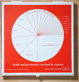
Pizza pie charts from The Economist’s “Get a World View” campaign. Philly pizzerias distributed the boxes which display pie charts with statistics related to world food distribution, emphasizing those used in pizza production (e.g. global wheat consumption, world cheese imports, arable crop land, etc.).

dusoft
on 22 Nov 08Could you please post not only the thumbnail, but link the thumbnail to the large version? What’s the sense of linking thumb to thumb? Where is usability, huh?
CJ Curtis
on 23 Nov 08“The idea was to target a youth market by branding their favorite source of sustenance.”
Someone explain this to me, cause I definitely don’t get it. Why would college kids give a ratt’s ass about world cheese consumption?
Rachel
on 24 Nov 08I really like that, great use of a pie chart cause it looks like the pizza and it makes you think about the food you’re eating – very good!
Chris Harrington
on 28 Nov 08Agree. That is a tasty looking pie chart.
This discussion is closed.