A couple weeks ago we launched the new Highrise marketing site. We’re still iterating that design post-launch, and we have a big post brewing about that design process, but today I wanted to share some of the iterations we explored for the new signup chart.
The start
Here’s where we started. This was the signup chart for the previous site. You can still see the design action on the Basecamp or Backpack site.
Design A
One of the earlier design directions for the new Highrise site included a light blue background and dark highlight boxes. This was the signup chart direction we were playing with while this design was in style.
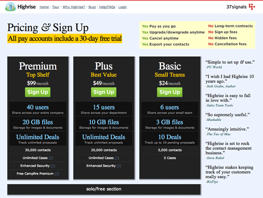
We wanted to highlight the main 3 differences between the plans (users, storage, and deals) so we darkened those boxes and colored the text blue. We also introduced a YES/NO list top right to get some key points across related to our signup policy. This was inspired by Southwest’s NO NO NO list on their home page.
Design B
We started iterating and began to explore something more visual. We wanted to see if we could show some relative comparisons between the plans. Numbers are fine, but could we be more visual?
![]()
So we experimented with icons. A group of people for users, a hard drive pie chart for storage, and $$$ for deals. This took a few hours and we recognized quickly that it was noisier and didn’t really help. But we’re happy we went though the process.
Design C
We then started experimenting with other background colors and patterns and type treatments. For a while we liked a deep plum color and pinstripes. As I look back at this I’m surprised I liked it at one point, but that’s all part of the design process. You don’t do your best work all the time.
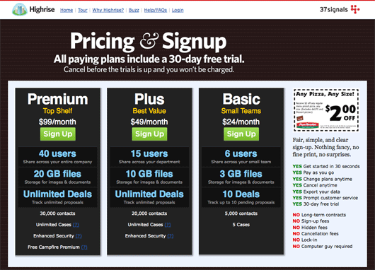
You’ll also notice we moved the YES/NO chart into the sidebar. We also introduced a coupon to the sidebar. We used a pizza coupon copied from another site instead of spending the time making our own fake coupon.
Design D
Once the colored background hangover wore off, we went back to white. We also went back to centered headlines that spanned the full width of the page. And we also removed the sidebar so the main three plans would each take up a third of the horizontal space.
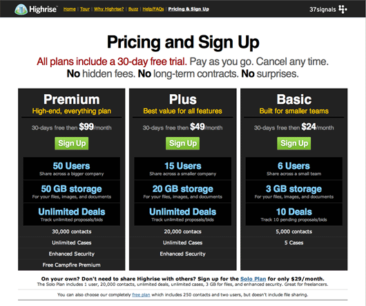
Now that we don’t have a sidebar, we moved the YES/NO information into the header. We focused mostly around NO. No hidden fees, no long-term contracts, no surprises, etc.
We also tried to reiterate the 30-day free trial by using red text in the headline and also adding “30 days free then…” before the price of each plan. This is the design we were planning on launching. We were a couple days prior to launch at this point.
Launch design
A day before launch Ryan asked me to click from the home page to the signup page. The home page happy blue background at the top with a colorful representation of the core benefits of Highrise. Clicking to the signup page took you to a stark white background with monolithic dark grey slabs for each plan. There was no continuity. Ryan was right.
So a day before launched I redesigned the chart. I wanted the design to remind people of the home page. Light blue, orange, grays. Something happier and more consistent with where they just came from.
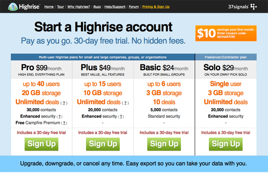
I also decided to move the Solo plan up from a small horizontal line below the other plans to a full-blown vertical column far right. I colored the main three plan specs orange so they popped, and big green signup-buttons ended each column. The plan names were also linked up in case you clicked those instead of the button.
The other thing we introduced in this chart is the notion of “Multi-user business plans” (Premium, Plus, and Basic) and the “Freelancer/Contractor plan” (Solo) using blue headers above the columns and a thick black vertical line between Basic and Solo.
This is the design we launched with. We ran with this design for 3 days. Paid signups were up and the Solo plan was far more popular than it had been on the previous site.
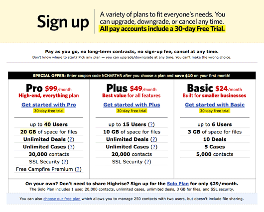
Post-launch, “Focus” design
While looking at the new signup chart, and our previous charts, I noticed something. We don’t suggest a plan. We give people choice, but we don’t point them in a recommended direction. We should. The thinking goes that more options are OK if you help direct someone to a default choice. But more options without a recommendation just lead to decision paralysis, uncertainly, and buyer’s remorse.
So I though about it for a while and sketched out a quick idea.
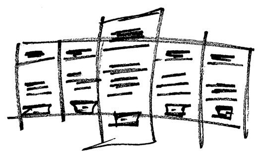
The idea was calling out one plan as our recommendation. We’ve always felt the Plus plan is our best plan. It’s a great value and it’s the first plan with all the features. It’s also the first plan with unlimited deals. So we decided we’d recommend that plan.
A few minutes later I mocked up the general structure in HTML just to see if it would work. It did.

I uploaded this picture to Campfire and the crew said “Interesting.” I thought so too, so I started to flesh it out.
A few hours later we were there.
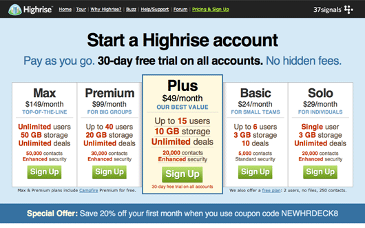
I centered the headline, bolded/blacked the “30-day free trial” message and flanked it with “Pay as you go” and “No hidden fees”. I also focused the colors on the differentiation points. I didn’t color “up to … users”, I colored the number of users. This helps people spot the actual differences, not the words in common.
The Plus plan has slightly bigger and darker text. The green sign up button is slightly bigger too. Finally, I gave the Plus block a pale yellow background to pop it even more.
You’ll also notice we added the Max plan to the list. We haven’t advertised the Max plan for Highrise for nearly a year. You can upgrade to the plan if you already have an account, but you couldn’t sign up for the plan straight away.
The design has only been live for a week. It’s been a holiday week, and the end of the year is generally slow, but so far we’re happy with the results. Plus signups are up about 20% over the norm. We’ll need some more time to see how it works long term, but I think we may be on to a winning signup chart format. You can see it live on the new site.
We hope this was helpful
There were a lot of tiny iterations between the big iterations, so if you have any specific questions, or would like me to go into more detail about a specific decision, please post it in the comments. I’ll try to answer as many as I reasonably can.

Kevin
on 30 Dec 08I love your posts on design iterations and the thought you put into your products. It challenges all of us to continually do our jobs better.
Btw, the new signup page looks awesome!
mikemike
on 30 Dec 08The dark one looks an awful lot like:
Wufoo’s sign-up form
The “focused” one looks an awful lot like:
CrazyEgg’s sign-up form
matthew
on 30 Dec 08@mikemike – I don’t see that at all?
ceejayoz
on 30 Dec 08This is the sort of post I love on SVN. Thanks!
@mikemike There are only so many ways to set up a comparison chart like this. No surprise that there are some well-designed forms that look fairly similar.
Colin
on 30 Dec 08Good stuff!
I especially like how you design something, then sit on it for a few days. When designing, it seems like I always prefer whatever is the newest iteration. But it’s more wise to see how the design stands up over time…let it sit and stew for a moment or two…then come back to it when you can be more objective.
Brandon Durham
on 30 Dec 08Thank you so much!! Favorite SvN post thus far. Great work.
Aaron
on 30 Dec 08The design with the icons may be a bit busy, but I think it reads the quickest with how the type is. The type with the current design tends to bleed together, for my eyes at least.
JF
on 30 Dec 08Colin: I usually end up hating what I did a few days later. Then I know the design doesn’t work. But designs I still like a few days later usually turn out to be winners. A week later, I still really like the new Highrise chart so I’m optimistic. I’m looking forward to implementing this across our other products.
Nathan
on 30 Dec 08Thanks for sharing this, as I was looking through the iterations I started to feel that you were showing too much information at once, but the final design with the ‘default’ choice is a really nice way to simplify it for most users while allowing the others to have several choices.
PS
on 30 Dec 08I find the order of the plans interesting.
I think if I was to design this, I would have reversed the order, so prices scale up from left to right. Any reason it goes (approximately) from right to left in terms of features/price?
Jeremy
on 30 Dec 08This is a great post—probably my favorite of all the Design Decisions articles. I noticed the final sign-up form presents the coupon code in text form, rather than as the graphic that appeared in earlier iterations. Was the final version of the coupon code done that way to avoid “banner blindness” or is that just a coincidence?
GeeIWonder
on 30 Dec 08or would like me to go into more detail about a specific decision, please post it in the comments
Conversion rates? HeatMap?
No prob if this is considered confidential, just thought I’d ask.
KMB
on 30 Dec 08Great post, even better sign-up-page; I almost signed up ;-)
But I would get rid of the small “30-day free trial on all accounts” within the “Plus-Box”. It’s redundant and deplaced, because it doesn’t only apply to the Plus-plan.
Shek
on 30 Dec 08Why is there a “Any Pizza, any size” ads look-alike thing in Design C?
Michael
on 30 Dec 08Really enjoyed the post. Are people signing up for max now?
JF
on 30 Dec 08Are people signing up for max now?
Basecamp gets the most Max signups. It’s more established which makes the Max plan there a better sell.
Highrise gets some, but not as much as Basecamp. Curious to see how that changes as Highrise gets more established.
It’s also hard to make any decisions about what works and what doesn’t right now—December is historically slow and this economy isn’t helping. The first half of the year is always the best part of the year, so we’re eager to see what happens in January.
Michael
on 30 Dec 08It’s unclear to me if you guys iterated amongst yourselves or did you use a product like Google Website Optimizer to let your users tell you which is best?
Andrew Mitton
on 30 Dec 08I really like the visual icons and found it much cleaner than a bunch of text. I found it much easier to process and much easier on the eye. Just take out the redundant sign up button at the bottom and make the icons a little smaller.
The text looks good, but I would left justify it. The left justify provides a cleaner line for the eye to follow. According to Robin Williams (Non-Designer’s Design Book) centering text provides a more difficult line for the eye to follow.
Thanks for the post. I always find it informative to see a design process.
JF
on 30 Dec 08It’s unclear to me if you guys iterated amongst yourselves or did you use a product like Google Website Optimizer to let your users tell you which is best?
Ourselves. Most of the designs above were never launched. They were just designs we whipped up along the way and decided we didn’t like for one reason or another. We only launched “Launch” and “Focus”.
Harvrock
on 30 Dec 08Thanks, guys, this is great stuff. Love the design decisions series.
rishi
on 30 Dec 08I really liked the customer quotes in design A. What was the reasoning on taking those out?
LBDG
on 30 Dec 08I noticed in the original “launch” version the small text and link to the free plan is missing, but it appears in some of the previous iterations and is present in the currently live update. Was this an intentional test to see if you were giving something away people might pay for, or an accidental oversight?
Paul
on 30 Dec 08I’ve noticed that the 37signals products have been quietly moving away from the Free plans. It would be awesome if you could do a post about your decision to move from the freemium model to mostly just 30 day free trial pay plans. Thanks for the post!
JF
on 30 Dec 08LBDG: We launched without a free plan to see what would happen. We often experiment like this. A few days this way, a few days that way.
While the lack of a free plan lead to increased paid signups, we decided we’d bring it back because we’d be missing out on a lot of upgrades from free -> pay. That’s a lucrative pay path for us.
Anonymous Coward
on 30 Dec 08Why didn’t you coloured the price of each plan (like you did with users, deals, etc.) ?
Deg
on 30 Dec 08The final design is very nice. Thanks for the great, insightful post. :)
Michael
on 30 Dec 08Just finished reading your post on the design process. I really like the final result. One minor suggestion. I like how when the user hovers over the Plus option additional information shows up for terms that might need such explanation. However that same information is not available for the other options. A minor thing, but something you may want to consider since that seems to be the only way to see the information on the current design. Also there’s no real indication that such information would come up when hovering over the words, but any visual indication would possibly take away from the design anyway. Again great job overall.
Matt Radel
on 30 Dec 08Very nice. Not to be picky, but the vertical alignment of the green buttons is bugging me…I’d prefer to see the text centered from the baseline of the text rather than the highest and lowest points (I’m having a typographic mental block at the moment for the exact terms).
Great stuff as usual though!
FredS
on 30 Dec 08Cool stuff.
Side note: “Prepare for Business with Highrise”??! uh…
Seth
on 30 Dec 08Jason, great work as always. I’m constantly inspired by the transparency you all offer on your design process. I do something similar over on my blog from time to time.
I think recommending a pricing plan is a great idea. I recently went through a similar exercise redesigning our pricing plan table. The new version offers many choices and pricing plans, and seems to be working very well for us.
I definitely will have have to try recommending a pricing plan option on Cashboard ;)
--Josh
on 30 Dec 08@PS “I find the order of the plans interesting…”
That’s based on the “principle of contrast” as discussed in the book Influence. Interestingly, you can see where I suggested that in response to a similar post about the Basecamp signup sheet four years ago after having just read that book here: http://www.37signals.com/svn/archives/000970.php. It’s amazing that it has been that long.
With the obvious design influence that 37S has had on the rest of the web app world since then, that design element has essentially become a standard.
Brandon Durham
on 30 Dec 08Curious… Why did you design the new Highrise pages instead of Jamie?
JF
on 30 Dec 08Brandon: Jamie and I worked on most of the design together, but I’ve always liked designing tables of data so I focused on the signup stuff.
Matthew Ensor
on 30 Dec 08I’m really enjoying these behind the scenes posts!
I work on a subscription based site. Our subscription system gets more and more out of hand with each new offer.
Any insights you can share about the subscription system you’ve built?
Jeffrey Kalmikoff
on 30 Dec 08I love this! I have only one question, and that’s if there’s purpose behind putting the Max plan on the left and and descending to the cheapest plan? The reason I ask is that since you just put it into the offerings, and it’s the most expensive, it’s probably safe to assume it’s the plan people sign up for least. Beyond it being “too big” for most people, I’d argue that $150/month is cost prohibitive for the majority of your users.
I tend to look at page real estate value as descending from left to right. Seeing how there’s 5 options which keeps the middle-of-the-road option dead center, the space may be better utilized with the most accessible (read: cheapest) option first.
My feeling has always been in that a service environment, the cheaper it is, the less you get. While that may be true, in the case of Highrise the cheaper it is, the less people it serves, and all of the features inherent in each plan will scale proportionately.
I’d be worried that by showing you most expensive plan first, by the time someone sees the cheapest plan, which may end up being the entry-level one they’d start with, there may be an assumption that the cheapest one simply won’t compare to the most expensive (read: assumptive best) one and they’ll maybe opt for nothing.
By putting the most practical plan first, it’s saying “these are all great – find the one that’s best for you” rather than saying “this plan is the Bentley of the group, if you can’t afford it, try working your way down to the one you can”. If someone NEEDS the larger plan, they’ll find it a few options over, but there’s something psychological to feeling like it’s OK to start small and you’re not really getting less – you’re just paying for what you need.
Scott Heiferman
on 30 Dec 08Fascinating, thanks for sharing, JF.
Meetup’s hiring a head of UI who’s turned on by this kind of thing… http://www.meetup.com/jobs/head-of-ui-engineering/design/
StartBreakingFree.com
on 30 Dec 08Great post Jason, thanks! Brian
Matthew Ensor
on 30 Dec 08@ Jeffrey Kalmikoff
I have split tested this and found moving the expensive plan to the left more profitable.
Tor Løvskogen Bollingmo
on 30 Dec 08What’s the reasoning behind going right-left from the cheapest plan, instead of left-right, like ‘the normal’?
--Josh
on 30 Dec 08For everyone asking, as noted a few comments above, the reason behind displaying the higher level plans on the left and the lower level plans on the right is the psychological principle known as the “principle of contrast”. This is most easily researched by reading this book: http://www.amazon.com/Influence-Psychology-Persuasion-Business-Essentials/dp/006124189X/ref=pd_bbs_sr_2?ie=UTF8&s=books&qid=1230670004&sr=8-2, or the newer more streamlined version: http://www.amazon.com/Yes-Scientifically-Proven-Ways-Persuasive/dp/1416570969/ref=sr_1_2?ie=UTF8&s=books&qid=1230670080&sr=1-2.
John Munsch
on 30 Dec 08I’m not a designer but for my side projects I have to play that role as well as the developer role. I’m always frustrated by how much time it takes me to get to anything I can stand in the way of design.
If you don’t mind me asking, do you have an estimate of how much time was spent in total to create all the different iterations of this design?
JF
on 30 Dec 08John: I don’t know for sure, but each major variation in the design probably took me one day from idea to nicely polished up. Sometimes I’ll make some minor tweaks the next day or two, but the bulk of the work takes one day.
Noel Hurtley
on 31 Dec 08Thanks for sharing this with us Jason. It’s really interesting to see how you guys approach the design process.
Darren
on 31 Dec 08This feels like change for the sake of change. What are you saying no to?
Anonymous Coward
on 31 Dec 08Shame, the only one that grabbed me from a “cost benefit” point was your discarded design B.
Those filled in ‘people bars’ don’t half hammer it home…
Roderick
on 31 Dec 08[pointing.out.the.obvious] These “Design Decisions” entries are the makings of your next book.
MichalT
on 31 Dec 08Why not just give all users “enhanced” security?
Lam
on 31 Dec 08Interesting!
Stacy
on 31 Dec 08Since you are doing experiments in this low season, try switching the order of plans from max-solo to solo-max, and see what happens, as others have suggested here.
Zach
on 31 Dec 08Great, great post! I have been looking forward to posts like this for a while. Keep it up.
William Lang
on 31 Dec 08This style of post is the best that appears on SvN.
MattH
on 31 Dec 08Great post. Thanks for the transparency!
I found that I liked each successive iteration more than the last. Though I still like the visual comparison of the people, hard drive, etc. it did make the end result a little noisy.
Jim McGowan
on 01 Jan 09Personal Plan is gone? Wow – looks like you’ve decided to just sweep out home/personal users altogether.
It was obvious that Highrise was planned as a business tool, plain and simple, but at least you kept some room there for personal and family users. Now it’s purely a business application; personal need not apply!
It’s a shame, really, because families could truly benefit from using a combination of Highrise and Backpack but it appears that you have made the decision to price families out completely.
I subscribe to a Solo Backpack account and a free Highrise account. I’d love to upgrade to a Highrise and Backpack account that my wife and I could use but as a disabled retiree I simply cannot justify the cost. I love Highrise and I do manage to keep only a portion of my contacts in the free account to stay within the 250 limit.
Thank you.
Jim
JF
on 01 Jan 09Jim: The personal plan hasn’t been on the signup chart for over a year. The redesign didn’t change that.
You can still upgrade or downgrade to the personal plan once you have an account. So you can sign up for free and upgrade to Personal, or you can sign up for any other paying plan and downgrade to personal.
Jimmy
on 02 Jan 09This post is really, really, really helpful to me at the moment – thanks a million for sharing; i think it’s a huge improvement.
Bert C
on 02 Jan 09There was something very approachable with only 3 options. (or even 3+1)
Pointing to a best value option makes sense, but in practice I predict most would start basic and upgrade later, after deciding this product worked well for them. Are you trying to change this behavior?
If the goal is encouraging signups vs. being informative, I’m not sure that making the value option most prominent is the way to go. This isn’t a fast-food joint where you’re being upsold to super-size your meal. In this economy, businesses are focused on the lowest risk. Showing a balanced view respects the user’s intelligence and gives them an opportunity to make a responsible choice without feeling overtly marketed to. It conveys confidence too.
Design-wise the overall scheme looks pleasant enough, though the cumulative effect of the bold, caps, and oversize text does feel quite shouty.
Blake
on 02 Jan 09Why did you decide to increment the plans from right to left?
Marko Lokas
on 02 Jan 09Ampersand lovin…
Holger
on 02 Jan 09I don’t like the names “Premium”, “Max”, “Plus”, etc. You never know which is which. Is “Plus” everything that “Max” has plus more? Then why does “Max” remind me of “maximum”? Confusing, at least for me.
The only way to really know is to compare the prices.
Brad
on 02 Jan 09I think what I like about it is that the design resembles a city skyline and that fits with the Highrise title. Not sure if that was intentional or not.
Adam Hermsdorfer
on 02 Jan 09Thanks for showing the mockups. The final layout is clean and to the point.
I know you didn’t use Google’s Website Optimizer or any other landing page optimization tool, but it would’ve been awesome too see which layout actually converted the best.
Hendrik-Jan Francke
on 03 Jan 09These are the kinds of posts I love about svn. thanks!
Martin Baker
on 04 Jan 09As others have said, I’m really intrigued why 37s choose to place the most expensive plan first rather than last. What’s the reasoning behind that?
Low to High pricing:
+ First point the eye goes to is the lowest cost plan. Makes it accessible to the widest number of users. Low barrier of entry.
+ The benefits of the plan increases as the user reads from left to right. In other words this is what the user would expect. It’s familiar.
+ Subconsciously locks in with the idea of customer aspiration. “How far across can I go? What’s the highest plan I can afford?”
High to Low pricing:
- First point the eye goes to is the highest cost plan. Immediately sends out a “You can’t afford us” message. We’re primarily interested in high end customers. I’d be surprised if this is 37s intention.
- The benefits of the plans DECREASE as the user reads from left to right. This is more obvious in the earlier designs but still seems very wrong.
- There’s no aspiration going on as the user reads from left to right. Quite the opposite.
JD
on 04 Jan 09Martin,
One important thing to note is we’ve structured all of our sign-up charts from highest to lowest since the beginning. So far the order from premium to economy has been working for us. Right now we’re interested to see how the new chart structure has changed things. Changing the plan order additionally would make it difficult to measure how successful the new chart structure is. As Jason stated above: It’s doing well. We want to see how it performs during a normal non-holiday week.
Radoslav Kostadinov
on 04 Jan 09Very nice article and also very reasonable comments.
Considering the fact that the price is on top of each box, it seems like it should be the main reason for your users to buy the product, and not the features itself.
Like other people said, the order Max, Premium, Plus, Basic, Solo isn’t logical. Also: Why should an individual have up to 20 thousand contacts, and a small team (with possibly more people) only up to 5 thousands? That would mean that the basic plan should be placed last (from left to right), if you decided to go list offers in decreasing pricing.
We also offer a “free plan” link says: “We have a 6th plan, but you shouldn’t bother with it”. From a customer point-of-view seems that you try to manipulate their decision. I wouldn’t define that as good behaviour.
How should a user clearly compare usage, storage, deals etc. when they are all marked with red? I mean, when everything is marked with red, nothing is popping up anymore.
While Helvetica may look well on a Mac, Arial at 34px size isn’t quite nice on Windows. Just my 5 cents.
Otherwise great design and very nice approval description. Hope, that my criticism will be considered as constructive and not as offensive.
Ryan Graves
on 06 Jan 09I’d love to hear more about the process of getting feedback from the team. What kind of constructive or non constructive feedback is shared, and how quickly does that process take place? Thanks Jason.
This discussion is closed.