The 37better Project (archive from 2001 – some links may not work) was one of the best promotional things we ever did for our company. It brought us tremendous exposure. The 37betters were linked up everywhere and discussed at length in all the right places.
The goal of 37better FedEx wasn’t to win FedEx’s business, it was to win someone else’s business. Someone else who saw what we did and said “That is better. We could use better ourselves.”
Further, it showed people that we weren’t just designers, we were thinkers. We were curious about solving problems not just painting pictures. You may have disagreed with our solutions, but we explained what we thought was wrong and why we thought our design was better.
I’m surprised I haven’t seen more designers/firms try to make a name for themselves this way. It works. Take on a few brands, redesign a few pages or flows, explain in detail why you did it and why it’s better. It’ll spread like wildfire today. Back in 2001 there weren’t many outlets to get the word out. Blogging was in its infancy. There was no Twitter or public Facebook, etc. Today it’s different. Take advantage of it.
A modern case in point: Patterns by R.BIRD
R.BIRD primarily designs physical packaging for consumer products. In the last few years they’ve been churning out Patterns — “a series of professional observations about package design practices within specific product categories.” Patterns are free PDFs anyone can download.
They have Patterns on tea, women’s razors, sliced bread, energy drinks, among others. They’re insightful and well executed.
They’ll look at a category, study it, compare it, dissect it, and share their findings. It’s a competitive analysis without the us vs. them. If you’re looking to hire a brand design firm, wouldn’t you want to consider a company that likes this stuff enough to do it for free?

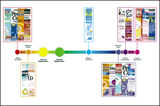
Unclaimed colors in the children’s cold medicine market.

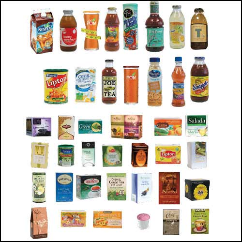
An overview of current tea packaging.

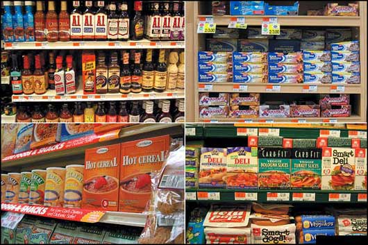
A snapshot of the low carb shelf at the supermarket.
Those are just some of the stills from the reports. If you’re interested in packaging, the reports are fascinating. And if you’re a potential client looking for a firm to help you design your packaging, the reports (the thinking) combined with R.BIRD’s portfolio (the design) make a great case.
What could you do?
Slow times are a perfect time to start putting together self promotional materials. What are the patterns in your business? How can you demonstrate competency beyond what everyone else is doing? Every designer on the planet has a portfolio of their designs, but how many have a portfolio of their minds?

Ryan
on 29 Jan 09Awesome post. I love the idea of sticking some of my optimization ideas out there. A few months ago I threw together a post about how one of the Redbox Screens could be improved. But I really should take this a step further and actually create some formal ‘case studies’.
Ryan McMaster
on 29 Jan 09Fantastic ideas. Like Ryan above, I tried my hand at something similar in the past but didn’t follow through properly. How many designers look at packaging, signage, websites and think “I could have done this much better?”. Probably all of us.
But by putting together thoughtful and interesting (re)designs and comments on how it improves x, y and z, maybe we can win over some to believe in us as thinkers too! Can’t hurt to try. Thanks for the inspiration.
Gavin
on 29 Jan 09This was an excellent post and the 37better Projects was awesome. These are the types of posts that makes 37 Signals stand out!
Evan
on 29 Jan 09I bet something like this could work for programmers, too. Showcase the improvements you’ve made to a few open source programs.
Luigi Montanez
on 29 Jan 09In the same vein 37better, the Sunlight Foundation recently did a mock redesign of USA.gov:
Rethinking USA.gov
JF
on 29 Jan 09Ha! I was thinking of bringing back 37better and doing one for government. The Rethinking USA.gov example is close to what I had in mind.
Aaron
on 29 Jan 09To help market ourselves we decided to build a free web app in a month and document the process: onemonthapp.com
That free app became Pulse which we are currently working on to add more features and a paid subscription model.
It helped our business marketing wise, but we were also able to build a viable application as well.
Chris Avore
on 29 Jan 09I think this can be a really useful technique for chunks of functionality, particularly when you’re really re-aligning a bad interface with good design patterns or convention (and thus taking far less time).
I recently did a similar exercise with the kludge that’s the UPS tracking screen when Jared Spool blogged that there had to be a better solution.
http://www.erova.com/blog/index.php/2009/01/07/ux-remix-ups-tracking-screen/
leethal
on 29 Jan 09Perhaps the reason people don’t do this is that they fear that it will make them look stupid, because “noone cares about it anyway”, and then being labeled “elitists”.
Cap
on 29 Jan 09David Rosen recently began a series of game design critiques in video form. They’ve garnered a lot of attention and are generally enjoyable.
http://blog.wolfire.com/2008/11/world-of-goo-design-tour/
Mark
on 29 Jan 09The 37better project is brilliant and inspiring! Keep on bettering the web.
The Design Eye Crew did a similar thing for craigslist http://craigslist.thebignoob.com/
nickd
on 29 Jan 09On the same tip, check out a recent Brand New article about a product being designed to stand out from its competitors.
Jeremy Thomas
on 29 Jan 09You make a great point when you describe the 37better project and that “I’m surprised I haven’t seen more designers/firms try to make a name for themselves this way.”
My buddy, Jake Schirm, over at suimple has a similar approach redesigning (rethinking) existing properties. Here’s one he did for Zappos shoes:
http://suimple.com/articles/2007/01/16/google-as-user-interface/viewer/
Keith
on 29 Jan 09Those redesigned articles and mockups were great, and as you intended told me less about FedEx and more about 37s.
Is this perhaps a sly preview of the next version of Getting Real?
Matt Brown
on 30 Jan 09Funny thing you brought this site up - it’s some of my favorite work from 37signals, and very inspirational to my UI design work. I loved that project, as well as your 37express service. You guys were just a bit ahead of your time - it’s surprising that so few have caught up yet.
Zoran Svetlicic
on 30 Jan 09great stuff. we’re in the middle of doing a thing on the visual language of finance here at our little branding firm out in hong kong.
one problem with client work is that most of the time great reusable category thinking is trapped in client-specific powerpoints and never see the light of day beyond the half dozen people you present them to in some dark conference room on the 50th floor of an anonymous office building.
more design firms should have a systematic way of abstracting and publishing this stuff as part of their way of working. management consultants are good at this (e.g. mckinsey quarterly) and reward people for publishing thinking that in turn feeds the reputation of their firms.
i’m left scratching my head at why more design firms don’t do the same. it seems like there is something about the culture of design and designers that makes asking them to write like pulling teeth. pictures are seen as cooler than words, i suppose.
Darren Marshall
on 30 Jan 09The better project is definitely one I’ve taken akin to since diving into the 37s archives. Our firm is still in its infancy, but we close nearly 95% of all clients this way. While we don’t initially approach every one with vision for their site/brand, we often extend this exercise well before we begin billing.
It’s a relatively small investment that shows commitment; not only to the client, but also to the principle. It’s also loads of fun, and helps jumpstart the creative engines for other projects :)
Vasudev Ram
on 30 Jan 09Good and useful post, thanks.
- Vasudev
Maurus
on 31 Jan 09Design was never about “just painting pictures”. Great design always has a great mind behind it.
Micha
on 01 Feb 09Very Good Post…thanx
Peter Connor
on 02 Feb 09Hi,
I created a couple of sites one was a money comparison site called http://www.moneyfish.ie it’s a very light site and I really worked hard on the credit card search, it looks simple but it took us a white to get there – I realised that people didn’t want to know what APR was they just wanted bottom line information like. This is my current credit card balance how much will I save a month if I move? Noting new but few do it.
Then I’ve created two more sites one called http://www.setmycompanyup.ie an instant company formations site and http://www.splitmybill.ie an social money management site. But I’m having terrible problems getting people to us it which means I’m doing something wrong.. I’m finding it hard to sit back and look objectively I’ve already cut so much out of the sites. I’ve created fun videos for the tour of SplitMyBill.. Being self financed I would love all suggestions??
Thanks Pete
This discussion is closed.