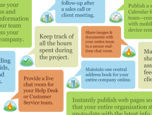
A few weeks ago Jamie posted a screenshot of a concept we were exploring to help someone choose the right 37signals product. It looked like this:

The idea was a series of tightly arranged conversation bubbles pointing to one of four different product icons (one for Basecamp, Highrise, Backpack, and Campfire). Each bubble would contain a use case. “Keep track of all the hours spent during the project” would point to Basecamp, for example.
It wasn’t a final design, it was just an exploration. We liked the spirit and friendliness and essence of it, but the execution was messy. We learned that we liked the bubbles. That’s what quick explorations are for.
v2
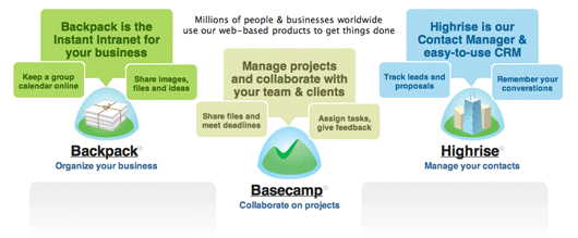
Last week we wrapped up another exploration using the bubbles. We’re not going with this direction, but we thought it would be interesting to share the progress. Here’s what we came up with.

Instead of random bubbles tightly packed, we went with a major bubble per product and then 2 secondary bubbles on either side. The major bubble was the big picture idea of the product and the secondary bubbles were key uses or features we wanted to communicate. Note: This is not final copy — it’s good enough copy for the exploration.
We liked this, but we still felt it was a little messy and lacked focus. A lot of imagery and shapes to communicate a few things per product.
But, this design lead us to what we think is the right design. We’re keeping the bubbles but reworking them again. We hope to have the new 37signals home page redesign live within a week.
Thanks for everyone’s feedback thus far. We hope you like the behind the scenes “Design in Progress” posts.

Ryan
on 10 Mar 09Sweet, can’t wait.
Just curious, is there any method to choosing the order of product marketing sites you’ve redesigned? Seems like you’ve established the pattern for the product sites, just wondering if there’s a reason the Backpack site hasn’t been redone yet.
Absolutely love the redesigns and the “design process” posts – keep ‘em coming!
JF
on 10 Mar 09Just curious, is there any method to choosing the order of product marketing sites you’ve redesigned? Seems like you’ve established the pattern for the product sites, just wondering if there’s a reason the Backpack site hasn’t been redone yet.
Good question. Yes.
We started with Highrise cause Highrise has some real momentum right now (reminds me of when Basecamp started to really take off). Thought that would be a good one to start with.
Then we did Campfire real quick. Just took a day or so. Wanted to have two done before we went on to the next one.
Basecamp was next. Bigger site, more pages, more stuff going on. Messaging was pretty solid so it was mostly design work and rewriting.
Backpack, the last one, is the biggest challenge because we’re still trying to figure out how to explain it best. So the BP site is mostly about rethinking messaging and examples. We didn’t want that longer process to hold up the other sites.
Neil Kelty
on 10 Mar 09A HUGE improvement and if this didn’t get picked, God can only know what the final site looks like.
It’s an interesting concept and the second image really shows the “decluttering” that many of the commenters mentioned on the last post.
Sarah
on 10 Mar 09Definitely like where you have progressed with using the bubbles. The first iteration is hard to scan. The second is much more streamlined and it’s a lot faster to figure out. I also like how your Basecamp product description is written from the user perspective – what you can do with the product/benefit of the product. The other description are product centric. Thanks for sharing the behind the scenes!
gvb
on 10 Mar 09Suggestion: delete “Backpack is the” and “Highrise is our”.
1) “Our” is Just Plain Wrong™
2) There is no need to reiterate the utility name in the bubble, it Just Wastes Space™
3) Eliding these turn the mumbly sentences into assertions.
The Highrise main bubble should have “your” in it… “Your Contact Manager and easy-to-use CRM” (is CRM redundant?).
Pies
on 10 Mar 09I think the v2 has an unnecessarily large number of design elements and is really unwieldy (hence the gray fillers.) Reduce the number of boxes per product to 1 or 2.
Also, why are Backpack’s boxes beige? It makes it look indecisive compared to the other two.
BTW, I really like the™’s in your product names. Very good idea.
Emil
on 10 Mar 09Your design process is interesting to follow. I feel sorry for Campfire, it feels like it’s not getting as much attention as it should. The video tour is showing features which has been stripped out of the product (search) and it still contains bugs (just take a look in the forum)
I think CG would get more love if people started using it together with a good desktop app like Propane or Fluid.
Pies
on 10 Mar 09It’s®’s not™’s, and it’s Basecamp with the beige boxes.
Anyhow, I meant to add that v2 does not at all communicate that Basecamp is the core product, quite the opposite.
Benjamin Welch
on 11 Mar 09I think this is a great idea.
I wanted to suggest that Backpack get a bubble for helping you organize your stuff. That distinguishes it from Basecamp a bit more. I use it to get my wits around my own shit as opposed to my teams shit.
MI
on 11 Mar 09Emil: Campfire’s search has not been stripped out, I’m not sure what you’re referring to there. If you’re having trouble with search, you should get in touch with support.
Matt
on 11 Mar 09Quit talking about bubbles – that’s why we started reading this blog in the first place ;)
Chris Tingom
on 11 Mar 09I really like what you guys have been doing with the sites. When I first saw the top graphic it reminded me of wrapping paper for some reason. It would make a sweet poster.
Taragh Bissett
on 11 Mar 09“Keep track of all the hours spent during the project” would point to Basecamp, for example. I never knew I could do this with Basecamp.
Mark
on 11 Mar 09If Salesforce and the like spent a tenth of the amount of time that 37s does on design and usability, rather than seeing how many features and complex data prisons (thanks to Edward Tufte for that perfect terminology) they can cram onto the page, I would have stayed on. Zoho has improved upon what Salesforce was trying too hard to do. But for shear simplicity-of-use and real productivity, apps like Highrise really shine. And I can easily shift my data to Zoho for advanced campaign work, etc. You simply can’t get to the point that 37s has unless you really love design and usability. You can’t fake this shit, and there sure are a million ways to fumble around and fuck it up. One way is trying to be the perfect everything-solution for everyone. You only wind up overwhelming and under-used. Thanks 37signals…for being underwhelming and usable, and, ultimately, making more of us little guys more productive and competitive. Now, over the past year, I’ve busted my man-sack exploring, testing, configuring, and re-configuring on-demand CRMs and project management apps. It was hell, and I had many slips and disasters along that road. But I always found myself back at Highrise and Basecamp. The journey has been worth it because they have never given up on their love of simplicity and usability as their ‘reason for being.’ How can you go wrong?
If you’re new to the whole on-demand CRM/project management journey and I seem a bit psychotic to you, and you’re the exploring type who really wants to “see for themselves,”well, then, all I can say is, “Have fun, pack some extra underwear, and, most of all, keep it simple… it’s where you need to be.”Augie De Blieck Jr.
on 14 Mar 09You might even want to consider joining the balloons together. Check out “JOINING BALLOON TO BALLOON” over at http://www.blambot.com/grammar.shtml for more details, and a wealth of other comic book lettering techniques and terminology.
This discussion is closed.