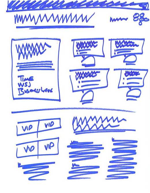
Preview of the new 37signals.com launching soon.
Blue Sharpie on inkjet paper.
You’re reading Signal v. Noise, a publication about the web by Basecamp since 1999. Happy !

Preview of the new 37signals.com launching soon.
Blue Sharpie on inkjet paper.
windock
on 12 Mar 09Would be great if it is not a preview but actual design. VIP section?
Stephen Jenkins
on 12 Mar 09I like the overall layout, but the text is very difficult to read, specifically the headline and body text. Considering using a serifed font, some like Georgia maybe?
JF
on 12 Mar 09Windock, that is the design. It’s revolutionary! Just going to scan pages and make them huge image maps.
Anonymous Coward
on 12 Mar 09I think those say VID.
Anyways… i love mock ups like this. I have piles myself after seeing some that you guys did years ago. Also lolz at Stephen’s font comment.
evolve
on 12 Mar 09Web 3.0 anyone?
BJ Neilsen
on 12 Mar 09More like Web 0.9 :D
Peter Cooper
on 12 Mar 09Future post idea: I notice the accolades are quite key there (the only things written in, in fact!) – does 37signals consider / find these important in order to building trust with visitors? If so, in what way?
Josh Williams
on 12 Mar 09So awesome.
Dave Tolsma
on 12 Mar 09I thought they would have used for this type of mockup.
Richard A. Muscat
on 12 Mar 09Loving it … the classic “you’re not allowed to read this” marketing technique.
JF
on 12 Mar 09Dave: Balsamiq looks like a useful service for heavy wireframers, but for us paper and sharpies are the perfect fit.
Rich
on 12 Mar 09“Getting Real” design tip: Just say no to Lorem Ipsum.
I kid, I kid. Obviously there’s a place for this kind of design before you start setting copy.
Chris
on 12 Mar 09Wait wait wait…I thought 37 signals just jumped right into the code; html mockups and all!
JF
on 12 Mar 09Chris: We sketch first and then to go HTML. Which is what we did. (had to make some of the graphical elements in Photoshop too).
Lindsey
on 12 Mar 09Hmm… I like where your going here… but… there’s just too much blue!
I kid. I love seeing hand-drawn mockups. So many people just jump right into the photoshopping/graphic work without getting a real idea of the organization and architecture of the site.
Ricky Irvine
on 12 Mar 09I like the image map idea.
Sammy
on 12 Mar 09What’s your take on user testing? When does it get tested for the first time? Would you use a tool like this for rapid iterative testing? Even possible for blue sharpie drawings..
JF
on 12 Mar 09Sammy: We don’t user test in the traditional sense. We do our best work, we put it out there, and then we tweak tweak tweak based on our changing perspective and people’s feedback. So our users are real people looking at the site (or using the products) for real. Anything else is too abstract for us.
Aaron
on 13 Mar 09The font is too small and the links are the same color as the regular text…
Judson Collier
on 13 Mar 09Love the new 37 signals logo. The Zigzags really capture the eye.
Always found the right side logo interesting though. What’s your thought behind that?
Jonas Sveningsson
on 13 Mar 09Did anyone say mystery meat navigation? :)
William
on 13 Mar 09That’s exactly how it’s done. I prefer a blue Bic pen however.
Calvin Chan
on 13 Mar 09haha, that’s awesome!
MongoCode
on 14 Mar 09JF: we call that using your customers as beta testers. :) Though, for design, it’s probably not a big deal where what you see is literally what you get.
rick
on 16 Mar 09I’ve started using my son’s crayola markers for site sketching.
Even better than sharpies.
Also, they come off the walls with just a bit of water.
This discussion is closed.