Jakob Nielsen says mega drop-down navigation menus work well.
Given that regular drop-down menus are rife with usability problems, it takes a lot for me to recommend a new form of drop-down. But, as our testing videos show, mega drop-downs overcome the downsides of regular drop-downs. Thus, I can recommend one while warning against the other.
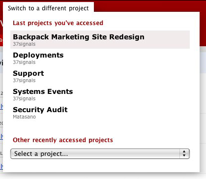
We’ll +1 that. A good, related example from our world: The project switcher in Basecamp.

Design Decisions: Basecamp Project Switcher [SvN] explains how we redesigned the project switcher from a normal drop-down to a mega drop-down.
Ryan adds this:
The original design was a single pulldown (a <select> tag). It was cramped and you had to scroll inside of it to find the project you wanted. Now the five most recently accessed projects have big easy-to-click targets, and you don’t have to scroll to see them. They’re all laid out in big type. The result is that you can navigate between the most recent projects without squinting and leaning close to your monitor. It’s really comfortable. Then since we had the free space inside the project switcher, we could also offer a big selection of more recent projects in a pulldown with a bigger font size. So in the cases where you need to dig beyond the last 5 projects, you can still do that. But most of the time it’s super fast to pop open the switcher and just click on one of those big targets without fussing around in a pulldown.
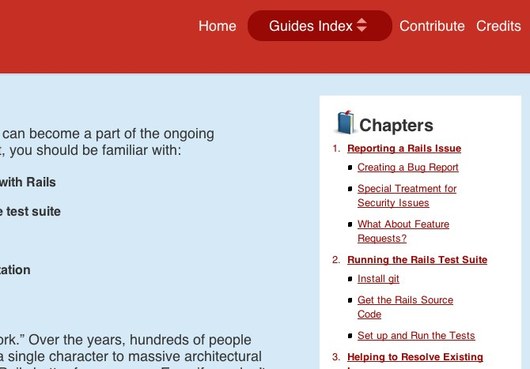
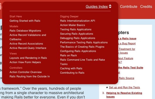
Another nice example of what Nielsen is talking about can be found at the Rails Guides site.
Check the “Guides Index” link:


Nate Bird
on 25 Mar 09I’m really liking the new rails guides site. It is great documentation. I liked it so much it got me excited so I signup up to help out. Amazing what design can inspire. :-)
Wolf
on 25 Mar 09Yes and no. Yes for someone new to the site. No for someone who knows what the contents of the list are, how they are ordered, and wants to jump to something quickly (without necessarily grabbing the mouse).
Breaking some shortcuts here (e.g. if I wanted the ‘X-games’ project I could hit X in a select box, but I couldn’t if all the projects were in a mega dropdown).
Although the argument could be made that I could resort to my browser search function then.
Then again, it’s hard to cater for both expert users and novices.
Mark
on 25 Mar 09Jakob Nielsen also says:
“Having GUI widgets (a text field and a command button) makes the drop-down a heavyweight interaction area instead of a simple navigation menu. “
And you have a drop down control in your mega drop down menu. Although I understand the use of your drop down control in your menu.
Michael Dick
on 25 Mar 09Whoever designed the Rails Guide site is killer…great work and great mega drop-downs!
Jason Zimdars
on 25 Mar 09Thanks, Nate. I’m the designer on Rails Guides. Comments like yours are much appreciated — I’m inspired by design so it’s great to know I can help inspire others. The feedback from the Rails community in general has been awesome. Thanks!
Chad Jaggers
on 25 Mar 09Really digging the Rails Guide site and the mega drop-downs. Also, have the 5 most recent accessed there really makes it easier.
Eric Anderson
on 25 Mar 09I do like the mega drop-down although his article focuses on it being hover triggered which I find annoying. First, because I have to pause for 0.5 seconds (his recommendation) before I get to see my menu. Second, hover triggered menus don’t work well on touch-screen interfaces like the iPhone. He even discourages active interaction of the menu’s visibility by criticizing Food Networks inclusion of a close button.
Your examples on the other hand are click triggered (for both opening and closing) which I prefer as it is touch-screen compatible and I feel like I have more control.
The only downside to having the menu click triggered is that you loose the option to make an alternative accessible page. For low-visibility (and small screen) people the mega drop-down is difficult. His solution is that if you click you get a normal HTML page that contains the same options as the mega drop-down. By having a click trigger the popup we loose that ability.
So here we are stuck with the choice of making it click-triggered allowing for more user control but less accessibility or make it hover triggered which looses some user control but does include the option to make things accessible.
Is there any alternative method that gives us the advantages of both methods?
Eric Anderson
on 25 Mar 09Also interesting that you guys choose to put a normal drop-down in your mega dropdown which Jakob Nielsen discourages. I think your setup is good and perhaps adds a good counter argument to the idea that putting controls in a mega drop-down is wrong. Obviously you want to keep it simple and not go overboard but controls in your mega drop-down is not always bad.
Brandon Valentine
on 25 Mar 09I know you guys are mighty proud of that mega dropdown in Basecamp, I remember the first post about it. But as someone who regularly navigates a few hundred Basecamp projects inside a single account, I can tell you: it’s for the birds. The most recently accessed projects as clickables is fine, but can you put more than just a seemingly random smattering of recently accessed projects in the select box? If I am, for example, pulling time sheets from all of the projects in a Basecamp account, if the Project I’m going to next doesn’t happen to show up in the select box, I have to go back to the Dashboard, find the project, then go to the time screen. It’s much handier to use the project switcher because it preserves where I am—the time screen, and just switches to the other project.
Vance Lucas
on 25 Mar 09I love the new Rails guides design. It’s a great piece of art. Perfect balance between functionality and simplicity. It’s a testament to great information design.
Travis
on 25 Mar 09A big dropdown box like this would be AWESOME for recent contacts in Highrise. Easily getting to more than the current four most recent contacts would be very welcome and a huge improvement.
RF
on 26 Mar 09The Rails Guides mega drop-down does seem cool, but the button for it is odd. The arrows and rounded ends suggest it’s maybe supposed to imitate a select box when it’s really a different thing. I kind of think it should scream “START HERE!” to a new user; the text “Guides Index” doesn’t do that.
(Also, big points for the goals list at the top of each guide. Summaries are underrated.)
I guess I’d name the button Find a Guide, stick it on the right side of the navbar, and give it some old-school emphasis with bold text, a rectangular darkened background (or a raised button look), and positioning on the right end of the navbar.
I might even dial down the shininess of the other page elements (maybe make the blue top-of-page background white, and make the dark-grey top bar background red) so as not to distract from important stuff in the text and key elements like the index button.
Anyway—people on the Internet. They have design ideas.
Daniel
on 26 Mar 09Any chance of implementing a similar thing for the account switching in the Open Bar?
zephyr
on 26 Mar 09Good to see a reputable design-centered company like 37 Signals get behind a usability guy like Nielsen.
Ryan
on 27 Mar 09I’m a big fan of the new trend towards mega-dropdowns. For the most part, they seem like a usability win. A couple of suggestions though with-regards-to the wording in your Basecamp mega-dropdown.
Currently, the verbiage above each section reads “Last projects you’ve accessed” and “Other recently accessed projects”. You could shorten both to read “Recently accessed projects” and “Other projects”. That shorten the comprehension time required to understand them.
Jonathan
on 27 Mar 09I love the look & feel of the mega-dropdown implemented in the Rails Guide… but the rendering looks awful and weird on both IE & Chrome.
This discussion is closed.