Understanding Comics (Amazon link) is a 215-page comic book about comics that explains the inner workings of the medium. We recently chatted about it and how the concepts relate to online visual communication too (e.g. choosing what to include and what to leave out, guiding the reader’s eye, combining text and images for maximum impact, etc.).
Some excerpts we discussed:

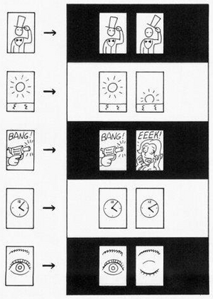
Creating meaningful differences with “sequential art.” McCloud writes, “Taken individually the pictures [above] are merely that—pictures. However when part of a sequence, even a sequence of only two, the art of the images is transformed into something more: the art of comics!”

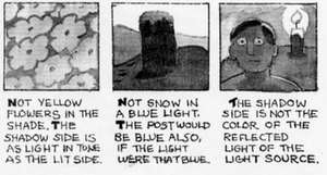
The first letter in each sentence is bolded to help separate statements.

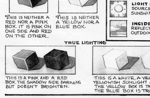
It’s interesting how the placement of the “True Lighting” headline is unconventional yet works like a charm.
There’s a related thread on cartoons, comics, and information design at Edward Tufte’s site. Some of the interesting links mentioned there:
- A comic book that explains fair use from the Duke Center for the Study of the Public Domain
- The Comic Strip Artist’s Kit helps beginning comic artists deal with perspective problems and other drawing difficulties. Check out this page on how thumbnail sketches help you think out problems.
- Tom Toles Cartoons shows how sketches turn into finished cartoons
Related:
Making Comics (McCloud’s new book)
“Forget the detail” and other animation-inspired lessons [SvN]

Chris
on 12 Jan 07I’ve read this book and it’s quite good.
Jeremy
on 12 Jan 07Good pick. I love these posts on comics. They’ve been sparking a lot of ideas with my team and prompted me to dig out a couple of old comics and animation books. In one called the Animator’s Survival Guide I found a couple of neat quotes related to the comics-web-design relationship.
This is exactly how a designer has to work when creating a website or application. It involves a series of pages (or panels or screens) and none truly stands alone; they’re all one in a sequence of many. Their context sets expectations that the page delivers on (or not), followed by some reaction by a visitor and then repeat.
Or as Charlie Chaplin put it,tim andersen
on 12 Jan 07Understanding Comics is a great piece of work, but like all things of post modern understanding, it is open to making fun of. After all most of us take ourselves and what we do way too seriously. Check out Filibusting comics by Dylan Sisson for a good laugh after you’ve gotten your intellectual fill from McCloud’s book. http://www.sequentialtart.com/reports.php?ID=912&issue=2006-12-01
Dean
on 12 Jan 07Great book! I read it because I hate(d) comic books.
For whatever reason I have no patience with comic books. I never read them as a kid but this book gave me a better understanding of why they can be great and why the good ones work.
Thanks to Scott, I don’t hate comic books anymore (but I still don’t like to read them).
Jacob Patton
on 12 Jan 07Maybe my coffee hasn’t kicked in yet, but how is the headline unconventional? It looks like it’s just bold, all-caps to me….
Tieg
on 12 Jan 07The theory behind this reminds me a lot of montage theory in film. As opposed to the “mis en scene” style of directing used a lot by the French where you tell most of the story in one shot using action in the frame, montage uses sequences of shots in contrast to each other to tell the story. That theory came together with the early Russian filmmakers and the Kuleshov experiments (which put the same image of a man’s face against different images and after watching it an audience thought that the man’s expression actually changed).
Joan M.Mas
on 12 Jan 07McCloud has published quite a few other comics, but he is known almost exclusively because of his ideas about comic and the way new media can be applied to visual storytelling. I have his trilogy, including his latest book, Making comics, and they are all very interesting reading. I certainly recommend them. His website also includes a few interesting pieces, especially the “I can’t stop thinking!” series (once object of a parody called “I can’t stop talking!”).
engtech
on 12 Jan 07I really enjoyed the style of that book, but I got a bit bored with it because I wasn’t learning anything new.
Great way to present information though.
Mark Bernstein
on 14 Jan 07Are the two images on lighting are really from UNDERSTANDING COMICS?
I don’t recall them in my edition.
john
on 14 Jan 07I don’t recall them either.
Jack Shedd
on 15 Jan 07Read Eisner’s “Comics & Sequential Art”. It’s older than McCloud’s work, and a great deal better.
“Understanding Comics” is a great book, but sadly his follow-ups have been lackluster at best. “Reinventing Comics” was inane, and McCloud’s personal experiments with the medium leave a lot of be desired.
Danny Sanchez
on 15 Jan 07Definitely agree that Scott McCloud’s book, which I’ve read twice, is the authoritative look at the elements of comics. Glad to see people from various media industries can adapt the techniques in that book to their work. I’ve also wrote a post at my online journalism blog about how comic-book elements can work for multimedia storytelling such as audio slideshows and such, which may be of interest.
Igor Asselbergs
on 16 Jan 07I didn’t know the book but got curious and went out to get it. Just read it in one go. Great work. I just love the way he explains things, even if I don’t always agree. The pages on color, btw, are realy good. He puts his finger on some of the aspects of color that most people never seem to grasp.
I was a bit disappointed though to miss the pages on lighting….
This discussion is closed.