“An artist emphasizes some things and de-emphasizes other things to make a statement.”
There’s a lot of inspiration about visual principles to be had at Temple Of The Seven Golden Camels, Mark Kennedy’s site about the art of storyboarding. The main topic is animation and drawing, but the visual principles discussed — what makes things blend together, group, separate, create interest, etc. — apply to more than just movie making.
Statements like the following, from Things They Don’t Teach in Art School #1, relate to the task of modeling a domain and creating an interface for it.
Real living forms are very complicated. But the point of art isn’t to capture life with all of it’s details….photography can do that just fine. An artist caricatures the world, filters it, makes choices. An artist emphasizes some things and de-emphasizes other things to make a statement…You can bend the forms to your will — make them what they need to be to make your drawing work. Make them be what will contribute to the best statement and/or the best design. If it looks right, then it is right. Design is more important than accurate structure!
Anthropologist Gregory Bateson once said information is “a difference which makes a difference.” The road to that difference is this filtering process of deciding what matters, what gets emphasized, and what gets downplayed in order to ultimately say something meaningful.
Character introductions
Another interesting post there is Character Introductions, which talks about the need to craft intros very carefully so they communicate to the audience exactly what the character is about.
So why is it important? I think it’s because you have to make the most out of every minute of film time you have. Film is “life with the boring parts cut out” and so every part of your film has to be interesting and make the strongest statement possible…Like many things in film, this works better if it’s done in a smart and effortless way…If your character is very complicated, then put the simple and strong statement over first and then add shadings to it as the story moves along.

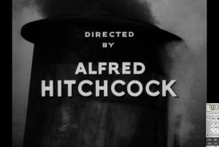
The post also includes a fascinating dissection of the opening credits of Hitchcock’s “Lifeboat” (warning: movie spoilers at the link). “An analysis of the beginning of the film is like a master class in beginning a film quickly and effectively,” writes Kennedy. “He gets across a lot of setup in a really compressed amount of time.”

Jemaleddin
on 20 Dec 06So, did you retype those quotes, or did the whole world forget which of than or then to use? =-)
Jemal (the typo king)
The Plethora of Chewing Gum
on 20 Dec 06Great info. I wonder if the Stone Temple Pilot song “Seven Caged Tigers” influenced the name of his blog.
ML
on 20 Dec 06Jemal, an overeager find/replace resulted in the then/than confusion. Corrected now.
JimDigritz
on 20 Dec 06@Jemaleddin
Perfectly correct usages of ‘then’ and ‘than’ in those quotes my friend.
Don’t be a sore ‘looser’ ;)
Jemaleddin
on 20 Dec 06What I forgot to post above is: “I’m not trying to be a jerk – just trying to help. Feel free to delete my comment if you fix the above.” =-)
pedro
on 20 Dec 06I think there is a lot that can be said for storyboarding, even/especially as it relates to site design and layout. I recently was pointed towards some of the extras on the DVDs of The Lord of the Rings as a sample of storyboarding. They obviously did a fairly exhaustive one, but the basics of it are helpful. I’d be curious to see or learn about the extent to which many web designers utilize storyboards and some of the tools of choice in that. Although you may not always need to do them to the same extent, I can see some great use in them.
Caleb
on 20 Dec 06I know Jason had mentioned in one of his comments on your Front Page redesign post that he would be putting together a Design Decisions post about the new front page, perhaps you could tie it in with the themes of this post? I would be very interested to hear what info you all thought was most important, and what could be left out.
Jeremy
on 20 Dec 06I trained myself as an animator and worked at it for a couple of years (both in-store kiosks touch screens and pitching a network show in LA—both crazy experiences). The animation and storyboard fundamentals you’re bringing up just make so much sense to the field of design on the web where I work today.
As a consultant it’s a struggle to get clients to read a page design as just one frame in a series of frames. It’s too easy for them to think of it as a frozen object that has to meet all the goals of a project in one place. They can’t click it, they don’t skim it, they tend to stare and pick apart and lose the bigger picture. (Of course, we shoot ourselves in the foot by locking the page down in a static screenshot to begin with, something I know you guys have had a lot to say about.)
More and more we find the antidote to this kind of problem is focusing on the series and the broad gestures. The old tricks I used to do cell animation are useful all over again. It’s cool.
John
on 20 Dec 06Apparently noone explained that to Jim Jarmusch.
Sam
on 21 Dec 06John – yeah. Or Robert Altman, rest in peace.
This discussion is closed.