A few weeks ago we launched the new Backpack marketing site. This completes the redesigns of our four top product sites (Basecamp, Highrise, Backpack, and Campfire) as well as the 37signals site. More on the 37signals.com redesign in another post.
I wanted to share the thought process and some of the design decisions we made while redesigning the Backpack site. Even though the Backpack site feels part of the Basecamp, Highrise, and Campfire design family, it’s the most unique of the four.
Before
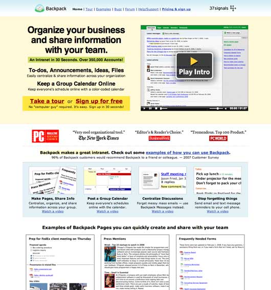
This was the old Backpack marketing site. It had been this way for a couple of years. It served the product well, but not well enough. The main weakness was a lack of focus.
Backpack is a swiss army-like product. It actually does a lot of things. You can use it to take notes, create to-dos, share files, share photos, create pages, set SMS reminders, collaborate on mini projects, keep track of who’s working on what, and view and share calendars and schedules. While all of this has been a strength, how we attempted to explain it was a weakness.
The old home page tried to expose it all. We wanted to flash the world with Backpack’s entire body. So we talked about notes and lists and calendars and reminders and pages, etc. It all made for an unfocused message.
Starting over
So instead of just taking the old content and repurposing it in a new design, we tossed it all out and started over. We asked ourselves: What is Backpack really about? What’s the core? What does it do better than anything else it does? What would it miss the most if it was gone?
Backpack Pages
The answer was Pages. Backpack Pages are the core of Backpack. They are what’s really unique about Backpack. They are the magic canvas that brings everything else together. Pages get you organized, they get you collaborating, they get you discussing, and they get your shit together.
Everything in one place all the time
But Pages were an abstract concept. We understood it, but the basic description lacked context. It wasn’t enough to just show examples of pages either. We wanted to show why you’d use Backpack Pages to keep everything one place all the time. That was the key: Everything together in one place all the time.
Next we started thinking about how we could illustrate the idea of taking all this disparate information that people usually have in multiple formats and multiple places and putting it together on a Backpack Page so they’d have it in one place all the time.
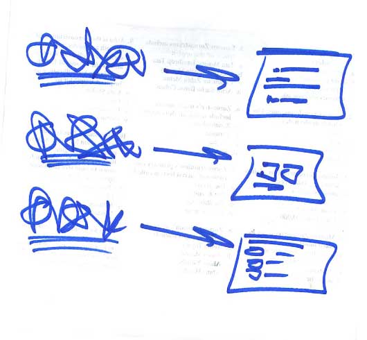
This was roughly what we came up with. Something messy and chaotic on the left turning into something orderly on the right. The left was what people have today, and the right was what people could have if they used Backpack.
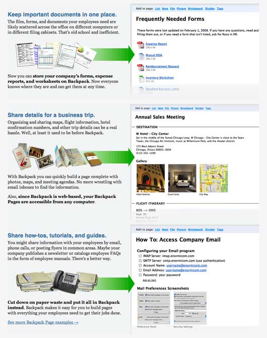
After a few rounds of back and forth with Jamie, he nailed it. Piles of stuff on the left (documents, maps, files, papers) turning into orderly organized Backpack pages on the right.
FLASH?!
To top off the new design, we wanted to illustrate how easy and fast it was to make a Backpack page. In the past we went through some screencast iterations, but they never felt interesting enough. This time we thought we’d explore something that felt more like a quick presentation than a video of a mouse moving around the screen just doing stuff.
We storyboarded the concept roughly and Jamie dusted off his copy of Flash and started to explore the concept. After a few rounds of back and forth, we were pretty happy with what we had. I don’t think it’s perfect, and I’d like to keep exploring this direction (and revisiting a video-based approach), but we consider the experience a success. We’re running with it for now. (You can watch the quick Flash presentation by visiting the home page).
After
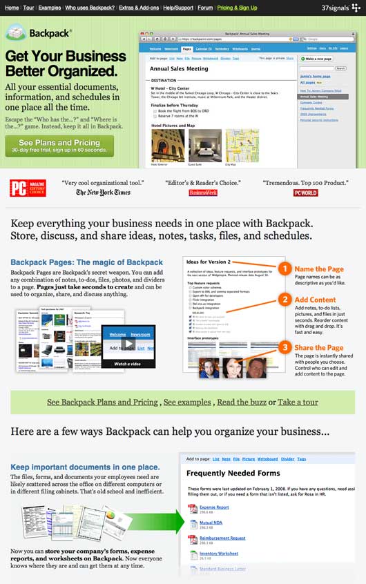
After a few days of writing and rewriting every word on the page, and designing and redesigning the visual elements, we put everything together and launched the new home page.
Sales up 25% since the redesign launched
We’re very happy with the new site. It’s a great addition to the design language found on the Basecamp, Highrise, and Campfire sites. It introduces some new elements and presents Backpack using before and after examples and narrative.
Sales in the 10 days following the redesign are up about 25% over sales in the 10 days preceding the redesign. More time will be needed to get a better feel for the long term results, but we’re very happy with how things are looking so far. We’ll be watching the numbers and A/B testing some language/button/layout variations down the road.
We hope this was helpful
We hope this look at the Backpack marketing site redesign was useful. The hardest thing was to really get to the core of what made Backpack special (Pages). Then we had to turn that into a message that made sense (Everything in one place all the time). Then we had to illustrate the benefits of keeping things together. It was a fun project.
BTW: Backpack just turned 4!
Backpack just turned 4 years old a couple of days ago. We launched Backpack on May 3, 2005 (Here’s the blog post that launched the product).

blackant
on 05 May 09Really digging this design. The old design seemed to have too many elements competing for attention. The new design is cleaner and more informative. Nice work fellas.
Nate Bird
on 05 May 09I saw the redesign a couple days ago and was surprised with the Flash demo but it presented the point of Backpack clearly and quickly. I liked it.
Devan
on 05 May 09I really enjoy the new design, much cleaner. Nice Work!
Devan
on 05 May 09As clean as the flash element is, isn’t flash slowly becoming a dead technology?
Brandon Durham
on 05 May 09Something I’ve found interesting in these redesigns is that there is no signup link on the landing page—only a link taking visitors to the Pricing & Sign Up page where they must choose their plan before signing up. Was it a conscious decision to funnel users through that page and have them select the plan to start the signup process? Had you ever considered letting the user choose their plan on the signup page (https://signup.37signals.com/backpack/basic/signup/new), possibly shortening that funnel?
I ask because I create a lot of landing pages for clients (and have a lot of Optimizer testing under my belt) but one thing I’ve never tested is adding that step to the signup process. It’s always assumed that making it as short as possible is ideal. I’d be interested to hear your opinion on this subject.
Brandon Durham
on 05 May 09Also, I know it’s been discussed before by users, but I’m not sure you guys have explained the reasoning behind ordering your plans from highest to lowest in the pricing table. I understand it’s based on the contrast principle, but I’m wondering if you might have any experiences or results to share that lead to that decision.
Steven Wagner
on 05 May 09I think you guys nailed the flash element.
We were looking for guidance for our “hero image tours” and yours seems to be the right fit. Many other ones are simply too much flash and not enough substance.
Did you find in designing that element you changed focus on future tours/demos?
BTW: Did you guys switch from Vimeo to Viddler for all the video tours? Why?
JF
on 05 May 09id you guys switch from Vimeo to Viddler for all the video tours? Why?
We did. Vimeo kicked us off their service. Long story, but basically their terms don’t allow commercial use.
Dan
on 05 May 09Vimeo kicked us off their service. Long story, but basically their terms don’t allow commercial use.
Which is lame as hell, because a) a lot of companies, including my employers, would love to use Vimeo and their oh-so-delicious wrapper as their video host and would gladly pay them for the privilege, and b) what the hell, Vimeo?
Nivi
on 05 May 09A lot of people have probably asked this question, but why don’t you A/B test?
This post from Bill Flagg is really interesting: “Direct marketers produce ugly, cheesy, long-winded stuff that CONVERT better.”
http://billflagg.blogspot.com/2009/04/better-converting-websites-marketing.html
As always, thanks for sharing.
JF
on 05 May 09Nivi, we do A/B test. We haven’t tested new elements of this design yet, but we’ve done some heavy testing on the Basecamp and Highrise sites and worked those learnings into this site.
Daniel
on 05 May 09@Brandon Durham: Actually, the guys explained some of that a while ago in this post. Of course that post is on the wording of the title on the Highrise signup page, but I’m guessing that the same reasoning (if not the testing) has been applied here.
To brutally summarize it: Shouting “Sign up!” at people seemed to turn some of them off. Instead, letting them navigate to pricing page first, and then present them with the “sign up” link tested better. Obviously, a front page “sign up” link goes to the pricing page on most sites, but its wording implies that you’re starting the process right away – before you’ve even seen the prices.
At least, that might be the reason why it tested better. It might be different for your sites though so test away!
Steven Garcia
on 05 May 09Excellent work. Jamie is a hell of a designer – I even like the addition of Flash, something I normally hate.
Beautiful and inspiring work – thanks for sharing the process!
ML
on 05 May 09Excellent work. Jamie is a hell of a designer.
Yeah, I really love the icon work Jamie did on those “piles of stuff on the left (documents, maps, files, papers) turning into orderly organized Backpack pages on the right.”
andy
on 06 May 09The first time I went to the new site, the flash video failed play. It said loading, but it never played after the load was complete. After refreshing the page, it played fine.
I have to admit that the main heading “Get Your Business Better Organized” seems awkward, and many, many Backpack customers are not businesses….just a thought.
Overall, the site is much better….you guys raised your prices too. I actually logged on today to upgrade my account from the single user to the three user account and decided not to upgrade because I have no need for 6 users and $24 per month is more than I want to pay.
Thanks for sharing about some of the design considerations.
andy
on 06 May 09One more thing…it appears as if you guys left your solo users stranded? Would you rather have solo users downgrade to free accounts to get an extra user?
Nivi
on 06 May 09Jason, Thanks for the reply!
1. Blog Reading 101: Read the entire post: “We’ll be watching the numbers ad [sic] A/B testing some language/button/layout variations down the road.” I should have read the post in detail!
2. It seems like you A/B test the finer points but not not the big stuff. e.g. comparing: http://www.regonline.com to http://www.regonline.com/marketing/products/event-planning-software-lf.aspx
I would be interested in learning more about the thinking behind that or even if my assumptions about what you’re doing are correct.
JF
on 06 May 09@Andy we didn’t touch the prices. Each plan is the exact same price as it was before the redesign.
Iain Dooley
on 06 May 09What’s most interesting to me here is that your graphic design process is almost like a flow chart. the idea that you can convey a sense of what it’s like to use a product in a simple, graphical message is quite intriguing. it deviates from the normal “feature by feature” type lists that most product design pages demonstrate.
thanks for the post!
Paul
on 06 May 09I like the new site. My only suggestion: get rid off texts “Now you can store your company’s forms, expense reports, and worksheets on Backpack…”, “With Backpack you can quickly build a page complete with photos, maps, and meeting”, “Cut down on paper waste and put it all in Backpack instead” – there is a bit too much of the text right now. And allow people clicking on the examples on the right – maybe tutorial for each example or just a full screen image… My 2 cents…
Joel
on 06 May 09I like the redesign, and with 25% increased sales it’s obviously worth it. I was really surprised to see Flash used, even though executed nicely. I was even more surprised to see the blue “missing plugin” cube when I browsed to the site for the first time on the iPhone. Are you planning to swap a static image or anything for those browsing with the iPhone?
Zeke
on 06 May 09Great to have you back Jason! Where ya been?
Matt
on 06 May 09The new design looks great, but there’s one thing that bugs me. I don’t understand why there’s not an easy-to-find link to the login page for Backpack.
I realise you see this as a marketing site, but this is the site that shows up in search engines for Backpack and it’s the site a user first associates with the app.
As a previous (free) user of Backpack, I can’t find any way on that site to login and give it another go.
Seems like an odd design decision.
JF
on 06 May 09Matt: You need to know your Backpack URL in order to login to Backpack. So even if we had a login link, you’d need to enter your Backpack URL. So just enter your Backpack URL into your browser and you’ll be right on your own Backpack account’s login page.
Matthew Hooks
on 07 May 09The new marketing site definitely highlights the (many) various uses of backpack.
I wonder if these new customers will also have less support queries/churn? That would be an interesting metric to see vs. the old marketing site.
Mike H
on 10 May 09JF.
I really understand Matt’s issue with the login page. Some people are still use to look for that on the homepage of the application.
Why not put an email input box + login button (so you identify the user’s account) and then take him to login page (with the email already in place)?
JF
on 12 May 09Why not put an email input box + login button (so you identify the user’s account) and then take him to login page (with the email already in place)?
Because email addresses aren’t usernames in Backpack. And email addresses aren’t unique in Backpack too. The same email address can be attached to multiple accounts.
This discussion is closed.