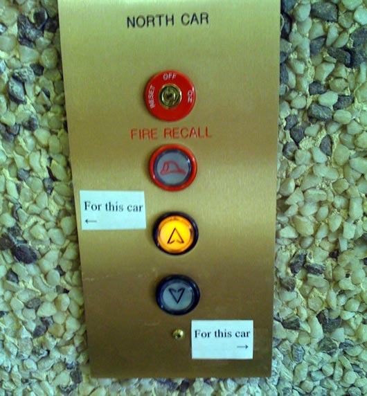
I love taking pictures of signs on signs. They usually point to bad design (literally). Here are some of the ones I’ve taken lately.
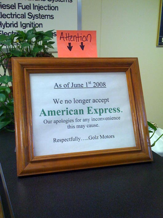
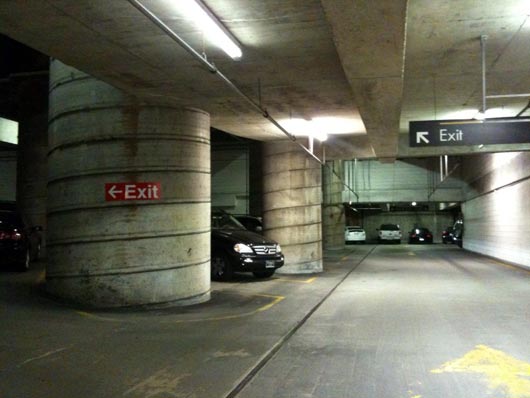
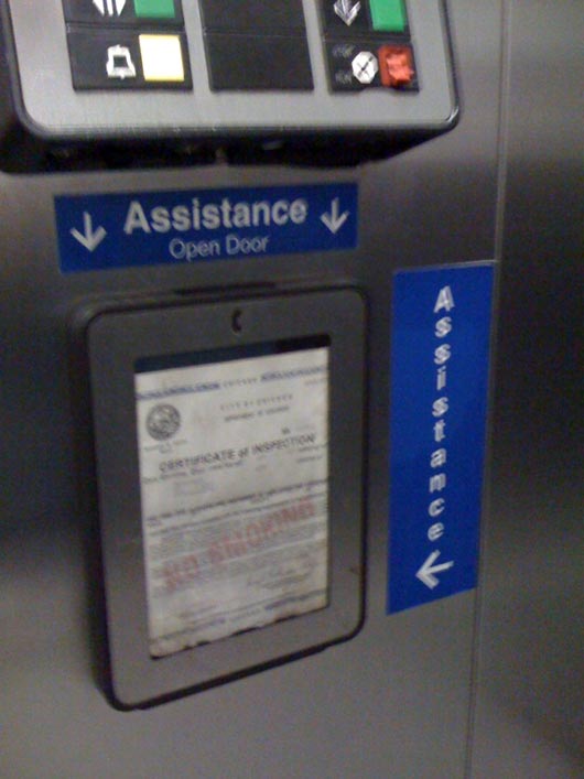
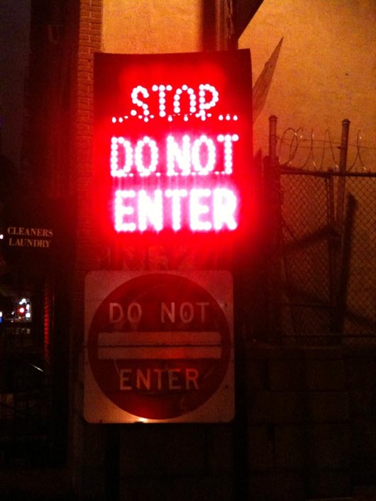
UPDATE: I’ve created a Flickr group called Signs on Signs so anyone can contribute beautiful specimens.
You’re reading Signal v. Noise, a publication about the web by Basecamp since 1999. Happy !
I love taking pictures of signs on signs. They usually point to bad design (literally). Here are some of the ones I’ve taken lately.


UPDATE: I’ve created a Flickr group called Signs on Signs so anyone can contribute beautiful specimens.
Saurabh Sharan
on 21 Sep 09The first one is hilarious :)
Brad Parnell
on 21 Sep 09wow. this is great. You should start a gallery of user submitted “bad sign designs”. It would be great to see terrible signs from across the country.
Jeremy Zilar
on 21 Sep 09Yeah – sounds like a really popular Flickr group in the making. I would be a regular contributor.
JF
on 21 Sep 09Brad: I’m considering it. My fascination is really with sign duplication and/or little hand made signs that have to go on other signs to explain what they mean. Pretty niche interest, but I’m sure there are thousands of examples out there.
Grant
on 21 Sep 09The elevator one is particularly awesome. I’m still not sure what they mean. They need an additional sign.
allan branch
on 21 Sep 09Why do elevators in buildings with two floors have a 1st and 2nd floor button? Why not just a “Go” button?
Nathan
on 21 Sep 09I love these. I see these kinds of signs all the time, I should start cataloging them.
Here is one, Muni trains in San Francisco have so many signs and most of them are all-caps bold with bright red all over. There is usually around 25 signs in my field of vision, all yelling at me.
Muni Photo
JF
on 21 Sep 09Ok, just created one: Signs on Signs on Flickr.
Annie
on 21 Sep 09I used to live in Botswana. In order to prevent “bushwacking”, there were signs posted on trees in Chobe National Park….”Please stay on the road.” During rainy season, there was no road, only the trees, stranded out in the Chobe River with signs inroad pointing out to the signs on the trees…”Please stay on the road.”
Nathan
on 21 Sep 09@allan branch – they want to be ready in case they add another floor :)
Levi Figueira
on 21 Sep 09You could hit up @rfelix and create something similar to what he has going on with http://notaparkingspot.com/ (Rails app, with iPhone companion) for “design/usability fails”. :)
Michael Houghton
on 21 Sep 09The illuminated and reflective sign case may just be an abundance of caution, if it was an outdoor location. If there was nowhere ideal to place the reflective sign, then it won’t be clearly readable in headlights, and the illuminated sign above it may even be (legally) necessary for safety reasons.
Likewise illuminated signs read less well than reflective ones during the day.
Nathan Bowers
on 21 Sep 09A few years ago I was in the Seattle Public Library designed by Rem Koolhaas. It was beautiful, though a bit overdesigned.
What struck me was the ugly office paper signage taped to the hugely expensive doors, walls, and windows by library staff.
Architects should learn from this and design systems for flexible signage to prevent the problem of literally tacked-on signage.
Peter Cooper
on 21 Sep 09I have a pet hate for diagonal arrows on direction signs when they refer to absolute left or right. That black direction sign implies to drive into the hood of the Mercedes.
Víctor Manuel González García
on 21 Sep 09Yo should see Mexico’s!
Ray
on 21 Sep 09The “blog” of “unnecessary” quotation marks is a truly great source of handmade signs, many of which modify other signs:
http://www.unnecessaryquotes.com/
Greg
on 22 Sep 09However, these signs-of-signs DID get you attention.
So they served there purpose.
Many times, poorly designed signs are the exact type of signs that get our attention … because our eye see’s those signs are not fitting in.
Which is why many great graphic artist, ironically, use Comic Sans as a typeface for the exact reason of it’s being a horrible looking typeface also a typeface that gets a lot of attenton.
Sean
on 22 Sep 09I know that parking lot in the second picture. I’ve driven around in circles in that parking lot too many times to count.
One night they had paper signs printed on standard 8.5×11 straight from someone’s printer. They were scotch taped at the top of that ramp, you know, the part where there are large signs warning you “Don’t turn left.” The paper signs had a note that said you could not turn right.
Of course we ignored those paper signs and ended up driving in circles a few times until I decided to stop the car, open the window and read the paper note that said to get out I needed to go the wrong way. Amazing.
That parking lot is a lesson in confusing signs.
Anonymous Coward
on 22 Sep 09Test
Patrick Hall
on 22 Sep 09These remind me of furigana.
Vekz
on 22 Sep 09Yo Dawg, Heard you like signs. So we put some signs on yo signs so you can read signs while you read signs.
Oliver
on 22 Sep 09Nice collection. I sometimes take pictures of people who take pictures of people who take pictures of pictures. That’s fun too!
The last photo really disturbs me – I can’t take my eyes of the stones on the background wall. Looks like someone built the wall from chewing gum. Really distracts me and I smell Spearmint now.
Have a nice day, yeah! Oliver
the best solutions
on 22 Sep 09it’s very good
aczarnowski
on 22 Sep 09Every time I see this the FAIL is palpable.
Here in Minneapolis we’ve got our fancy, budget breaking, light rail with artistically and individually designed stations. All with 8.5×11 printed signs taped randomly on every frick’n surface that will hold them past their useful date.
Tanner Christensen
on 22 Sep 09These really are great! The parking garage exit signs are confusing.
Anton Veigas
on 22 Sep 09@Nathan Bowers and @aczarnowski - as a person involved in the architectural sign industry, I can definitely confirm that the use of paper stick-on signs is a real problem. Often there are 2 issues at work here - poor design that restricts changeability, and an inefficient or non-existent reordering process. Often times it’s the reordering process that is the culprit.
The staff member doesn’t know how to navigate the bureaucracy to order a new sign insert, or even worse, yet doesn’t know how to print out a graphically consistent paper insert themselves. For sake of expediency, they resort to a hastily assembled paper sign taped to a wall.
I am involved with building a cool web app that is a project documentation and management tool specifically for sign projects. We are in the process of building a reorder module, which will make it easier for all involved to quickly order or create the appropriate sign inserts. Hopefully, if/when sign companies, designers, and architects adopt our system, there will be less tacked-on paper signs in the world.
That might mean fewer funny sign photos, though.
Francis
on 22 Sep 09@Grant there are two elevator car with separate buttons they put signs so people will not confuse which button controls which car (elevator).
Kevin Holesh
on 23 Sep 09I’ve always seemed to notice “signs on signs,” but never really thought about it until now.
It’s amazing how much signs lack common sense or even the most basic of basic design principles. I’ll keep my eye out for more sign on sign action to post to the flickr group!
rick
on 23 Sep 09I love HOT sign on sign action.
iffizarticles
on 23 Sep 09People misused American Express and should be jailed.
Jeff Mackey
on 23 Sep 09Would this photo count? ;-)
400 N May St….
http://www.flickr.com/photos/davidduran/404202180/
dave reeves
on 23 Sep 09Totally. My favorite is this one from big-dig-era boston:
http://www.goodexperience.com/broken/images/bostonsigns.jpg
This discussion is closed.