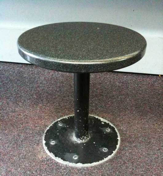
Here’s a stool at a gate at O’Hare (Chicago) airport:

Everything below the seat was black painted metal. I’m sure it looked nice when it was painted and originally installed, but it ages quickly. So here we have a material (metal) that will last forever, but a high-contrast finish (paint) that only lasts a fraction of forever. Probably not the best idea for a high traffic area – especially when a lot of people in airports have hard-soled shoes. A bad design decision.
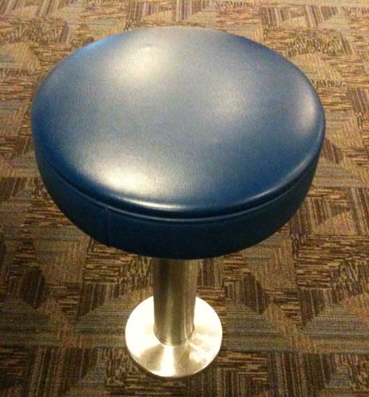
Here’s a stool at a gate at Hartsfield-Jackson (Atlanta) airport:

More comfy seat, but let’s look at the base. It’s either steel or aluminum. But it’s bare – no paint. It’ll hold up just as long as the metal base on the stool at O’Hare, but it’ll age more gracefully. No paint means nothing wears off. It looks new longer. Less maintenance means money saved and aesthetics maintained. Good design decision.

Peter Cooper
on 07 Jun 10Good observation. American Airlines is famous for mostly-unpainted planes and saves a lot of money in fuel while maintaining a timeless aesthetic.
That said, how far can you go? In the Atlanta airport picture above, the seat may be low maintenance but.. there’s carpet. The seat could probably outlive the carpet, yet the seat will most likely be replaced when the carpet is. It seems a tradeoff has still been made (carpet vs a more solid flooring surface) – just not in the seat.
Anonymous Coward
on 07 Jun 10One word upholstery…So the problem was solved with the base, but now the problem is upstairs…High traffic use will destroy the upholstery , all money will be going into this.
Kevin Gainey
on 07 Jun 10The O’Hare “seat” looks more like a place to sit your drink down. Maybe it’s just the lack of context in the photo, but not something I’d want to have to use for an extended period of time, regardless of what the lower part looks like.
Fred S
on 07 Jun 10I’m sure rats ate the paint at ORD.
Jason Klug
on 07 Jun 10Something similar to this bugs me all the time: dated interior design.
I’m all for having a unique style… even if that particular style is but a snapshot of your life at a time. But when people impose that style on more permanent aspects of their home/office (color-du-jour tile floor, for example) it doesn’t “age” well.
Keep the more transient stylings on less-permanent things, like bed linens or wall-hung artwork… don’t tie the bones of your home (office, etc.) to an era.
Ed
on 07 Jun 10I could hardly make it down to the base as that god-awful carpet caused permanent retinal damage even with the short-term exposure. Please tell me the picture was taken in 1976. Please?
One thing that drives me crazy about Harstfield is the lack of “Please stand on right” signs on escalators and moving walkways. They always brag about being the “world’s busiest airport” but hope your layover is longer than 20 minutes because when you have to rush from Concourse A to D, you’re going to experience the “world’s busiest airport packing the world’s largest concentration of self-absorbed first time travelers”. You go to Boston, Orlando, anywhere… you see the signs. Hell, I’ve seen them at the metro in places like Santiago, Chile. Harstfield? Nah.
Can you tell this is a sore spot? :)
Keith Lang
on 07 Jun 10Can aged objects ever look beautiful?
Is this statue’s green discolouration beautiful, or just old and ugly?
http://skitch.com/keith/dg634/statue
Jason Klug
on 07 Jun 10@Keith – I’d say that the statue has aged with its surroundings… so the scene as a whole is still consistent, if not beautiful.
The problem with the airport stools is they are in surroundings with far less (visible) wear & tear, so they seem all the more dilapidated because of it. They are clearly not aging gracefully, and that’s because of the failure to connect their “styling” element with their real-world use.
Chris Palmieri
on 07 Jun 10I’m with Keith, aged chipped paint surfaces can be quite beautiful, coveted items.
At the Conran Shop in Tokyo, they are selling Xavier Pauchard’s Tolix A Chair brand new for $180, or very used for $400-500.
Shown here new and antique: http://smallburst.wordpress.com/2009/06/19/je-taime-tolix-chairs/
When I was chair shopping last year, I was lured in by the Tolix’s glossy cheeriness and indoor/outdoor versatility. But I was sold on the anticipation of what they’ll look like after decades of family history are chiseled into their surfaces.
Jim Shamlin
on 07 Jun 10I can’t believe that economy or longevity what the designer had in mind, given that the cloth and vinyl of the carpet and upholstery don’t support the same principle. The stem of that stool is probably the only thing that will stand the test of time.
Also keep in mind that paint was originally used on metal not merely for aesthetic enhancement, but for functional reasons (to protect the metal from the environment) – and the “bare” look of metal and wood that’s fashionable of late is due to improvements in coatings and treatments that were likely unavailable five or ten years ago. So at the time, paint probably was the best way to preserve the metal and ensure greater longevity (though in the image, it’s clear that it’s time for a touch-up).
Your intended point is a good one – there’s value in considering longevity from both a functional and aesthetic perspective – but I don’t think these specific examples are the best way to illustrate it.
Kale
on 07 Jun 10So here we have a material (metal) that will last forever
Not sure if that is true. The painted one is probably just a steel post and base and that would start to rust without paint (even if it is inside, the humidity will do it). And really plan steel and the weld doesn’t really look that great without some finish.
The bottom stool appears to be aluminum or some other finish that won’t rust and because of that I would imagine the cost between them is significant. I totally agree that the paint doesn’t look as nice and there is a maintenance tax associated with it, but based on the difference of costs can it really so clearly a “Good design decision”?
Scott
on 07 Jun 10Agree with anonymous that nothing says aged to me like a worn out vinyl seat, which is what Atlanta will be in a few years. All it takes is one puncture wound and it’s incredibly ratty in no time.
Maybe they figure that an airport is a safer environment for vinyl than most places?
Scott
on 07 Jun 10Do you think the O’Hare stool was painted after it rusted? So originally, it may have been metal, but now its painted to cover spots rather than being replaced. Owners looking to save a few bucks do that all the time. Instead of fixing the root problem water spots on the walls, they’ll just paint over it. Instead of replacing boards that have been knocked up, they’ll patch it up and paint it. Instead of replacing ratty, dented, rusty stool hardware, they paint it. The O’Hare Stool is probably much older than Hartsfield’s Stool.
tali heruti-sover
on 07 Jun 10hi im the editor of managment section of TheMarker the most popular economic newspaer in Israel Jason ; i would love to write abour rework – couls i please get your e-mail or any other contact details ? thanks so much! Tali
David McCallum
on 07 Jun 10If you’re getting into aesthetics, you need to take into account that the one has a bright golden shaft pointing at the user’s butt.
J
on 07 Jun 10Agree with anonymous that nothing says aged to me like a worn out vinyl seat, which is what Atlanta will be in a few years. All it takes is one puncture wound and it’s incredibly ratty in no time.
And replacing the seat is fast and cheap. Replacing paint means the entire seat is “out of order” until the base dries.
Benjy
on 07 Jun 10Another example of this is the Inland Steel building in downtown Chicago. Clad in stainless steel for obvious reasons, the building still looks shiny and new in spite of being 50+ years old. Doesn’t rust, age or patina like other metal finishes.
Alexandr
on 07 Jun 10Base is better, but the seat isn’t gonna last.
David Andersen
on 08 Jun 10How long do we have to endure seeing these two ugly photos at the top of the blog? Spare us!
This discussion is closed.