Last year we released a single sign-in system called 37signals ID. It was a massive project for us, and when you do big projects you can’t make every detail perfect. “37id” (as we called it internally) would never launch if it had to be perfect. So since launch we’ve been fixing rough spots as we identify them.
One rough spot had to do with sign-ups. When you sign up for our products, you can either create a new account from scratch or you can identify yourself as an existing customer. Existing customers can use the same username, see their 37signals apps in one place (Launchpad), re-use their avatar and so on. Basically it’s a big time saver and a big convenience. The problem was very few customers took advantage of the feature. Our support staff often heard from customers with multiple accounts who had no idea that they could link their accounts into a single 37signals ID. So we had a design problem on our hands. Why weren’t people logging in on the sign up screen?
Let’s have a look at the original signup screen. The form was completely geared for new customers, except there was a strip at the top of the screen just below the header. The strip called out to new customers with a link to “sign in” if they already use our products.

We figured there were two reasons why people weren’t signing in with this link. One: it could be that they didn’t notice the callout. And two: maybe people were noticing the link, but the language wasn’t compelling enough to make them click. We took these explanations one at a time and focused first on the placement of the callout.
Our basic intuition was that the callout should detach from the header block. When it’s attached to the header, the callout and header glom into a single unit and it’s easy to skip past both of them. Does detaching the callout help?
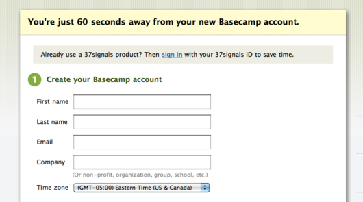
The detached header was harder to miss, but it took us too far in the other direction. It had too much focus. It felt like an obstacle. We wanted the signup form to stay focused on new customers and we didn’t want anything to trip new customers up or make them pause. The detached block felt like an interruption or a diversion instead of a helpful callout. “Already use a 37-what? Do what now? I just want to sign up.” This noticable-vs.-obstructive dichotomy become a key balancing point right from the start.
Next we tried moving the callout into a sidebar so it wouldn’t interrupt the vertical flow.
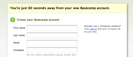
This didn’t satisfy either side of the problem. It wasn’t noticeable enough. It felt like a tooltip or “did you know?”—something we expected repeat customers to skip. And while it didn’t stand out enough, it still introduced enough extra complexity that it remained an obstruction. It felt like a fork in the road. We wanted new customers to get further down the form.
To increase the noticeability we could give the callout a background color. And to decrease the obstruction, we could move it further into the flow of the form, after new customers already have gained momentum.
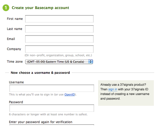
At first glance, this looked better. But we had to pause and ask ourselves: was the block noticeable because it was really noticeable, or had we already trained ourselves to stare at the right side of the screen? Would people read the right-hand side so carefully? After a step back, our intuition said no. It was too easy for the eye to follow the scanline of fields downwards and disregard the sidebar.
But one thing felt right. The top of the page looked better without a callout. It looked simpler. There were no alternatives or choices to make. Just a couple easy questions – everybody knows their name and email address – and the momentum would start.
Another thing came to mind. It’s no big deal to enter your name, email, company and time zone. But as soon as you hit the username field, friction appears. Usernames are weird. The one you want might be taken. There might be requirements, like a certain number of characters for security reasons. Generally this is the part of sign-up where pain enters the picture. That brings us back to 37id. A key benefit of 37id is that you can re-use the same username/password for all of your 37signals products. Creating usernames is a pain and 37id is a pain reliever. So something was right about this placement near the username field.
A few facts floated in our heads. 1) The sidebar was too easy to ignore. 2) The callout made sense near the username fields because of the pain/remedy connection. And 3) the eye was more likely to see the callout if we interrupted the scanline. With these facts in mind we mocked a version with the callout below the “Now choose a username & password” header.
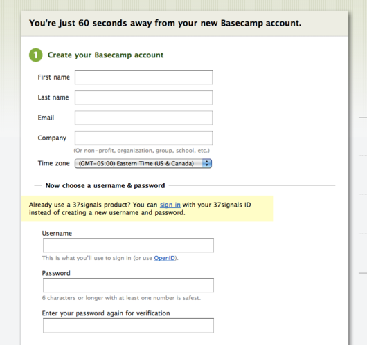
Now we were getting somewhere. It was time turn our focus to the copy. The block with two lines of text was too tall and substantive. We wanted a thin, noticeable strip with a clear message.
Here’s a sample of the process we went through in Campfire to shorten and improve the language:
Here’s the final design:
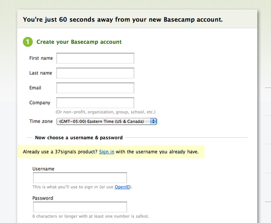
It’s short, punchy, clear, hard to miss and easy to skip when it doesn’t apply.
Something unusual about this design is that it actually encourages people to type information unnecessarily. If you fill out the name, email, and company fields before you click the “sign in” button, that data you typed in will be replaced by the info we have on file for your 37signals ID. At first this might look like a fault, but we decided that the hassle of unnecessarily filling out those fields was much smaller than the hassle of having separate accounts, separate username and passwords, separate log-in URLs and all the rest.
It felt good to focus on a rough spot in the 37id flow and whittle down to a sharp solution together. I hope you enjoyed a look behind the scenes at the decisions behind the design.



Dave T
on 22 Jun 10Why have a different section at all? Why not ask the new or current user to type in the user ID they want or already have. Then if it’s new, they provide the info, or just link the account for existing users.
Brandon Adams
on 22 Jun 10I think the best solution may be a hybrid.
First, stick with the solution arrived at above as the default.
Here’s the non-default – use cookies to detect current customers, and show them a different sign-up form that makes it obvious that they ought to use 37id. Basically, invert the default form. Ask for the 37id credentials as a first resort, while giving the option to setup a separate account if that’s what the user really wants.
Charl van Niekerk
on 22 Jun 10The new design does look much better than the old one, well done!
Personally I do wonder though if having the name/email/company fields above the username/password fields is necessarily better as it would make more logical sense to have them the other way round (considering you’re replacing the info anyway if the user logs in with their existing 37id).
What I’m trying to say is that, as a user, if the info I just inserted got changed automatically after logging in, that would seem somewhat obnoxious to me (even though the new info might be correct) while I don’t really think it would deter me from signing up once I reach this page to have to complete my login first before entering anything else, especially considering there’s a good chance I have an existing 37id I can use. Besides, all services of this nature has a login, it’s something I would come to expect.
On the other side, I have been using 37id right from when it was released, so maybe I’m just a power user. :)
Gareth Townsend
on 22 Jun 10So you’ve got pretty good reasons for all of the changes that you’ve made.
Have you tested any of the assumptions behind your reasoning?
It seems to me that this would have been an ideal candidate for some A/B testing, then you would know if your gut feeling was right or wrong.
jüri
on 22 Jun 10It seems a bit like
1. Start something new – fill out some fields 2. Ah darn, maybe I should not have done that?! You seem to redirect me somewhere else? On another path?
Though I am not a user this interface in either case, it would seem more logical to me to put the path to “do something else instead” up front, not somewhere in the middle.
Isaac Priestley
on 22 Jun 10Have you been able to verify this version is better than the original?
How have you measured that?
Itai
on 22 Jun 10if a customer already uses one of your apps you can see it in their cookie and suggest using the same account: “Hi Josh, start using Basecamp now with your Highrise account »”
Sean
on 22 Jun 10I agree with jüri.
Why remind the user that they can just sign in after they’ve already wasted some time filling in 4 fields?
Jody
on 22 Jun 10I love these looks into how you guys come up with the simple, straightforward language and design that is your trademark. Thanks again.
Martin Olsson
on 22 Jun 10Hmm. Asking people to sign in (by clicking on a small link) and then presenting a large username / password entry form seems like it would cause confusion, no? Also, by moving the callout below the first part of the form suggests “signing in” is the second step after filling in your name and email. The final design might be better than the old one, but your “basic intuition” version seems more “right” to me.
Greg Macoy
on 23 Jun 10Sorry, I’m not convinced this is any better.
Michael K
on 23 Jun 10Why not have a simple question at the beginning?
Already use a 37signals product?Or
Already have a 37signals username?Clicking yes prompts them to login (with a cool ajax thing) Clicking no brings up the standard form. It seems clearer without having to fill in info unnecessarily.
vanderleun
on 23 Jun 10Don’t repeat “Already.”
Peter
on 23 Jun 10Ask them to sign in first then you can complete their first name, last name and company automatically based in the details in their profile.
Adriana
on 23 Jun 10As I read this post, I was asking myself the same question Sean posed:
“Why remind the user that they can just sign in after they’ve already wasted some time filling in 4 fields?”
This doesn’t make any sense. It seems that this time the team lost the forest for the trees. I agree that you had a problem with the strip on top not being very noticeable (and potentially getting new customers to pause if given too much emphasis).
But making an existing customer waste time filling out first and last name etc. before telling them that they can simply sign up is clearly not the best solution here.
David
on 23 Jun 10This isn’t the right comparison. It’s not “unnecessarily fill out fields” OR “have separate accounts,” as you suggest. Rather, it’s “unnecessarily fill out fields” or “not unnecessarily fill out fields,” the latter being the result you’d have if you didn’t encourage people to fill in needless information before you ask for their 37ids. It seems like you’re really not there yet.
Another issue—what happens when I click that link? Will I lose my progress on the form (like my name, etc., which I might not realize is on file with my username)? Will there be an AJAX-type form? I really don’t know the answer.
Craig
on 23 Jun 10This may seem old fashioned to most people but not everything old is bad. Why not first send them to a simple ‘wizard’? “Do you use any of our other products?” If No – then give them the account creation form. If YES, “Did you know you could have a single sign-on for all 37Signals products?”
Omar Ting
on 23 Jun 10random comment, but David Heinemeier Hansson was referred to as “Eric” on the back cover of Rework, at least the copy I purchased at Borders when I visited NY. I felt vicariously annoyed at that.
Benjamin Lupton
on 23 Jun 10Why didn’t you first have a page with two big boxes, on the left big box have “New Customers, Create your account here.”, on the right box have “Old Customers, Update your account here.”
It forces them to make the decision, and can’t go unnoticed, rather than trying to merge them together in a messy form, and have someone start filling out the form then realise they could have clicked the “sign in” button. Clear and concise, not bundled and messy which seems still the solution is.
Neil Kelty
on 23 Jun 10Um…I feel like you guys are missing the blatantly obvious here. Why not just see if I’m already logged in…if so, take me to a different form? I bet that’ll solve 80% of your issues – the other 20% will probably notice the link.
If you have 100 people and a 50% notice rate – by simply having us already logged in your cutting from 50 people who miss the link to 10 people who miss the link.
Why aren’t you doing it this way?
Derrek Pearson
on 23 Jun 10Challenging design problem no doubt.
One concern I still have, particularly when setting up my clients in our Basecamp account, is that they sometimes already have their own Basecamp account or use one of your other products, but they have no clue who 37signals is. This sign up form doesn’t really draw the connection for them.
The copy you wrote seems to only work well if they’ve heard of 37signals. When I talk to my clients, they’ve heard of Basecamp and some of your products, but not 37signals.
Pwb
on 23 Jun 10I agree with some of the others that it does not appear that you have ended up with the best approach.
verne
on 23 Jun 10I agree with G above. As a user experience designer designs tests I would put this in a split test with multiple versions. You can make the conversion action whether they sign up. Ultimately you should let the users tell you what works best instead of guess (which is what it looks like your doing with your article/conversation).
On a side note, tou could also use the email addy box to prompt the user about the fact this email exists in the system. :)
Cool post though.
Martin
on 23 Jun 10I have to agree with previous comments.
Your “sign in” link makes me wonder, if I lose the information I already entered into the form when I follow it. And I wonder if I will get back to the previous page or get redirected to the home page.
Happened too often to me in similar forms, so I am quite hesitant to click such links. I open such links in a new tab and reload the first tab after log in (and hope that works without clearing the cart et al.)
Bram
on 23 Jun 10I’d go with a ‘wizard’-like approach (let the user choose a path in form1, fill out the info in form2). It doesn’t make sense to make a user fill out some fields that might be discarded anyway. At the very least, I’d change the order of the fields, which makes more sense anyway. Inspiring post though!
Mark
on 23 Jun 10I really dislike it when a login form is given second-tier treatment to an account-creation form.
Himanshu Chanda
on 23 Jun 10Wouldn’t a simpler approach help. I mean whenever someone finalizes any product the first screen just has login to your 37Signals account. And a noticeable footer saying, dont have a 37 signals account Sign up here?
Yahoo, Google and likes provide various services and this approach seem to go well with them too.
Regards Chanda
Alan Smith
on 23 Jun 10Why don’t you check the e-mail address in your database and if there is already a 37 signals id associated with it then offer to attach it to the same id?
Jeremy Proffitt
on 23 Jun 10This seems very counter-intuitive to much of the current form usability testing and research from the likes of Jared Spool and Jakob Nielsen. It would seem that you’d want to emphasize the most desired user action (use an existing ID) and provide a clear route to the secondary option, ether than have a user go halfway down one path only to realize they wanted something else.
David Wu
on 23 Jun 10@Jeremy Depends on what the most desired user action is. From previous material 37signals seems to emphasize new customer acquisition as a strong emphasis. Users outgrow your product, there’s always a fresh crop of freshmen coming up. If this is the case, then the emphasis should be on signing up new customer as opposed to cross-selling to existing customers.
Course, technically this is a new customer of Basecamp…
Ricardo
on 23 Jun 10I like the way you guys went back and forth, trying out different ideas, getting feedback, etc… to make a better UI. I like the process and the communication that took place to resolve this issue.
Is this new UI more efficient than the previous? have you guys collected enough data to be able to tell if more existing users are actually clicking on the right link?
Keep up the good work, processes and communication you all seem to have.
John
on 23 Jun 10This thread is a great example of why design is a hard job at an organization where it isn’t respected.
Designers: Here’s a good design that we worked on collaboratively, and we all agree it’s good.
Everyone Else: Why didn’t you do it this way? Why didn’t you do it that way? Have you tested it? JUSTIFY YOURSELF!
Derek
on 23 Jun 10Everyone one has an opinion about the design…But there is no doubt in my mind that this will solve the problem of multiple accounts that inspired the redesign in the first place.
Ryan
on 23 Jun 10Ugh, you’re doing it wrong. The obvious problem is that the whole screen is oriented toward making a new username when that step is wrong for many of your users.
I don’t know when this happened but some years ago most websites started burying login for existing users and popping the signup form everywhere. It’s a way if screwing existing users to make your product grow faster.
Quit this idiotic mass movement. Only prompt to make a new account when you know you’ve got a new user on your hands. (duh.)
Ryan
on 23 Jun 10Wait a minute. Don’t all 37ids have an associated email?
You are presenting the user an uneccesary choice. The first basecamp new account screen should have one field: email. If there’s an existing 37id account with that email, you confirm with the user it’s ok to link the account. If not, ask for full name, company and that other junk on screen 2.
Michael
on 23 Jun 10I would use the a:visited trick to see if they log into other products.
Pedro
on 23 Jun 10Hello. Here’s an idea:
When you enter your desired username in the text field, it’s verified if that username is being used. What about showing a message like “john is already being used as an username. Hey Long John Silver, is that you? If so, you can sign in using your existing credentials. Just click here! Otherwise, you can pick one of the following names below”.
That’s just an example text, it doesn’t need to be that long =)
RS
on 23 Jun 10We discussed pretty much all the ideas mentioned in the comments above when we initially integrated 37id into the sign-up forms. After considering all the options, we consciously decided on a low-tech design that heavily favored first-time customers.
I’ll respond to a few major topics:
First time customers
Regarding the decision to favor first-time users, we ran exploratory queries on our databases to estimate how many existing account owners are also users on other accounts. The number was very small. That meant new customers were our priority on the signup form.
Wizards and up-front questions
We knew we would have to offer a way for the small minority of repeat customers to sign in, and it was very important for us to keep the sign-in process simple and obvious. Wizards, up-front forks in the road, and early questions about other products were all immediately thrown out because they add mental overhead to the sign-up process.
Cookie detection
We did explore cookie detection and email detection. Cookie detection isn’t as simple as it sounds because the sign-up form, login forms, and products all live on different domains. Browser security prevents us from looking at a cookie from a different domain. It is technically possible to overcome this problem, but it requires a lot of time and work. And still at the end of the day, if a customer is logged out of our apps, cookie detection would fail them. So a low-tech solution remains necessary.
Email and username detection
Clever tricks like email detection and username detection are fraught with usability problems. In theory it sounds simple to “just tell them if you notice their email is already used.” In practice (and we mocked these things up to check), the unexpected change in course is confusing and unclear.
Overloading the username field
One comment suggested using the same field for new username and existing usernames, which is a recipe for total confusion. “Sorry, that username is taken. Unless that’s you.” I find it hard to remember which usernames I have on which systems, especially when you have to come up with variations like ryan1, rsinger1, etc. Asking “are you Long John Silver?” as one commenter suggested would be a violation of privacy because it would reveal a customer name. And those are just the tip of the iceberg.
We’re happy with this design because it is low tech, it doesn’t involve a significant engineering investment, and it adds as little mental overhead to the signup process as possible while streamlining for new customers.
I hope this comment gives you a sense that we did in fact think this through. Commenting on other peoples’ designs is easy. Really thinking it through and examining all the trade-offs takes a bit more energy.
Denny Deaton
on 23 Jun 10One thing to add about email and username detection…
That’s a big privacy and security no-no. Someone could use your site to harvest email accounts and usernames by populating the forms and seeing what the response is. This could also be automated fairly easily. Glad you guys didn’t go that route.
Richard
on 23 Jun 10Looks like analysis paralysis to me, totally inconsistent with your principles.
The Sasquatch
on 23 Jun 10Why not just put the username/password stuff as the first fields that you fill in?
That way the message to the returning users is at the top of the form, and they don’t have to fill out half a form before they get to the point where they can just use an account that they already filled out.
Frankly, I think the second screenshot with the broken out box would have been just fine.
JF
on 23 Jun 10Why not just put the username/password stuff as the first fields that you fill in?
Because the percentage is return customers is exceedingly small when compared to the universe of new customers. Why would you want to preempt 99% of your new customers with fields they can’t fill out?
Rahul
on 23 Jun 10Fantastic response by Ryan, thanks for that.
Rafael Madeira
on 24 Jun 10I would be pretty pissed if the form tricked me into typing all that if I didn’t to.
Use the final warning box design but place it immediately below the “Create your Basecamp account” header.
That solves all problems, reads natural and fluid and looks good enough.
Diego
on 24 Jun 10Hi!
I recently encountered this scenario and though I found the callout pretty clear I encountered an error after entering my existing username and password from an old backpack account.
I was clearly prompted with “If you haven’t used your accounts since the system update on December 18, 2009, please sign in to one of your products first and then come back here to try again” as the solution and I logged in with no problems to my old backpack with the same username and password that gave me the error.
Since logging in to my old account was specified as the solution, I went back to do the same thing expecting a different result.
I got the same error and was prompted with the same solution, and I must admit I did the same thing a couple of more times expecting some background magic to do the trick.
After thinking for a while I remembered it was necessary to actually create a new user/pass in order to have it work as a 37signals ID.
It was then clear to me that somewhere in my old backpack I would be able to create my new 37signals ID, and I eventually accomplished it in My info.
“If you haven’t used your accounts since the system update on December 18, 2009, please sign in to one of your products, create a new 37signals ID (go to My info and edit your personal information) and then come back here to try again” would have certainly worked for me.
Hope this helps further improve the sign up :)
Tyler Reed
on 24 Jun 10I agree, it is a tricky situation, trying to balance both new users and existing users. Personally, I noticed the “sign in” link right away and have made use of it several times.
However, based on the new design, I would think that an existing user would only unnecessarily fill in those first few fields once, before learning that they can sign-in. Therefore, the next time they want use sign-up for another 37 Signal app, they know where to look and sign-in.
I guess it’s also about taking the concept of users learning and remembering how to use an interface into consideration.
Henrique Carvalho Alves
on 25 Jun 10Why not do like Amazon?
1. Type email 2. Already a user 2.1. Proceed to login 3. New user 3.1. Proceed to signup
They nailed this problem right on the head there.
Benjamin
on 25 Jun 10Personally, I think it is strange to have the existing users box half-way through the form. I think there is probably an acceptable way to keep it near the top without it being too much of a distraction… unless 90% of Basecamp users have ADD. I like attention to detail, but this may have been over-thought a little.
Peregrine Solus
on 25 Jun 10“6 characters or longer with at least one number is safest.”
Are you telling your existing customers that if their current password is 5 characters or shorter, with no numers, it is “safest” for to attempt to log in by padding their current password with extraneous characters and digits?
Remember, they are not creating or changing their password on this GUI, but attempting to log in using their existing password.
This discussion is closed.