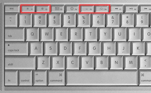
Macbook Pro keyboard. Two icons right next to each other that are exactly the same, except one is ~15% larger than the other. Does this qualify as effective difference?
You’re reading Signal v. Noise, a publication about the web by Basecamp since 1999. Happy !

Macbook Pro keyboard. Two icons right next to each other that are exactly the same, except one is ~15% larger than the other. Does this qualify as effective difference?
Jared Hanson
on 20 Jul 10The difference in size can be a bit hard to discern. However, they are also in positions that make smaller one less than the larger one, numerically. That fact always helps me when I glance down at the keys.
Matt
on 20 Jul 10I’ve always thought they should have one key each for screen brightness, key backlighting and volume – and require a press of that key and the plus/minus key to increase/decrease whatever it is.
Fred S
on 20 Jul 10I think the newer MBPs (black keyboard) are a little more exaggerated.
Rob L.
on 20 Jul 10Ditto what Jared said — the position of the icons is the additional affordance that makes all the difference here.
The Kernel
on 20 Jul 10Never thought about it until right now. Never questioned it either. So I guess it is effective for me.
Gabriel Boyer
on 20 Jul 10As Jared mentioned, I’d say the primary difference at play here is the positioning of the keys, not the icons. That left corresponds to decrease, and right to increase, is a common idiom, and would seem obvious to most users.
The icons mostly just serve to identify the pair and it’s function, so in this case their similarity would be an asset.
Of course, this does mean that if your desired action is “increase brightness”, you have to both perceive the pair and choose the rightmost, instead to just gravitating immediately to a unique “increase brightness” icon.
Brian Pan
on 20 Jul 10+1 Jared Hanson’s comment
I guess this is the reason I have trouble with the volume keys. Having 3 icons that don’t differ by much confuses my brain just enough that I often stab at the wrong key. This doesn’t happen with the brightness and backlight because of their relative position.
Mason Gentry
on 20 Jul 10I agree with Brian, the volume keys are really bad. I use those far more often than the brightness keys so it’s really irritating.
Nick Husher
on 20 Jul 10I can’t remember the last time I actually looked at the icons separately; they always appear in pairs in my mind, where they make relative sense in comparison to one another. Once you learn what they do by experimentation, it’s pretty obvious for ever after which one is which.
I don’t like the arrangement of the volume icons, though. The mute button is always in the wrong place: either I can’t find it by touch because it’s four keys in from the end, which is bad when you unpack your laptop and it starts screaming YouTube stupid into the library. Or I hit it accidentally when I advance a track and wonder why my music has disappeared a minute or two later (hey, some tracks start quietly).
Mike Roberto
on 20 Jul 10Yes. Especially considering the keyboard backlight icons – they are a progression of 3 keys _ _ __ just like the mute -volume and +volume.
Anonymous Coward
on 20 Jul 10Also that must be the most recent MBP keyboard, because mine is different. http://bit.ly/9yyZwA
Robert
on 20 Jul 10Looks fine to me—you would never be presented either key alone, so it’s quite obvious.
I also am not sure if I liked the “effective contrast” post you linked to. The subtly-different-shades-of-blue map is useful if you’re trying to get an overall picture (“the depth gradually increases from here to here”), but it’s nearly useless if you want actual information (“how deep is it here?”) unless you want to spend the rest of the day trying to decide exactly which shade of blue some random spot on the map is. (And this is still true for me, despite my colorblindness.)
Of course, that’s where a digital representation would really shine; then you can manipulate it all you want.
John Daigle
on 20 Jul 10Yes. This qualifies as effective difference.
First, the icons are not exactly the same, differentiated by size. Both icons use a common line thickness. Because of this common size, the contrast between icons is quite obvious. Second, the screen dimming icon is a circle surrounded by dots, while the screen brightening icon is a circle surrounded by lines. Again, there are real differences in the space between shapes and the relative sizes, far beyond simple scaling. Third, the icons are meant to be extremely similar, because they affect the exact same functions, brightness and contrast. Which is why they are next to each other.
In other words, yes. This is an effective difference.
mga
on 20 Jul 10Agree. I have always thought that Mac keyboards are rather complicated to use. As a former PC user getting adapted to F5-is-not-really-F5-but-some-other-function-you-must-edit-somewhere was a pain. I have since disabled all of that and use Fn + F5 if I want to use the “special” function.
jhoysi
on 20 Jul 10I think so. You can tell that one is larger than the other, and I’ve never had to stare at the keyboard to try to decipher the meaning of these buttons. As a pair, I think they’re effective.
pbreit
on 20 Jul 10As many have said, position is also a key attribute. Advantage Apple.
Ahmad Alhashemi
on 20 Jul 10Those buttons are a mess.
The icon on each button is meaningless without comparing it to the second of the pair and if your eye falls on one of them you have to look for the other one on both sides.
This is also true of the three volume buttons, specially the mute button, which on its own, implies turning the sound on to me. Mute buttons usually display the speaker icon with a circle and a line across it (like the no smoking sign), so a speaker without the circle and line implies an un-mute function.
What they should do is to group those pairs of buttons together, put a common sign on top of the pair and plus and minus signs on the buttons themselves, like the controls of any decent AV device.
Nicholas Piasecki
on 20 Jul 10Having a plain old Macbook, I wondered what the second pair was until I skimmed the comments. (“Tachometer display size ENLARGE?”)
Now that I think about it, most of the symbols on my keyboard are standard. A sun for brightness (though as Ahmad mentions above, “more standard” would use + and – signs). A stylized speaker with waves for volume. A half-filled circle for contrast, a double right-facing triangle with a bar for next track, etc.
All as icons are probably as useless in terms of intuitiveness as the stick figure man that means “men’s restroom”, but they are comfortable because I have seen them everywhere and memorized them like any other ideogram (like the Escape or Option symbols in Mac menus).
I had no idea what the keyboard brightness icon was at first glance in the above picture—is it a common industry-wide icon for this or just something Apple just came up with? Or would I have known my Macbook Pro has this feature and put them together? And if you have to memorize the icon to understand its meaning, is the icon worth having?
Denis Fadeev
on 21 Jul 10As already mentioned, the relative position of these ideograms is important. The same thing with n-dash and m-dash: they are distinguishable only in context with other symbols (m-dash is only ≈20% bigger).
Doug Adams
on 21 Jul 10Brake and accelerator pedals. Any problems?
Matt Sanders
on 21 Jul 10Correct me if I am wrong, but I’m pretty sure that in my first use with an apple keyboard of this design. I glanced down searched for the display brightness keys .. quickly found them at the top left of the keyboard and my mind automatically told me that the one on the left was to decrease brightness while the one on the right was to increase. It makes logical sense. The sizing of the indicators are a plus but in my case I only remember noticing the larger one. From that first use case on I have never looked at those keys again. My mind knows where they are.
Daniel
on 21 Jul 10mga: "I'm used to [something else]" is quite different from "this [new thing] is rather complicated to use". I mean, being used to Mac keyboards, I think the same way about Windows keyboards: Why are the alt/option keys different? Why is the -sign where it’s at? And all the currency symbols are shuffled around. And so on. The F5-to-reload always takes a conscious effort for me to remember. The first thing I press to reload is always cmd + R, but of course there’s no command-button, so I actually hit Windows-button + R. I realize my mistake, and hit ctrl + R (which works in IE, btw). And on then do I remember F5.
In any case, since you’ll have a hard time finding anyone who is used to neither Mac or PC keyboards, yet does not find computer just inherently complicated, we’ll never find out which way is better.
On topic: Same as what everyone else said: Positioning plus different size and different symbols does indeed constitute effective difference in my book. But as other’s have mentioned, the volume buttons are less clear. A) they’ve moved around since my last Mac laptop, and B) I sometimes read the mute/volume down buttons as “volume down”/”volume up” since I scan the keyboard left to right, and see a lot of pairs of buttons, so see those two volume buttons first and expect a pair, not three buttons. The volume down button also has a little wave-line, so compared to mute it looks like volume up.
This discussion is closed.