Typography guru Jan Tschichold on indenting paragraphs:
The indent of the paragraph should be the em of the fount body.
Omit indents in the first line of the first paragraph of any text and at the beginning of a new section that comes under a sub-heading. It is not necessary to set the first word in small capitals, but if this is done for any reason, the word should be letter-spaced in the same way as the running title.
If a chapter is divided into several parts without headings, these parts should be divided not only by an additional space, but always by one or more asterisks of the fount body. As a rule, one asterisk is sufficient. Without them it is impossible to see whether a part ends at the bottom of a page or not. Even when the last line of such a part ends the page, there will always be space for an asterisk in the bottom margin.
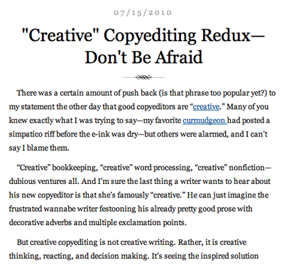
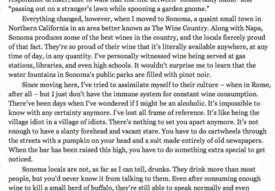
Of course, the web is in the process of killing off the indented paragraph. But not everywhere. Some examples of indenting can be found at the following sites:

The Subversive Copy Editor blog
Even back in the day, these rules were often ignored. Why? According to Tschichold, it was because typists were trained by business schools, who were “utterly incompetent when it comes to questions of typography.”
The perfect book and page
Tschichold also came up with a system for the perfect book and the perfect page. Yes, perfect.
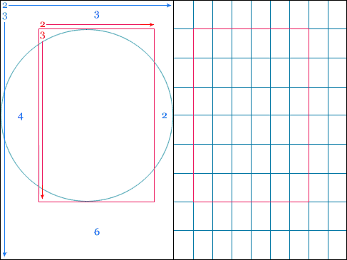
No matter the page size, you will always end up with a 9×9 grid, with the textblock 1/9th from the top and inside, and 2/9ths from the outside and bottom.

It all goes back to the Golden Ratio:
The page ratio is best at 2:3…His reasoning was that it sits within the Fibonacci Sequence, as well as the Golden Ratio, and establishes that the textblock will be harmonious and proportional to the page — it’s how the height of it equals the width of the page.
Here’s an example layout:

More details/examples at The Secret Law of Page Harmony.
Related: Tschichold and the golden section [Wikipedia]


Martin
on 21 Jul 10Also, the rule is to either indent the first line OR use vertical spacing to indicate new paragraphs.
Two of the website examples fail this rule.
One of the nice things about LaTeX is that it takes care of all these rules for you :-)
Ryan
on 21 Jul 10Very nice! I’m familiar with the Fibonacci Sequence but I like the 1/9th and 2/9th application for a page layout – makes it very simple.
David Kadavy
on 21 Jul 10Whoa, was I surprised to see someone else talk about this! (I blogged about this same thing several years back). This is from The Form of The Book.
While the web is a bit dynamic for this to apply to margins, a similar philosophy can be applied to static elements within a design, as illustrated in the video at the bottom of this post.
D
on 21 Jul 10Can someone explain the difference between this and numerology?
Kyle Fox
on 21 Jul 10Indentation is an unnecessary (though charming) thing of antiquity. It is used to provide clear paragraph separation while conserving space vertically—which is necessary with physical media.
Vertical height of digital displays is infinite, which eliminates the need to conserve space.
In my opinion, indenting text on the web is a great example of sticking to convention for convention’s sake.
Kyle Fox
on 21 Jul 10Err, I forgot to add that this rational approach to page layout is pretty interesting. It does look quite good to me.
Alejandro Moreno
on 21 Jul 10What about the space eaten up in the book-binding?
Oh, well, I guess I’ll go read the source material.
Joe Clark
on 21 Jul 10I have experimented with removing whitespace between paragraphs and it hasn’t worked thus far. I have no explanation for this. But such whitespace certainly is wrong in typical print work – cf. nearly any O’Reilly book.
To do that properly, I would need hugely expanded leading. I am not willing to go there yet.
p+p { text-indent: 1em } is literally the only CSS you need for paragraph indents.
Tschichold was not working on computer screens and 1em is not necessarily the only possible indent value.
You know, I could go on about this.
Alex Charchar
on 21 Jul 10What a great surprise! Thanks for linking to retinart, I really appreciate it :)
I mostly agree with you Kyle, but I think more than sticking to it for the sake of convention (because as has been shown, it isn’t conventional online, or even in print these days) it’s used for the aesthetic value it puts on the text—rather that just being something that can help conserve space vertically (as you pointed at), it’s used to give a certain kind of texture to the typography of a page..
But it’s a tricky thing that is almost never done right, isn’t it? Even design books will give it a go and don’t often succeed (ie. they put an indent and a space after, when it should really only be one or the other, as Martin mentioned).. a tricky one!
Alejandro You’re not the first one to bring that up! My thoughts are that the creep experienced in most publications is so minimal that it wouldn’t alter the balance of the inner margins too much and if it were any bigger, then I’d hope your printer is adjusting for it in pre-press
Thanks again for linking to Retinart :)
peter
on 22 Jul 10welcome to design basics. great you found it.
Christian Augustin
on 22 Jul 10My experience from documentation (technical and design) is that vertical space is best with short paragraphs and very diverse content (documentation), while indentation works best for longer passages (which most novels and “prose” are made of – and this is the use Tschichold had most of the time). In this sense, O’Reilly does it right (for the mix of text and code that’s in their books).
There is room for both ways (but not at the same time, I’d agree with that), and often it’s a matter of style; but Tschichold is right that with page oriented media, vertical space isn’t clear enough to separate paragraphs. Worse is text without vertical space and indentation (than, you’re often forced to guess).
And though Tschichold wasn’t working on computer screens, the basic (visual) rules of typography don’t change on screen. Physical limitations shift those rules, but more in the details than generally, and with increasing resolution (Retina Display, anyone?) the differences to printing on paper are getting smaller day by day.
Tschichold was a little bit old-style in his later years, but he made some really awesome books (i.e. showing old Chinese woodcuts), and I’m lucky to have some of them standing on my bookshelf.
Joe Clark
on 23 Jul 10Pushing Tschichold is kind of a beginner’s mistake, a name brand for neophytes. (Cf. Bringhurst.) I should know; I did the same thing. But that was nearly 30 years ago.
This discussion is closed.