Lately, we’ve been exploring ways to offer web apps that perform like native apps on mobile devices. For this short sprint we targeted mobile WebKit browsers—especially the default browsers on iOS and Android—because of their widespread use and excellent support for HTML5 and CSS3.
Here are a few things we’ve learned along the way:
Browser differences
Targeting WebKit browsers specifically lets us make liberal use of -webkit extensions to CSS3 (as seen in the spinner animation we shared recently). Incompatibilities between the current browsers on iOS and Android devices has not been an issue so far.
Fonts
The biggest difference is the default installed fonts. We prefer Lucida Grande for our apps in desktop browsers, but the font isn’t available on any of the mobile devices we tried. iOS offers Verdana, Helvetica or Arial; Android devices have Droid Sans. Just like on the desktop, Verdana is large relative to other fonts. For that reason, we choose Helvetica on iPhone. Compared to Helvetica, Droid Sans appears a bit smaller and more condensed.
Form widgets
Form widgets are another distinct difference between the platforms, but because of the flexibility of WebKit are less of an issue. The native browser widgets on Android are ugly in some cases and unuseable in others.
For example the checkbox widget has a checkmark in both the checked and un-checked states—the checkmark turns green when “checked”. Using CSS we were able to create new widgets that look nearly identical on both platforms. Because of the differences in font rendering, however, it can be difficult to do things like align text inside a button. Web designers should not be surprised by this since it’s a common hassle between even desktop browsers and platforms.
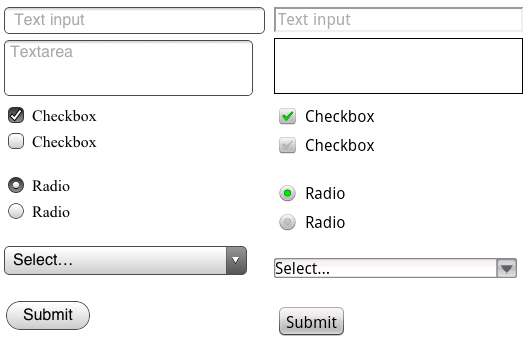
Default form inputs on iOS (left) and Android. Notice how the label on the submit button is positioned differently on each. Or imagine a long list of Android checkboxes where none is “checked”. Are they all checked or un-checked?
Testing
For the purposes of testing your app, both platforms offer desktop simulators. Testing on the iPhone SDK simulator is fast, convenient, and fairly representative of using the actual device—it actually looks like an iPhone.
The iPhone simulator supports the iPad, iPhone and iPhone 4 devices, but only on the latest OS version. Because of this, supporting older versions of Mobile Safari could be a challenge. While it’s possible to run multiple versions of the iPhone SDK, testing on older versions is best done on a physical device.
The Android SDK’s simulator, however, is a sluggish java app launched from the command line that gives no sense of the feel of the OS within the context of the hardware. It does account for the wide array of Android hardware and software versions/features in the wild, but in an obtuse way. You can’t, for example, launch an HTC Droid X profile but instead have to spin up a new virtual device and enter the hardware profile yourself.
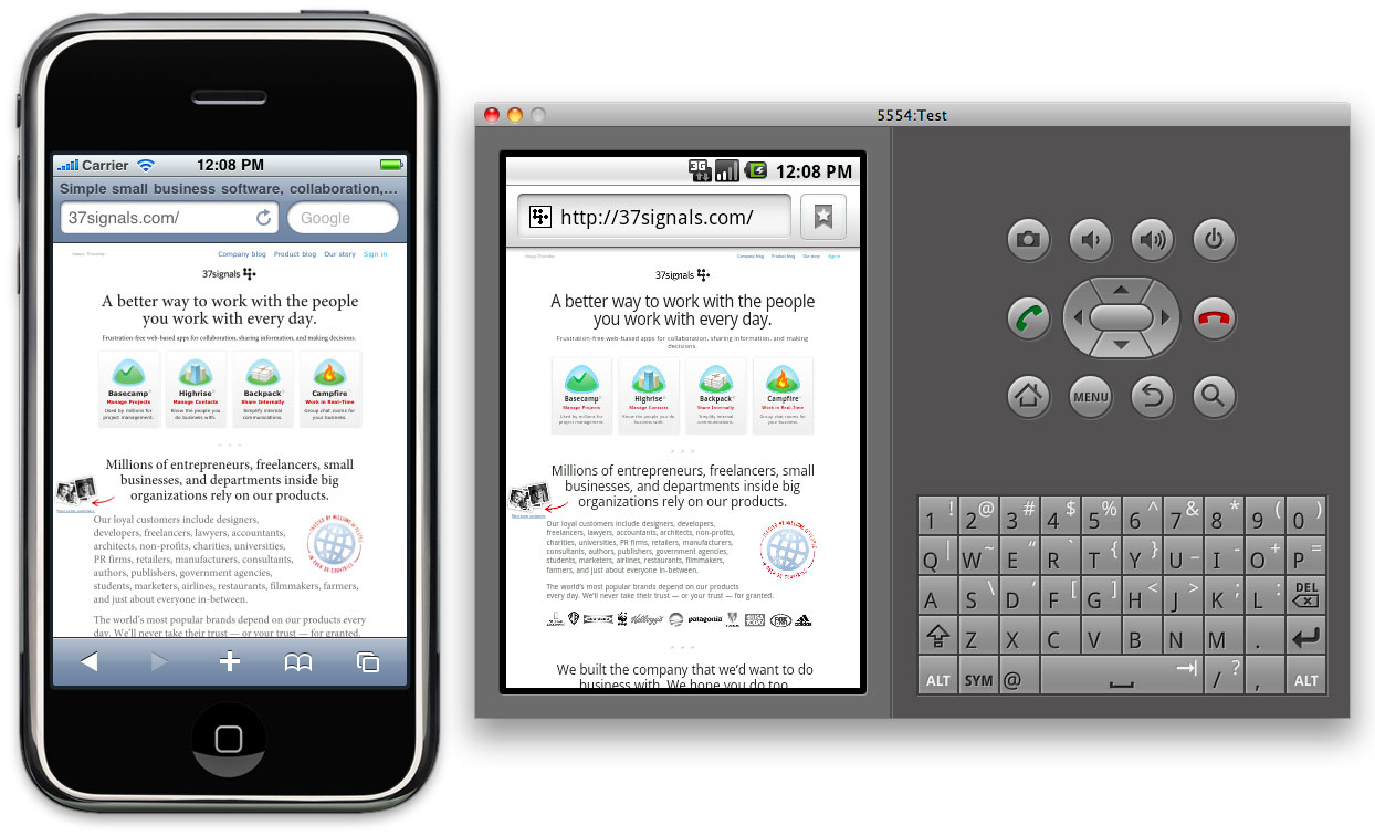
The iPhone and Android simulators running side-by-side. Click the image to see it larger
In fact, all testing is best done on real hardware. The simulators give a poor sense of the app on the actual devices. This is especially true in terms of scale. The much smaller pixel size on desktop computers means the simulated devices appear much larger than you’d expect on your computer screen. Much larger than the actual device. Type that looks great on the device can look horsey on the desktop.
For this reason we’ve also been testing on real phones. Using Dnsmasq we can serve requests for the app on our development machines to devices via a wifi network. Touching the UI is an important distinction from the desktop simulator. Real devices are also particularly useful for previewing on the iPhone 4’s retina display. And a real Nexus One is much faster than the simulated Adroid device.
Screen resolution
The iPhone’s retina display also revealed some additional challenges. Web pages in Mobile Safari on iPhone 4 are scaled at twice the resolution of the earlier iPhone models. This means that images created at 72dpi look fuzzy on iPhone 4 where they are zoomed to twice their size.
Fortunately, -webkit browser extensions to CSS handle this scenario well. Images in CSS targeted at Mobile Safari should be designed at exactly twice the intended display size. So a 16px x 16px icon rendered as a CSS background image should be built in Photoshop at 32px x 32px. Then, we can tell the browser the intended display size using the -webkit-background-size property like this:
background: url(images/icon_retina.png) no-repeat;
-webkit-background-size: 16px 16px;
That displays a high resolution image for iPhone 4 when it doubles the dimensions, and a shrunken version for the lower resolution devices. This appears to work similarly on Android though we haven’t tested a wide range of resolutions. We’ve used the convention of naming images that require this special handling with “_retina” in the file name.
Web app settings
We also explored the apple-mobile-web-app-capable settings which lets apps that are bookmarked to the home screen on iOS act more like native apps. These settings let you specify a loading screen image, allow for local caching of data (even the entire app), and hide the browser chrome. Unfortunately nothing like this yet exists on the Android platform, but it’s a great step for browser-based apps so hopefully the idea will catch on.
Final thoughts
Despite opinions to the contrary, mobile web apps still feel like an excellent opportunity to offer native-like performance without having to specialize in a particular platform, or be subject to the whims of an overlord.
Browser-based mobile apps clearly have the potential to offer user experience that is on-par with native apps. Of course designing that kind of experience is going to require more than emerging mark-up and style techniques—it’s not going to be enough to just serve a mobile stylesheet for your app. Offering a native-worthy mobile experience requires you to rethink the UI of your app and deliver it within an environment where touch is the rule. A big part of this exploration not covered here considered fast page rendering, touch interaction, and local asset storage. We hope to share some of the tech side in another post.
Eric
on 08 Oct 10Android’s unchecked check boxes look more like they are checked and disabled then unchecked…
Mike Rundle
on 08 Oct 10Perhaps I’m missing something, but what part of this entry has anything to do with HTML5?
Matthias Dietrich
on 08 Oct 10@Mike: The title and the first paragraph… SCNR
David
on 08 Oct 10Mike Rundle is right. I don’t see a single thing in this post that could be counted as HTML5.
An interesting article, but a misleading title.
Gib
on 08 Oct 10Thank you. This is great information and I’m looking forward to more on the tech side. We’re using a Rails gem called Mobile_Fu to provide mobile views, but have ignored smart phones altogether. We currently side step the issues you’ve addressed here by dumbing the mobile view way down—no js and limited styling. An overhaul is entering the pipeline, so this post comes with perfect timing and much appreciation!
JZ
on 08 Oct 10Good point, I’ve corrected the title.
For what it’s worth, the app we’ve been working on uses HTML5 mark-up as well as manifest for local storage, neither of which are covered in this article.
Sorry for the confusion. Besides, we all stopped using HTML5 now right?
;)
cpinto
on 08 Oct 10Good call on exploring the browser-based app avenue, for apps that have little need to access native device functions (such as yours) this is the best bet and the time necessary to get the webapp out of the door (and its future iterations) will blow your socks off if you’re used to native app development.
A tip: check how youtube’s iphone website does its “installation” instructions.
Eric Anderson
on 08 Oct 10What a about WebOS? It is webkit based. Also it’s emulator kicks ass. VirtualBox based so it works just about anywhere (no need to buy expensive dev hardware or buy into exspensive dev programs). Since you are running the real software there is NO difference between hardware and emulator.
Juhani
on 08 Oct 10Thank you for an interesting article!
One correction though. Android emulator is not a sluggish java app. It is an actual emulator running the real android os. Applications run on it exactly as they run on a real device. And it is possible to skin your emulator to make it look and behave like any android device.
It is very slow though. You are right there.
Jon Glick
on 08 Oct 10Doesn’t replacing the system UI controls with, admittedly better, CSS ones break continuity between apps/os? It seems like this would be a major detractor when trying to make a mobile web app feel native.
yons
on 08 Oct 10nice info
OpenAppMkt
on 08 Oct 10Great post!
Take a look at http://OpenAppMkt.com. We built an app store for HTML5 mobile webapps. The store itself is also a webapp. We tried to make it feel as native as possible.
The service has been live for abt 2 months. For now, it’s supported only on the iPhone, but other platforms are coming soon. You’re welcome to distribute 37Signal’s apps there.
David Kaneda
on 08 Oct 10Great synopsis — I gave a similar presentation recently at Web 2.0 — If you ever want to chat custom form fields in Mobile WebKit (pretty easy to do with CSS3) just give me a shout (hint: -webkit-appearance-none)
David
on 08 Oct 10Nice, you changed the title, much better. You know you’re reaching the right audience when the first comments are semantic pedantry.
Justin Reese
on 08 Oct 10@Juhani: Android being Java-based, isn’t the emulator by definition a Java app (or rather, a self-contained Java VM)?
Louis Simoneau
on 08 Oct 10I think your criticism of the android phone controls as “unusable” shows you’re thinking about yourselves more than about your users. Those controls may be briefly confusing to non Android users. But if every other checkbox on the phone you use every day, from websites to apps to system preferences, works and appears in a certain way, I think you’d be more likely to be confused when a certain app or site goes out of its way to flout that convention.
Neil
on 08 Oct 10I have an opportunity to have an investor, but having done so much work already and reading about bootstrapping I’m in 2 minds about accepting.
Dave
on 09 Oct 10and if you are targeting mobile devices thru web applications, you may be interested in phonegap.com which supports iOS, Android and more.
Stan Wiechers
on 09 Oct 10http://deviceanywhere.com/ is a good choice to test on real mobiles through a remote interface. Its not free, but can be very efficient.
Marcus Hast
on 09 Oct 10@Justin Reese Not quite.
Parts of Android applications are running on the Dalvik VM, but the internals are C or C++. (Eg the base OS is Linux which is C.)
The emulator itself is QEmu which I assume is C/C++ based. What the UI of the application is made in I don’t know.
Jason Lander
on 09 Oct 10Awesome post. Lots of useful information here.
tomk
on 09 Oct 10I’ve notice there’s a difference in how mobile safari understands and differentiate input type=submit and button type=submit, can you clarify which one you’ve used?
JT
on 09 Oct 10I’m with Louis Simoneau, it’s going to look odd when [your] website is the one that implements custom controls but the user is used to seeing the others, whether you dislike them or not.
Sachin
on 10 Oct 10This will surely help us a lot…we are in the process of building 2 mobile apps currently….thanks a lot
Sunny Singh
on 10 Oct 10I never had a problem with default Android form controls, I know exactly what is checked and what is unchecked. If it’s unchecked, it makes me want to check it and does not make me assume that it’s already checked or disabled.
As far as webkit goes, I would still make it as cross-compatible as possible (Firefox prefixes and no prefixes at all). Using only webkit prefixes will cause problems in the future, considering Mozilla is working on a Firefox for Android app (which is very nice, by the way).
Bruce
on 11 Oct 1037signals is very handful in UI design.
ron
on 11 Oct 10come on, from reading the article you get the impression that Android is outright shit. why not just say so?
Ryan Cannon
on 11 Oct 10In my initial web-app-capable experiments, I found that the standalone mode had suprisingly different performance characteristics and CSS rendering bugs that made it very difficult to target.
It’s possible that’s all fixed now. I’m curious your experience with it.
Anonymous
on 12 Oct 10So you’re not hiring an iOS developer?
Paris Nakita kejser
on 12 Oct 10Holy moly, i know it’s defrindt between the browsers on desktop, bu not so mutch and not so mutch between mobile devices and desktop using browseres :/
Ben Smithett
on 13 Oct 10I have to agree with @Louis Simoneau above, re: android checkbox controls.
You’re looking at it from the perspective of a non-android user. To Android users, those checkboxes are perfectly clear because that’s how all checkboxes appear on the phone.
Changing them to render the way you think they should look will just confuse users.
In other words, how would you like it if I did everything in my power to make your iOS controls render like they do in Windows XP because that’s what I’m used to?
Christophe
on 15 Oct 10I strongly suggest you try Sencha touch : http://www.sencha.com/products/touch/
(it’s a HTML5 mobile Web App Framework)
This discussion is closed.