
Iterations was a good place for us to implement some responsive design ideas we’d been interested in trying.
As it turned out, making the layout work on a variety of devices was just a matter of adding a few CSS media queries to the finished product. The key to making it easy was that the layout was already liquid, so optimizing it for small screens meant collapsing a few margins to maximize space and tweaking the sidebar layout in the cases where the screen is too narrow to show two columns.
The CSS max-width property seems almost forgotten in the web designer’s toolbox since it wasn’t supported by Internet Explorer 6. With that restriction lifted, it’s the perfect compliment to a liquid layout letting the content re-flow naturally at a variety of widths but not expanding to the point of absurdity where extreme line lengths make reading a chore. It’s a great compromise between liquid and fixed layouts.
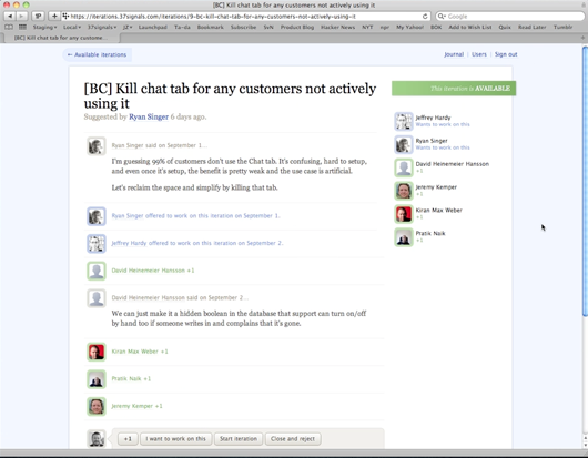 A wide view. The max-width property keeps the width of the content at a reasonable size for nice reading.
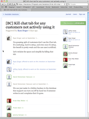
A narrow view. No need for any media queries here, the browser automatically reflows the content in our liquid layout.
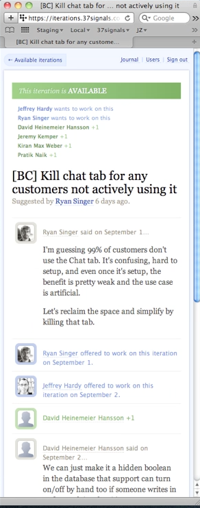
Even narrower. The margins and padding around the content collapse to maximize space, the layout changes to a single column—this is the basis of the mobile phone layout.
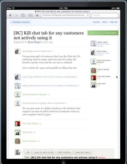
The view on an iPad. Simple tweaks to reduce scrolling and zooming.
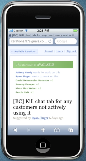
The view on an iPhone. Because the layout works in very narrow browsers, we only had to adjust the fonts in the top navigation to make it look great on iPhone.
Optimizing for mobile browsers wasn’t an upfront requirement for this app — or even all that necessary — but we learned a lot by taking a couple of hours to try something new. For us, small projects like Iterations are a great place to experiment with new techniques that might be impractical (or far more difficult) to implement in production sites that require us to consider legacy code and fringe compatibility cases. Plus, it would just take a lot more time to bring techniques like this to a bigger app. By using these techniques on Iterations, we got to learn more about the process and feasibility of bringing them into our other apps.
Related: Responsive enhancement [adactio]
Simon
on 15 Nov 10Looks very neat what you’re working on there. I’m looking forward to get my hands on this tool.
Regarding the layout it looks a lot like the recent (also very neat) cssgrid by Andy Tailor: http://cssgrid.net/.
Arthur
on 15 Nov 10Small note; max-width is also not supported for IE7 unless you define the HTML as XHTML Strict. Other than that, great post about power of proper CSS use.
Timothée
on 16 Nov 10That’s a giant iPad that you have here!
Peter Koman
on 16 Nov 10Just some font-size…?
Alan
on 16 Nov 10Have you seen this?: http://www.slideshare.net/bryanrieger/rethinking-the-mobile-web-by-yiibu
I think media queries is going to be very practical..
James Pearce
on 16 Nov 10I think you should stress that building a good mobile site or app probably takes more effort than flowing a desktop page onto a narrower piece of glass.
The mobile user on the other side will quite possibly want to do different things to their desktop brethren, and deserves more than some pixel shuffling.
Otherwise, this experiment is like broadcasting a radio show on the audio channel of one of those new fangled TV things ;-)
(PS I know you guys are doing cool mobile app stuff, so I’m probably preaching to the choir with this.)
Jason
on 17 Nov 10James, isn’t the opposite the case? A lot of mobile sites I’ve seen are dumbed down versions of the full thing, which is really annoying when you find that the feature you want isn’t there. The design here is the same site adapted to different screens, meaning the end product doesn’t lose any functionality. I think this is much better than making decisions for your users as to what they will and won’t want to see on their mobile phone.
Edward
on 18 Nov 10I’ve just launched a simple tool for prototyping and testing exactly this approach. http://protofluid.com
I have been having trouble explaining exactly why the app is useful, this short example demonstrates exactly where it would come in handy… a fluid layout with media query max-width tweaks.
A more appropriately designed version of the full website is definitely preferable in my opinion.
Thanks for the interesting post.
diy solar
on 20 Nov 10That indeed looks to be a interesting one to give a try at and I think that with a lot of iPad fans lurking around, this will without a doubt be among the most sorted ones. I think that this will be of a very good use to many to have some good benefits.
This discussion is closed.