Less is more. Form follows function. Two phrases we hear all the time. Yet furniture designer George Nakashima considered them nothing but shallow slogans. In 1962, he published a manifesto that explains why while also lamenting the disappearance of design excellence.
In a world where manual skills are shunned we believe in them, not only in the act of producing a better product, but in the sheer joy of doing or becoming. We feel that pride in craftsmanship, of doing as perfect a job as possible, of producing something of beauty even out of nature’s discards, are all homely attributes that can be reconsidered.
It might even be a question of regaining one’s own soul when desire and megalomania are rampant – the beauty of simple things…
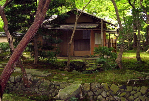
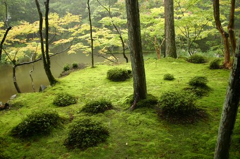
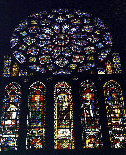
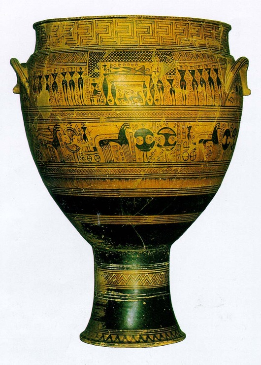
To look for clues, we can go into the past: the moss garden and tea house at Sai Ho Ji, the wonders of stone and glass at Chartres, the dipylon vase. These are all examples of excellence that can go unchallenged but also unnoticed. They are all formed inwardly with a nearly impersonal experience. Compared to our day, with its arrogance of “form-giving,” the shallowness of slogan design such as “less is more,” “machine for living,” or even “form follows function.”
In proportion to the flood of consumer goods, we are probably at one of the lowest ebbs of design excellence that the world has seen. It requires a genuine fight to produce one well designed object of relatively permanent value. One of the difficulties is the lack of integration between the designer and the producer – the evolvement of material and method into a well conceived idea. Big city architecture has reached such a profound state of boredom that man might unwittingly destroy it in one last tragic gesture – without humor. Sentimentally again, we can look back to the thirteenth century, when almost every hinge was a museum piece. Where there was a touch of greatness in the majority of acts and conceptions.
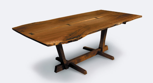
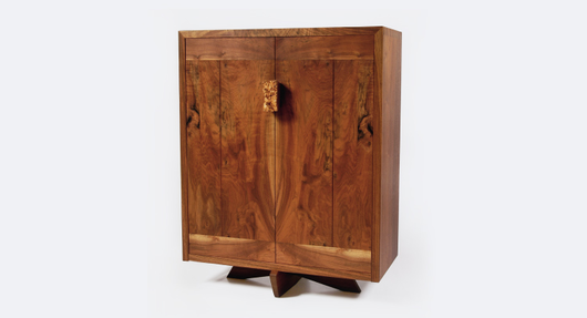
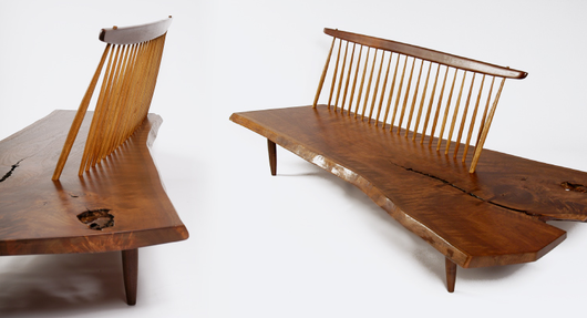
Some Nakashima designs:
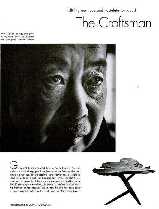
1970 Life magazine profile of Nakashima:
As for his “examples of excellence,” here is the moss garden and tea house at Saihō-ji in Kyoto:

Related Signal vs. Noise posts
Re: examples of excellence from the past, “Finding fresh inspiration” discusses seeking inspiration in objects from the past, other cultures, and nature.
Re: the lack of integration between designers and producers, “The man behind Apple’s design magic” looks at Jonathan Ive and the close attention Apple’s design team pays to the manufacturing process.
Sean McCambridge
on 15 Dec 10Thanks for posting this.
Many well designed websites are the product of a modern-day digital craftsman who enjoys the process of becoming, as Nakashima mentions. Some of us are lucky to be both designer and producer. I consider myself really lucky to be a pretty good producer working with a great designer.
But what about the future of web design? Will the programmer-craftsman finally fall victim to the millions of WordPress themes (that let you slap together a decent website like a factory presses out products) or a decent version of Dreamweaver (if that ever happens).
Alex Lande
on 15 Dec 10I doubt it. The key here is the word decent. There will always be a market for something that is legitimately good, or even great.
Hibiscus
on 15 Dec 10With due respect, I think Nagashima contradicts himself. He decries “the shallowness of slogan design such as ‘less is more,’ ‘machine for living,’ or even ‘form follows function,’”, but then lists as one of design’s key difficulties “the lack of integration between the designer and the producer”.
In fact, “Form follows function” was designed to address exactly this problem. If “design” is just superficial decoration, added on top of an object without regard to its function or the characteristics of the materials out of which it’s made, you never get elegance or simplicity or respect for craftsmanship or excellence.
And in my experience, that disjointedness is the worst threat to excellence in web design as well. Too many decisions are driven by static 2D graphic renderings, made by people who bring in assumptions based on print or TV and don’t understand the web medium or its function at all. The best web design is like the best modern skyscraper – driven by essential properties of the materials and medium out of which it’s made, with nothing superfluous or purely decorative (like a museum-piece hinge?) added on.
Alex Lande
on 15 Dec 10There’s definitely something to be said for elegance and simplicity; pure decoration is not something to strive for. However, what we’re talking about here is character.
Web design needs to be driven by the essentials, but it also needs to be interesting. These two things are not mutually exclusive, and treating them as such will leave us with boring, sterile websites. Take a risk: it’s important to be interesting.
Trent
on 15 Dec 10While they are certainly very pretty, I can’t say that the wooden seat looks very comfortable to me. To me the function of a seat is to provide a relaxing place to sit. While it’s form is lovely, surely it’s function has become it’s form – it’s not a seat for sitting on, it’s a seat for admiring as a piece of art.
Sean McC.
on 15 Dec 10@Trent – I dunno. Looks pretty comfortable to me. Has the necessary seat back that makes a good wooden chair.
AJC
on 16 Dec 10In the 13th century some hinges were masterpieces and the majority of the world would be lucky to have a toilet other than the ground! As the standard of living increases I think it’s fair to trade mass product craftsmanship…
I usually take everything on this great blog as tried and true advice but this excerpt and general point of view does not have the same halo around it. Not sure why but his perspective does not seem complete—or maybe it’s too limited? There are times and goals that require practicality, and less character is ok. Other times we have the luxury of time or money to build in character…
Sometimes we can build character into a mass product through options on a car or choice of phone manufacturer but again it comes down to resources. You have to factor time and money into the design equation.
Dan
on 16 Dec 10Most custom “web designs” are not as good as a $35 dollar theme from themeforest so why should they exist? Simply to pay a designers wage, thats pointless for the person paying and ultimately unfulfilling for the person designing.
Michael
on 16 Dec 10AJC, I see what you are saying but the masses have actually been put in a difficult position by the lack of beautiful designs around them. The essayist suggests that they are in greater danger of annihilation—that there is a connection between experiencing beauty and respecting human life.
That two atomic bombs were dropped on the essayist’s country may explain the concern.
Jeff
on 18 Dec 10Now, I’m not coming to this from a web point of view, but from a woodworker’s point of view instead. Nakashima is a heralded figure for furniture design the world over. It should be clear that nothing he produced was ever intended for mass consumption. In fact his canon of work was a testament to changing perceptions about consumption. He was encouraging people to buy for multi-generational use. In one aspect – not good for business, but in another sense, a smart way to manage his pricing.
His comment about the disjunct between designer and craftsman was more of a statement about how a designer did not know where limitations played and where they could be bent. Only a craftsman possessed that true knowledge.
And yes, his work was also a statement about humanity as he learned in a Japanese internment camp in Idaho during WW2 – facing heavy racism from his captors.
And yes – his chairs are insanely comfortable, not despite being wood – but because of his treatment of the wood.
This discussion is closed.