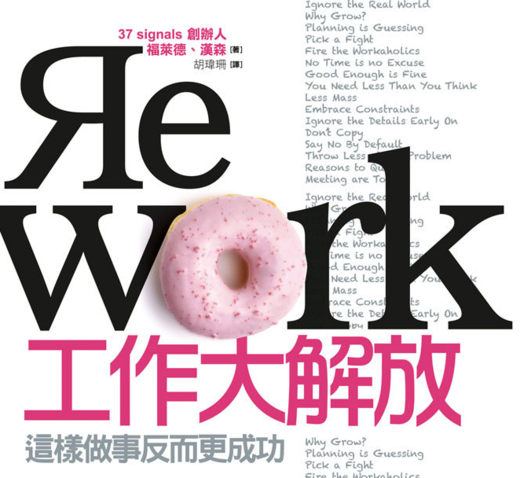
Cover of REWORK, Taiwan edition (Traditional Chinese). FYI, we have no influence over the cover of international editions. Each publisher can work up their own cover. (via Zero Credibility).
You’re reading Signal v. Noise, a publication about the web by Basecamp since 1999. Happy !

Cover of REWORK, Taiwan edition (Traditional Chinese). FYI, we have no influence over the cover of international editions. Each publisher can work up their own cover. (via Zero Credibility).
Richard Bird
on 29 Dec 10I like how the donut (with sprinkles, even) combines with the character below it to create a little pink person.
Alain Meyer
on 29 Dec 10That’s hilarious, do you have any idea how sales are over there?
That might give you an indication of whether or not this was just adjustment for culture and if it was successful.
Wolf
on 29 Dec 10Rather strange, it’s YOUR book, and you can’t decide on the cover. I guess that’s pretty common in the world of international publishing. Can you at least send them the feedback that they misspelled 37signals?
GregT
on 29 Dec 10WTF does a donut have to do with anything? This cover would make more sense in Canada than China. A donut or a box of Kraft Dinner, Canadians will snap it up!
Anonymous
on 29 Dec 10Awesome! They are selling this book while making fun of it.
The re-design is poking fun at the fact that the book is written by a small group of very rich white people making radical (backwards) and arrogant claims about work. – Background has been changed to white. – R is backwards – Donut suggests that the authors can afford to eat too well
Rich S
on 29 Dec 10Um…that’s odd. I’m not seeing how the donut fits. And why is the R backwards?
Martin Edic
on 29 Dec 10I have three books published in China. There are two editions of the same book and one is half the length.(?) In traditional publishing foreign rights are sold for a lump sum which is usually split with the publisher and you have no control over anything after that. Love the pink donut…
Paul
on 29 Dec 10Why don’t you have na influence on how the covers look like? This one looks quite tasty – like Meatball Sunday one (US edition as the UK edition is crap).
Allen
on 29 Dec 10I’m really not a fan of this cover design. As a person familiar with the Taiwanese culture, I must say the donut doesn’t make sense to me either. Worse still, I think it evokes the wrong message.
I am however very glad to see a Traditional Chinese translation; I can finally get my Taiwanese peers to read the book.
Edward C. from Taiwan
on 29 Dec 10Wow~ You know what, Traditional Chinese version is very popular in our Taiwan bookstore. Lot’s of people will grab it and take a look what it’s all about.
I bought the English version REWORK for my self and read completed, and we got Traditional Chinese version in our office too. We definitely love it!
Deltaplan
on 29 Dec 10I think the whole message about the cover is that the book is all about breaking conventions.
The donut belongs to the stereotype of the American office worker. Using a pink one is probably meant to convey the message that this isn’t your typical book about business strategy.
Same thing about the backwards “R”, it’s the same message : “look, this book is very uncommon”. And the way that they put the whole chapter list on the front cover is also an indicator that they want to put the emphasis on the fact that this book is full of controversial messages, or in other words : “everything that you assumed was good for business, is wrong, and vice-versa”.
Reminds me of the comparison of the covers of the international editions of Freakonomics :
http://freakonomicsbook.com/around-the-world/
Sinclair
on 29 Dec 10I’m right where you are Allen!
Steve Y
on 29 Dec 10Excellent that you have a Taiwan edition. A very well matched message for the audience there.
Cowardly MacNonymous
on 29 Dec 10@Deltaplan – You had me at Freakonomics: Turkey edition.
B.C. Bailey
on 30 Dec 10It’s so off the wall. I kinda like it.
James Chou
on 30 Dec 10The Chinese characters below the big Rework means ‘Liberate your job, you can make your job more success by this way’. I guess the donut stands for ‘you can have more break time if you work this way’. This could be culture difference between east and west, but 37 Signals story in this book really inspires those small firms like the one I am working for. Thank you.
Michael
on 30 Dec 10Love it. Having lived in Taiwan for a number of years it is abundantly clear to me that cute and curious is a HUGE selling point over there in the Republic of China (not to be confused with the People’s Republic of China, which is just over the straits)
Over there I’ve seen mafia like guys wearing pink Hello Kitty motorcycle helmets. So I see the pink donut as meaning “we have some bad ass shit” here.
I think the Taiwanese will love this book, and it does not hurt that the title in Chinese is “hugely liberate your work”, the subtitle reads “working this way will oddly enough make you more successful”. I will have to pick up a copy when I am over there next, I love reading this kind of stuff in Chinese.
Aen Tan
on 30 Dec 10Be thankful at least they didn’t put some over-plastic-surgerized teenage girl on it.
Deltaplan
on 30 Dec 10Possible explanation for the donut ?
http://www.thedonutproject.com/inspiration/rework-illustrations/
yohami
on 30 Dec 10Man, this is so funny. It went from too serious to too cute! to each culture its own
Peaches
on 31 Dec 10Let’s put it this way: if they decided to put a picture of any of the staff at 37signals, we would have a best selling horror novel. I’m glad they went with a dounut, it’s far better to look at and not feel Ill.
Maxim
on 31 Dec 10The French edition is strange also : SS500.jpg
I prefere the original one…
Maxim
on 31 Dec 10The French edition is strange also : http://ecx.images-amazon.com/images/I/51PoENlyFGL.SS500.jpg
I prefere the original one…
Maxim
on 31 Dec 10Sorry for multiple links, here is one that works http://tinyurl.com/2e2kohw
This discussion is closed.