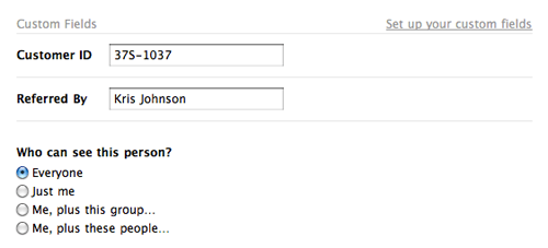
We recently added custom fields to Highrise (below) which allow you to keep track of extra details beyond standard contact information like phone, email, address, etc.

After the launch, we had a “looking back” conversation to see what lessons could be learned from the process. Three of our findings:
1. Add to an existing design before trying a new one.
When you begin work on a new feature, try to add it within the context of the existing design, evaluate it, and then make a decision about how to proceed based on that experience. That way, you quickly get a good sense of what works in the existing design and what doesn’t. You might even discover that the new feature fits into the existing design without any further work required. (Huzzah!)
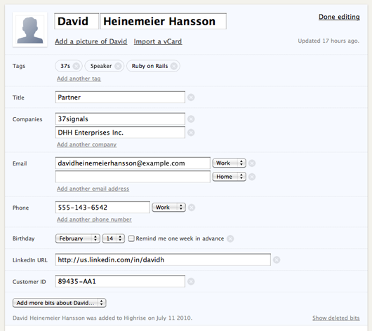
We started with a different approach when we tackled the custom fields project. We began with a completely new design for the contact edit page and pursued that design (below) for most of the project.

In the end, we decided to discard this design because it wasn’t the right solution and it introduced a bunch of new problems. It took us a long time to make that decision because there was a lot of work involved in developing the new design. And most of that work was not giving us good feedback about the nature of the problem we were trying to solve.
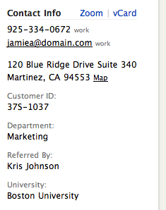
 When we reset, we discovered that some of our assumptions about custom fields were wrong. For example we assumed that shoehorning custom data into the contact page sidebar (right) would make the page too cluttered and inconvenient for people. But we failed to actually try it out to confirm this assumption. When we finally did try it, we discovered it wasn’t bad at all.
2. Resist the urge to make something special out of something boring.
Custom fields aren’t the sexiest feature we could have worked on. Plus, we were building them based on customer requests instead of our own internal needs. Because of that, we mistakingly tried to make the project more interesting with indirectly-related work, like a redesign of the contact pages, streamlined contact dates, bigger avatars, and fancier ways to save data. None of these things were required for us to launch custom fields, but we were tempted to tackle them because they were more fun.
Adopting all those extra concerns obscured the reality that custom fields could actually be a very tiny project. When we finally threw out all the extras, the feature seemed embarrassingly simple. Nonetheless, our customers love it. The lesson here is the tiniest version can be good enough.
3. Storyboard complex interactions instead of building them immediately.
We tried to build out the redesigned edit page so that every interaction could be demonstrated for real and then evaluated. Since there was a lot of complex interaction on the page, most of the work involved in this process was Javascript programming which took a long time to complete. And programming the interface early made it difficult to change the design as we learned more about the problem.
Creating a storyboard of all the states is a more efficient approach for developing pages with complex interactions. It takes much less time to generate storyboards and they are easy to share and discuss with everyone. We used this approach when we worked on bulk operations and it worked well. Everyone was able to see the design early and understand how it should work. From there it was much simpler to divide up the work and build the feature quickly.
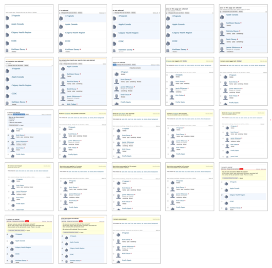
 Our storyboard for all the screens for the Highrise Bulk Operations project. Storyboards like this illustrate the complete flow so everyone’s on the same page.

Anonymous Coward
on 15 Jun 11@37signals
Can you make the storyboard picture bigger.
That thumbnail is so small, I can’t see anything but a bunch of squares.
Joe
on 15 Jun 11What did you use to make the storyboard? I hope not Photoshop.
Al Pittampalli
on 16 Jun 11I like your second point. Sometimes, boring is boring. Accept it and move on. And storyboarding can be useful in so many situations. Planning something out fully can save tons of time in the long run, even if in the moment it feels like it’s slowing you down. Thanks for the tips.
Christopher Clarke
on 16 Jun 11Great post! Its always a temptation to try to use the addition of new features as an opportunity to to go back a rewrite stuff that you really never really liked in the core product. In my limited experience this is never worth the effort. Have you guys been using any special storyboarding software? Are graphics tools like omnigraffle etc sufficient? What about the Ipad? does it help in this area? Agree that a bigger picture of the storyboard would be helpful
Paul Krefta
on 16 Jun 11+1 storyboard bigger :-)
Michishige Kaito
on 16 Jun 11I’d like to +1 the question about the software you used to make that storyboard, although I’m almost certain you just used your regular design package, whichever that might be.
Also, +1 for bigger storyboard picture :)
David
on 16 Jun 11+1 for bigger storyboard please.
David Sims
on 16 Jun 11+1 storyboard bigger :-)
Pete
on 16 Jun 11Storyboarding electronically seems slightly un-37Signals. How did you guys “keep it real” while storyboarding? Not so much interested in the tools as how you communicate the storyboard and changes to it quickly, without getting too detailed on a fake interface. Is the storyboard done in html?
JF
on 16 Jun 11The “storyboard” is made of screenshots of real HTML-designed states. These aren’t wireframes – they are the design in the actual product.
Hooking them all up with Javascript and making sure every interaction is smooth is what takes more time. So doing quick HTML mockups of the various states helps us assess the concept in general first. Then if we think it makes sense, we can go to the next step (wiring it up and interacting with it for real). If we realize that it’s not going to be worth it, we can save a lot of time.
As always, it’s about context. Somethings works well mocked up this way, other things are better hooked up for real and used for real.
Rindy Portfolio
on 16 Jun 11+2 on bigger storyboard and tool used – or are they just HTML wireframes?
Clark Valberg
on 16 Jun 11Totally agreed on the storyboarding direction.
A picture just isn’t worth enough words by today’s standards.
It also helps that your screens are fully designed (rather than wireframes or sketches). That level of detail tends to help the team pay much more attention to the details. We take the same approach using Photoshop and InVision. We create a hi-fidelity interactive prototype of the workflow and pass it around for review and refinement.
Adam Wood
on 16 Jun 11@everyone—I think you are missing the point on the storyboard. The content is this example is not important. You can tell by looking that it shows the same webpage, with every step in a particular process. The point is to storyboard your processes to show what each step looks like in your particular case.
Emil
on 17 Jun 11Oh someone has thought about the company issue (on the first screenshot). It’s pretty common for a person to work/own more than one company.
Alex
on 19 Jun 11This is really interesting, because i always had the feeling, the custom fields are not executed in a way, that they really do what they could do. But how should they, if you don’t know why. They could have been the killer feature of the app.
To me, you missed a big chance in making HR more useful. The real value in using a CRM like HR is not having more fields to store information. I can do that easily in my paperbased adressbook. Or the background field. The real value is in the ability to interlink information.
One example: I could create a custom field “Referred by” but if the content of this field doesn’t point to a person, it’s useless. I’d like to see in the record of the referrer whom he referred.
One other example: Lets say i work with students and professors in a university. Sure i can use a custom field with every student who their professor is. But it would be really useful to see which students one professor is affiliated with.
Thats the point where a database is more useful than a piece of paper. Sometimes i feel HR misses the ability to really shine at places where it could be best. And, while i generally love your idea of keeping things simple exactly this approach makes things more complicated. Because sometimes you need something more sophisticated because the problem to be solved is complex. So are relationships.
Arsavin666
on 20 Jun 11information on the fit is good enough to increase my knowledge further
Rick
on 20 Jun 11This one looks nice but I wanted to be able to select the kind of field – like a dropdown, etc. Wufoo does a really good job in their form builders. It flows very well.
We have a custom fields feature built into our content management app. and the customer gets to select the kind of field and how the field functions.
But it’s the least intuitive part of our app and one that brings up the most questions.
Todd Dominey
on 20 Jun 11+1 bigger storyboard image
Mike Iconis
on 21 Jun 11Wufoo is still telling me there are issues with the API and the Custom Fields. My Wufoo forms cannot insert custom fields, but works fine once I remove then from the matching.
Please tell me there is an ETA on this. This is why I signed up last week, just to find out the form data can only be fed to the standard contact fields and nothing custom.
Susan
on 21 Jun 11We started our adoption of HR for our CRM because of the custom fields. Then we learned that they are not drop down or radio button menu driven. So we have delayed implementation knowing that getting 6 people to consistently enter 5 or 6 possibilities for a field, without spelling mistakes is almost impossible. Tags just don’t really do the same thing. We also learned that Wufoo forms cannot do this. I urge you to work with them or redesign the custom fields to have drop downs.
This discussion is closed.