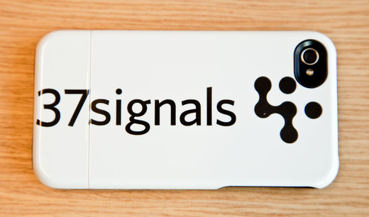
We’re long overdue on thanking our friends at Uncommon for sending over these awesome iPhone cases. If you’re not familiar with Uncommon, they specialize in custom designed cases for the iPhone, iPod Touch and iPad. Check ‘em out!
You’re reading Signal v. Noise, a publication about the web by Basecamp since 1999. Happy !
Jean Moniatte
on 28 Nov 11If they send us some with our logo, we will make sure to write a blog post with not 2 but 3 links to their website :-)
Jake
on 29 Nov 11Why does the case have a plastic crease between the “37” and “signals”.
Also, as a suggestion, the camera black circle should be incorporated into the 37signals logo so that you don’t have clashing black “spots”
Chris W.
on 29 Nov 11Oh wow this is really cool, I’m going to have one made for my company.
Joe B.
on 29 Nov 11I think the logo is too large.
Nora Reed
on 29 Nov 11Beautiful design, but not as a logo!
James
on 29 Nov 11Yeah, I doubt that we’d be seeing this post if they weren’t friends at Uncommon.
Gerard Kelly
on 29 Nov 11Yep logo is too large – the 3 on “37” flows over the edge.
Question: will anyone at 37s be using this as the cover for their iPhone for more than a couple of days? ;-)
Armchair Art Director
on 29 Nov 11Can we make the logo a little bigger?
Kevin
on 29 Nov 11If the cases colors were inverted (white logo/lettering on black) the logo would look like spunk.
Jake
on 29 Nov 11@Kevin
Maybe not spunk, but having a black case on white lettering would DEFINITELY be better given that in that instance, the black camera hole cutout wouldn’t detract from name/logo of 37signals.
EH
on 29 Nov 11Jake: It’s where the halves of the case lock together.
Jake
on 29 Nov 11@EH
Why are halves even needed?
kevin k.
on 01 Dec 11probably the only non-art director previously-artdirector here. when one professional can work with another for the better of both, we are making progress. and though i personally dislike wrapping my iPhone in a case, having just experienced the first shattering of an iPhone screen, I may be starting the case search some day soon…
Chris
on 01 Dec 11The font for “37Signals” is wrong! Looks wierd.
Nae
on 01 Dec 11This looks like a poor execution of the 37Signals logo the 37 drops off the sides, the seam looks weird between the 37 and signals, and the placement of the brandmark next to the camera cutout makes it look like the two are supposed to be connected, but they aren’t. I wouldn’t want this out there as an example of my work.
This discussion is closed.