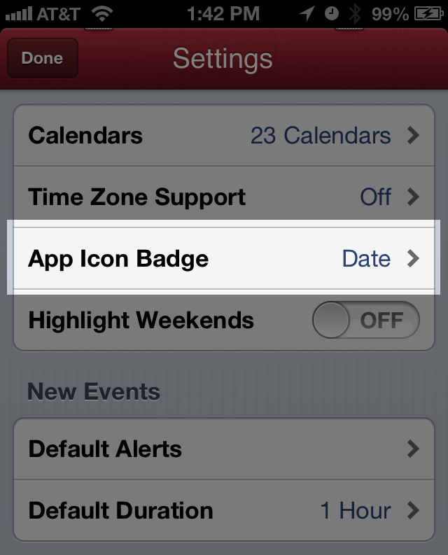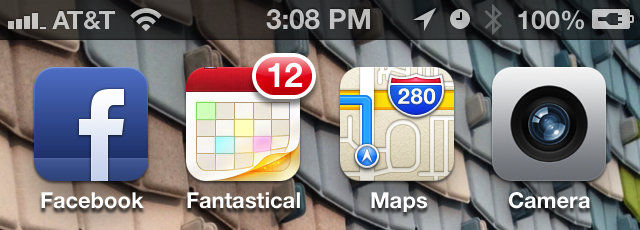
I love Fantastical but missed having a quick way to find out today’s date, a feature the native iOS calendar app provides with a special app icon that changes each day. To work around this Fantastical offers a clever hack: an option to display the current date as a badge on the app icon.


Jonathan West
on 12 Mar 13Is there a similar hack for a weather app? I would love to have a badge that tells me the current temperature and the sun/rain/snow/wind status.
Ryan
on 12 Mar 13Just hit the lock button. Date is right there before you swipe to unlock, and when you do so you’ll land right back in the same app.
Geof Harries
on 12 Mar 13I don’t like this option because it creates too much confusion. The rest of the apps on iPhone use the App Icon Badge to indicate object count (number of reminders, appointments or items unread, for example) and this breaks that pattern. I understand why the developers did it – there’s presently no way for a non-Apple app to use the current date feature and this was probably often requested – but we’re all trained to use and see the App Icon Badge for its intended communication. Every time I see this on my phone, I think I have appointments on that day in Fantastical.
Devan
on 12 Mar 13I agree with Geof – this actually breaks the mindset of what the badges are for. If a weather app maker concedes to Jonathans request above and starts showing the temperature as a badge, then the whole badge concept quickly degenerates into a messy “What does this number mean” thing, rather than what it is now, which is a quick alert mechanism to the number of actions/outstanding items that you have to do/check.
I am not surprised that Apple does not allow the lay developer to access the API for changing the actual app icon on the springboard like they do for their own Calendar app. Seems to bring back memories of another major software player years ago who was castigated for having ‘secret’ API hooks in their OS that was only known (and used to advantage) by their own internal app developers who were writing software for the OS.
Andrew
on 12 Mar 13@Jonathan – yes, there are 2 weather apps….Fahrenheit and Celsius which give great long term forecasts and also show the current temp as the Icon Badge. I use Fahrenheit and love it
Alex Karasyov
on 12 Mar 13+1 for Geoff. Too much confusion with the badge.
Adam Fitzgerald
on 13 Mar 13The settings screen header has staples in it.
Alex Shaffer
on 13 Mar 13Don’t really like this feature because the date could be confused with updates or notifications like on other iOS apps.
Ryan
on 13 Mar 13I also bought the first 3 iPhones like the obedient fanboy I was and harped on to everyone who would listen about how great they were. No more. Android not only respects choice and diversity but is also now head and shoulders above iPhone in terms of experience and even more so in terms of functionality. Screw Apple and their freedom-hating walled garden.
Anonymous Coward
on 13 Mar 13This is silly. The lock screen already has the date.
Kåre Hansen
on 13 Mar 13But the lockscreen doesn’t have the date if you are using a audioplaying app, only the time. And if you are confused by it, don’t use it. It’s off by default.
Don Schenck
on 13 Mar 13I love tricks like this. Shows creativity.
Livlife
on 13 Mar 13Thanks, Michael. I started using Fantastical because of you, but that was always something that bugged me. I was delighted to find this tip this morning. I don’t agree with the comments that it is confusing. I’m pretty intelligent, I think I can remember that my badges are updates, but Fantastical is today’s date.
Great workaround and thanks for sharing!
Jan
on 13 Mar 13Date doesn’t really bother me, its a nice “hack”, but i personally think that date on lock screen is enough :)
Btw. Michael, i really like te wallpaper you are using, can you share it please.
Michael Berger
on 13 Mar 13Agreed it’s not ideal, but short of dynamic app icons it gets the job done.
@Jan here’s a link to the background pic. It’s a photo I shot at the Ronan and Erwan Bouroullec show at MCA in Chicago this past fall.
Carl Zetterberg
on 14 Mar 13Like the creative idea, but not the execution of it. I always turn off the red badges since I consider it noise on my screen.
Kim Siever
on 14 Mar 13I agree with Geoff as well. This is an awkward solution. This would just keep telling me I have 12 alerts (or 31 at the end of the month).
Juan Orozco
on 15 Mar 13If the app isn’t running, doesn’t the icon keep it’s last state? I didn’t think they updated in the background (with app closed). I agree, it’s better than nothing.
I also think it would only be confusing if it broke consistency or contrast. I have three apps on my first page that use the badge. Anything more and it’s too much, for me. Luckily, one of those is a date.
Anyway, the badge is counting something… days! It’s a “day counter app.”
John
on 16 Mar 13I wish Apple would open their platform up a bit.
LiAh Sheep
on 17 Mar 13I tried to turn that “Date” option on for 2 days. However it only caused confusion. I’m the type of person who always wants to clear the app badges. When I see a badge that says 10 or 11 it freaks me out, making me think there’re 10-11 remaining tasks to do.
Now I chose “Today’s remaining events” and it feels good to have an app badge that decrements when I finished a meeting.
This discussion is closed.