![]()
Mister Default
Here he is: our default profile picture. You may know him as “Generic Avatar”. He’s the picture you get when you create a new account and profile on Basecamp, Highrise, Backpack, and Campfire. Mr. Default is a standard guy. He’s found everywhere on the web (in variations): message boards, comments, activity streams.
He forces everyone to look like him regardless of gender, race, and physicality. He’s also very boring.
![]()
Time for a change
People don’t usually have a picture on hand to change the default avatar. What happens is none of the default pictures ever get changed. Basecamp looks boring when everyone is Mr. Default. Splashes of color and personality from peoples’ pictures bring life to a product.
We want your first experience with Basecamp to be colorful, welcoming, and friendly. First, we’ve improved the flow for replacing the default avatar. Additionally, we’ve improved the default profile pictures. Say goodbye to Mr. Default.
Literal Icons
Initially I thought about approaching the pictures like the game Monopoly. Everyone has a different icon much like the pieces in that board game: an iron, a thimble, a race car, etc. Here are some sketches from that session.
![]()
I had been experimenting with a painterly style for a different project, so I tried that with this literal icon imagery.
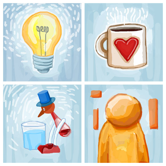
Jason Fried’s feedback: Having literal and distinct icons might cause people to want to switch one out with another, or not find a suitable match. Would we need to build an interface to “choose your default icon”? Too complicated. Maybe we should go abstract.
37signals Office Surface Textures
Another idea I had was to try our office surface textures. The 37signals office is made of so many great materials. Basecamp is basically our office. Perhaps it was worth a try.
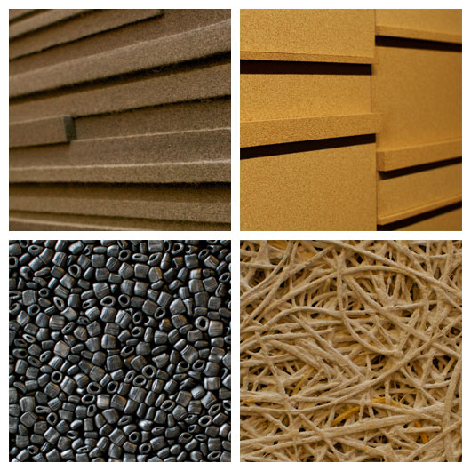
Jason Fried’s feedback: We want people to see Basecamp as theirs not ours. This isn’t about 37signals. Who wants to be represented by cork? Also the imagery feels too masculine. Let’s go softer and more cheerful.
Abstract Paintings
I liked the painterly style of the first batch of icons. They were colorful and cheerful. What if I tried some abstract shapes and patterns?
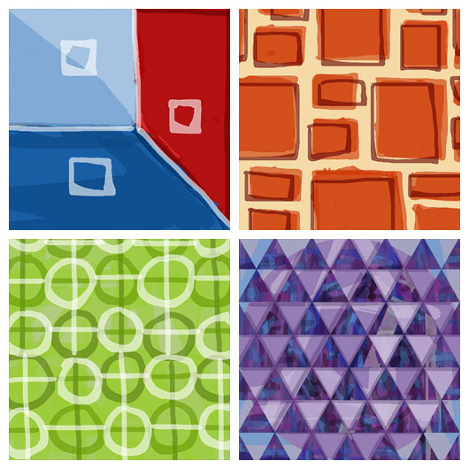
Jason Fried’s feedback: These are closer. The patterns might be too distracting. Try shapes and lines like that one on the upper left.
Refining the Abstract Paintings
Concentrating on shapes instead of patterns was a big breakthrough. The shapes started to take on face-like features.
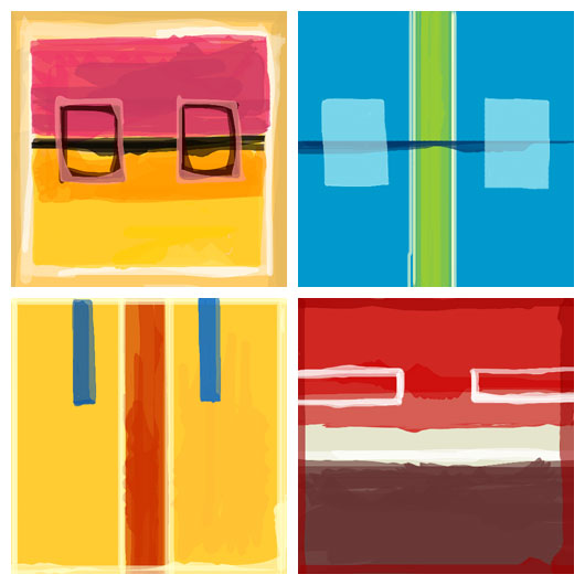
Jason Fried’s feedback: Loving these. These are great!
Jason Zimdars’ feedback: When I see these I think of cars. The headlights and grill make a face. I wonder how they’d look with a slight smile?
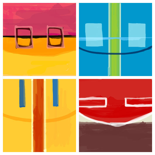
I’m very happy with the way these default profile pictures turned out. When someone creates a new Basecamp account they will be randomly assigned one of these custom painted pictures. As you’d expect, each picture can be easily swapped with their own personal photo.
The difference now is straight away, out of the box, Basecamp will have color, personality, and vibrancy as you start managing and completing your projects.
![]()
Christopher B
on 08 Feb 12Love this. I’d be the red one with scruff =) Been watching my Twitter like a hawk waiting for the next back of invites. The last one I was about 20 seconds short it seems. Can’t wait.
Ricky Salsberry
on 08 Feb 12Love these & love reading the feedback / seeing the process. Thumbs up.
Des
on 08 Feb 12Nice work, love the end result and it’s great to see the process.
Thomas
on 08 Feb 12This is an awesome idea and very well executed. An additional bonus is that the new imagery isn’t gendered at all – a big plus!
Pavel T
on 08 Feb 12I love this approach
Anthony Garand
on 08 Feb 12Wow. Love the process here. Thanks for sharing this. Also the new avatars look stellar. Nice work.
Christopher
on 08 Feb 12Would love a gravatar default.
1. User uploaded (if user has uploaded an image) 2. Gravatar (if user has a gravatar) 3. Abstract Smiley (default if other two don’t exist)
BTW, love the new defaults over the grey silhouette!
Jake Kellogg
on 08 Feb 12Love seeing the process and the feedback.
Chad Burt
on 08 Feb 12I love posts like these. It’s great that you guys make the time to deliberate over decisions like this.
One critique. The purpose of avatars is not just to add colors to the page but to also give users a distinct identity. I’m not sure that if I saw all these icons on the page I would be able to recognize individuals.
One way to deal with that would be to have each avatar be more monochromatic with a whole range of color choices. That might not work well though because many users could have the same favorite color. Maybe just doing pairwise comparison of each and throwing out similarities would improve the situation. For example, choosing only one of the blue/green/light-blue avatars in the upper right corner.
Another way might be to just do pairwise comparison of all combinations and make sure they are all very distinct.
BruceBruce
on 08 Feb 12Suhweet, great progressive post.
dave
on 08 Feb 12You should have went with unicorns!
Sean Schraeder
on 08 Feb 12They look very similar to the original Mac OS icon/face http://upload.wikimedia.org/wikipedia/en/8/81/Mac_OS_Logo_with_Text.svg
King Sidharth
on 08 Feb 12This is amazing. The best part is the thinking process that went behind rethinking something that was way to ignored.
James
on 08 Feb 12i like the fact that despite the threat of horrid horrid legal action, you settled on pokeballs. The bottom left blue one especially ;)
Ryan Hyde
on 08 Feb 12I love everything this idea. I think the fact that is still is a face is so clever and subtle. I love that so much care went it something that seems to be little but really sets you guys apart. Thanks!
Doug Johnson
on 08 Feb 12@Chad I agree with you in principal, but the idea is to have a good looking placeholder until you can get your own personalized avatar in place, and to make things lively if you never get around to it. These are much more fun and good looking that Mr. Default, but not so engaging that you wouldn’t eventually decide to get around to putting your own picture up. And Jamie, thanks for exposing your process to us.
Russ A
on 08 Feb 12Framed with circles they look like face-on Pac-Men.
george
on 08 Feb 12Mr generic was stereotypically white. He stood for the white, no matter how you describe him. Am glad he is gone. :)
GeeIWonder
on 08 Feb 12Those things are CREEPY man!
David Andersen
on 08 Feb 12How long did this process take?
AC
on 08 Feb 12Nothing says welcome like a sub machine gun!
Colin
on 08 Feb 12My designer said these look very much like Mark Rothko’s work http://bit.ly/AgM9Pi . Love how they turned out. Nice stuff.
Brad Fults
on 08 Feb 12I second the request for fallback to Gravatars. I’ve already dealt with my user profile image once; I shouldn’t have to deal with it again on every single new site.
Don
on 08 Feb 12Love it! Accomplishes a craftsmen/artist look while conveying emotion with a simple smiley face motif. I’ll take the bottom left cause it’s the cleanest!
Dave Sailer
on 08 Feb 12Congratulations on your merger with http://theoatmeal.com/
Jason O'Brien
on 08 Feb 12Love, love, love. Thank you for doing this and writing about it.
Huund
on 08 Feb 12I’m not convinced by the new direction. The new profile pictures assign a lot of personality, maybe too much, and risks to be a bad fit. This was less of an issue with the generic guy. I would have tried variations of the generic guy using different background colors and silhouettes to end up with various generic profiles rather than personalities.
Ahmad
on 08 Feb 12This will be the face of avatars on the whole wide web
Eoghan McCabe
on 08 Feb 12Love this.
Scott
on 08 Feb 12Like it!
Moderator
on 08 Feb 12Interesting post, but I would hardly call this SVN material. Closed.
nataliepo
on 08 Feb 12Yey! I bemoaned the lack of creativity around userpics last summer (http://nataliepo.typepad.com/nataliepo/2011/06/you-are-not-a-userpic.html) so I’m very happy to see someone taking a much more creative step. I also love their cherubic roundness! They’re very happy icons. Nice work!
Dave Driesmans
on 08 Feb 12haha the paintings are totally rothko :)
Jeroen Roodnat
on 08 Feb 12Love the new icons. Love the fact that you take the time and effort to think about something like this. In most projects such level of detail is usually not done and grey avatars are put in place.
Taking this effort will pay off because users notice the icons and it creates reaction.
Rockiger
on 08 Feb 12Sorry guys, I will definitly steal this idea from you.
Like the approach, kudos.
txt
on 08 Feb 12I think having a mr.default with a wide range of colors would be 100x better, but with a twist.. X amount of posts, will change your avatars color.. Or maybe the amount of feedback, ‘likes’, or type of content posted would change its color..
FredS
on 08 Feb 12This is really going to work well for Cirque du Soleil’s account… the rest of us – not so much.
Chris
on 08 Feb 12Oh god no.
Jamie Tibbetts
on 08 Feb 12I agree with Chad. The new icons are super cool looking, and The Mr. Generic icons are indeed boring, but they serve a purpose. They say at a glance: “This user hasn’t uploaded a custom avatar yet.” With these new colorful icons, you run the risk of having the icons become associated with specific individuals.
For example, I learn over time to recognize Bill by his orange and purple generic icon. Then if Janice is added to the project and she chooses the same icon, I will, out of habit, glance and think her comments are actually coming from Bill.
I think the design of the avatars is cool, but I think you’re creating a potential problem while trying to solve a problem that wasn’t really screaming for a solution.
Just my 2¢.
Jamie Tibbetts
on 08 Feb 12I think Huund’s solution is a good one. It adds a splash of color, but still keeps them instantly recognizable as “generic.”
Anonymous Coward
on 08 Feb 12For example, I learn over time to recognize Bill by his orange and purple generic icon. Then if Janice is added to the project and she chooses the same icon, I will, out of habit, glance and think her comments are actually coming from Bill.
And how is this different from multiple people having a generic avatar? Everyone looks the same with generic avatars too – there are only so many colors you can choose that are distinctly different. So is the purple generic avatar Sally’s or Steve’s? Same issue. And why would Sally look like a man?
Scott C
on 08 Feb 12Why force a profile pic? Shouldn’t it be relevant if one is used? Preset choices can just end up having the same affect as one default with just a little variation and no meaning.
Ryan
on 08 Feb 12Those pictures are creepily cute. They remind me of this site
http://explodingdog.com/
Daniel
on 08 Feb 12i’d have to say these look like some attempt to merge meaninglessness into something meaningful…. totally ugly….
Rian Murnen
on 08 Feb 12The abstraction is pleasant and friendly due to the irregular edges. And the implied faces make me smile back.
The color variety is great as well and my sense is that even at smaller sizes they avatars would staff distinctive.
This is a really nice extra touch. Well done.
Barry Sindlinger
on 08 Feb 12While I appreciate that “there is no accounting for taste,” it seems that some own a distaste for humanizing iconic joy, or emotion.
Now, it is true that 37’s products don’t verge on [Hoy’s] “freckle” or even “Charm,” exemplars of her philosophy of “cheerful” software. Nor (I discern) are they seeking to invoke “cotton candy and dream-clouds”.
The branding expert might try to tie the abstract painterly avatars more tightly to their names: “Basecamp,” “Backpack,” “Campfire” (exempting “Highrise,” which tends to broaden the semantic climate, for the moment!). Such congruency could call for “rustic,” more “sepia-toned” icons. The same shapes could be used – just tone ‘em down a bit.
But some of the ones set forth are close to the realm….
The abstraction combined with lovely splashes of color brings joy or pleasant emotion to the working realm.
And while BC has no desire to become the exclusive realm of the comic or cartoon-lover, many of 37’s clients broadly consider themselves “creative types,” if not downright Creatives. We don’t fancy ourselves the straight-laced IBM “suit,” nor the blasé comic avatar (the current version). Nor cartoons….
Again, we would not think ourselves in the realm of Cirque were we to see the abstract art of the icons (under discussion) on the walls of a respected business establishment – ranging from the original “Cranium” to “Apple” to the doctor’s office to “Sun”.
Having set forth the above points, I must express a degree of disappointment – the final design step’s conversion of the frames to “circles” was mildly disconcerting to me…. It seemed the avatars lost some of their joyful elegance. They somehow became lesser (by convention?).... They lost their abstract grandeur, and became more like smurfs, pac-men, or Mattel toys! ;) While these also belong to the “creative” realm, I perceive 37 as heading away from the truly “campy”.
Finally, RAILS is “opinionated” software. Why shouldn’t the front-end graphics be? ;) (throwaway argument)
Anonymous Coward
on 08 Feb 12@Murnen – My thoughts on “pleasant art,” but well expressed! ;)
@tibbetts – 37s could practically solve your problem for their demographic by 1) creating enough avatars reasonably to allow for distinction of every member of a project (they may already have been headed that direction, having shown us 10, though it appears obvious they would need more), 2) controlling their unique dispersal of the avatars – i.e., one for each member of a project – with a simple algorithm).
Brett Atkin
on 08 Feb 12Sometimes it feels like you waste time on things (like this) that could be better spent on something else (like going live sooner).
The generic avatars serve a purpose (as someone previously mentioned). Why not just have a generic male and female? If someone uses one of those designs, they may never upload their pic and then we’ll never know what they look like.
I like these types of posts where you share your thought process, but I think this particular idea was a waste of your time.
Brett
Anonymous Coward
on 08 Feb 12@Anonymous Coward
He just spent two paragraphs explaining how exactly it is different.
Generic avatar = you see a lot of those, so you learn not to confuse it with specific persons. It gives the message “this person has not uploaded an avatar yet”.
Personalized generic avatars such as these = you might confuse “avatar #2 with Jane” (as you are used to see #2 in her profile), and you can be confused and mixup Jane with someone new you get to interact with which has the same one assigned.
JF
on 09 Feb 12Sometimes it feels like you waste time on things (like this) that could be better spent on something else (like going live sooner).
This project had no impact on our launch schedule.
Nate
on 09 Feb 12I like the ideas in action here. Will there be only ten or will there be hundreds of them?
Pete
on 09 Feb 12Awesome. Love the solution and appreciate the insight into the process!
matt mcinvale
on 09 Feb 12another vote for gravatars. please please please (please)!
FDS
on 09 Feb 12It’s minimalist, I love it. Simple UI, simple app(basecamp), simple avatar-> it all goes together guys.
Brett Atkin
on 09 Feb 12I’m glad it didn’t impact the launch schedule.
Byrne Reese
on 09 Feb 12Why not use Monopoly board pieces (e.g. Top hat, race car, etc) as default user pics?
Maneesh Prabhalayam
on 09 Feb 12Beautiful Innovation!! Good Work!! Liked :)
cuu ho giao thong
on 09 Feb 12thank for your post , great :)
Watch a video
on 09 Feb 12I am not sure if the abstract ones are as appealing as a mugshot of a comic/monopoly character. Personally I prefer the painter like icons, especially the ostrich with the beaker but I guess some people will prefer to stick with the default. One option is to go with a mix of comic / funny and superhero characters.
Red Feet
on 09 Feb 12If someone would have said “let’s create avant-garde style painted smileys”, the idea would have been swiped off the table immediately with a loud “Naaah!” But by going through this all these steps, you ended up with: “avant-garde style painted smileys”! And be happy with it after all. what I learned about perception: Results + Process <> Plain Results
Manuel F. Lara
on 09 Feb 12Funny how I didn’t like the images at any step of the process, but once I saw the balls with the face on it I thought “That’s brilliant, love it!”. Hopefully you guys won’t assign the same default avatar to two people in the same project (when possible given the amount of people on it).
Pedro
on 09 Feb 12I like the heart cup =)
jon
on 09 Feb 12I think it looks like crap.
Sara
on 09 Feb 12ROTHKO!
Love them!
GeeIWonder
on 09 Feb 12Rothko doesn’t work well as a circle though. The minor note becomes major as the middle gets fatter.
Worse, the ‘smile’ exacerbates the problem as it makes the thing look pseudo-spherical .
So yeah, Rothko—but robbed of the aesthetic.
Lesa
on 09 Feb 12Love the finished icons! Wish more businesses put this much thought into how accounts get created on their systems and the impacts those decisions have on users. Great job!
Barry Sindlinger
on 09 Feb 12@ GeeIWonder – agreed; see how I was trying to get at the same factors above.
I love the “rothko-esque” approach, but think the overlaying sphere frames turned the aesthetic into a near-campy “Pac-man,” “Smurf,” or a “Mattel” toy (rather than a “Melissa and Doug” or higher).
Your additional comment latching onto the “smile’s” subtle exacerbating the demoting of the aesthetic is spot-on.
However, did you think the “smile” without the “spherical frame” failed? After all, 37s is not seeking to duplicate Rothko (!). I though the smile worked as subtle enough – without the sphere.
Scott
on 10 Feb 12Love the thought of improving things that we just take for granted.
Personally, I really liked the more personalized icons, and disagree with:
Just have a large selection of personlized icons to pick from, and present the users with a set of 5 to start. Click “more icons” to cycle through more icons. Downplay the importance of it and allow them to change later. Why is it a big deal if they want to switch one out? That is kind of the fun factor right? Like for a holiday they could switch out to a shamrock for awhile?Or best of both worlds: intermix specific icons (like the amazing drinking bird) with a generic one (like the wall).
Another problem no one mentioned about the “final” circle version is that if I’m glancing at it, I’m not going to be able to differentiate or remember that Frank picked the one that had the blue part on the top right or did he have one with the green stripe down the middle. If you were more specific, like the drinking bird, I could make the association and it would stick.
JF
on 10 Feb 12All avatars in Basecamp Next are circles. That’s why they are circles.
Gareth Rees
on 10 Feb 12Love them, great idea.
GeeIWonder
on 10 Feb 12Clearly making a perfect copy of Rothko is not what anyone’s after here. That would be boring and trivial and derivative. By becoming a circle, they are very much not Rothko-like is I guess what I was trying to say. If you love Rothko, this may be a minus, but it’s not inherently a minus.
@BS I don’t mind the ‘smile’ in the rectangles.
Skipper Chong Warson
on 10 Feb 12Thanks for sharing your process, a nice read on a Friday afternoon for me. A great detail for your products, which are already pretty spiffy.
Craig Barnes
on 11 Feb 12This is a nice twist on generic but unique default avatars:
http://static1.robohash.com/
Not sure if robots would really fit with Basecamp but the idea is pretty interesting.
Craig Barnes
on 11 Feb 12P.S. I’ve just realised “generic but unique” is kind of an oxymoron. I hope the internet grammar police don’t read this blog.
TOIVO
on 11 Feb 12you should include the google +1 button (in the beginning of the post)
Michaela
on 13 Feb 12I really love these! Great to see it happen from start to finish.
@michaelwithana
Farsi dictionary
on 14 Feb 12SVN material, cool as always.
This discussion is closed.