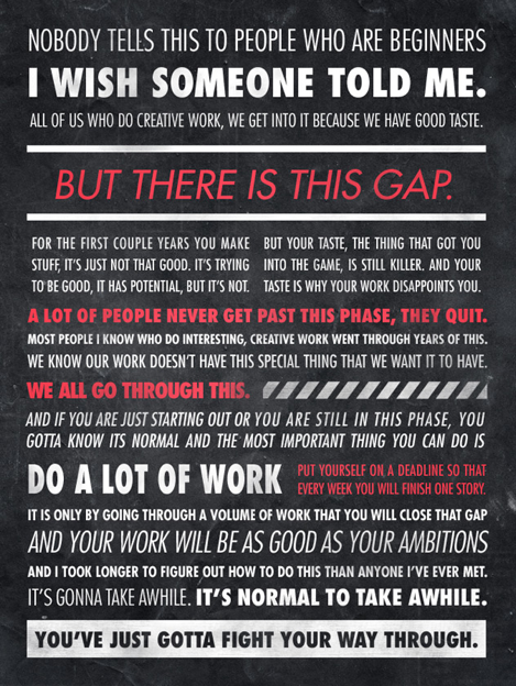
I love this Ira Glass quote from the Code Academy handbook, designed by Sawyer Hollenshead.
You’re reading Signal v. Noise, a publication about the web by Basecamp since 1999. Happy !

I love this Ira Glass quote from the Code Academy handbook, designed by Sawyer Hollenshead.
Yaniv Yaakubovich
on 29 Jun 12David Shiyang Liu created a great video about it using Ira’s audio track http://vimeo.com/24715531
Abhi
on 30 Jun 12I need to buy this as a poster!
NguyenBaHoangAnh
on 30 Jun 12where i can buy this poster ? ..[URL=”http://4lap.vn”]4lap.vn[/URL] chuyên buôn bán phụ kiện, linh kiện máy tính laptop uy tín, chất lượng cao
NL
on 30 Jun 12For anyone who likes this, it’s extracted from a video that’s available on Youtube. All four parts of that video are well worth a watch.
Stefan Loble
on 30 Jun 12Besides Jason, another author that writes about the challenge of being a creative person in a similar way is Hugh MacLeod.
I credit his first book with helping me get my act together to start a company. And, he forced his publisher into letting you read most of it at: http://gapingvoid.com/ie/.
The GAP is not an easy thing to span…
GeeIWonder
on 30 Jun 12Why is it its then it’s? and why is a guy who can’t get the basics down giving life advice?
Michael
on 30 Jun 12GeelWonder, the poster was made by a designer who transcribed a portion of ann interview with Ira Glass, who is considered to be a successful public figure. Ira Glass would not make a mistake like that, and we are reading Glass’ words, not the designer’s.
LVNT
on 01 Jul 12The message is much more inspiring than the design. I kept reading, trying to clear away the visual clutter. And GeelWonder, where do you see an improper “its”? Surely you understand the usage of “its” vs. “it’s,” otherwise you wouldn’t have commented, right?
Devan
on 01 Jul 12I agree that the ‘poster’ is a really bad design. Very hard to read and take away anything from that clutter of words that make your eyes jump all over the place.
Also, the wording itself seems a bit clumsy and seems to have an awkward measure, which doesn’t make them flow, nor stick in the memory at all.
Sorry – didn’t work for me at all…
Mike
on 01 Jul 12I like the message. I hope that some day in the future I’ll be able to look back and say “hey, it was true”.
Jacob
on 02 Jul 12Ironic that the poster looks so beginner.
Farsi dictionary
on 02 Jul 12There’s a huge gap from beginning a path to near finish it, and that’s experience. I’ve tried to use others experience to fill this gap, but without actual experience it’s impossible.
Mark Mansour
on 02 Jul 12“You’ve just gotta fight your way through.” Amen to that.
Jon
on 02 Jul 12That’s absolutely fantastic. I hope that it’s true!
GeeIWonder
on 02 Jul 12@LVNT: The ‘designer’ here has used both its and it’s for ‘it is’. That is the incorrect usage I was referring to. Plus it’s inconsistent. So it’s doubly wrong.
@Michael: Point taken. But someone presumably took the trouble to type the thing up and ‘design’ fonts/layout to relay life advice and convey emphasis and do other graphic stuff that further tweak (and perhaps even change the meaning of) the original. And that someone, while clearly having an ability to randomize fonts, is missing the basics like command of the language the content is written in, and the ability to double check.
Terrence
on 02 Jul 12@GeeWonder: By ‘presumably’ you mean ‘I presume’. Of course someone is ‘able to presume’. Freshman grammar mistake but why is a guy who can’t get the basics down giving grammar advice.
Anonymous Coward with Taste
on 02 Jul 12“All of us who do creative work, we get into it because we have good taste”.
Right…
GeeIWonder
on 02 Jul 12@Terrence – What?
Bisset usage. OED. But also Patono etc etc.
But goodness knows we all make grammar mistakes. Sometimes even on purpose—such as ‘Gonna’ above.
GeeIWonder
on 02 Jul 12Here let me add an easy one for all the ‘freshmen’ level experts to play gotcha with:
Your not going to be hard pressed to find grammar errors. Even less so if you make up new rules (or misunderstand existing ones) about how some words can be used. And none of this, however, invalidates the original point.
Michael Hall
on 02 Jul 12i love it too. we need to stop comparing our amateur work with professionals, we learn from them so much that we always feel inadequate in hindsight, but the average person that needs our service often thinks we are the best, because they don’t see the flaws that we know are there, and we only know because we are always trying to be even better, really if you watch a dance team or ballet, or even a speech, the person makes mistakes but nobody notices except the other professionals – the average person doesn’t see the flaws because they are usually not an expert. My wife does excellent nail designs and everyone loves her work – but other nail techs come to her and they are very critical of her technique and watch very closely, but it is only because they know what to look for, the average client doesn’t care as long as the nails look great at the end.
so give yourself a break from your own critical eye, and just do a lot more work – practice, practice, practice – makes your work closer to perfect.
Michael
on 02 Jul 12GeeIWonder, I completely agree the grammar errors and some aspects of the design are amateurish. I personally would link someone to the original interview with Ira Glass before I linked them to the image. But, I wouldn’t denigrate the words on the poster because of the design of the poster. I think we’re on the same page here.
Michael
on 02 Jul 12Hah, I just noticed it’s “Gee I” and not “geel.” Sorry about earlier. I thought all these years that “Geel” was some unusual Dutch name.
ADI
on 02 Jul 12Great poster, should be up in every office.
anitha
on 03 Jul 12very nice words.. So beginners should be thankful now someone told us….
bikram
on 06 Jul 12awesome quote…
This discussion is closed.