I always get a kick of out seeing how other people customize the home screens on their phones, so I put out a call for screen shots from everyone at 37signals. We got a pretty good response so I thought I’d share:
Kristin Aardsma (Support)
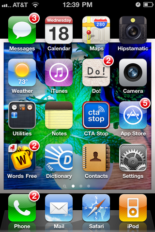
—
Michael Berger (Support)
—
Merissa Dawson (Support)
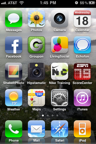
—
Jamie Dihiansan (Designer)
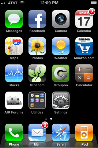
—
Jason Fried (Designer)
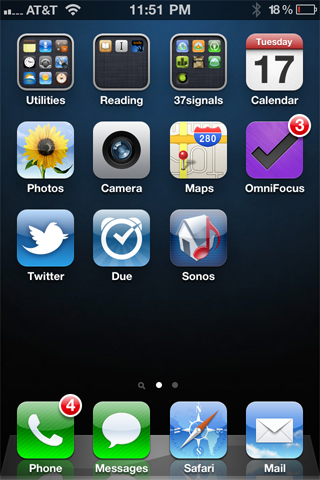
—
Will Jessop (Operations)
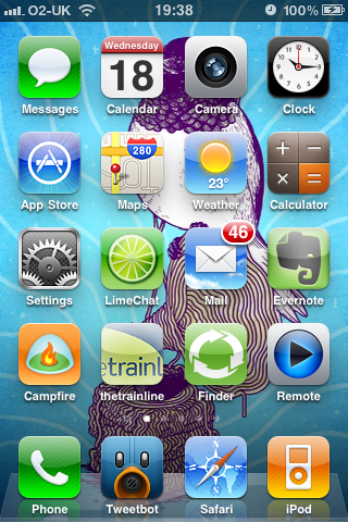
—
Matt Linderman (Media)
—
Noah Lorang (Data & Analysis)
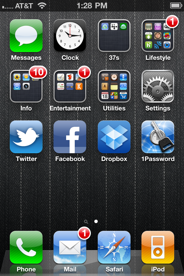
—
Javan Makhmali (Programmer)
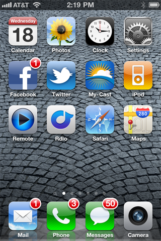
—
Pratik Naik (Programmer)
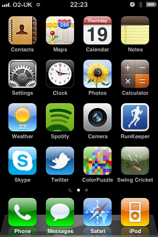
—
Jason Rehmus (Support)
—
Ryan Singer (Designer)
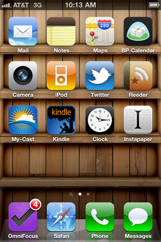
—
Trevor Turk (Programmer)
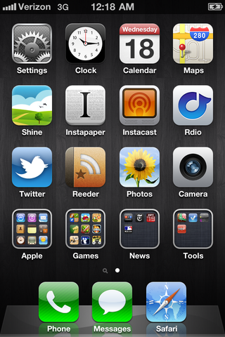
—
Scott Upton (Designer)
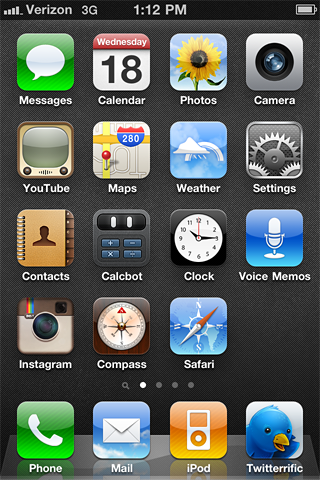
—
Taylor Weibley (Operations)
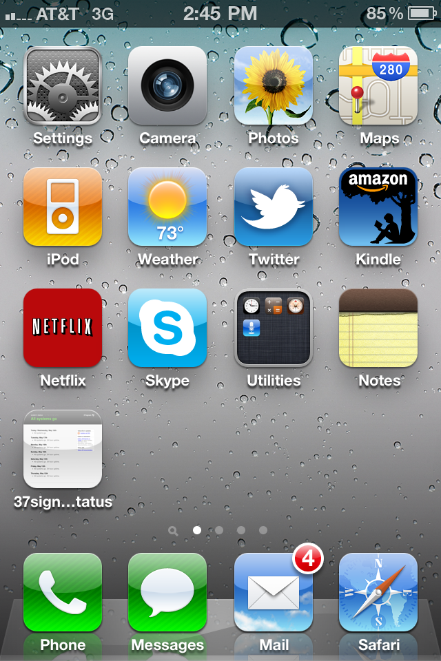
—
Jason Zimdars (Designer)
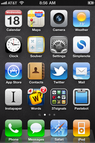
—
David Heinemeier Hansson (Programmer)
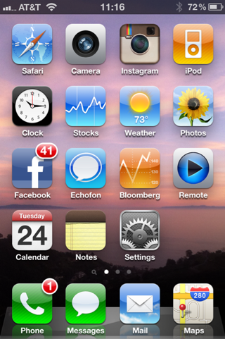
—
Jeremy Kemper (Programmer)
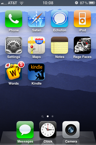
—
Do you have an interesting home screen?
Share a link in the comments!

mikhailov
on 24 May 11no dhh iphone?
Ahmed Eid
on 24 May 11Ha! I love these! It is kind of an art form.
Ivan Camilo Vasquez
on 24 May 11So… not one of you has an Android? too bad ;)
OnLooker
on 24 May 11This begs another question… does anyone working at 37s use something other than an iPhone? If so, I’d be curious to know which phone.
mikhailov
on 24 May 11it’s here now
Dave
on 24 May 11Love how most don’t have unread messages. Here’s mine: yfrog.com/h79qoruj
Eugen
on 24 May 11hey, jason has our app “later” installed. cool. does the rest not like it? we did send you some promocodes…comeon give it a try :)
Jamis
on 24 May 11@Ivan and @OnLooker, I don’t use an iPhone. My cell usage is so low I’ve opted to go with a cheap T-Mobile phone with a pay-as-you-go plan. I wind up paying about $100 a year, so an iPhone would definitely not be cost-effective for me.
That said, I do have an iPod Touch. :)
Justin Jackson
on 24 May 11JF needs to plug in his phone!
Here’s my home-screen: https://skitch.com/mijustin/fbdqk/my-home-screen
Ricky
on 24 May 11Jason Fried and Ryan Singer use OmniFocus. Jason Fried uses Due. I thought 37s had these tools covered.
Matt Vague
on 24 May 11I organize my home screens by color. My first screen is blue because it so happens that all of my most important App’s icons are blue. http://twitpic.com/51z6jh
It sounds weird, but you’d be surprised how much easier it is to find your apps when all you have to remember is what color their icons are.
Eric
on 24 May 11David’s image is broken. It appears to be a permissions issue with S3.
Justin
on 24 May 11Nice – I like having 1 blank screen as my homepage, with my apps organized on pages 2 and 3.
Here’s mine: justinr.us/iphoneBG.png
John
on 24 May 11@Ivan and @OnLooker I have been on a Palm devices for about a year now. However, I do own an iPod and iPad.
Carson
on 24 May 11Who are you freaks with only one or two screens total? Sheesh, thanks for making me feel like a total slob guys.
JD
on 24 May 11Carson, lol. I am a single-pager. I removed all of my apps a few weeks ago and went stock. Then added the ones back that I really use. It’s nice to use a phone with just a few apps.
I’m actually thinking about downgrading back to Nokia dumb phones… I’m serious.
john ratcliffe-lee
on 24 May 11Fun post. It looks like there might be a service for doing just this (posting/sharing homescreens) pretty soon: http://jratlee.com/post/5264764016/nikography-a-site-for-those-who-care-about
Joe
on 24 May 11Two surprises: 1. For all the “simplicity” messages coming from 37signals, most of these screens have every spot filled – nothing clean about them. 2. “Customization” on an iPhone simply means which apps to put on the screen and what background to use? I’m not sure that classifies as customization. It’s more like configuration.
Tony
on 24 May 11Mine.
Scott McMillin
on 24 May 11@Joe: I think you’ve misunderstood what “simplicity” means. Or you’re showing us an example of some strawman flamebait.
Jim Lamb
on 24 May 11I’ve taken foldering a bit farther than Jason ;) http://twitpic.com/51zoso
@Ricky, it’s always useful to see how others are solving the problems you’re working on.
Austin Schneider
on 24 May 11@dhh Check Facebook much? :)
David Norton
on 24 May 11@Jamis: I just switched to a pay-as-you-go phone with AT&T. It’s a sacrifice but definitely worth it.
Drew McKinney
on 24 May 11Happy to see my App Droplist in there! Awesome!
Martin
on 24 May 11All but three people have the settings app on the front page. What setting is changed so often that you give up top real estate for that? I am curious, never had an iPhone.
LMC
on 24 May 11@Martin I keep it there to turn on/off the 3g radio, it drains the battery its on only when I need it.
John
on 24 May 11I like it when companies pay for mobile subscription, esp. for those directly responsible for responding to “down” warnings and the like. Do y’all do that?
Adam Trimble
on 24 May 11I’m obsessive with my folder organization….
Homescreen Image
Will Jessop
on 24 May 11@Martin: I’d just never considered moving it I guess. I almost never use it. Replaced it with n-Track Tuner.
Pedro Fernandes
on 24 May 11Here’s my home screen: http://db.tt/iDDybd0
@Martin, in my particular case I use it to turn wi-fi and bluetooth on/off quickly.
Albert S
on 24 May 11@37signals
What does Matt’s job title of “Media” mean?
I thought everyone was either:
- Designer
- Programmer
- System Admin
- Support
With the recent new addition of the office manager, who’s the first employee who doesn’t directly influence the products.
“Media” is a vague title and very anti-37signals mantra, no?
Aaron M
on 24 May 11@Pedro Fernandes, I haven’t really ever cared for the folders feature. It makes it harder to see what is where.
Pedro Fernandes
on 24 May 11@Aaron M, when I got mine I didn’t use them as well, now I find them useful.
It’s a bit tricky to see what’s where, but that’s why I use “general” categories like Games, Music and such (BTW, screenshot is in Portuguese). It’s extra cognitive effort, but I’d rather group them like this than scroll through extra pages to find what I’m looking for. :)
Aditya Athalye
on 24 May 11Will look really cool if printed in halftones on rectangles of clear glass … Kind of like looking out at the world from the other side of the screen…
Tim
on 24 May 11Sure, I’ll play.
The second page is all folders, including one called “Low Res” exclusively for apps that haven’t updated to retina icons.
Jon
on 24 May 11Bushmills (Guinness black lager :)
Don Schenck
on 24 May 11What app or how are you getting the screen captures?
Edward D. Hofmann
on 24 May 11@Don—you can screenshot by holding the home button and power button. it stores the shot in the camera roll in Photos.
Mart
on 24 May 11@Don: hold the home button and the power button together briefly: takes a screen shot :)
Wagz
on 24 May 11I love that JF and DHH have their designer and programmer job titles.
I wonder how many other ‘designers’ have the income to load the Sonos music app on their iPhone? ;-)
Thanks for sharing, this is a cool way to see both what people are using and how they’re staying organized.
Ben
on 24 May 11Really interesting to see how few apps Jason and DHH have (at least on their home screens).
Deltaplan
on 24 May 11After all these years telling us how bad having an exit strategy was… and Matt has one on his home screen ! Shame on him.
JB
on 24 May 11@Martin
I use Settings to change screen brightness twice a day. Otherwise it’s far too faded in daylight and cornea-searingly bright in the evening.
Would be good if the Auto-Brightness feature actually worked..
Tim Flores
on 24 May 11I am surprised that nobody on the 37Signals staff has a hacked iphone (At least as as far as I can tell). Linked below is my homescreen.
https://skitch.com/teaflow/fbgxe/img-0533
George
on 25 May 11I think it’s interesting that only 5* of the 18 screens show a 37s app.
6 if you count Taylor who has a home screen bookmark for the 37s status page.Dan Forster
on 25 May 11Here’s mine – on review, there’s really so much usefulness right there…
I find it interesting that a lot of people would truly believe that I have this phone purely due to hype/marketing. Isn’t it plain to see that these things are genuinely useful – just touch what you want, and there it is.
(I’m probably surrounded by too many ‘technical’ people who don’t understand the wide gap between features & usefulness – thanks 37s)
Tim
on 25 May 11FUN!
Mine reflects a page of stuff I access always. In summer, the footy (AFL) one pushes off screen.
Surf, coffee, cycling.
http://wsp.so/lVPVwf
nickd
on 25 May 11Fun! Here’s mine: http://cl.ly/72XK
Hamid
on 25 May 11I was surprised, It is great. Really interesting and minimalist approach.
JH
on 25 May 11@Tim
Just started watching AFL recently, they’re showing it here (Ireland) on the state channels. What a game!! It’s so fast!
Fred S
on 25 May 11shelf wallpaper like ryan’s: http://www.bartelme.at/journal/archive/shelf_iphone_wallpaper
bruno
on 25 May 11Honestly surprised to see no pictures of anyone’s kids on their phone.
Are you all childless, or just don’t have the parental urge to look at your offspring every time you pick up the phone?
Ros Hodgekiss
on 26 May 11The Campaign Monitor team joined in on the game in our blog – believe it or not, we’ve actually got an Android screen in our line-up, too. Curious to see how similar a lot of our home screen choices are, in terms of both backgrounds and the types of apps (ie. photo, weather) that are on display.
Will Jessop
on 26 May 11@bruno I do have kids, but I guess my memory of them is better than a small picture behind some icons :) My background is from Ramen music issue #4
JD
on 26 May 11@Bruno, I have kids too. Unfortunately I have a crusty iPhone – thus no wallpaper on my homescreen. My family’s picture is on the lock screen. Is that OK with you?
Erica R
on 26 May 11All of these iPhone screenshots look … the same. Android home screens are #winning. Take a look at the Android screenshots over at MyColorscreen. http://mycolorscreen.com/category/android/
MiSc
on 26 May 11Interesting to see that only two of you guys are “breaking” the 4-by-4 grid with having 3 icons in the dock. I have two, I like things simple.
Pedro Fernandes
on 26 May 11@Erica R, some of them are quite pretty indeed, but how many of them are usable at all? Customization like that can be a time sink.
Erica R
on 26 May 11@Pedro It’s like comparing apples and oranges. I own both an iPhone and HTC Android. The definition of “homescreen” varies depending on your device. The iPhone homescreen is a locked down layout of desktop-like icons with diff backgrounds. The Android homescreen can be whatever you please. The iPhone vs Android discussion is for another forum on another day. Just thought I’d share some Android goodness here :)
Chris Sparno
on 27 May 11My home page is mostly social and contact apps. It’s mostly the stuff I use all the time. BTW, I am not a big fan of folders, but I do stick all the Apple standard stuff in a folder on page 3 with other not much used apps.
http://www.cl.ly/0×3z2H3n1202443S3J2q
Shahib
on 27 May 11I Realise that designer always go with the simple, minimal, pattern like wallpaper.
TJ
on 27 May 11thanks to Jeremy’s screenshot, I now have rage faces for the iPhone. This will forever revolutionize the way I send and reply to messages.
James
on 27 May 11I find it very interesting that JF and RS both use OmniFocus.
Cass
on 28 May 11Heh… I knew that you could arrange the icons on the iPhone/iPod Touch home screen, but for some reason, I thought the built-in Apple apps had to stay where they were (on the 1st page). And I was too lazy to actually take the time to re-organize the screens based on what I use (until I saw this post!).
Here was my previous iPod Touch home screeen: http://brizzly.com/pic/4IAC
Though I never use Stocks or Game Center, the Voice Memos was the one that truly doesn’t belong on my home screen. The iPod Touch doesn’t have a built in mic, and I don’t have an external one. So it’s completely pointless.
After some customization, here’s my new home screen: http://brizzly.com/pic/4IAD Kind of wish I didn’t have so many blue icons, but what can we do?
Edo "Amin" Elan
on 28 May 11Looking at your home screens, I noticed most of you tweaked the dock app configuration. This started me thinking: What percentage of iPhone users keep the app dock’s factory configuration?
Quora question: http://www.quora.com/What-percentage-of-iPhone-users-keep-the-app-docks-factory-configuration-Phone-Mail-Safari-and-iPod
Daniel Richard
on 29 May 11Looks like Jason Fried’s the only one with most of the 37s apps in the phone. :)
Liked JD’s 1 page only screen with the black bg.
I’m a Nokia user though, with an iPad.
Here’s mine: http://m.lockerz.com/s/105939606?sid=u5piakevoddv3to00iil4pv1s5
Aryanpour
on 31 May 11I was surprised, It is great. Really interesting and minimalist approach.
This discussion is closed.