Designing the mobile version of an existing app is about so much more than screen size.
The fundamental concept of the new Basecamp is this: a project on a single page. Projects resemble a nicely organized paper document with wide margins, familiar proportions and plenty of white-space. In a glance you can see what’s happened in the project, what’s left to be done, and any relevant files. You can almost imagine peeling the sheet off the screen and handing it to a co-worker to get them up to speed. It’s an iconic design.
We knew that this design would be instrumental in making Basecamp for iPhone feel like Basecamp so it’s no surprise that we attempted a very literal reproduction in an early version of the app.
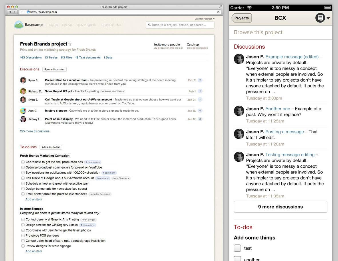
It’s all here: the clean, white sheet topped with the project’s name followed by sections with snapshots of the latest Discussions, To-dos, Files, etc. A virtual clone in smaller package. We were pretty happy with this mini-me design for awhile, but the story doesn’t start here.
From the beginning…
The very first design was inspired by the cards on Basecamp’s Projects screen.
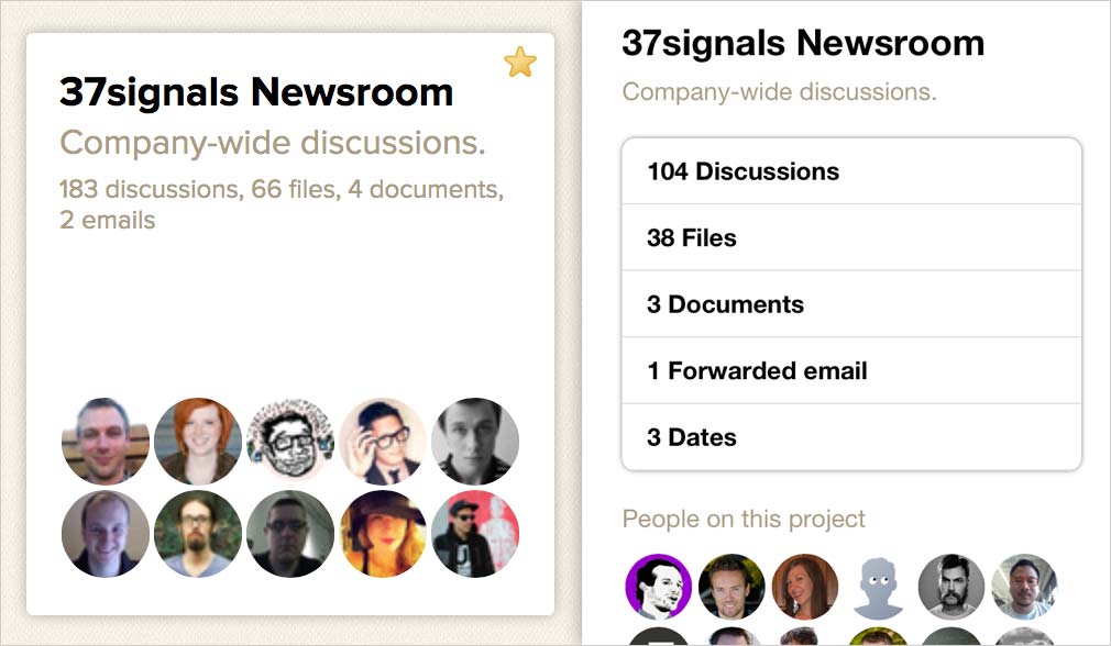
Predictably, each card showed the project’s name, description, people and a jumping-off point to each content section. Just like the thin strip under the header in Basecamp, each section counted how many of each thing was in the project (5 Discussions, 10 To-dos, etc.). This design also succeeded in feeling like Basecamp, but it wasn’t particularly useful.
Page loads are precious on mobile, each one takes time and sips more data from the customer’s plan. Here, choosing a project revealed no content – just a glorified menu. It’s a poor value for your tap. This feeling that there should be some payoff of real content when entering a project led to the aforementioned mini-me design.
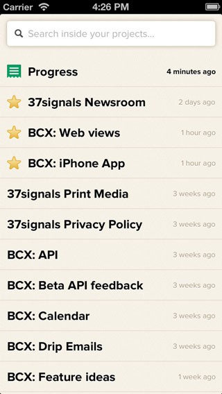
Priority #1: Show me the latest news
It wasn’t until we began to focus the iPhone app experience that the deficiencies of that design became clear. The top priority for the Basecamp iPhone app is fast access to what’s happening in your projects. Haplessly browsing content sections looking for something that’s changed was no way to figure out what was going on.
Basecamp’s Catch-up screen shows a summary of each day’s project activity and a by-the-minute stream of every action. Catch-up was what we wanted but the information isn’t well suited for mobile. The Progress screen seemed like a better fit – it’s ideal for quick check-ins on all your projects. The resulting design is something we call Latest project updates, basically Progress scoped to just one project. You can scroll back through the entire history of a project just by swiping.
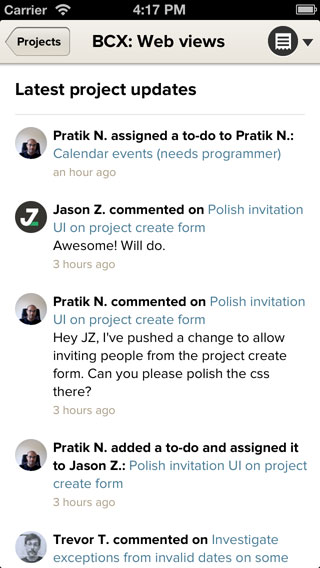
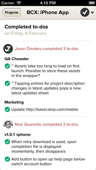
This was a big breakthrough but seeing everything that happened wasn’t always appropriate. Sometimes you just need to know what got done (that’s whole point of projects, right?). Because it was hard to scan the activity steam and pick-out only what was accomplished, we made introduced the Completed to-dos screen. There you can see – day-by-day – what was completed and who did it. It’s great for spotting bursts of activity (and lulls) and revealing who is really killing it on the project.
Priority #2: Drilling deeper
The mini-me design also failed to satisfy the the other top priority of Basecamp for iPhone: digging deep into the contents of a project. Jumping to the Files section, for example, meant scrolling past an unpredictable amount of Discussions and To-dos hunting for the button. How far down was different on every project. We’d already found that Latest project updates and Completed to-dos were better at showing you what was happening in your project so now we knew we could do a better job of helping you jump into the content when you want to dig deeper. Enter the project menu:
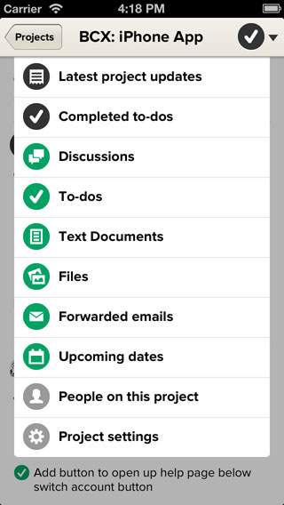
Here you can easily switch between the two main views or jump right into the content sections. Two taps, no scrolling, and predictable locations that build muscle memory was a huge improvement.
Looking through the lens
Our focus on clear priorities was applied with equal success to the main screen of the iPhone app. Early versions had no opinion about what was important offering equal access to projects and content sections. Iterations on the design that amounted to no more than rearranging the furniture should have been a big red flag.
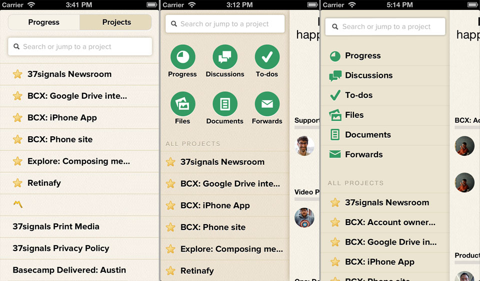
It wasn’t until we made the decision that getting the latest news is more important than digging through content that we were able to find the version you see now:
Opinions change
When designing the mobile version of an existing app it’s easy to think that all you have to do is optimize for small screens. Keep it familiar, on-brand, shrink the contents to fit and you’re done. But truly crafting your app for mobile means considering the difference in forces (not just the physical ones) and re-thinking the jobs your app is hired to do. Even the most opinionated designs might just require a change of opinion on mobile. For Basecamp that meant that we had to let go of the core design of the Project screen on iPhone because the priorities we established were better satisfied with something new. I’m curious to hear from others who’ve been through this process. How did your design change going from desktop to device?

Anonymous Coward
on 15 Feb 13In your photo comparison, it’d really help if you showed the same project being compared side-by-side.
Nic
on 15 Feb 13The inevitable xkcd – http://xkcd.com/1174/
Mike
on 15 Feb 13Funny you should mention that @Nic. I just read that same comic before I started reading this.
Waris
on 15 Feb 13Hi, Jason
Just thought about giving a feedback. I downloaded the Basecamp iPhone app. I think the sign in form and font could be improved a lot aesthetically. Keep up the good work Cheers
Sean Reilly
on 15 Feb 13Any chance that you’ll enable editing of text documents from the app?
Ron Paul
on 22 Feb 13I appreciate the way the comparison has been made but I recently downloaded the mobile app and as mentioned by @Waris sign in form can be improved and made cool as the web app.
This discussion is closed.