Hey iOS developers, App Store “screenshots” don’t actually have to be screenshots and they can communicate more than just how your apps looks.
They can communicate:
-
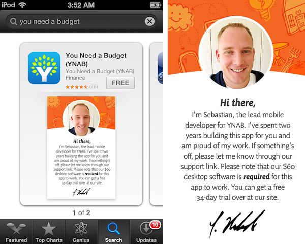
Who you are, how hard you worked, and prerequisites to using your app…
-
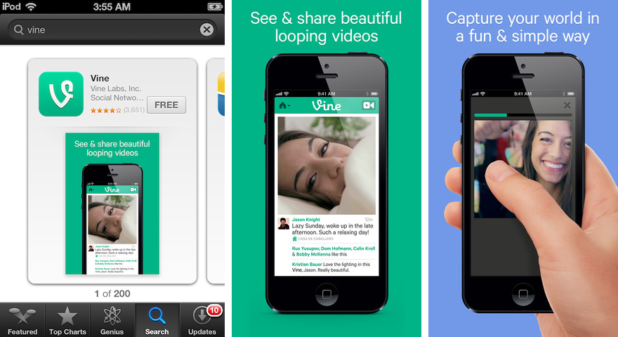
Your app’s job…
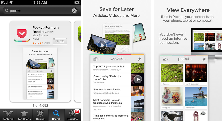
- How to use your app…
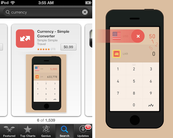
As an aside: keep in mind that these images will be seen outside of the App Store too, such as in Twitter cards…
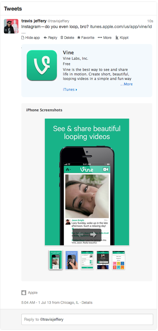
What’s cool about these screenshots? They’re interesting—i.e. not boring lists! They communicate explicity, often using words. It’s cool seeing the apps from the perspective of being on a phone and in someone’s hand. They use colors outside of the typical app color pallete. They convince me that these apps will do the job. Most important, they convince me that the makers of these apps care.
The apps listed above, and other good examples:

Andre
on 06 Jul 13I seriously hope this tip doesn’t get widespread adoption. As a consumer, an unembellished screenshot tells me more about your app than any copywrighting shoehorned in. If developers can’t pitch the value proposition of their app in the designated Description field, they need to improve or outsource their writing.
That said, the “How to use your app” suggestion is a tolerable exception.
Travis Jeffery
on 07 Jul 13@Andre, the App Store’s design is such that you only see the description after you’ve tapped in to see the details of the app. If your screenshot doesn’t interest your potential customer then they’ll scroll over to the next app—it won’t matter how good your description is because it’ll never be read.
Steve
on 07 Jul 13God I hope this is a joke. Things have to hell since Steve left.
“Screenshot” doesn’t mean make an ad tile. Just post a damn screenshot and let your app sell its self.
God
on 07 Jul 13@Steve, no joke, bro.
Michael
on 07 Jul 13I really like that YNAB tries to head off the people who don’t read the description and think the app is standalone. I think it’s important that developers have a way to do that. I don’t think developers should be doing it in the app screenshot section. They should at least create a frame for the screenshot like Vine did. I think that the app store needs a way for developers to indicate the app requires an external service and whether it is a paid service or a free service, and then to indicate that on the app’s listing in iTunes. That all said, the YNAB card is beautiful and I agree it’s one of the best examples of creative app-store listings.
Geoffrey
on 08 Jul 13Hi, Is it possible to have your advice on the screenshot I made for my app ? (https://itunes.apple.com/app/kwit-arreter-fumer-est-jeu/id525441365?mt=8)
hm++cb
on 08 Jul 13I don’t understand why people have to be so negative. Why can’t we appreciate the effort that went into a post like this. Even if it’s a minimal effort, the fact that someone cared to share what has impact to them should not be belittled. It really is a sad state. Some of us read comments to learn from the experiences of others and read their reflections. I’ll never forget the statement that Steve Jobs said to someone who had very little regard for the process of work, “What have you done in life?” This near the end of his life. Perhaps he’d take back a few years of his life and spend them in other ways, but you can sense in his statement that all our toiling for necessity or for our passions should be respected. Not for some grand slap on the back, but because we put ourselves and our teams out there and we did it. Too many of us can’t think outside the narrow confines of our small minds and experiences.
Marcos
on 08 Jul 13Wow, I don’t understand the negative reactions some commenters have to “screenshots” that are more than just screenshots. I am always incredibly greatful to app developers that do a thorough job of communicating what their app accomplishes without me having to install it. Enhanced screenshot cards have often served that purpose well, in my experience.
Duolingo is another great example. If they had only posted raw screenshots I could have guess the purpose of various UI elements (like the hearts), but by adding 6 or 7 words per-screenshot, they’ve communicated the app’s experience much more clearly!
Tobias
on 08 Jul 13Just 2 cents: last time I checked, this was against the AppStore submission guidelines.
Will
on 08 Jul 13Really? I think most people who download an iPhone app understand that they will be using it on their phone with their hands. What additional context does that provide the user that they would fail to understand otherwise? Do you really think your users are so unimaginative that until they see your screenshot on a mockup of an iPhone with a shiny reflection across it and a hand pecking at it, they’re not going to feel like it’s a real app or not going to understand its context?
Shouldn’t the point of app screenshots be to demonstrate the app? Shrinking the size of the glimpse into the app, so we can show it surrounded by its obvious device, in its obvious context seems like a lot of wasted informational space in the actual screenshot lost to making the screenshot more of a marketing shot. That might make sense to use on the side of a bus or in a magazine advertisement or as a Twitter card, where the context of viewing an app isn’t obvious but it seems redundant in the context of the App Store. I don’t think turning all screenshots into marketing slides so they look better when shared on Twitter is necessarily best for users.
In the Vine image with the hand, does that really add benefit to the understanding of the app? I don’t think it does. A user who has never used Vine isn’t going to understand that you tap and hold the video to record based on that promo slide. That’s not made obvious in that image to a user with no prior Vine experience. All that image really seems to show is that you use your hand to hold the phone and maybe interact with the app. I’m not sold on that being a better communication to the user than a proper screenshot would be (although obviously the point Vine is trying to communicate is almost impossible to do in just a screenshot of that part of the app). If nothing else, Vine should have used the text on the screenshot to better explain the concept that their visual failed to do, rather than using copy that reads as much as generic marketing text as it does a description of their unique interface.
That initial YNAB slide feels like something their marketing team decided needed to be put in place to preempt potentially angry users. Which is understandable I guess, but makes for a terrible “screenshot.” I would probably never even click through to see more about the YNAB app if that’s all I was presented with in the first screenshot. They give no context about what their app does or how it looks, they just say they’re really proud of it, and oh make sure you don’t bother with it if you’re not using the desktop app. That’s a terrible first impression of the app, and I say that as a YNAB user.
Can this technique be leveraged successfully? I’m sure it can. But should it become the new norm? I certainly hope not. I know personally, I’m always off-put by screenshots that behave this way – they feel like they’re trying to hide something by not giving me a clear view of their UI. I want to see the app, not the marketing pitch for the app. The nice thing about the screenshots has been you can ignore the marketing pitch in the descriptive text and just see if the screenshots are appealing. And now we’re encouraging turning the screenshots into a marketing pitch as well, so they can no longer be trusted? I agree that the app should be selling itself through the screenshots. The more they’re embellished, the more I wonder, as a user, why the app can’t stand on its own.
They’re called “screen shots” for a reason – they’re supposed to be shots of the screen; snapshots into various states and stages of the UI. Breaking from that had better be done for very compelling reasons beyond just the ability to add a marketing phrase to each slide. In my experience, the only time that’s successfully done is on games with unique methods of interaction where the developer wants to try and convey the experience of playing the game through a series of instructive screenshots.
Yes, the “screenshots” don’t have to be screenshots. But they probably should be.
Dmitry
on 08 Jul 13Next lesson: “How to open a Photoshop!”
Dave M.
on 09 Jul 13I’m with some of the other commenters here that screenshots should be of the app, not an iPhone showing the app on its screen with ad copy around it. Before the Retina iPhone, the 480×320 pixel resolution left little room for an actual screenshot if that screenshot was placed in an image of an iPhone with space around it for ad copy.
Granted, with the Retina resolution, 960×640 or even 1136×640, there is some space for this. However, shrinking the actual screenshot so that ad copy can be placed in the image is just not a good idea.
To be fair, it’s not as important with apps like Vine or Facebook. The real need for full resolution screenshots are in the Games category.
I would love to see Apple allow one 30 second video to go with the 5 screenshots for an app. AppShopper.com tries to do this with their iPhone app and that really helps make purchasing decisions when it comes to games.
If you want to put ad copy in your screenshots, then spend the time to create a website that shows off your creation with any resolution you want. Leave the small screenshots as clean as possible for the App Store.
Andre
on 09 Jul 13Insisting a keeping product description in the description field is hardly “negativity”; it’s attending to customer expectations. There no disputing the creativity behind using the screenshot gallery for copywriting, but only a segment of prospects are going to look at screenshots with the attentiveness required to pick up informational copy.
The YNAB example illustrates my point perfectly. If I’m looking for screenshots, the instant I discern that the slide isn’t a screenshot—a photo of the developer and a first-person intro—I’m going to skip to the next slide until I see an actual screenshot, and assume that the non-screenshot content isn’t required reading. For an app that’s useless without an expensive non-mobile purchase, that’s a problem. On the other hand, prospects who choose not to expand and read the Description field can’t blame the developer if the information was included there, in congruence with App Store norms—that’s where the information is supposed to go, that’s where it’s expected. You can either work with customer expectations or work against them.
Dave M.
on 09 Jul 13@Andre, your second paragraph… I would assert that if a picture of the developer was in the first screenshot of an app, I’m moving on to the next app in the list. My thoughts being that if the developer thinks so little of his product that he would rather show a picture of himself instead of the application, then I don’t think too much of it either.
I skip lots of apps due to bad screenshots. People, screenshots are the patron’s first impression of an app. Like the cover of a book, DVD or album.
Look at how we purchased applications and games before these app stores. We would pick up a box, turn it over to look at the screenshots as well as requirements (hint, hint) and make as educated a decision as we could given the screenshots. We were not allowed to open the box or run the app, just look at the outside of the box.
It’s pretty much the same with the App Store. We are allowed to look at the outside of the box, but until we plunk down the cash, it’s just the screenshots and description we have to go on. Maybe a video in YouTube or Vimeo if we are lucky enough to find one and one exists.
John
on 10 Jul 13As tweeted by @marcedwards:
If you read this and thought it sounded like a good idea, reread page 9 of this: https://developer.apple.com/appstore/AppStoreMarketingGuidelines.pdf where it clearly says many of the ideas above are in direct violation of Apple’s guidelines. Seems like your app could be rejected for such things.
Travis Jeffery
on 10 Jul 13@John, sure—theoretically, in practice all of those apps are in the app store and many were featured.
Devan
on 11 Jul 13Interestingly, whenever I visit a website to purchase a desktop or mobile app (including App Store apps) or web apps, I ALWAYS first go to the ‘screenshots’ page before even reading the marketing spiel. I almost never watch ‘tour’ videos.
I really want to see that the software is nicely designed and makes sense straight away as a user sitting in front of it. Messy, cluttered or confusing interface designs, or anything that uses a strange paradigm doesn’t get looked at any further. If I don’t see a page with several screenshot samples, I close the browser window and try somewhere else.
A screenshot shows you the primary mode of working with the software. It is the same as buying a car. If I sit behind the wheel and feel comfortable with the layout and ergonomics of the driving position, I am willing to talk further. If not, I hop out and try the next car.
I don’t care if the app has ‘feature X’ that I cannot live without. If you make it harder to find and work with ‘feature X’ than your competitor, then no thanks.
Reynaldo Cortorreal
on 13 Jul 13As a side note, Google Play screenshots are required, by policy, to be actual screenshots and not graphics. Many apps, break the rule slightly, some egregiously. At least it gives us a legitimate reason to downrate apps and report them for abuse.
I specially love those screenshots of 2D games represented with photoshopped 3D that seemed to have come from another dimension… then it turns out that the game is terrible.
This discussion is closed.