Today iOS 7 arrived and along with it our freshly updated Basecamp for iPhone. Perhaps there were some existing apps that just worked on the beta releases of iOS 7 but Basecamp wasn’t among them. And while we knew some under-the-hood changes would be required to support the new system, we didn’t anticipate changes to the design or how much we’d like them.
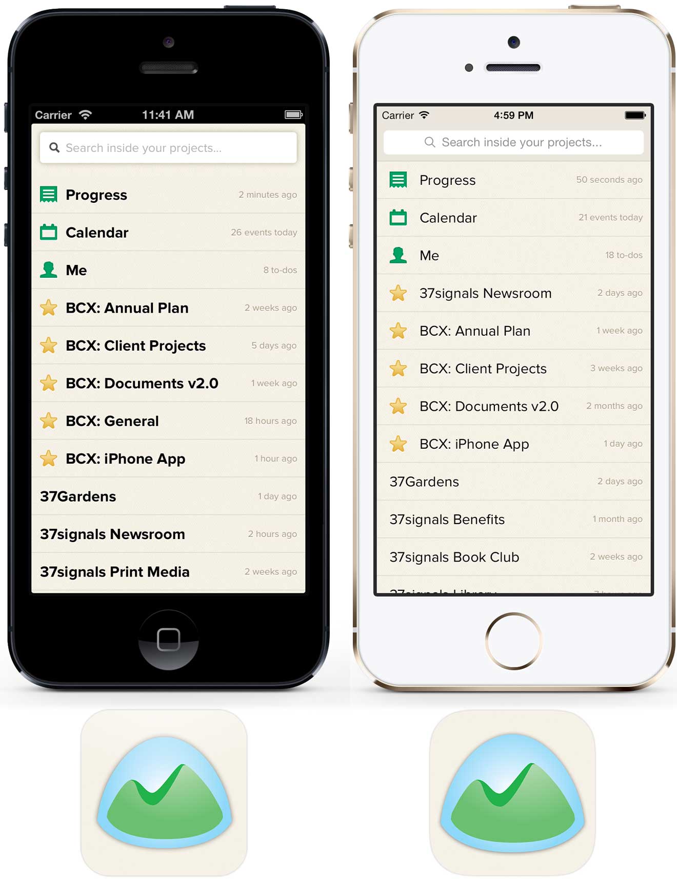
Here’s a quick before and after look at what’s changed.
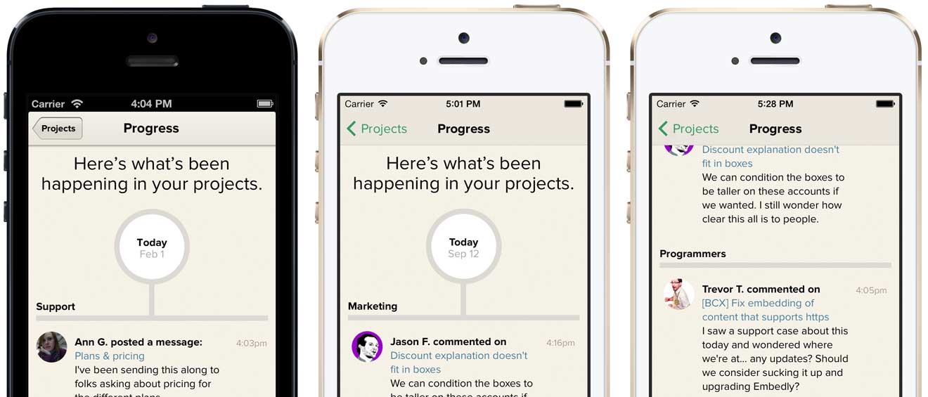
Navigation bar
Basecamp was already using a tinted stock navbar so updating to iOS 7’s aesthetic meant embracing the flatter look and borderless “Projects” button. Tinting the button green was a nice opportunity to add some personality and expand our already-in-use color for tap highlights. We weren’t happy with the default opacity and blur effects when scrolling content up under the navbar so we created a custom background image with a very small amount of translucency. It’s a similar but subtler effect.
Page stacking
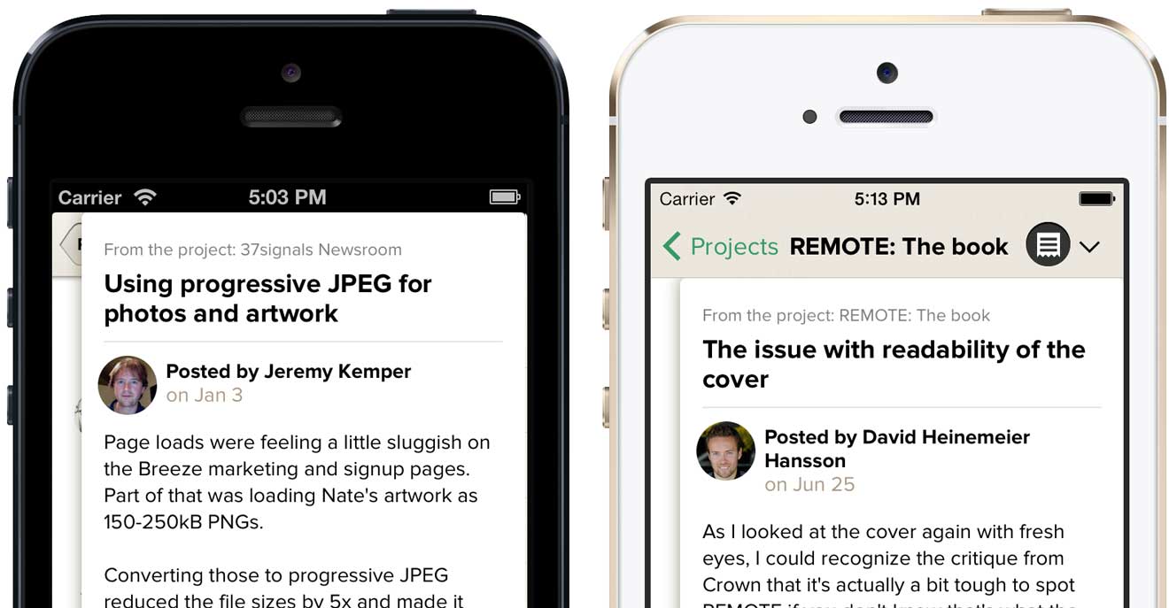
Arguably the most unique part of Basecamp for iPhone is the page stacking navigation. As you tap through projects, new sheets stack on top of the one you were looking at before. Getting back to where you were is simply a matter of swiping the sheets off the top of the stack. It’s a unique and intrinsic part of Basecamp.
In the iOS 6 app stacked sheets overlapped the navigation bar but that design didn’t work with the way content now scrolls underneath the navbar and status bar in iOS 7. Updating the design so that sheets tucked under the navbar felt like a compromise at first glance but we’ve come to realize that the page stacking metaphor is still intact—with the added benefit that you can now access the project menu anytime and jump to another section without first dismissing the stack.
Typography
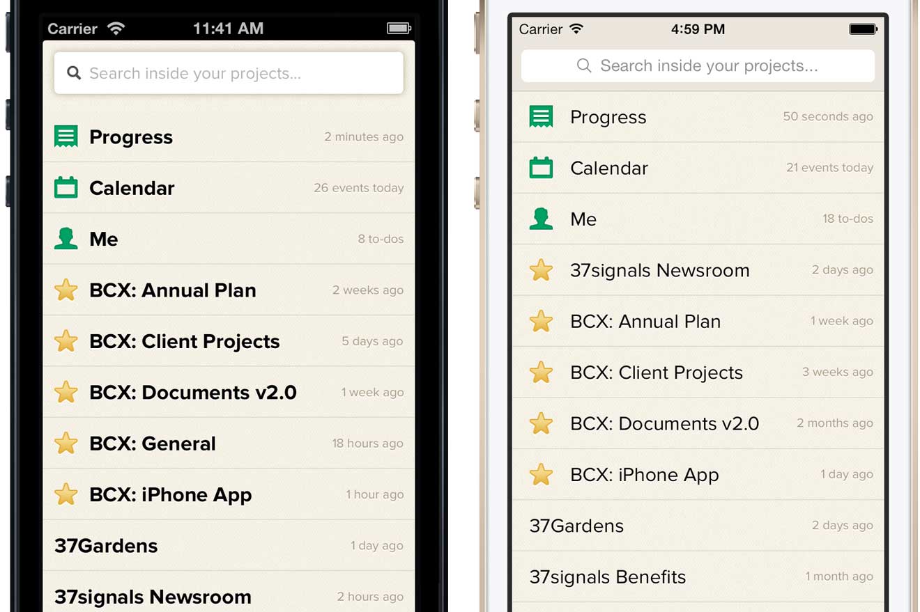
Proxima Nova is a strong part of Basecamp’s identity so there was no chance we were going to switch to iOS 7’s default Helvetica Neue, but that’s not to say we weren’t influenced by iOS 7’s lighter sensibilities. In general, the system seems to avoid multi-facet contrast by tending, for example, to rely on just type size or color when iOS 6 would have created contrast with size and color and weight. The lack of that heavy navbar, in particular, seemed to free us from the bolds we used on the project menu. Basecamp is improved by embracing these cues from the OS.
App icon
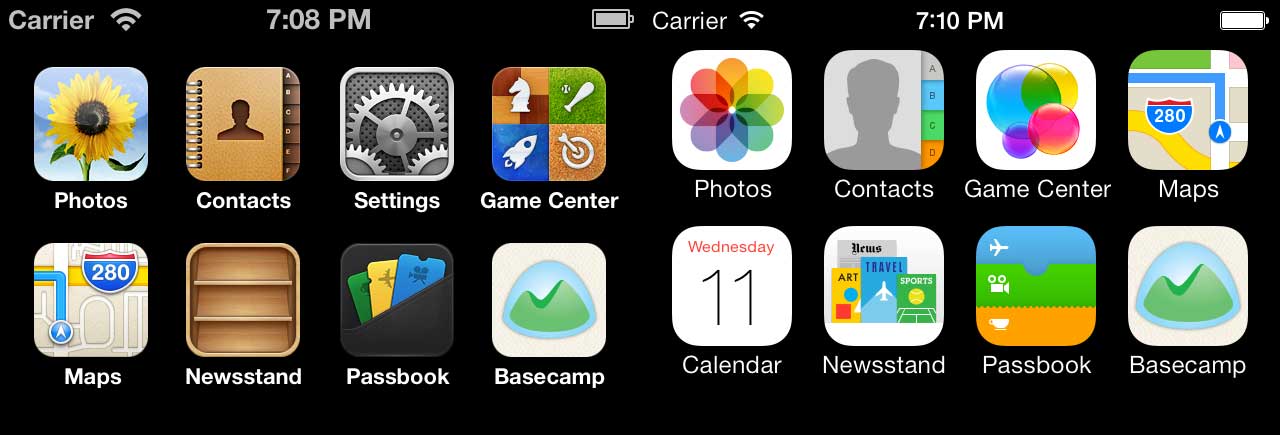
The new icon designs for Apple’s built-in apps might be the most discussed change in iOS 7. While we didn’t attempt to flatten the artwork or brighten the colors, we did enlarge Basecamp’s logo inside the icon bounds. The larger logo looks better inside the new rounded rectangle radius and feels more at scale with the built-in app icons—it just reads better. A very small change that makes Basecamp feel more at home on the new OS.
We’re still getting cozy with Apple’s newest OS, but right now everything feels fresh, light and new. The newly updated Basecamp for iPhone was released today alongside iOS 7. Be sure to get the latest version when you upgrade or when your shiny iPhone 5s/5c arrives on Friday!


Javier
on 19 Sep 13Subtle but nice work. Will be there a Basecamp app for iPad?
Bryan
on 19 Sep 13Upgraded to iOS 7 last night, then updated my Basecamp app and had some problems. Projects were displayed, but selecting anything (To-dos, etc.) all showed a blank “sheet”. Restarting the phone did not help. Finally, I uninstalled and re-installed the Basecamp app and everything worked fine. Since it worked out I didn’t send it thru to support, but figured I’d mention it here in case it happens to others.
Beyond that hiccup, the new app feels very “clean” and fits in well with the new iOS 7 look and feel.
David
on 19 Sep 13Looks clean and good. One minor nit, at the risk of being pedantic: wouldn’t the the contrasts and differences be best illustrated by showing two phones of the same color—holding all other design elements constant, in other words?
JZ
on 19 Sep 13@Bryan – thanks for that report, we heard similar stories from a few others. We submitted a new build with a fix this afternoon. Signing-out and re-launching the app seems to work as you suggested, but 1.4.1 should clear the bug entirely.
@David, you make a good point. My intent was to make it obvious which one was iOS 7 with just hardware. But between you and me, I’m also just plain enamored with how great Basecamp’s warm tan colors look on the Gold iPhone 5s ;)
Kevin
on 20 Sep 13Great post; great app.
Ron Stauffer
on 20 Sep 13I’m loving the new app! I had the same problem with blank pages but that seems to be fixed now. Also, slightly off-topic: will we see an update to the Highrise app? It feels generations behind the Basecamp app even though it’s been around much longer but for my business it’s equally as important.
JT
on 20 Sep 13Looks good, now bring that to Android… my Moto X is dying to have the official Basecamp app on it.
Andrew
on 24 Sep 13I just joined 2 seperate projects using basecamp and am having difficulty switching from one to the other. is there a guide that can assistme in learning these nuances? it is using 2 seperate log ins…please advise…[email protected]
This discussion is closed.