Pitchfork Media encompasses the award winning online music publication Pitchfork.com, the Pitchfork Music Festival, Nothing Major: a journal of visual culture, and their newest cinematic sibling: The Dissolve.
I recently sat down with Pitchfork Creative Director and friend Mike Renaud to chat about being part of the company as it’s grown organically, nourishing his analog roots, and his experience using Basecamp.
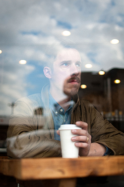
Tell me a bit about the team. Are you all centralized or spread out across multiple offices? How do you communicate?
The Pitchfork team is made up of about 45 employees, now about 54 including The Dissolve staff. Twenty of us are located in Chicago, with editorial and Pitchfork.tv split across two different offices in Brooklyn. The Chicago office is our headquarters where our design and development teams, management, and advertising staff work.
A few team members go out to New York a couple of times each month for meetings, shoots, etc. Because the offices are located in different cities we use a lot of Basecamp to communicate and help keep everything together. Probably one of the main reasons Basecamp works for us is because of the distance.
Within the company we have kind of an IM culture. Everyone is on IM every day. For communicating with the New York office it really helps, but in Chicago it kind of annoys me when someone sitting next to you IMs for something. I always prefer talking and facetime. I can see the argument about avoiding distraction from work but in its own way I really think it becomes distracting to have people IMing you constantly; it makes people feel like they can approach you more than they otherwise would. And I still feel like I need to stop everything and answer.
What types of projects do you use Basecamp for?
We fucking use Basecamp all the time. “The Dissolve” Basecamp project is insane. We have a project going with the development and design teams around building the website, and without Basecamp I don’t know if we could have done it.
We also have projects for all the different parts of the music festival – the festival website, the merch booth, the stage flags, etc. Outside of the festival it’s been great having a project for each cover story and we also make a project for every major advertising campaign.
Getting a whole team on board with embracing a new system like Basecamp can sometimes be a challenge at first. What was this like for you and your team?
My favorite moment with that was for the festival. Pitchfork proper has been on board with it for a while, and there was a little bit of resistance here and there, but pretty quickly everyone was like, “OK, cool, I understand why this is a good thing and I’m into it and it works.”
For the festival, we were introducing it to people who have never used Basecamp before and I introduced them to Basecamp for the festival website like, “OK guys, here’s what Basecamp is, we’re a lot about it, here’s why it’s good, here’s why you should use it.” The next day I’m still getting emails from them, and I’m just like, “Can we do this in Basecamp?” Just for weeks this went on—“I know this is annoying but can we please just do this on Basecamp? ... It’s just as easy, please just do it this way. You’ll see.” It was so rewarding a month later to get an email that was like, “OK, Mike, Basecamp is fucking awesome and I get it now! This makes sense. I’m loving it.” It just kinda clicks and you’re like, “I get it.”
I think for you guys it’s probably designers and developers who would be the ones promoting Basecamp and trying to get other people to use it, but it’s actually more useful for the clients or other partners than the designers themselves because it gives other people constant access to all these files and other things that they wouldn’t otherwise have. We love it.
I’m proud of how the company has grown in really natural ways; we’ve never had angels come in and make what we do possible, it’s all been a really natural progression of us doing everything ourselves.
In the beginning they didn’t really have much need for full-time designers. Ryan Schreiber, who founded the company, designed the first three or four iterations of the website back in the late ‘90s/early 2000s. I think the first professional they brought on was Chris Eichenseer with Some Odd Pilot who did the site design in 2004 or so, and then Tangible did a redesign a few years later. That was the last time anyone was brought in from outside the company to do a site overhaul.
Aside from that stuff they would just do everything themselves, mostly cropping photos for editorials and such. Pitchfork has never had an advertising campaign or anything like that, and back in the mid-2000s social stuff wasn’t really a predominant thing, so there weren’t really design initiatives beyond the actual website. They designed it so they could be self sufficient in that way.
I came on as one of Pitchfork’s first freelancers back in 2007 as their first sort of “design employee,” so I’ve been able to grow while I’ve watched the company grow. One of the first things I did for the site proper were some house ads, filler ads for when they couldn’t sell a skyscraper or a 300×250 or whatever.
Since 2008-2009 when I came on on a more full-time basis it’s been pretty much me doing our design stuff, along with the help of Molly Butterfoss and Joy Burke in the last year in a half. I’m proud of how the company has grown in really natural ways; we’ve never had angels come in and make what we do possible, it’s all been a really natural progression of us doing everything ourselves. People have just been brought on out of necessity when we’ve needed more help here or there.
In the last year you’ve expanded the Pitchfork brand beyond music with Nothing Major for design, and now The Dissolve for film. What’s the story behind diversifying the brand in this way?
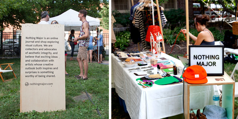
Nothing Major and The Dissolve kind of happened the same way that Pitchfork did in that they really came from a place of people being interested in those topics and having a real passion for wanting to work with those things. There are of course business motives behind it somewhat, but it really came from a very natural place of inspiration and just wanting to do something. Nothing Major has actually been a couple different things over the last couple of years. It’s been a very slow, slow build. Right now our expectations are just set at wanting to do something of quality, and we’re not promoting it very heavily because we’re still just feeling it out and wanting to make sure it makes sense and is legitimate in its own way. Nothing Major came from Chris Kaskie and I just talking about our love for design and other illustrators and designers we wanted to promote, and so we’ve done that in different ways—one way by focusing on a store and a brand, another way by focusing on an editorial site, and now I think we’re able to sort of see where we can blend the two.
What’s a project at Pitchfork you’re particularly stoked about these days?
Cover Stories are a lot of fun. They’ve given us a bit of attention on the design and development end of things, which is nice and I’m excited about where it will lead. The impetus was just to highlight these great features that we were writing. Pitchfork is known for its reviews – some people go to the site just to see what’s new, see what scores (new albums) got, look at the news, then they beat it. We kinda wanted to figure out a way to get people to pay more attention to these great interviews and pieces that our editorial staff were doing. So we figured, all right, why not make these article pages a little bit more interesting, engaging, and sharable. Now for us it’s a challenge to see how we can sort of start to blend that into our actual site, what ways we can make that style, functionality, and experience work through a CMS.
When adding interactive elements to editorial pieces there’s a fine line between enhancement and distraction. How did you find the sweet spot for Cover Stories?
That’s one thing I’m really kinda paranoid about and internally I’m always trying to be the devil’s advocate. It’s cool that we can blend video, music, moving imagery and all this stuff into a story – that’s awesome and obviously an advantage that we have over print. At the same time you need to remember that people are there to read the story, so keep it simple, keep it less than distracting, and try to keep some traditional, nostalgic experience in there as well so it feels like there’s some heart in it. It’s funny because people will talk about how [Cover Stories] are possibly helping to evolve things in some ways and how they use technology to further things, and honestly, our biggest inspiration is print. It’s funny that’s what inspires it, the old school shit. We’re not trying to be like print, but we’re able to apply the simple, hundreds of year-old rules about grids, typography, flow, and layout, which to me is why Cover Stories have been successful. Not just because CSS3 and HTML5 allow us to do it—it’s more like, now we can make this how it’s supposed to be.
Is your background working in print?
Yeah, I was the art director of the Chicago Sun-Times for a while and learned how to design by screen printing posters and that type of thing, so print is definitely my first love. I begrudgingly made my way into web design, but I love it now for so many reasons … one of which is that I can fuck with what I love about print and try to integrate that into web design.
What was the “begrudgingly” part?
You know, it’s because I kind of hate the Internet a little bit … and I’m just a guy that loves life, real life. I also love and have a nostalgia for print, newspapers specifically. While working at the Sun-Times I was a very vocal proponent of trying to keep that alive, whatever that means. Looking back, that’s idealist and my viewpoints have since changed for environmental reasons, ease of use, and all that. It’s also because I’m not a developer; I don’t code. I know basic HTML and stuff but I don’t want to do that, it’s not fun for me.
What do you do to balance a life in the tech world with the desire for an analog lifestyle?
I still try to do a lot of things by hand and scan things in, even if it doesn’t make any sense and it’s less productive. Earlier today at work I was screen printing posters for an event we’re doing with Nothing Major. Getting my hands dirty, moving my body, not sitting around all day—I think helps a lot just psychologically.
I do the best I can to go on trips where I can easily say, “Eh, you know what … I don’t think my phone is going to work there.” Finding those places is pretty key. I try to do that at least once or twice a year, find a place where I can tune out as much as possible a little bit off the grid.
What would you say is your favorite thing about about what you do?
Learning has always been really important to me; I’ve never wanted to feel like I figured something out and just did it for the rest of my life. I’m lucky to work with a lot of really creative and intelligent people who give me a lot of great feedback and inspiration, and who I learn from all the time. Because of the nature of what I do, things are always changing and we’re always trying to open ourselves up to new opportunities, so I’m always trying to figure new things out. It’s cool to start a new project because it’s a chance to figure out a new process, and how to keep inspiration and creativity within that process.

Paul McMahon
on 11 Oct 13I had a similar experience when I tried to use Basecamp with my customers: they kept using email. How can I get to fucking awesome without a month of bugging them?
Michael
on 12 Oct 13Paul, I don’t think there is any magic way to do it because customers usually know they can get away with it.
One way is to gently explain that Basecamp saves your team a lot of time and prevents mistakes. If they don’t use it, they’re keeping the deliverable from being on time and high quality.
Another way is to put everything they say into Basecamp and then reply through Basecamp (so they get the notification) and put a code at the end about using it. This one doesn’t work well if they cc lots of people or someone in your office isn’t on board and replies first.
Another way is to try to initiate conversation with them frequently so that they never have a chance to email first.
The best way is to have a “Why Basecamp?” with extremely basic instructions about communicating with it and, while being nice and customer-friendly, get across the idea that there simply is no other way the project operates. Explain in it that this is the way they get daily status reports without you having to spend any billable time.
Sometimes it’s nice to show them Basecamp in initial meetings/get-to-know-yous so they understand it’s just how you work. When freelancing, I found many clients to be impressed enough by it that it got me more work, so if it turns off the occasional client it’s worth it.
This discussion is closed.