When I switched to Android a few years ago, I promised myself this: I’d switch back the minute Apple added smart notifications, app data sharing, widgets, and a better keyboard to iOS.
Apple’s WWDC keynote yesterday was exciting. Craig Federighi is super awesome (I wanna hang out with him). iOS is finally getting the Android features I love. Yesterday I was ready to switch back, but now I’m not so sure.
Some iOS fans have pointed to Google’s Android as being a poor copy—thermonuclear theft. On the surface there are similarities, but conceptually Android started from a power user’s perspective. Where Android had power features it also lacked in the simplicity and obviousness of iOS. Simply because iOS did far less.
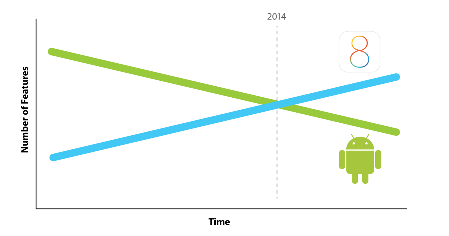
Yesterday Apple showed iOS doing a whole lot more. Apple is refining iOS by layering on functionality. They’re adding features to the simple iOS foundation. However, the more features there are, the more complicated it becomes—and the harder it is to use.

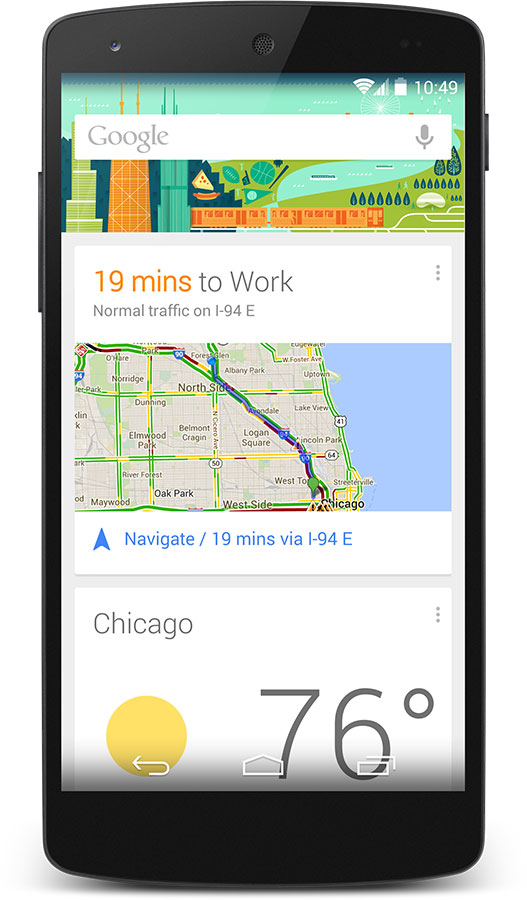
Meanwhile, Google has done something interesting with Android. It started out as a very power-user complex platform, but they’ve been refining it in a different way than Apple. Instead of adding features, they’ve pruned them. Historically Google hasn’t been afraid to nix apps or services in an effort to focus and simplify. You can see these efforts in Google Now. With Google Now you don’t interact with apps or widgets. Their “cloud” knows what you want to know and tells you. No interaction needed.

It’s always harder to take away features that are already there. But, I have no doubt Apple will try to continue making iOS easy-to-use while they layer on new power user features. At the same time, Google’s not afraid to take away features. Maybe Google will keep simplifying Android, pushing all you need to know from their sentient “cloud”.
I’m curious to see what happens next. But, I’m not switching back to iOS just yet.

Donnie Clapp
on 03 Jun 14When people ask me whether they should buy an iPhone or Android, I always say [said], “It basically comes down to two things: how much do you like to shuttle links and information between apps, and how much do you care about how efficient your typing is? Everything else is the same.”
3rd-party keyboards puts a pretty big dent in that gap. However, something else has happened recently that’s making these kinds of decisions difficult: the price structure is changing. The Moto X is $350, the One Plus One is $350, the Moto E is $150 (off-contract). If things continue to trend in that direction, the overall feature parity and small effective differences are going to make iPhone a tough sell.
Josh
on 03 Jun 14I can’t agree more that a lot of new features for iPhone are not as good as it seems. The more features for iPhone, the harder to use.
Alex W
on 03 Jun 14Is that graph saying that Android gets harder to use as it loses features?
Matt
on 04 Jun 14Alex W – No, it’s saying Android gets easier to use as they reduce features.
Benson
on 04 Jun 14Just wondering that, if Android started from a power user focus now refine/prune features to be more usable, isn’t that inversely true that power users will lose out? iOS started from simple/usability user focus and now enabling more features may make less usable/more complex is a statement I am unsure Apple do. I think a better visual graph might be both lines actual merge (not divergent) and homogenise to balance feature/usability in the long term.
Devan
on 04 Jun 14I still perceive most of the ‘new’ features in iOS to be ‘below the surface’ and not obtrusive enough to warrant confusion in new or old users. For instance ‘Hey Siri’ is an enhancement that doesn’t make Siri any harder to use than before, but gives the user an option to make it, in fact, easier to use Siri. So is Siri’s new music recognition feature. Most people would just skip past that with no impact on their daily use of the tool.
Berserk
on 04 Jun 14Alex W and Matt, actually, it quite literally says that iOS now (2014) has more features than Android. The y-axis says “Number of features”, not “ease of use”.
In other words, the graph doesn’t quite follow the text.
Alex W
on 04 Jun 14The x-axis was originally labeled something like “Harder to Use”.
Simon D
on 04 Jun 14I try to stay a bit agnostic with the “platform wars”, but …
My wife has a Nexus 5 and I just don’t see the attraction to Android. It just seems to me like everything is the result of an internal technical feasibility study … nothing feels finished and it seems like the wrong types of people (engineers and coders) are the last ones reviewing things before they “go live”. “Yup! That works JUST LIKE THE iPhone! .... GO!”
Plus: 3rd party apps still look second-rate compared to the iOS equivalent in the instances I see.
I know the auto analogy is stale, but all the Android phones just seem like GM to me … lots of generic-feeling models based on a kinda-good-enough framework.
Variety is the spice of life, tho, so ….
Brad
on 04 Jun 14I think it still comes down to the total ecosystem. The “continuity” feature doesn’t seem to be a complex addition to the phone, but instead appears to be a seamless way to do more, and to do it easily, with more devices when you are playing in the Apple ecosystem.
I’m not an Android user. Can anyone give some concrete examples of features that have been removed from the Android mobile platform?
I bet Google, Samsung, etc. wouldn’t go around touting that they have less features than iOS 8.
jake
on 05 Jun 14“I always say [said], “It basically comes down to two things: how much do you like to shuttle links and information between apps, and how much do you care about how efficient your typing is? Everything else is the same.””
What you’re basically saying is that the only advantages are Androids. I couldn’t disagree more. I’ve switched twice, and always returned to the iPhone. It feels more cohesive, my favorite apps, despite Android getting better, are on the iPhone. I could give at least 10 more reasons I prefer the iPhone, but my point is not that one is better than the other, but that claiming they’re ‘the same’ except for a couple of Android advantages is nonsense.
This is a huge update for iPhone. It completely destroys any advantages I felt using an Android phone, while keeping what makes the iPhone does best. Will definitely be buying the new iPhone, and I don’t see any way I’ll be switching back.
Andreas
on 05 Jun 14Googles apps may become more simple, but those apps are available on iOS too. I’m not seeing that with Android, which with new directions (Android silver, etc) is becoming even more unfocused.
And I disagree on the keyboards – if you learn to trust the IOS keyboard then you’ll write just as fast on that one as on any keyboard.
There are a lot of things with Android that I like personally but it’s not my main phone yet. I guess I’m not very interested in the constant search for new apps or tweaking of the old ones.
Anonymous Coward
on 06 Jun 14Great observation. Striking a balance between simplicity and capability is a constant struggle for designers and engineers. Reading Don Norman’s Living with Complexity really helped me think about it in a new light: Good design can tame complexity: Not by making things less complex, but by managing their complexity.
Apple’s design mojo has been in their ability to ruthlessly determine what features people need, and omit everything else. I’m excited to see if they can do the ‘great design’ of managing the complexity that comes with adding more capabilities.
Kris Niles
on 06 Jun 14Oops – didn’t put my name on the above comment. I’m not a coward, I swear!
GeeIWonder
on 07 Jun 14The whole premise of this post seems dumb.
Promising yourself to switch back? Why exactly?
From a design perspective the features argument is a) fictional b) lame and c) incorrect. It misses the point entirely I think of what features are and how complexity is managed, If this is the way you and your colleagues see/manage features, this would seem to be a major shift for some of the design thinkers at Basecamp.
From a business perspective, the consensus view (except perhaps here) seems to be that Apple is trying to especially avoid attrition of its customer base. I think that sort of says volumes (as does the Beats deal).
I suppose someone could make up a fictional plot to support the above statements (it certainly is easier to draw lines than to actually assemble data to support them!)
John Varghese
on 09 Jun 14Obviously a very biased review with a completely subjective made up graph using two thick straight lines on axes that don’t make sense, pretending to predict the future.
Way more noise than signal.
This discussion is closed.