We’re currently working on modernizing the Basecamp interface to bring it closer in line with Highrise. The new screenshots below represent some of the changes we’re making.
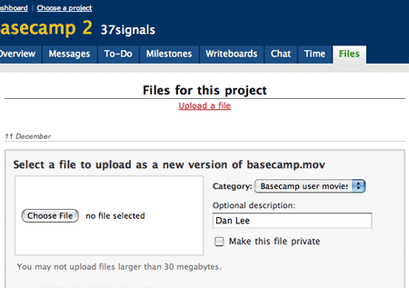
If you have a paid Basecamp account, you can upload multiple versions of the same file and keep them grouped together inside the “Files” tab. After a while, we began to feel the “upload a new version” screen wasn’t as clear as it could be though. Here’s what it looks like today:

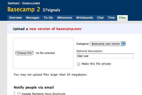
It was too easy to ignore the file name (“basecamp.mov” in this example). So we made the header clearer. We separated it with a light blue background, used red text to make the key part pop, and shortened the text from “Select a file to upload as a new version of basecamp.mov” to “Upload a new version of basecamp.mov.” The less reading required, the better.

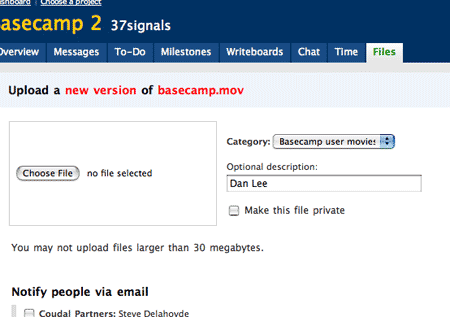
That’s better but the filename kind of blends into the tail of “new versiona..s.df….sa.mov.” Let’s separate them by making the “of” black.

Now the words “new version” and the file name pop. This follows the principle of the smallest effective difference: Whenever you make a mark (label, line, etc.), make it as small as possible, but as small as possible to still be clear. Look for opportunities to maximize value with the smallest possible change.

Lee
on 19 Apr 07I love your attention to detail!
Recently I have found the ‘tweaking’ of web sites to be almost as enjoyable as making them in the first place. It used to be the other way around and I had a load of very unpolished web sites under my belt. I think I have you guys to thank, so…. Thanks! :)
Justin Reese
on 19 Apr 07You guys are approaching a Tufte-ian level of information density and beauty. The removal of borders was a particularly wise choice.
Jeff
on 19 Apr 07The red doesn’t pop the way you think it does. The word “of” pops. There’s more than color at play here, and designers get tricked by reds. White on red will pop; red on white won’t.
Mostly, though, the red/black/red/black progression is a mistake. It makes the text more complicated than it needs to be (is the fact that it’s a new version THAT important? No.). Pick one thing, and emphasize that. You’re trying to emphasize two things at once.
Rachel
on 19 Apr 07I disagree, I think the red does pop, in fact I was sort of surprised to see how much so. But, that may be just me. The “of” does pop as well, and maybe there are other solutions but I still think it works. I thought it was more clear than the all-red version anyway.
Design Decisions is my favorite :) I can never have enough Design Decisions posts! Even when I disagree, I find it fascinating to watch other peoples’ processes of raking through the little usability things and reasons for making different choices. more please…
Justin Reese
on 19 Apr 07@Jeff: Now that you mention the black popping, I see it too. My eyes are drawn towards the black first, though the red is significant in periphery. Very interesting.
Being a designer is hard, eh?
JF
on 19 Apr 07We don’t believe this is about where your eye goes first or second. It’s about noticing the difference and making sense of the difference. Seeing “Of” first doesn’t change the experience of noticing that the other two words are different.
This isn’t about a split second reaction to avoid an accident in your car, it’s about treating key parts of the sentence differently. At the end of the day it’s not a huge deal either way, we just think it’s better.
Fran
on 19 Apr 07Someone (was it George Orwell?) once said: if you state something, state it positively.
With that in mind, might I humbly suggest an improvement? Rewrite the text “You may not upload files larger than 30 megabytes” to “You may upload a file up to 30 megabytes in size” or somesuch.
Otherwise, it looks tasty.
Robert
on 19 Apr 07For text I always prefer a dark gray instead of black. It’s more comfortable to read and less important emphases could be black. The red is too red, I would prefer: #CC0000
If you’d put the file name in single quotes, it doesn’t irritate but clarifies which part is the file name – even when it is a file name without an ending.
Upload a new version of ›basecamp.mov‹
(new version in black, file name in #CC0000, rest #333)
Terry Suton
on 19 Apr 07Incredibly nitpicky. No wonder you guys do so well.
steph
on 19 Apr 07hey, what’s that? “basecamp 2”?
JF
on 19 Apr 07Rewrite the text “You may not upload files larger than 30 megabytes” to “You may upload a file up to 30 megabytes in size” or somesuch.
I agree, this can be better. We’ll work on that.
Long Time Listener - Repeat Caller
on 19 Apr 07And I am sure many people look forward to your upcoming journal post detailing which words you will use instead. Wink.
Diego
on 19 Apr 07Make “new version” and “whatever.mov” UPPERCASE!!!!
Just kidding of course.
Ryan
on 19 Apr 07Very nice. I can’t believe how obvious these things become after I read one of 37signals’ design decisions post. Nice job.
Neil Wilson
on 20 Apr 07Red won’t pop at all to those who are colour blind – it’ll tend to disappear.
It’s always useful to use bold/normal text as well as a colour change. Not everybody has perfect colour vision.
NeilW
Igor Asselbergs
on 20 Apr 07Red doesn’t pop because it’s red. It only pops because the background isn’t red. Which means popping depends on contrast. Black has more contrast to white than red has, so black on white pops more than red does.
You color scheme has EVERYTHING to do with where your eyes go first or second. If you don’t take that for a fact, you’re likely to mess up the color scheme and hence the design. Like it or not, your color scheme determines the hierarchy within your design.
Using red has no bearing whatsoever on the color blind. At least not in the way it is used here. Most of the color blind have difficulty to distinguishing between red and green. Instead they see a color that may be called ‘gred’ but is clear to see nonetheless.
I don’t get the new light blue background. It doesn’t clarify anything and only serves as arguable decoration.
All in all, as a user of basecamp, I prefer the current design. The new design is overdone.
JF
on 20 Apr 07I don’t get the new light blue background. It doesn’t clarify anything and only serves as arguable decoration.
To each their own, of course, but we believe the light blue header reduces the number of design decorations on the screen.
The current version has centered text, a border under the header, boxes around the widgets, grey/white combos.
The new version has a light blue header and gets rid of all the other noisy elements. No need to draw lines, no need to have so many boxes, no need to use grey to set off the white, etc.
And there’s more to the redesign than we’ve shown. We’re actually reducing the total # of elements on the screen whenever you do something new.
Stay tuned.
Mike Gowen
on 20 Apr 07@Jason
I’ve noticed a pattern on the 37s apps that most of the system level functions (create/edit/delete/), and basically anything that does some kind of destructive change, are red links. You also seem to do this with warning text (late milestones, etc). But overall your use of red is done sparingly which for obvious reasons is understandable. Do you have any sort of conventions for using red versus some other form of visual emphasis? What about for other things like bolding? Are there site-wide conventions or do you approach each “module” in the page independently?
JF
on 20 Apr 07Mike: We usually use red for admin or system-level links. Sometimes we’ll use red text in other places, but usually just for emphasis. But most admin-type links are red.
We don’t really like hard and fast rules, so we’re always open to exceptions that make sense.
This discussion is closed.