Over the last day or so I spent some time learning about the different Apple Watch components (notifications, glances, WatchKit app) and imagined how Basecamp might work on the upcoming device. Here’s what I came up with.
Notifications are a given for Apple Watch. The ability to see what’s new in your projects simply by raising your wrist sounds fantastic.
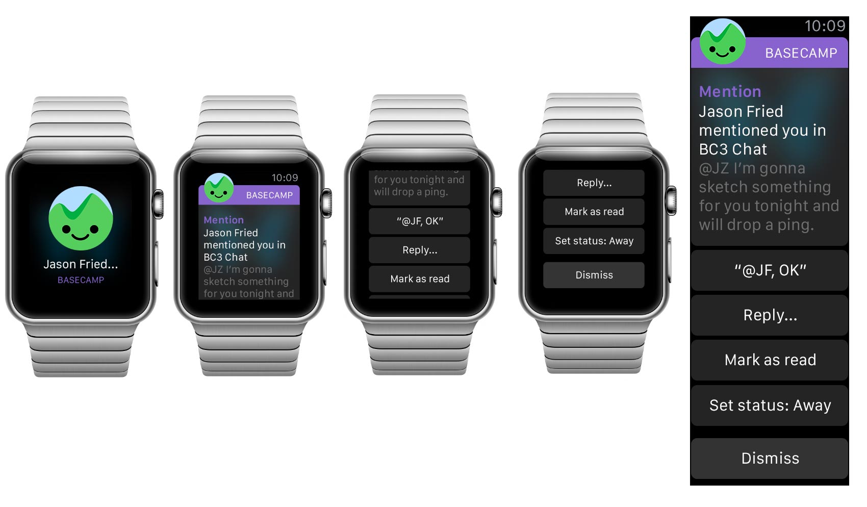
Canned, quick-reply options could be great. I also like the idea of setting your status as an option when notifications start piling up.
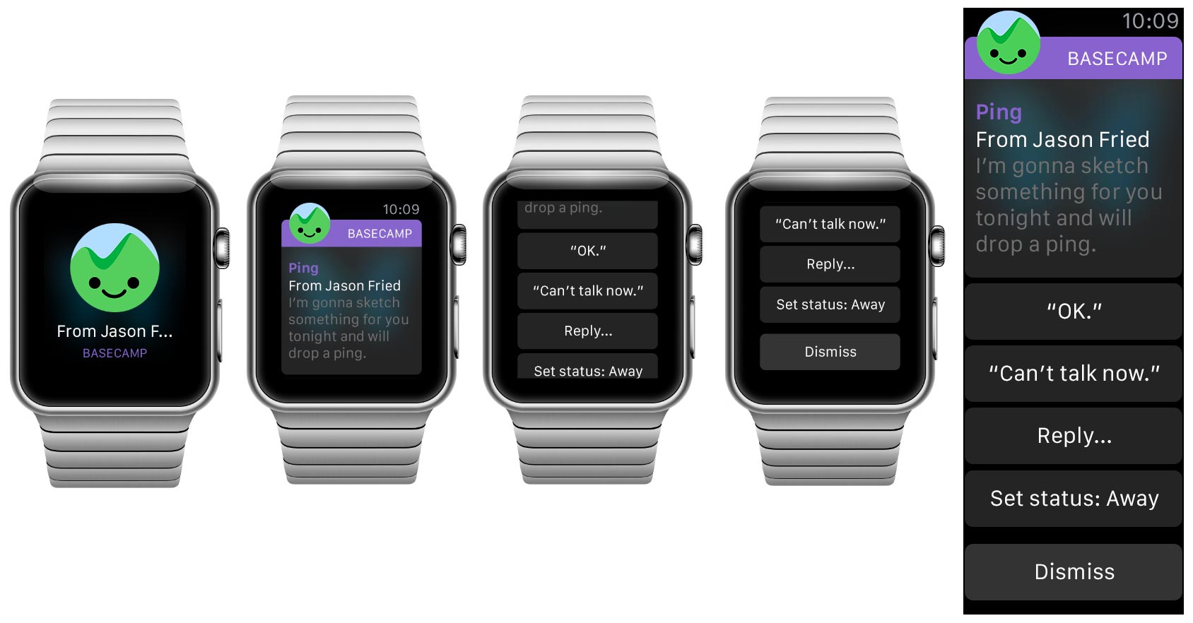
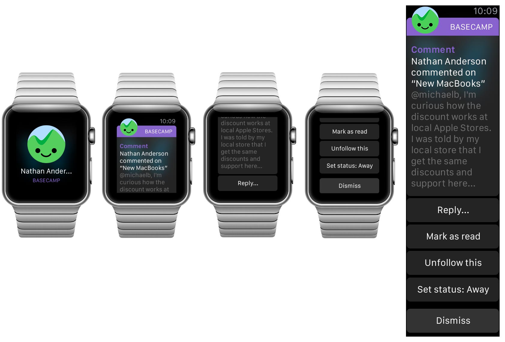
It’s interesting how the actions can change depending on what kind of communication it is—there are a ton of possibilities. Comments, for example, could offer “Stop following” or “Bookmark” (not shown).
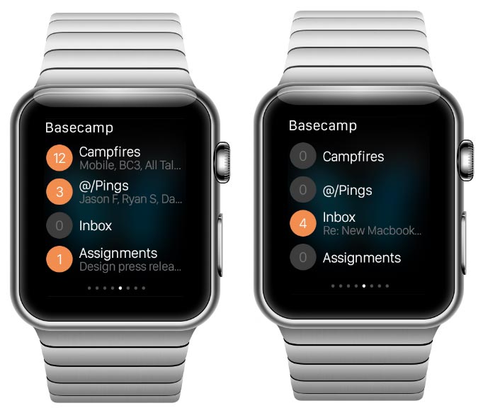
Glances are for quick information display, a great place for state-of-the-world type content. This glance answers the question, “Is anything new in Basecamp?” by showing what’s new for you by bucket and how many items are in each.
Notifications and Glances are outside the WatchKit app, itself. Here are some additional sketches showing how full a WatchKit app could look:
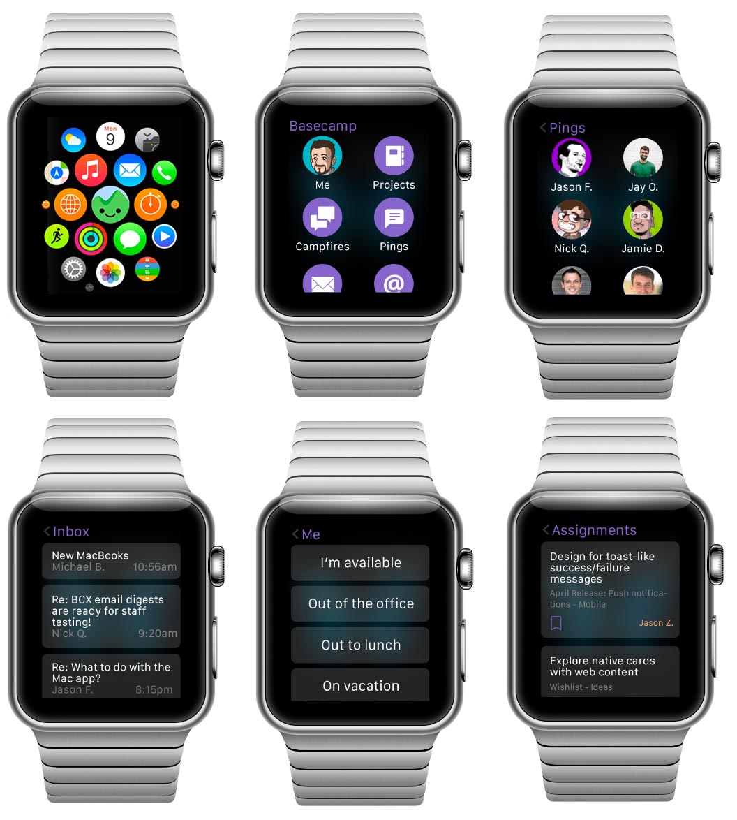
I went into this skeptical but came out convinced there is a lot in Basecamp that could be useful on a watch. Notifications seem natural, in particular, but any kind of communication has potential. These simple designs use mostly stock UI widgets until we have a better idea what can or should be customized further. We’re certain to have new ideas once we have the device on our wrists.

Fred
on 09 Apr 15“Pings”? “Assignments”?? “Inbox”??? Where these mock-ups created for a different version of Basecamp that I’m not aware of?
Pascal Laliberté
on 09 Apr 15Campfires huh? Hrmm…
Lachlan
on 09 Apr 15It looks fantastic, but I’m really confused by the copy. Are those existing features in Basecamp, or a ideas/a combination of several Basecamp/37S products?
Chad J
on 10 Apr 15Can you show me what it looks like on the Apple Watch Edition? :)
Beth
on 10 Apr 15Yes please, yes please make a Watch edition. Already love Basecamp on the phone…would love to get notifications on the Watch I just ordered too. Basecamp is the handiest collaboration tool I’ve found, and just keeps getting better.
Eml
on 11 Apr 15@Lachlan It’s the upcoming Basecamp 3 which includes real time chat, an email client and gantt charts (based on the screens in this post). It will be nice to have multiple instances of messages/files/assignments instead of the combined everything in on one page which is the case with the current BC version.
Bubba Watson
on 13 Apr 15@Pings are amazing. They helped me win 2 Masters… oh wait, those Pings aren’t clubs?
P
on 14 Apr 15Basecamp are secretly working on a new version of Basecamp…shhhh
Random
on 14 Apr 15The ‘face logo’ is absolutely awesome…
David Martinez
on 16 Apr 15Really nice initial pass. I’m working on an Apple Watch graphical library now, so this was very helpful. Thanks.
Juan
on 16 Apr 15This is a scary path to thread. I mean, how critical is a project supposed to be that you can’t take the time to check in your phone or laptop for updates? I can understand the intellectual attractiveness of thinking about new UX for the apple watch. But how far are we going to take this notifications thing? First there was email, then sms, then growl notifications, then push notifications. Is it gonna be in my dreams in the future? How much notifications do we really need?
This discussion is closed.