
I've been exploring Medium as a new channel for my writing. It's a pretty place to read and share my thoughts – though still written on Draft :) – and getting more and more popular. Yesterday I shared a post: Poison, which received some nice traffic and shares. A couple people began to comment. And that's where I started getting confused.
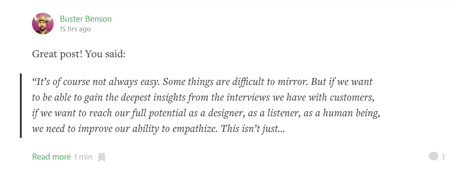
There's a comment, what Medium calls a "response", but it's not the full comment. In fact, I have to click Read More just to get to the meat of it. When I read the comment and wanted to respond, that even was a new affair, encouraging me to Publish or go Full Screen:
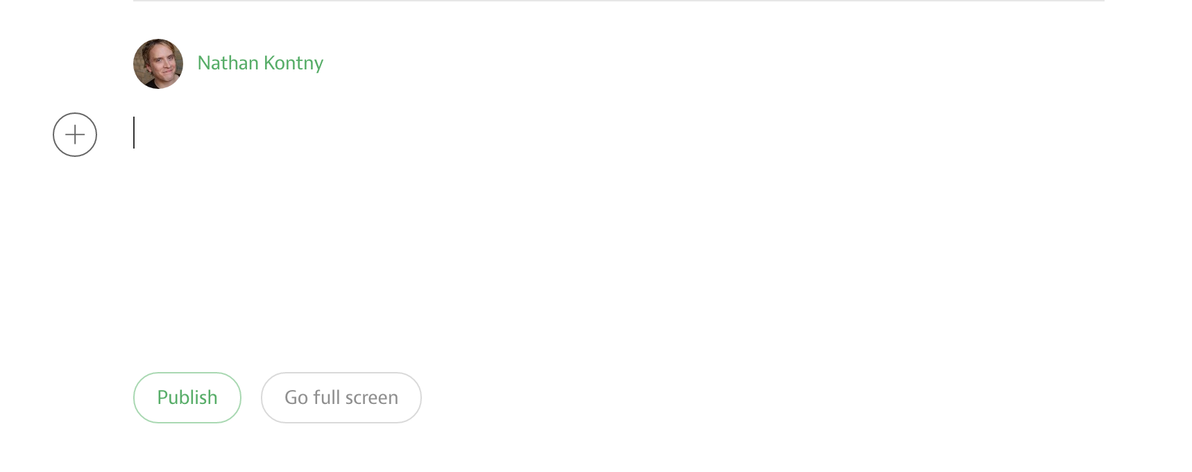
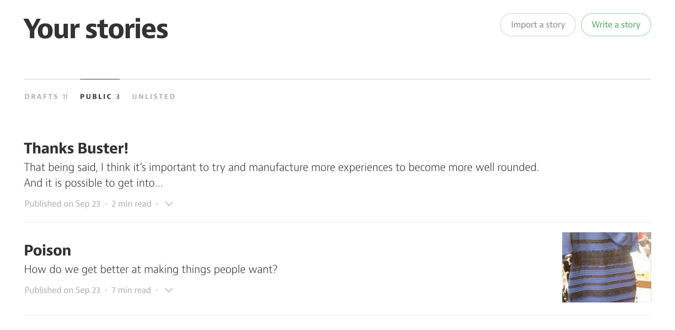
And then I realized even more what was about to happen from that Publish button: I was publishing this "comment" as a full fledged story in my profile. That top story is my "comment" back to Buster.
Huh, that was unexpected. It's confusing because it doesn't follow most expectations we have for reading or creating comments on the web. Most comment areas on the web all look the same. From Reddit to Hacker News to comments on blogs. We can expect to read them fast, reply to them quickly, and see a ton of them at one time. They have a design pattern.
But where has that gotten us?
Comments are proof most people don't read the articles.
— Jeffrey Zeldman (@zeldman) September 20, 2015I really have to beat this into my head: Don't. Read. The. Comments.
Ugh, people are horrible.
— Laura Rueckert (@LauraRueckert) September 24, 2015
Have we just designed for this? Our comment boxes are small, distracted, usually anonymous. Easy to pound out knee jerk reactions. They don't have a "draft" mode, so "You better not sleep on the idea. Create comment now. Ask questions later."
But Medium has taken a completely different path. Reading a comment takes more work. It forces me to remove myself from distractions on the screen just to read the whole thing. Replying encourages me to step back and think about what I'm writing as if I'm publishing my own article – because I am. My profile exposes my comments as first class thoughts. They aren't buried in some sublink of a sublink from my profile.
While replying to Buster I took extra time to chew on his question and was more careful in how I replied to him knowing more people would potentially see it since it wasn't buried in a comment thread.
What seemed confusing because it didn't follow a common pattern is actually a great and innovative design. Something many of us should pay a lot more attention to.
As we're designing something, are we just cargo culting an experience we take for granted somewhere else? Do we understand the actual job someone wants to do with the thing we're designing? Are we designing to be consistent with a pattern our users expect at the expense of figuring out how to help them kick more ass?
P.S. In a recent late night chat Jason Fried and I spoke about design challenges like the above.
You should subscribe to our YouTube channel.
Or, if an audio only podcast is your thing, grab our RSS feed.
And let us know on Twitter about things you'd like us to discuss.
This discussion is closed.