Digg

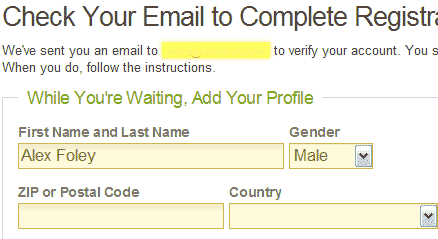
Alex Foley on Digg’s “While you’re waiting, add your profile”:
Excellent way to avoid having a longer signup form. I filled out the second part without even thinking.
The Nonist

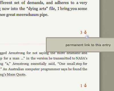
The Nonist blog gets aquatic/literal with its anchor icon.

Joel writes:
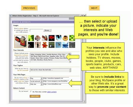
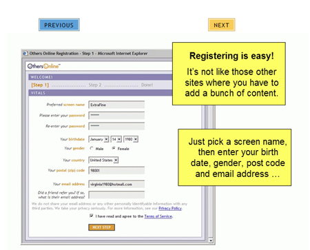
I was looking at the Others Online product tour and found these two screens. They say: “Registering is easy! It’s not like those other sites where you have to add a bunch of content. Yeah, you just have to enter a screen name, password, birthdate, gender, country, postal code, email address, a friend’s email address…And then upload an image, type in your interests, your tagline and your various web addresses. Sure, it is (unfortunately) fairly standard to ask for all that on registration pages, but what’s interesting is that they claim to be very simple and better than “those other sites”.
Got an interesting screenshot for Signal vs. Noise? Send the image and/or URL to svn [at] 37signals [dot] com.


Jeff
on 18 Oct 06This guy beat yah with the anchors! :-)
micah
on 18 Oct 06woo, go digg!
i’m a fan of the “one click will get you pretty much anything” interface digg has.
Brandon
on 18 Oct 06I digg the digg one. The last one made me laugh.
Nathaniel
on 18 Oct 06Oh yes, I digg Digg’s usability.
Tim Goh
on 18 Oct 06The Others Online product tour… did they get those yellow arrows straight out of an office suite?
Tis a shame… they have a pretty decent design, and someone ruins it by putting autoshapes on top of it in the tour. The designer must be seething.
Punctuation pedant (it’s the grammar nazi’s day off) alert: you’re missing a quotemark in there—the one that matches the quote mark before “Registering is easy”
Des Traynor
on 19 Oct 06Registration is a total deal breaker for me, if its complicated I am gone. Gone Gone Gone.
Thats why I signed up to reddit immediately, it’s one step. Pick a username and a password. Press Ok. You’re done!
I did a quick comparison of 2 sign up forms on the first episode of Usability Reviews. Web Usability In Review #1
Hatim
on 19 Oct 06The signup process needs to be the simplest part of any site, how many times i just navigated away because of some 3 pages form that asks about pretty much everything, even the dog’s name in case you forget your password.
That’s simply telling your users to go away! When will we learn.
Eric
on 19 Oct 06Long live Digg!
(Alex Foley is a god.)
pete
on 19 Oct 06i use roboform and it removes all the misery – their web plugin does all the work
http://www.roboform.com
Jan
on 19 Oct 06The idea with digg’s registration goes hand in hand with granting direct access to a service after the registration form was filled out. The user then has an x minute timeframe where he can do non-(business-)critical stuff until his confirmation arrives.
Won’t work with amazon though, of course. But when using a service anonymously for a few minutes can’t cause any harm, why not let the user in immediately? I often find myself less eager to do something after filling out a form and waiting for mail. Every now and then I just don’t register and go away.
Jan Lehnardt
on 19 Oct 06Congrats on the new very snappy comment system!
And sorry for the off-topic post, feel free to remove it.
Alex Foley
on 19 Oct 06I think what also made me fill out the second part of the form was that the registration system was just so darn quick. The response from Digg’s servers (as one would hope) was stunningly fast… When there’s no waiting, people don’t get anxious to run to their email for the registration code.
Scott
on 19 Oct 06Thats why I signed up to reddit immediately, it’s one step. Pick a username and a password. Press Ok. You’re done!
I do wonder how many “junk” accounts they get from people who do have an account but just mistype their username.
Tony Chester
on 25 Oct 06I’ve had too many clients want to capture all the info they could on the sign up pages. I try to explain to them, make it simple and quick to get them to sign up. Throw your other 100 questions at them AFTER they register.
Ankur
on 26 Oct 06For some sites, registering is more of a pain, and of no benefit to the user (e.g. Nytimes.com). For cases like this, there’s www.BugMeNot.com.com
Anonymous Coward
on 26 Oct 06Sorry, I thought it would automatically make it a link. Link
This discussion is closed.