Cork’d Blog

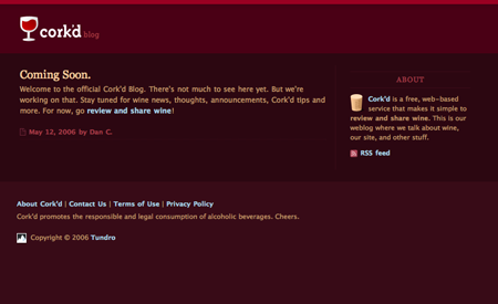
The original corked blog had a Cabernet color scheme…

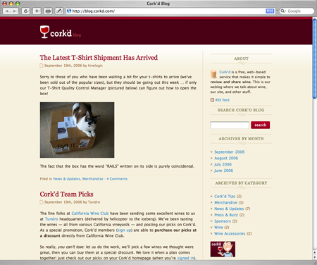
...but now it’s more Chardonnay. Could it be that light type on a dark background doesn’t age too well? Fwiw, Apple’s decided the cool factor of a dark background is worth the legibility cost at its MacBook Pro and other screens.
T-Mobile

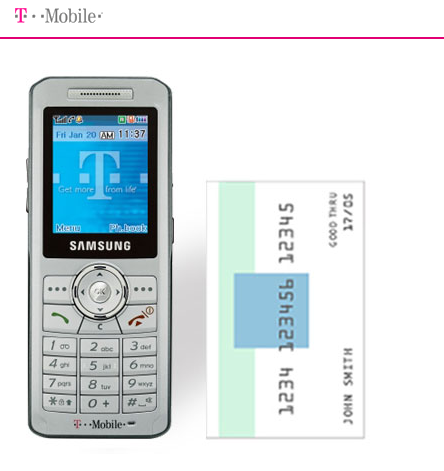
T-mobile gives credit card context to demonstrate phone sizes.
Safety scheme
 Needapresent.com is trying to make you feel safe with this badge. But first off, the headline (“Internet shopping is safe.”) is a bit too sunny. Reminds me of the old addage that whenever someone insists they are your friend it’s a pretty good sign they probably aren’t.
Second, an unknown acronym (ISIS) and the word “scheme” aren’t exactly great ways to instill confidence. Might as well talk about the site’s great “PTHX security racket.”
The Fart Button
Online advertising reaches new lows (too painful to show here). JSM writes, “I know I know, ads like this are easy to take for granted, but I
stopped and had to think of the person who actually had to sit and make this.” Coming soon: The pull my finger pulldown.
Got an interesting screenshot for Signal vs. Noise? Send the image and/or URL to svn [at] 37signals [dot] com.

Dan Boland
on 26 Oct 06I agree that the original Cork’d blog color scheme wasn’t too conducive to readability, but I disagree that light gray type on a black background is inherently hard to read. (Then again, I have good eyesight.)
Hanna
on 26 Oct 06Cork’d has a bunch of content now. The colors are sultry and cool for sure, but if you’re drinkin’ wine and reading his blog, you’ll probably appreciate the new colors.
just me
on 26 Oct 06Lately, it seems that reading black or grey text off of a white background causes more strain. Just me, I suppose.
Ryan M
on 26 Oct 06Fart button. Ha! Seen it. I Clicked it. Looking forward to the “pull my finger pulldown.”
Nathan
on 26 Oct 06The worst thing about that fart button ad is that it didn’t bring the goods when I clicked on it in the wild. :(
FJ
on 26 Oct 06A common mistake when using light text on dark backgrounds is to simply reverse the color scheme – think white on black – which can indeed hurt the eye quite a bit. In our experience, softening contrasts can make such schemes just as enjoyable, if not more, than traditional black on white. Of course, “light something on dark something” should not be taken to the extreme. But if more designers took the time to “take off the edge”, I’m ready to bet such color palettes would be much better received.
A lot of books for big readers – think researchers – here are published on light yellow paper with dark gray ink. Not neon yellow like cheap pads, of course. The contrast is taken down compared to regular books and yet, the result is a lot easier to read over long periods of time.
Travis Bell
on 26 Oct 06Hehe, re: The Fart Button.
Our company just did a fairly huge campaign for a company here in Calgary with, you guessed it, farts at its center. The site is located here: http://www.makemoregas.com/
While I understand it is a lower sense of humor, it was still awesome to be involved designing it, and as work needed to be done in the office having a “fart attack” showdown where whoever had the lowest score was forced to do the grunt work.
On that note however, yes ads in general—not very engaging or interesting.
Mark Webster
on 26 Oct 06“…ads like this are easy to take for granted, but I stopped and had to think of the person who actually had to sit and make this.”
We’ve all had “Fart Button” projects at one point or another…
There’s a new term for you:
Fart Button: a demeaning design project/assignment done only to help pay the bills.
Nick
on 26 Oct 06The acute customer must guess that ISIS is that reassuring “Internet shopping is safe” depicted above and after that he must have no doubts at all when entering credit card details.
Barry
on 26 Oct 06I have to disagree, reading on a stark white background with black text is like staring at a light bulb. In my opinion, a dark grey background with a lighter grey text is the tops.
Cameron Fleming
on 26 Oct 06I see your points about needapresent.com, but in British English the word “scheme” does not necessarily have the same negative connotations it does in North America—see “scheme” here. On the other hand, if they were marketing to North Americans this would definitely be a problem.
Dan Cederholm
on 26 Oct 06Funny enough, the real reason for the color swap on the Cork’d blog, was to unify the background colors of both the site and blog. Sharing art, sponsor logos, etc. on both proved much easier this way. I actually miss the Cabernet color scheme - but it was laziness - no, efficiency that won.
Glad to see it was captured!
Justin Bell
on 26 Oct 06I keep seeing complaints about black text on white backgrounds. I’ve never had a problem with this. I think that people who do may have their monitor set too bright.
When I see bright text on black, my eyes hurt and when I take my eyes off the screen, I see lines everywhere—clearly not a good sign.
Of course, if the problem was screen brightness, then surely the bright-on-dark fans would notice the line effect even worse? Anyone have any ideas here?
Anyway, I set my IRC client and terminal window with a light gray on dark gray scheme—it works quite nicely, but not something I’d use on most websites, despite my fondness of gray.
Justin Bell
on 26 Oct 06There’s probably a couple of other things at play here, too: People on CRTs with low refresh rates. And people who like to sit in dark room, with the only source of light being the computer monitor.
Brian
on 27 Oct 06RE: Fart button Maybe not a pull my finger pulldown, but close: http://www.morningtoast.com/pmf.swf
Mo
on 27 Oct 06Speaking of using the credit card to give an example of the measurements of a phone, I was watching the Apple Keynote when Steve Jobs introduced the iPod and he compared it to the size of ‘Bicycle’ playing card case. Wonder if the popularity of ‘Bicycle’ brand playing cards went up after that event.
iPod Keynote on YouTube
Shawn Oster
on 29 Oct 06There is of course one of the most tricky issues: preference.
The first commentor said he liked light text on dark background’s and that “he has good eyesight”. I have great eyesight but I still hate light text on dark bg’s. Some people have a hard time switching from the two as well. Stare at a light fg/dark bg for an hour, then switch to a dark fg/light bg and some people’s eyes will freak out, other’s will be just fine and that has nothing to do with eyesight.
It’s funny to watch people debate the merits of this back and forth when there are color schemes in both camps that work fairly well, yet it still often comes down to what “feels” right. Like in most of design there are no “right” answers.
Don Schenck
on 30 Oct 06I prefer red wines.
Just sayin’
This discussion is closed.