New York Magazine
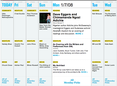
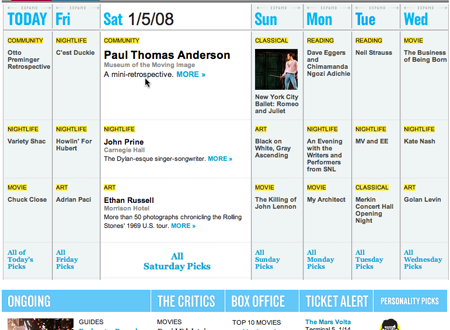
New York Magazine’s Agenda calendar shifts focus depending on which day you mouseover.
WellStyled.com
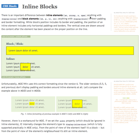
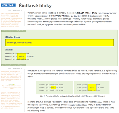
Check out how the two languages are swappable at WellStyled.com. The sidebar is in Czech but if you click it, it swaps with the English. Even the nav changes too. And it sticks as you move through the different pages.
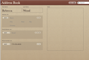
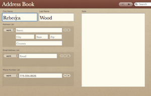
Bento
Here’s how Bento combines Address Book show and edit states.
Have an interesting link, story, or screenshot for Signal vs. Noise? Contact svn [at] 37signals [dot] com.

Brandon
on 07 Jan 08Anyone know what NY Mag is using for their agenda? Seems like a pretty great solution…
Brian
on 07 Jan 08@Brandon Not sure about NY Mag, but you may want to check out MooMonth for similar functionality.
RF
on 07 Jan 08I highly approve of Bento’s combined view/edit screen.
I generally wonder what Web apps today can learn from old-school recordset-editing interfaces. For instance, master-detail views seem like a handy way to review and edit lots of records within one screen. Similarly, I think desktop apps’ tendency to put controls in a fixed place on the screen - where they can’t scroll away - is often the Right Thing, and is one way the Yahoo Mail beta beats GMail, even though I like GMail better overall.
dusoft
on 07 Jan 08I am glad WellStyled technique has been mentioned here, I have perceived it long time ago as being really innovative.
Alex
on 08 Jan 08Brandon – looks like good old tables with some JS in the mix. Not an expert with the JS looks like the yahoo (YUI) Library which is a set of utilities and controls, written in JavaScript.
HTH
Jose Espinal
on 08 Jan 08That agenda might need some transition effect for smoother feel…
scott
on 08 Jan 08@jose espinal: ach, no. extraneous transition effects add delays to otherwise responsive applications.
in most cases, transition effects are only necessary when it’s not otherwise clear what action has taken place. like when removing an element from a page. even then, it’s best employed as a stopgap until a better solution is devised/implemented. (for example, a notice of what was removed with a button/link to undo the removal is more useful.)
scott
on 08 Jan 08mind, delays aren’t inherently bad. without the slight delay they’ve implemented for mouseovers, the interface would be oversensitive or, worse, confusing.
This discussion is closed.