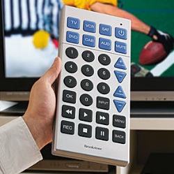
Super-Sized TV Remote: “With giant buttons, this extra-large remote is easy to use and impossible to lose.” Even with all that room they still need to use acronyms (e.g. CAB and AUD) instead of full words?

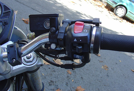
No Ideas But In Things says, “Probably a lot can be discovered and utilized from the multiple buttons and levers of a typical motorcycle’s hand controls. Imagine a mouse as functional.”

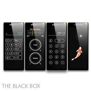
The Black Box (concept): “The Black Box concept is to recall and respect the classic long-time conventions and real-world experiences of using various common tools and devices; keep only the meaningful and minimal interface elements to fulfill the maximal user desires.”

brad
on 27 Oct 06Probably a lot can be discovered and utilized from the multiple buttons and levers of a typical motorcycle’s hand controls. Imagine a mouse as functional.
They’re kidding, right? I find it interesting that on a digital camera I want buttons for everything that I commonly use, but on a mouse I only want two buttons and no more. I actually have a keyboard that has buttons to control music, to lock my desktop, to go to Word, Excel, the calculator, my email program, and my web browser, plus it has forward and back buttons for my web browser, but I have never used them. I actually prefer using menus or keystroke commands on my computer, whereas I hate using menus on my camera.
Daniel
on 27 Oct 06Ever since I first saw the Black Box concept, I’ve been a little smug, since the design comes quite close to something my group and I presented to a large Danish electronics manufacturer as part of a student project (we ended up with a very different design, though). Of course, our renders weren’t as aesthetically pleasing, as this was all early in the process. However, it’s a bit much when they say it has “minimal interface elements” as its interface is virtual, so it depends on what’s on the screen. For instance, a ticket vending machine can be pretty complex, even if its only physical interface element is a touch screen.
Also, I do think that Jobs would dislike a mouse with as many functions as the motorcycle’s handle. It after all took over 20 years before the Mac’s mouse got that extra button. Still, I see the point
Ashe
on 27 Oct 06Chances are, if you need a giant remote, you need large letters.
Dave
on 27 Oct 06You can tell the Black Box is awesome; they’re so cool they resize my browser for me for optimal viewing of their site. Too bad if I want the browser to be MY size. Obviously they know what’s better for me.
Sometimes enforcing constraints does NOT make for a good user experience. They need to heed their own advice and “fulfill the maximal user desires”.
Joshwa
on 27 Oct 06The Black Box reminds me more than a bit of the Optimus Keyboard (and his new project, the Upravlator).
Adam Villani
on 27 Oct 06So they make a giant remote, but it uses primitive 1989-style design? You do know that they make remotes with much more intuitive designs now, right? http://www.uei.com//category.php?page_id=67
Patrick Lafleur
on 27 Oct 06I just bought a Kameleon universal remote control. It only shows the applicable controls based on the selected device. http://www.ofausa.com/k_demo/index.html. Very simple to use, very effective.
When you compare that to more “advanced” universal remote controls where all the possible buttons are all cramped on a single remote http://www.logitech.com/index.cfm/products/productlist/US/EN,crid=2080&categoryid=406.
I really like the concept of Black box interface, less buttons is so much more effective.
Splashman
on 27 Oct 06One note about motorcycle controls: All four limbs are used. In a car, unless you’re driving a stick-shift, you can mostly get away with one hand and one foot (I do, anyway). With a computer, there are two idle limbs as well.
(I’m not making any suggestion in particular; just sayin’ . . .)
Splashman
on 27 Oct 06Patrick, I can see the advantages of Kamelion-type remotes, but there is one significant disadvantage that (for me) would outweigh the advantages: I’d have to look at the remote before I pushed a “button,” since I couldn’t feel the shape/size. Just like on a keyboard, when I grab a remote, the first thing my hand does is search for the “home” position, whatever that may be on that particular device. If the Kameleon’s virtual buttons were larger, the case shape might provide that “home” reference, and muscle memory might eventually take over, but for me (and, I think, the average consumer), the concept is fatally flawed. There is a market, though: enthusiasts are willing to put up with just about anything.
John Lein
on 27 Oct 06The more I look at that remote the more I feel the designer (?) really missed out on a lot of opportunities. There’s a lot more to making something easier to read than the “make it 3 times as big” stategy.
What about color? What about button size, shape, placement? I agree that acronyms are better than spelling out words (size), but wouldn’t icons be better in this case (not always the best choice, but this time it would be more readable imo).
Why is Mute grouped with Power and Devices instead of Volume? Etc…
Plus, it looks awkward to use simply due to size – I mean that thing is huge! You’d have lay it down on your lap and hit the buttons. The elderly audience I assume they’re targeting probably wouldn’t have the grip strength to hold the remote still while pushing some of those buttons on the outer corners, due to distance/leverage (probably tire my hands out too).
Killian
on 27 Oct 06I really don’t like the remotes without real buttons – I think the Black Box is cool for a multi function portable device but with a remote I want to touch real buttons.
While we are on universal remotes- I just got a Harmony 550 and am totally impressed with it.
Not too expensive ($99) very easy to use/set up, it is totally customizable to however weird your components are thru an online DB. My girl can now watch DVDs- watch a DVR- cable whatever without calling her personal support line (me) to walk her thru changing the inputs.
Yea I’m loving it….
Scott
on 27 Oct 06Isn’t there already a universal remote that is just a touchscreen with downloadable skins for each device?
Adam
on 27 Oct 06Motorcycle controls are built this way for a few reasons. One, they’ve been built this way for 30 years and follow basic conventions. Two, you can’t really take your hands off the handle (especially your right, the throttle) so you need everything in one place. Three, all the buttons are thumb-centric because your fingers are either braking, using the clutch, or both (and sometimes you’re braking, pulling in the clutch, and hitting a turn signal while modulating throttle and using your right foot for the rear brake…).
One thing not mentioned about that picture is the only button you use while riding is the turn signal which is the switch with the hazard icon above it. The red button is the kill switch and the bottom button is the starter.
So really, motorcycle controls aren’t that great! I can do a heck of a lot more with one hand on my Logitech mouse than I do with both hands on my Suzuki.
Anonymous Coward
on 27 Oct 06Hear, hear. Tactile feedback is very important.
Emir
on 28 Oct 06isn’t Apple trying to patent something similar for &ldquofuture iPods”?
Martin
on 28 Oct 06Well, I friend of mine connected two foot pedals to two keys to do strafing with the feet in Unreal Tournament. He was the headshot king as well. Best of all, he once studied religous science (catholic I believe) and learned to play the organ (thus the pedals).
Adam: And the left foot to shift down while doing all of the above :-)
Chris
on 30 Oct 06Motorcycle controls are quite easy to master. In the course of a weekend I went from a complete novice to a competent rider by taking a Motorcycle Safety Foundation course. I’m glad that I took the course, but it illustrates a point about motorcycle controls; I would have been lost without the class. Sometimes good designs still require training to become an expert. Look at Vi, Emacs, and TextMate: all what I consider to be excellent text editors. All have a learning curve to become proficient at them. 37 Signals touts simple design as good practice, but simple isn’t always better.
Mark
on 30 Oct 06It looks to me like the Apple patent is about adding something that touchscreens do not have but screen+cursor+mouse does have – a rollover state. That would help with some touchscreen usability problems (“where am I about to ‘click’?”). Also, it will be slick to be able to morph from a d-pad/wheel GUI to a touchscreen GUI depending on where the user’s finger is.
cjcurtis
on 01 Nov 06these people kinda remind me of artists that swirl white paint on a white canvas and call it “art.” nothing personal against you “white on white” guys, but get real.
first, the controls on a motorcycle all have a necessary function. without one, it does not work properly. my mouse has two buttons and a wheel, which i control with my index and middle finger….the other three fingers move the mouse itself…and i’m fresh out of fingers. all you’re doing is making a more expensive piece of junk.
as for the gian remote…as long as we’re discussing “ease of use,” i would point out that this is the first remote i’ve ever seen that seems impossible to operate with just one hand.
This discussion is closed.