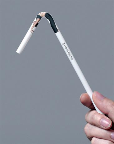
A clever yoga center straw.

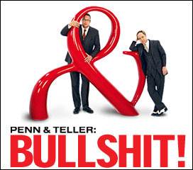
This image for Penn & Teller is a nifty representation of the duo. The ampersand, usually a throw away character, becomes the star here with elements that match the performers’ personalities. The fat, curvy, loud part of it evokes Penn perfectly while the quiet little extender fits Teller to a tee.
(Aside: Where does the phrase “fit to a tee” come from? A couple of theories.)
If you dig this sort of witty design, check out the book A Smile in the Mind. It’s a neat resource for playful, creative design.
This book explores witty thinking — the most entertaining area of graphic design. Witty thinking is playfulness with ideas, words playing against images, unexpected connections prompting new insights. It is clever thinking, not funny drawing.

victor
on 13 Nov 06fantastic! finally a 404 that actually informs you!
http://www.phrases.org.uk/bulletin_board/12/messages/404.html
John Rhodes
on 13 Nov 06Love that pencil.
I have no idea why, but this posting reminds me of M&M’s dark chocolate campaign…
http://us.mms.com/us/dark/index.jsp
It also made me think of Sony’s bubblewrap campaign… http://www.gooduse.co.nz/thegoodnessarchives/000345.html
Mrad
on 13 Nov 06That straw rocks. I bet it’s a bit pricey to make though.
matthew
on 13 Nov 06Nice. Great idea. Only made better if used on something yoga-related.
The straw reminds me of those pens that had the effect of revealing a portion (usually some naughty bits) when turned upside down.
manuel martensen
on 13 Nov 06bought.
Cheshire Dave
on 13 Nov 06An ampersand as the main design element is dear to me as well.
Peter Cooper
on 14 Nov 06My first guess is it was something to do with the golf ball resting on the tee, but guess I’m wrong ;-)
MJ
on 14 Nov 06Fits to a tee explained here: http://www.worldwidewords.org/qa/qa-toa2.htm
Basic answer: no-one really knows, but it’s centuries-old.
Prophetess
on 14 Nov 06For “fit to a T”, you may also want to consult World Wide Words entry http://www.worldwidewords.org/qa/qa-toa2.htm.
Andy
on 14 Nov 06I’m not sure I would say that the ampersand is a “throwaway character”—I would actually say that it often tends to be one of the most interesting characters.
Jack Goodby
on 14 Nov 06Don’t know if it was intentional but the representation of the ampersand reminds me of a bull, or at least the zodiac symbol for taurus (allbeit inverted) http://en.wikipedia.org/wiki/Taurus_%28astrology%29
SteveC
on 14 Nov 06“We at Showtime Online express our apologies; however, these pages are intended for access only from within the United States.”
lame beyond belief.
This discussion is closed.