Steve Duenes, graphics director for The Times, recently answered reader questions at the site. In one answer, he talked about striving for “daily graphic excellence” that educates readers without forcing them to skip a beat:
Our criteria for what makes a great graphic varies a little. There are things we attempt, and we hope the result will be spectacular, but we also think there’s such a thing as daily graphic excellence.
It doesn’t do us much good to produce a few splashy graphics but stumble on the smaller, routine things. If a reader can glance at a map or simple chart and quickly orient themselves or understand a statistic, and then continue reading the story without skipping a beat, it means we’ve edited and designed those graphics well.
A nice sentiment all the way around but the part that sticks out to me is the idea that good design makes it easy for people keep the beat.
That seems an especially apt metaphor for web design. By setting expectations, by offering preemptive support (e.g. explanatory text next to a form field), by being consistent, you let your visitors pursue their goals while staying in rhythm.
Some examples…
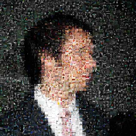
Keeping type in phase
Rhythm can come from a subtle visual thing, like keeping type in phase so it creates a rhythm up and down the page.
Type that’s in phase.
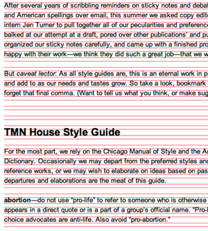
Punchy copy
Or it can be done through smart, informational text that’s short and punchy so it’s easy to comprehend at a glance. That means users can stay on their path instead of having to bail to get more info.
Quick instructive text keeps customers in flow.
Mindless choices
It can be UI options that offer mindless choices, even if that means more clicks. (Following Steve Krug’s advice that any time you give a user a no-brainer decision, without large amounts of stuff they don’t want or need, you’re making their job easier — “It doesn’t matter how many times I have to click, as long as each click is a mindless, unambiguous choice.”)
For example, TurboTax software makes people fill out one question per page for dozens of pages. Most sites would aggregate this data instead of spread it out over so many pages. While it may not be the most efficient method, the TurboTax way definitely gets customers in the flow of answering question and clicking through.
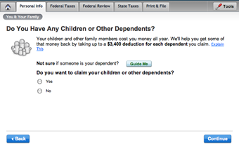
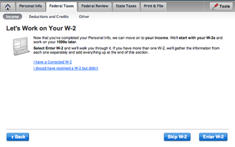
TurboTax goes one question at a time in order to keep customers on track.
Moving target slideshow links
On the other hand, little discrepancies can throw users’ rhythm off.
A pet peeve of mine: Slideshows on the web where the previous and next buttons bounce around on each page depending on the height/width of the images. You’re forced to recalibrate on each page. “But it’s just a little mouse movement.” Yeah, but your rhythm winds up totally botched.
Click the next button here...
...and it moves down leaving your mouse right over the back button:
Just put the buttons at the top of the page and visitors can keep their mouse clicking without having to break rhythm.
The Pocket
When it comes to rhythm, drummers talk about being in the pocket:
The phrase “in the pocket” is used to describe something or someone playing in such a way that the groove is very solid and with a great feel. When a drummer keeps a good metronomic pulse, often referred to as keeping time, and makes the groove feel really good, and maintains this feel for an extended period of time, never wavering, this is often referred to as a deep pocket…
Today, the term “in the pocket” has broadened a bit, suggesting that if two musicians (usually the bass player and the drummer) are feeling the downbeats together, feeling and placing beat “one” at the exact same time, they are said to be “in the pocket.”
Whether you are playing ahead (front) of the beat, or behind (back) of the beat, or right on top (middle) of the beat, as long as two musicians (ie. bassist and drummer) feel the downbeat at the same time, they’ll be in the pocket.
Many people feel that the question is not so much what the pocket is as much as how you know when you’ve achieved it. To the musician, it feels like the music is playing itself, as though everything has merged together … all the rhythmic parts being played by one instrument.
That’s a great goal for a designer too: create a situation where you and your audience are “feeling the downbeats” together. When you and your users are in sync, everything flows. It just feels right. And you earn a magical result: They start to trust implicitly they’re in good hands and that whatever happens next will make sense.
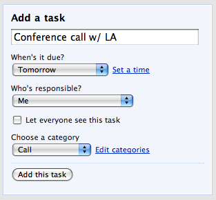
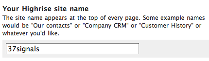
The “Add a task” flow in Highrise has five elements, but the metronome-like pace of it keeps it feeling simple.
Alejandro Moreno
on 11 Mar 08I certainly agree, but must you contract “when is?” =o)
Dan
on 11 Mar 08I have to say that the wandering Back and Next buttons are a major, major pet peeve of mine. If I have to “chase the Next button” the site has failed.
Ricky Irvine
on 11 Mar 08@Alejandro
I noticed this same thing, and then I thought about how a user might actually be using this interface. They aren’t really reading it, but scanning it. And when you scan, word forms stick out. So, you see “When’s” and “due”. If it were “When is it due” there are more forms floating between the keywords.
In real life, I’d be curious to know which form is more clear and effective, but I imagine the difference would be negligible. At least, though, it’s conversational. I like conversational UI.
Thijs
on 11 Mar 08I really agree that rhytm is one of the best ways to accomplish good user experience!
That said, i have to say i think the highrise form isn’t the best example.
It could look much simpler by a few small visual tricks i think, giving the selects a fixed width would make the visual rhytm better. Also, the ‘let everyone see this task’ check looks like it’s belongs to the “who’s responsible” select instead of being an seperate entity.
For the rest, great article! ;)
Ricky Irvine
on 11 Mar 08@Thijs
Oh, that would be a terrible mistake! That would be sacrificing ease of use for a false aesthetic ‘perfection’. I think, with the select-menus staggered, it is quickly — subconsciously — understood (again, by the scanning eye) that they are different from one another, and carry different purposes.
David Andersen
on 11 Mar 08Having all the selects the same size is like CAPITALIZING EVERYTHING. It’s much harder to perceive differences and thus more confusing (and thus more stressful).
Wolf
on 11 Mar 08Moving target slideshow links—> this one bother me a lot too. We have a pagination in our CMS that stays in the same place no matter what. So your mouse can stay in the same position while you browse the page. The next page button will still be in the exact same spot if you press end for instance.
Thijs
on 11 Mar 08@ Ricky & David Personally i think that it’s not the select itself that defines the scannability of a form like this, or any other form, it is the label instead.
‘call’ doesn’t tell me anything, ‘choose a category’ does.
Thomas Allen
on 11 Mar 08I’d go with “when is.” It’s such a minor issue, but it’s probably better to choose the clearer wording. And save yourself from having to encode the entity if you’re using a proper “smart quote” apostrophe.
Seth
on 11 Mar 08I have used TurboTax twice now and loved it…the second time was more confusing than the first because they imported my previous data and had filed stuff for last year that I never did…which was weird, but after I removed that it was great.
I think it’s necessary to use the “one at a time” approach with TurboTax because the information is critical. You could easily misread or get confused by multiple questions, however it would be nice to be able to see all of them at mass after you enter it once.
Des Traynor
on 11 Mar 08Matt this is a really good article, thanks a million for taking the time to write it!
Mitch
on 11 Mar 08I totally agree on the next button thing. It is really annoying when you have to recalibrate every time.
I also like your approach of the more mouse clicks in order o prioritize clear choices. It makes sense once you think about it but it really isn’t the way most interfaces are designed. I’ll have to try this on my next design.
Adaptiv Media
on 15 Mar 08Would have to agree with this one. When I Design Websites I like to keep some sort of rhythm and consistency going throughout pages and channels. I think it’s all part of branding.
This discussion is closed.