You’re reading Signal v. Noise, a publication about the web by Basecamp since 1999. Happy !

Yelp's nice settings toggle

Jamie
Jamie wrote this on 5 comments

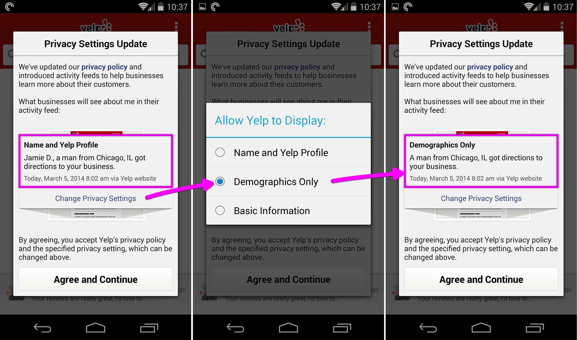
Yelp updated their Privacy Policy so now businesses can get some insight on their customers. The nice thing is Yelp gives you a preview of how your information would appear to these businesses.

You can Change Privacy Settings to toggle between how much info you want to reveal. As a Yelp user I’m not passive in this. I’m given a choice. I thought this was a pretty cool interaction—a nicely done modal.

The Category Moat

Ryan
Ryan wrote this on 15 comments

A few of us at Basecamp became fans of the “job to be done” framework taught by Clay Christensen, Bob Moesta and Chris Spiek. The core idea is that what you are selling and what people are buying are two different things. Understanding what people are trying to do with your product helps you know whether you’re getting hotter or colder as you consider changes to your product.

For example, we think we’re selling a project management product. But some people really use our tool and pay us every month to manage their clients. The projects were always fine—it’s the clients that are a challenge! That’s just one example.

Clay has suggested (eg. here) that when you identify what people truly use your product to accomplish, you protect yourself from competition. He’s a smart man, so when he says something odd like that I try to dig in. I’m starting to see what he means.

It’s natural to identify with a product category. You think “we make product management software” or “we make candy bars” because you have to explain yourself over and over. It’s always easier to use available categories than to invent new ones. It’s just like language. We speak the lexicon instead of inventing words.

But for people who want to innovate, this is a problem. Identifying with a product category is outsourcing your strategy to the past. Is the world really carved up into allowable product categories? No. We are all figuring this stuff out every day. Experience shows that amazing breakouts and surprise successes competed on unorthodox dimensions (see Blue Ocean Strategy for examples).

Bob tells the story of a clock maker. They sell an alarm clock for small kids who started sleeping in their own room. It’s not a normal alarm clock. It has an arrow that points to whether the kid is supposed to be in bed or whether he is allowed to get up. That way he doesn’t go running into his parents’ room until after a reasonable hour.

If you think this product is a clock then it’s in the clock category in the clock aisle with a clock price. But parents who bought the clock said they would pay $100 or more for it because it keeps the kid out of their room. It’s a sleep protector.

So how does thinking outside the category protect us from competition? I’ve been conducting interviews with Basecamp customers, and I’m feeling first hand how tricky it is to think outside of a category. You don’t have a shorthand. You don’t have words and feature lists given to you. It’s like you’re floating out in space with nothing to grab onto.

That’s the key. The fact that it’s so hard to think outside of a category is the moat. Staying focused on why you made the features you did, what specific situations call for them, and how that combo creates progress for people requires diligence and confidence and unyielding attention to actual behavior. Sticking to the truth of the matter instead of the walls of a category keeps you on your own path and away from the pitfalls of conventional thinking. That’s hard to compete with.

App Store Ratings Mystery

Jamie
Jamie wrote this on 32 comments

All software developers want to get good ratings in the app store. That’s how customers judge the quality of your app. The other desirable metric is quantity of ratings—the number of people who have reviewed the app. It’s hard enough to get good ratings, it’s even harder to get a lot of people to review your app.
Here’s the mystery.
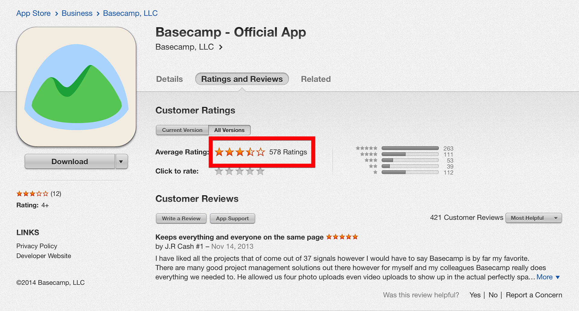
Basecamp for iOS has been out for over a year and has received 578 ratings (as of today).

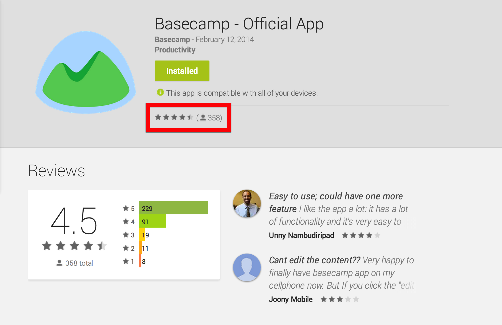
Basecamp for Android has only been out for a few weeks, yet it has 358 ratings (as of today). That’s over half of the number of ratings we got for the iOS version which has been available for over a year.

Do Android users like to review apps? Do iOS users hate to review apps? Is Google’s Play Store designed so it’s easier to rate apps? I have no idea, but I’m curious about this uptick in Android ratings.
What do you think?

Join our team: We're hiring a product designer.

Jason Fried
Jason Fried wrote this on Discuss

We’re looking to add another product designer to our team! We don’t hire for this position often, so we really savor moments like these. We’re eagerly anticipating hearing from you.

Besides design, your job is to make an undeniably positive impact on our company, our culture, our products, and our customers. As long as you make your best effort, and you love to learn, we will do everything we can to support you creatively and help you do the best work of your life.

Product designers at Basecamp are always working on different things. You may be working on polishing up an existing feature, pitching and designing something brand new, or fundamentally rethinking how we do something. You could be working on the web or you could be exploring designs and interactions for a native mobile app. Projects at Basecamp always start with design, so you’ll constantly have the opportunity to lead us in new directions. Challenge us! Push us! Be original and show us the way!

Besides having great visual taste, talent, and the right sensibilities, you must write well-structured HTML/CSS. Basic Javascript or Rails skills are a plus, but not required. Experience designing for iOS and Android is also a plus. Great writing skills are required.

We are not looking for someone who’s already expert in everything they do. We’re looking for someone great who demonstrates the interest, drive, and desire to keep learning new things and continually get better.

At Basecamp you’ll be working with great people. Friendly, talented, original folks from dozens of cities around the world. The people who work here have a wide variety of interests and interesting life experiences. You’ll have a chance to learn from some of the best people you’ve ever met. And we’ll get to learn from you. We’d love for you be part of our patchwork.

Working as a product designer at Basecamp is a unique opportunity. We have a small team, so you won’t be one of dozens. You’ll be one of a few, so your impact will be felt inside and outside the company. You’ll be working on a product that is used by millions of people. You will help drive us in new directions. You’ll help us see things we haven’t seen before, consider things we’ve never considered before, and bring fresh perspective to our team. Brighten us up and put a big smile on our customers’ faces.

You love to write, too. You understand that copywriting is design. The words matter as much as the pixels. Great visuals with weak words are poor designs. You should care about how things are phrased as much as you care about how they look.

We’re open to hiring the best person no matter where they are. If you’re in Chicago we have an open desk for you in our office. But more than half of our company works remotely all over the world, so you’re welcome to be part of the team no matter where you live. If you do want to relocate to Chicago we’re open to that as well.

How to apply

Send relevant work samples, and anything else that will make you stand out, to [email protected]. Extra effort and personal touches will be looked upon favorably. Show us how much you want this job and not just any job. Please include [DESIGN] in the subject of the email.

It doesn’t matter where you went to school, or if you even graduated. It doesn’t matter if this is your first job or your fifth. Doing great work and being driven to improve yourself and everything you touch is what matters.

If we think you’ll be a good fit, we’ll be back in touch with step two of the application process.

Giving less advice

Jason Fried
Jason Fried wrote this on 20 comments

I’m often asked for advice. I’ve decided it’s time I give less of it. There are things I used to know that I just don’t know anymore. I should stop talking about those things – it’s unfair to anyone who’s listening.

If you want advice on product design, copywriting, reducing complexity, business strategy for a well-established small business, or building a team – happy to help. I know I can be valuable there because those are things I’m thinking about and working on every day. I’m current.

But if you want advice on how to start a new business, how to get your first customer, how to hire your first employee, or anything related to starting something brand new, I’m not your man. It’s been 15 years since I started my company. I just don’t remember what it’s like anymore. I’m out of touch.

Advice, like fruit, is best when it’s fresh. But advice quickly decays, and 15 year-old advice is bound to be radioactive. Sharing a life experience is one thing (grandparents are great at this – listen to them!), but advice is another thing. Don’t give advice about things you used to know. Just because you did something a long time ago doesn’t mean you’re qualified to talk about it today.

Think you’ll get a good answer from a 30 year old telling you what it’s like to be 15? Or a 20 year old remembering what it’s like to be 5? Shit, I’m about to turn 40, and all I remember about being 25 is that I wasn’t 26. How clearly do you really remember anything from 15 years ago? And how many of those memories are actually marred by time and current experiences? How many of those things really happened the way you recall them today?

If you want to know what it’s like to start a business, talk to someone who just successfully started one. If you want to know what it’s like to hire your first employee, talk to someone who just successfully hired theirs. If you want to know what it’s like to make an investment, talk to someone who just made a successful one.

While distance from the event itself can provide broader perspective, the closer you get to the event, the fresher the experience. If I want to know what something’s really like, I’d take a fresh recollection over a fuzzy memory. I think the same is true for advice.

Google Play Banner Design

Jamie
Jamie wrote this on 3 comments

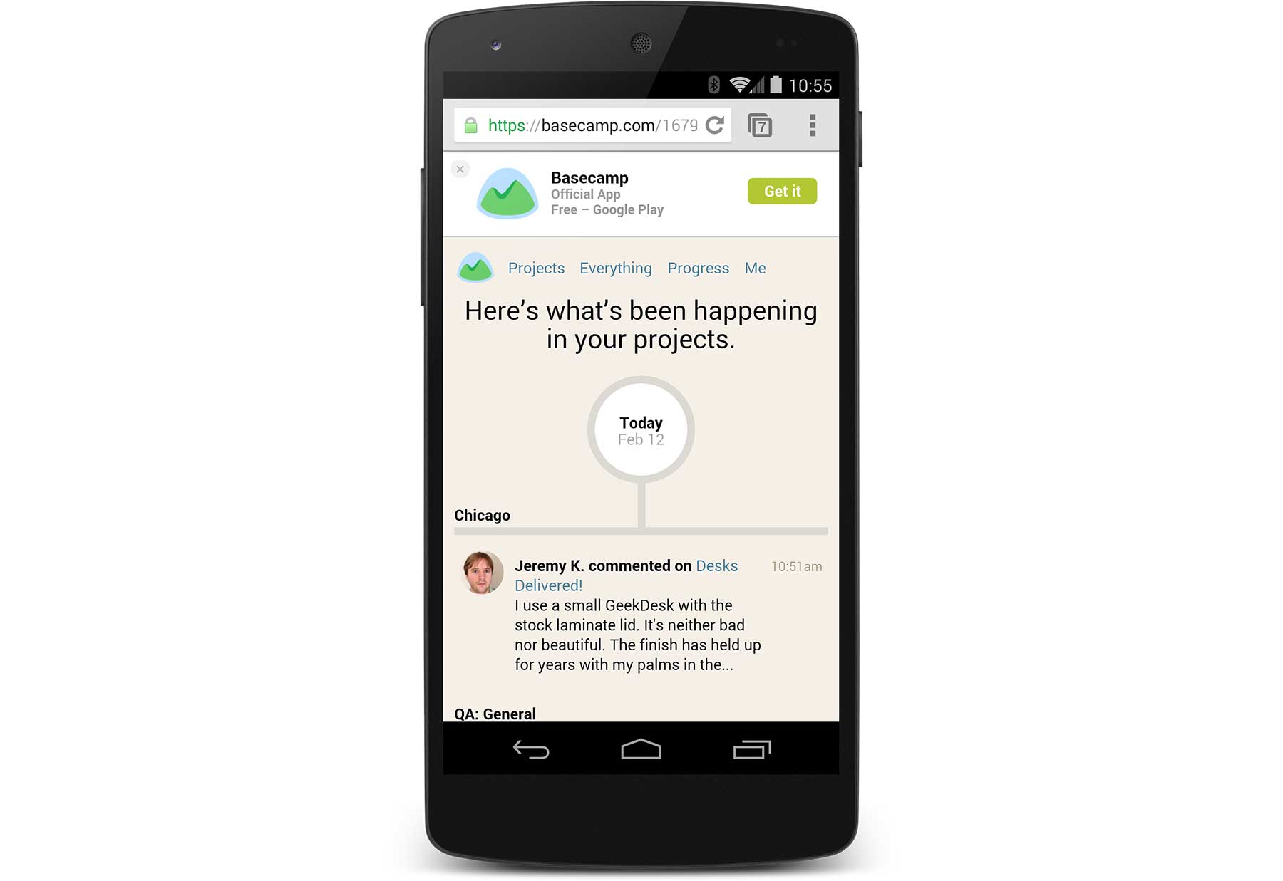
Apple provides a nice “Smart App Banner” hook for developers to promote their iOS apps from within their web apps. Unfortunately Google doesn’t have anything like this for the Play Store. Now that we have Basecamp for Android, we want to promote it to customers using Basecamp on their phone browsers.
Thanks to GitHub there are a few nice solutions:


These combine both iOS and Google Play designs which we didn’t really need. In the end we rolled our own solution, but I based the banner design on Vitaly Glibin’s Smart App Banner.

I uploaded a working version of the HTML to GitHub. Please feel free to use this design to promote your apps in Google Play. Thanks again to Vitaly’s Smart App Banner for the inspiration.
And if you’re an Android user get the Basecamp app on Google Play!

Prophet: My first commercial web site design project (1996)

Jason Fried
Jason Fried wrote this on 22 comments

With the big name change from 37signals to Basecamp, I’ve been feeling a bit nostalgic. So I decided to go back to the beginning and dig up some old work. Thank you Wayback Machine!.

Back in 1996, I landed my first web design freelance gig. I was still in college, so this was very much a part time endeavor. I learned basic HTML by viewing source and deconstructing other sites. I knew my way around Photoshop 3 just enough to be dangerous. So it was time to do some selling.

I looked around the web for sites that I thought I could improve. My interest was in finance at the time, so I reached out to a variety of financial sites. I often sent a short email to whatever email address I could find on a given site. Usually it was [email protected].

I don’t have any of those original emails anymore, but they went something like this:

Hi there-

My name is Jason. I'm a web designer in Tucson Arizona.

I think your site is pretty good, but I think I can make it better. If you'd like, I'd be happy to put together a one page redesign of your home page to show you what I can do. It'll take about a week.

Let me know if you're interested.

Thanks!

-Jason

As you might imagine, hardly anyone returned my email. But a few did. And one of those folks was Tim Knight, the owner of Prophet Information Systems.

Tim took me up on the offer, so I whipped up a quick redesign idea for him. Unfortunately I don’t have that work handy anymore, but ultimately it was good enough for him to hear me out on a complete redesign.

I pitched him a full site redesign (which I think was a few “templates” and a home page) for $600. He bought it. Tim became my first ever web design client. He was the first person to really bet on me like that. I’ll never forget that.

I can’t remember if I met with Tim in person before I delivered the first few design ideas, but we met a few times during the project. His company (which was just him) was based out in Palo Alto. So I’d find some time to head out there on the weekends in between classes. Or maybe I skipped classes, I don’t remember.

We went back and forth via email and phone and finally we landed on something we were both happy with.

So here’s the big reveal. Here’s my first ever commercial web design project from back in 1996.

The home page / splash page looked like this.
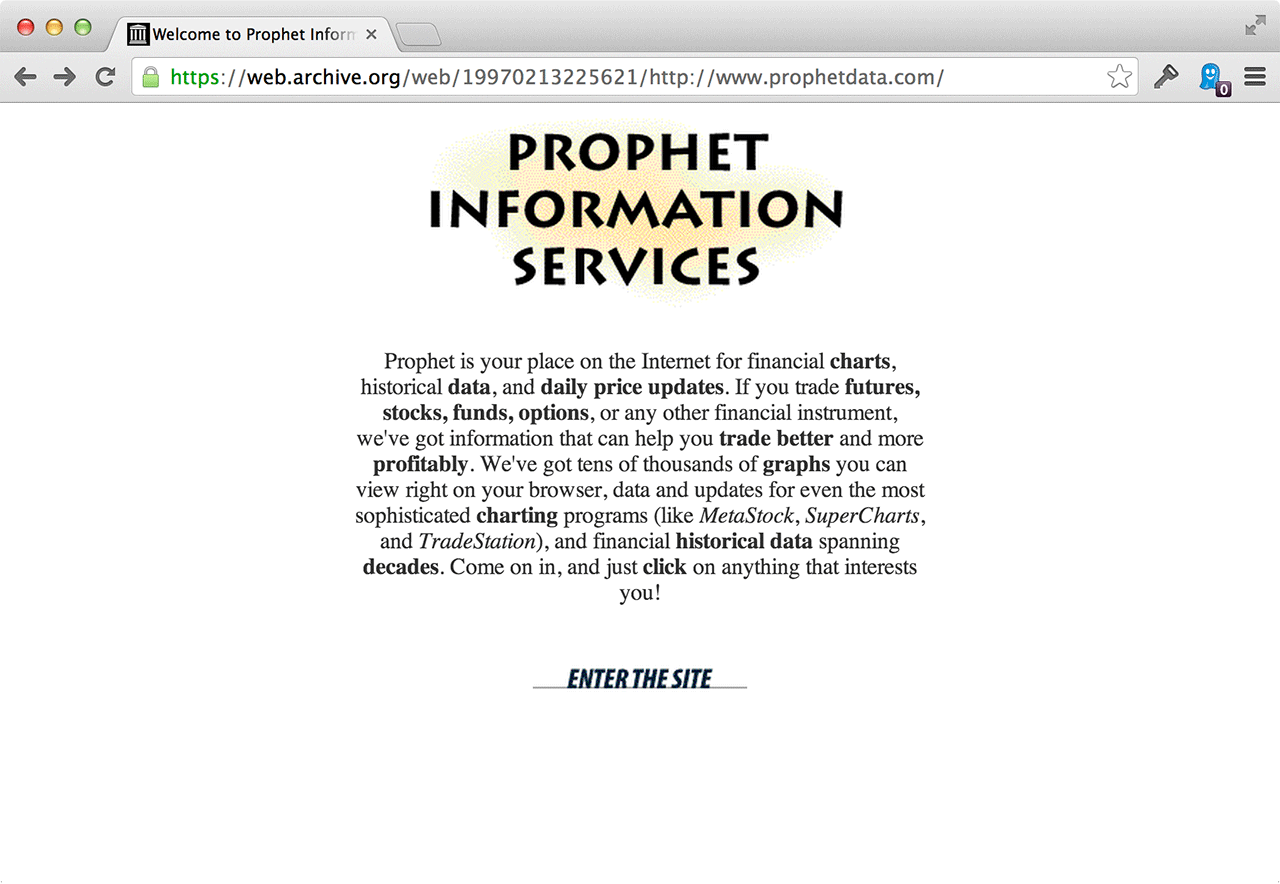
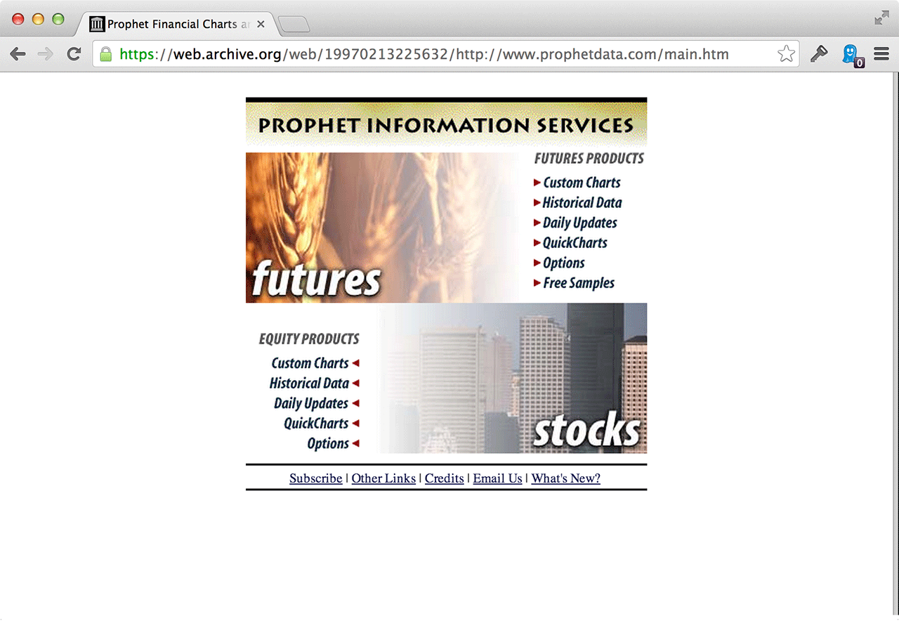
When you clicked enter, you went to a menu page. Remember when web sites had splash pages and menu pages? It was such a simpler, clearer time back then. Here’s what the menu page looked liked:
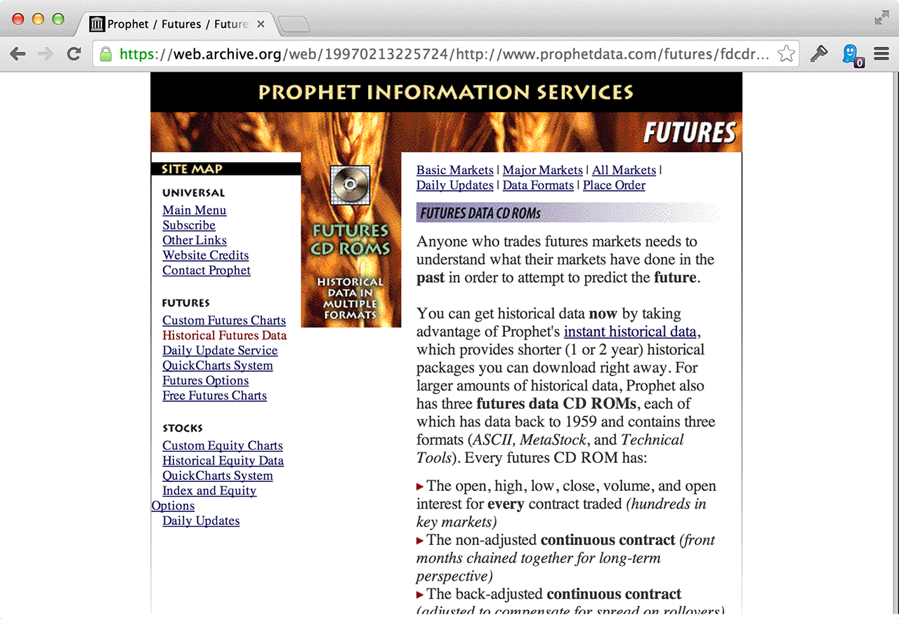
If you clicked one of the links, you’d end up on a page like this:
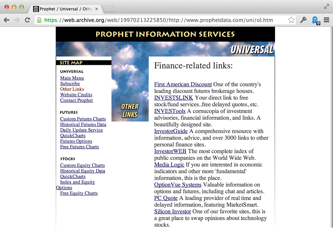
One of the things I really miss about that era of web design was the “links” page. Most sites back then linked up other sites that they liked or respected. It was a cool mutual admiration society back then. Companies weren’t afraid of sending their traffic elsewhere – we were all so blown away that you could actually links to other sites that we all did it so generously. Here was the links page at Prophet:
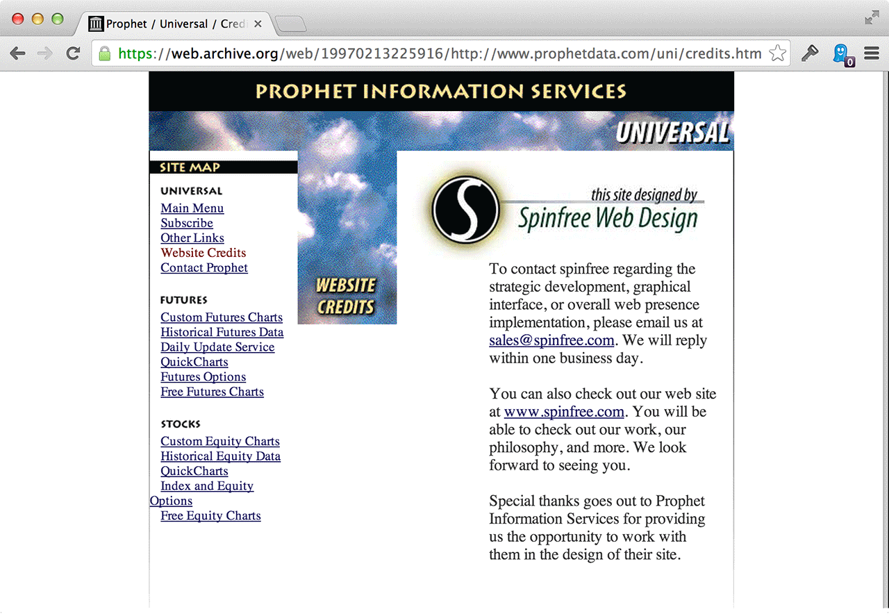
Last, one of the other things I really miss about that era was the ability to sign your work. There was often an understanding between the designer and the owner that you could have a credits page or a link at the bottom of the site showing who did the work. So here was the credits page (“Spinfree” was my freelance name):
You can actually walk through the whole site using the Wayback Machine. Here’s Prophet Information Services as it was in October of 1996.

It’s fun to look back and see where you started, who took a shot on you, how you did, and where you’ve been since. I’m so grateful that Tim saw enough of something in me to give me a chance (or maybe he just saw a cheap $600 price tag ;). Regardless, it changed everything for me.

Tim also taught me a lot about technical trading, so not only did I get $600 and my first client, but I learned a bunch too. I was a finance major, so it was fun to get some real-life exposure to technical trading. They didn’t teach this stuff in school, and Tim was a good mentor. I couldn’t ask for anything more. In the years after, I did a few more site designs for Tim at Prophet. He was a great client.

Here’s Tim today on LinkedIn. He blogs at Slope of Hope. In 2010 he wrote a book on technical trading called Chart Your Way To Profits. And to complete the small world loop, Tim has a show on TastyTrade network which is based here in Chicago. Good times.

So what about you? Who gave you your first shot? Who was your first client? Care to share some (embarrassing) early work?
Big news

Jason Fried
Jason Fried wrote this on 27 comments

Today, February 5th, 2014, Basecamp turns 10. What an amazing ride it’s been. And since nearly all our business comes from word-of-mouth, we owe it all to our customers. We are so thankful for what you’ve helped us build.

And on this special day, we have a couple very big announcements that will define the future of our company. Click that link to find out what they are.

These are exciting times. Fifteen years into our business, we are so grateful for everyone’s support. It’s been such a blast. We’re looking forward to seeing what we can do together for the next fifteen.

Thanks for everything, everyone. Here’s to what’s next.

Bonus link: The original blog post in 2004 that launched Basecamp.

The 5 most common Basecamp workarounds

Emily Triplett Lentz
Emily Triplett Lentz wrote this on 16 comments

Basecamp can’t be everything to everyone — when you err on the side of simplicity, you have to say no a lot.

But when customers take the time to explain what they’re looking for and ask whether it’s possible, we want to give them something other than “nope, sorry!” So we end up suggesting a number of workarounds. Here are some of the most common.
To-do templates
Users sometimes miss the to-do list template feature from Basecamp Classic — the new Basecamp has templates, but not to-do list templates. So we suggest the following:

  1. Create a new project template that includes the to-do list you want to be able to reuse
  2. Create a new project from that template
  3. Move the to-do list into the project you need it in
  4. Delete the new project you created from the template.

The Email-In feature also lets you add files, discussions, and to-do lists to your project via email. So you can also keep a draft email with the to-do lists you want to re-use, and email it to your new project.
Sometimes folks have already created a project, but they want to apply a template to it. They can use the same create-a-project-from-a-template/move-things-over/delete-the-new-project process to add content from the template to the existing project.
File versions
This is another popular request from customers, especially those who were familiar with Basecamp Classic. That’s something we’ve explored for the new Basecamp, but at this time there still isn’t a way to upload multiple versions of a document.
In the meantime, you can upload the original file like normal to the Files section. The revision to that file can be uploaded as a comment on that original file (along with any notes about the new version). This way, you keep the original file and the latest version is always in the most recent comment.
Moving a single task from one project to another
You can move whole to-do lists from one project to another, but there’s no way to copy an individual task from one project to another (since Basecamp doesn’t know which destination list to put the task in). But you can:

  1. Create a new list in the original project
  2. Drag and drop the task into the new list
  3. Click the new list’s title, then use the Move feature to put it in the destination project.


Assigning a to-do to more than one person
There’s currently no way to assign a to-do to a group, because users have different preferences about what should happen when the task is complete. Should every person to whom it’s assigned have to check it off? Does only one person need to, for it to be marked as complete? We’re still unsure how or whether to approach that one.
So for now, the best solution is to leave the to-do unassigned, then add a comment to it. In the comment, you can notify all the people who need to be involved.
Sub-projects and sub-tasks
People sometimes ask for a way to list multiple small projects under one larger one, or break a single task into multiple smaller ones. For simplicity’s sake, there’s only one level for projects and to-dos in Basecamp, but there are other ways to organize and prioritize them.
For groups of projects you want to keep together, we recommend using a common preface or emoji. For example, we use “BCX” to name any project that relates to the newer version of Basecamp (“BCX: Android”; “BCX: Support”), which helps us group all those projects together for quick reference. (Check out this video for other project organization ideas.)
And while there are no subtasks, you can add a comment to-do, in which you can outline everything the to-do entails. This video does a pretty great job illustrating all the ways you can organize to-dos in Basecamp.

In some cases, we get enough requests that we ultimately make a change. That was the case with Google Docs, Client Projects and the majority of the improvements we’ve made to our products over the years. When the same issues crop up again and again, it forces us to take a look at how things work, ask if there might be a better way, and take the time to fix it.
Do you use any workarounds in Basecamp? Let us know in the comments!

47246719.jpg

The 3 1/2” floppy disk as the go-to save icon gets a lot of play, but I don’t think enough attention is paid to the venerable trash can icon.

First of all, trash cans never looked like this while I was growing up in Denmark — I only knew what it was from American TV. Second, I don’t think there are any of these left even in the US.