You’re reading Signal v. Noise, a publication about the web by Basecamp since 1999. Happy !

Most artists and designers I know would rather work all night than turn in a sub-standard job. It is a universal truth that all artists think they a [sic] frauds and charlatans, and live in constant fear of being exposed. We believe by working harder than anyone else we can evaded [sic] detection. The bean-counters rumbled this centuries ago and have been profitably exploiting this weakness ever since. You don’t have to drive creative folk like most workers. They drive themselves. Just wind ‘em up and let ‘em go.


Linds Redding, A Short Lesson in Perspective
Jason Z. on Nov 2 2012 14 comments

Competing on easy

Jason Fried
Jason Fried wrote this on 45 comments

Some people get excited about building something new that the world has never seen.

Others get excited about making something more beautiful than it was before.

Others like making things faster.

And some others get off on making something less expensive.

To differing degrees, these are all personal driving factors of mine as well. But the one that stands out above all the others is the drive to make things easier. I like to make things easier for people. I love competing on easy.

I find easy to be the most personally rewarding, too. It has such direct impact. When something is easier, you feel it. You’ve done it the hard way before, so when you experience the easy way you immediately know the difference.

Easy feels like a cold Coke on a hot day. It’s just so satisfying. The harder it’s been – the thirstier you are – the better it tastes, too.

Another thing about easy – it’s personal. “Thank you” is often a response you hear when you make something easier for someone. Easier is appreciated.

Easy could mean faster. Easier could mean more obvious. Easy could mean a lot of things. But the part of easy I like is when you take an existing problem, study it until it becomes clear, toss out everything that makes it blurry, and carefully polish what’s left over.

I’ve been thinking a lot about this lately because we’re finishing up a brand new product. In some ways it’s entirely new territory for us, but in other ways it’s familiar.

This new product eliminates the hassle of one thing in particular. After that it’s about the same as anything else it competes with. In some ways, it does significantly less than the competition.

Plus, the other products are totally free. Ours won’t be.

We’re charging – betting, even – on easy. I like our chances.

A New Class at The Starter League

Mig Reyes
Mig Reyes wrote this on 16 comments

Since the day The Starter League opened their doors, people from all over the world have traveled to Chicago to learn how to program web apps.


It didn’t take long before design-focused classes made their way into the curriculum. In Carolyn’s class, people learn how to research and shape great user experiences. Shay’s class takes those experiences and turns them into something tangible for the web. Now we’re thinking there’s room for even more. Today, we’re excited to announce the next addition to the growing list of design offerings at The Starter League.

Continued…

In the past, we used to define “work” as a place you’d go to. These days, we define “work” as what you do instead of where you go.


Gerb Kingma, Head of Customer Experience at Herman Miller, as delivered on a tour of the beautiful Design Yard Campus. Thanks Gerb, we agree with you.
Mig Reyes on Oct 29 2012 Discuss

Hi my name is Sam Brown

Sam Brown
Sam Brown wrote this on 13 comments

I’m the artist behind Explodingdog. Jason invited me to do some drawings. Last time I did drawings based on suggested titles. The time before that we did the same, but based the titles off the theme “In the future…”.

What should we do this time. I will be doing one or two drawings a week. Should we do a theme? Should I just draw from titles? Any other ideas or suggestions let me know.

Basecamp Delivered

Chase
Chase wrote this on 15 comments

I love when good ideas start small and organically. One day, a customer visited our office and had a question about Basecamp. Kristin, one of our support team members, pulled up their Basecamp account. They were able to sit together and figure out what needed to be done. Our customers absolutely loved seeing the answer right away. So an idea was born.

We call it Basecamp Delivered. 

Watch on Vimeo.

We’re hitting the road again for other cities soon. You can help bring Basecamp Delivered to your city by letting us know where you are.

If you’re in Chicago, go see the Ronan and Erwan Bouroullec show at the MCA

Jason Fried
Jason Fried wrote this on 1 comment

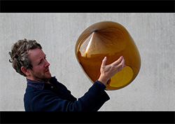
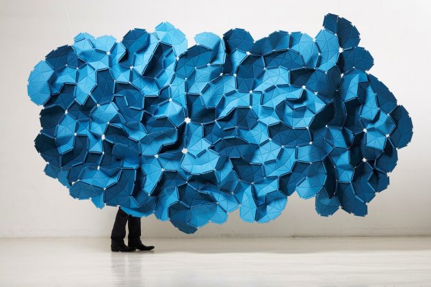
If you’re in Chicago any time before Jan 20, 2013, spend a few hours walking through the Ronan and Erwan Bouroullec exhibition at the MCA.

This is one of the few times the MCA has opened up its exhibition space to furniture/object design. I hope the success of this show encourages them to continue the trend.

The Bouroullec brothers are really on to something. They somehow manage to combine high-tech with organic with comfort. A cool mix of simple and complex, sharp angles and slow curves, and an explosion of multiples. Wonderful colors and mastery of materials. Their work with textiles is something to behold.

They are inspiring.

Check it out if you have the chance. You won’t be disappointed.

Continued…

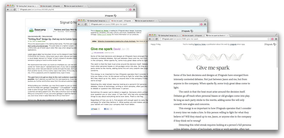
The Typography and Layout behind the new Signal vs. Noise redesign

Mig Reyes
Mig Reyes wrote this on 64 comments

We’ve been sharing our process and company values on Signal vs. Noise since 1999. It’s where we’ve planted the seeds for Getting Real and REWORK. And for many readers, it’s their first taste of 37signals. Yet, we haven’t given the look and feel any serious attention since 2005.

So I decided to tackle a much-needed redesign. In planning the overhaul, I wanted to focus on creating a beautiful, clear, focused reading experience.

Designing Outward

“Blog” has such a temporary, read-and-forget tone to it. On SvN, we take our time writing and editing every article. So rather than treating this like a “blog,” I shifted the mindset to that of a tenured publication. So, the entire redesign process started with typesetting the post, and designing outward.

Instead of poring over other blogs, I spent a week studying books, magazines, and of course, Bringhurst. Capturing the right feel for body text was step one—it sets the tone from here on out.

Perhaps it’s me, but there’s something about 13px sans-serif faces on the web that feels like “my Rails app just spit this out of a database.” I want you to read articles, not text rendered on a screen. Kepler, set at a comfortable size, wound up being a beautiful serif that added the touch of humanity I was looking for. Setting the headlines in Acta added to the look I was going for, and Freight Sans wound up being a great sans-serif pairing.

Continued…

Some advice from Jeff Bezos

Jason Fried
Jason Fried wrote this on 50 comments

Jeff Bezos stopped by our office yesterday and spent about 90 minutes with us talking product strategy. Before he left, he spent about 45 minutes taking general Q&A from everyone at the office.

During one of his answers, he shared an enlightened observation about people who are “right a lot”.

He said people who were right a lot of the time were people who often changed their minds. He doesn’t think consistency of thought is a particularly positive trait. It’s perfectly healthy — encouraged, even — to have an idea tomorrow that contradicted your idea today.

He’s observed that the smartest people are constantly revising their understanding, reconsidering a problem they thought they’d already solved. They’re open to new points of view, new information, new ideas, contradictions, and challenges to their own way of thinking.

This doesn’t mean you shouldn’t have a well formed point of view, but it means you should consider your point of view as temporary.

What trait signified someone who was wrong a lot of the time? Someone obsessed with details that only support one point of view. If someone can’t climb out of the details, and see the bigger picture from multiple angles, they’re often wrong most of the time.

Great advice.

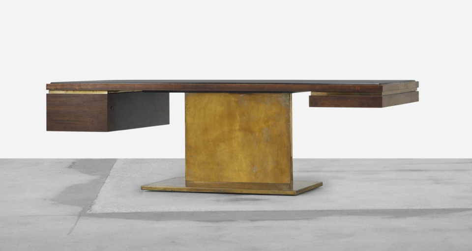
platner-executive.png

Love this desk by Warren Platner. Bronze base, rosewood millwork, leather top. It’s so heavy, but with a chair in front it looks like it’s floating.

Jason Fried on Oct 18 2012 18 comments