Cool example of customers innovating behind your back. (via Mashable)
Announcing the second "Switch Workshop": Gain fresh insight into why customers choose, or leave, your product.
Customers don’t just buy a product — they switch from something else. And customers don’t just leave a product — they switch to something else.
The first workshop sold out in just 5 days, so if you‘d like to attend, register now.
It’s in these switching moments that the deepest customer insights can be found. On the 2nd of November, a select group of 24 people will attend a unique, hands-on, full-day workshop to learn about “The Switch”.
Most businesses don’t know the real reasons why people switch to — or from — their products. We’ll teach you how to find out.
The workshop will be at the 37signals office in Chicago. The cost to attend is $1000. The workshop will be led by 37signals and The Rewired Group.
You’ll participate in live customer interviews.
You’ll learn new techniques for unearthing the deep insights that most companies never bother to dig up.
You’ll understand why people switch from one product to another and how you can increase the odds that the switch goes your way.
And you’ll be able to put everything you learned to immediate use.
There’s only one simple requirement: You’ll be asked to bring something with you. It won’t be a big deal. Details will be provided one week before the workshop.
Spots are limited. Only 24 people will be able to attend and participate. Want to be one of the 24? Register now. We will see you on November 2.
Easy retina-ready images using SCSS
If you’re interested in adding retina image support to your website or app and you happen to be using SCSS, here’s a handy shortcut that makes it dead simple.
Just include this SCSS mixin in any rule and specify the high resolution image’s path and device independent pixel dimensions. Here’s an example:
div.logo {
  background: url("logo.png") no-repeat;
  @include image-2x("logo2x.png", 100px, 25px);
}
Putting the high resolution alternative in the same rule as the normal image instead of putting it in a separate @media query rule or in different stylesheet altogether is a big win in terms of clarity in our CSS. It’s easier to read, easier to understand and easier to maintain.
The image-2x mixin detects high resolution displays like this:
@mixin image-2x($image, $width, $height) {
  @media (min--moz-device-pixel-ratio: 1.3),
         (-o-min-device-pixel-ratio: 2.6/2),
         (-webkit-min-device-pixel-ratio: 1.3),
         (min-device-pixel-ratio: 1.3),
         (min-resolution: 1.3dppx) {
    /* on retina, use image that's scaled by 2 */
    background-image: url($image);
    background-size: $width $height;
  }
}
The mixin not only makes development easier, but it centralizes the definition of high resolution displays so it can easily be changed globally as more devices come to market. The @media query is based on the one in Thomas Fuchs’ Retinafy book but, for example, we’ve already modified it to define the Google Nexus 7 with it’s 1.3 pixel ratio as a retina-capable device.
A key insight here is that with SCSS, @media queries can be nested inside other rules. Such that these both work the same:
@media print {
  body {
    // print styles
  }
}

body {
  @media print {
    // print styles
  }
}
Purists of hand-crafted CSS may rail that this method results in the rule being repeated in the compiled CSS each time we use this mixin and that’s true. Basecamp is light on images so we’re talking about a handful of repetitions, not dozens or hundreds. It also seems likely that as SCSS continues to improve, these rules will be smartly combined. For now that trade-off is worth the improved clarity and convenience in our code.
Surprising Your Customers

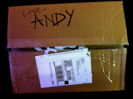
My little cousin decided to dress up as Woody from Toy Story for Halloween this year. After finding the perfect version of that costume from the Disney Store, his mom had it shipped to the office since we didn’t know exactly what time it would arrive in the day. When it got here, the words “Love – Andy” was written in marker on the outside by someone from the Disney Store team.
If you haven’t seen Toy Story yet, first – go see it. It’s a great Pixar movie. After you’ve seen it, you’ll know that Andy is the kid from the movie and Woody is one of his toys.
It’s great to see when a team goes out of its way for the little things. It only took that person a few seconds to sign the box. Now I can’t wait to see how excited my cousin is to see that his costume was from Andy himself.
Don’t forget the little things that you can do with your customers to brighten their day. It might just be signing a name to you. It’ll be a whole new experience to them.
Behind the speed: Basecamp mobile
Speed is a core value for 37signals and it’s easily Basecamp’s most important feature. When you have the luxury of that kind of focus, decisions about the product are easier to make because you have something to measure against. Will this feature make Basecamp slower? Is it worth that trade-off? So when we designed the mobile web version of Basecamp we knew that speed would be just as important as it was in the full desktop version. What was different was how we got there.
On the desktop, Basecamp’s speed is the result of some nifty tech that minimizes network requests, reduces page rendering and aggressively caches content. Moving through a Basecamp project is nearly instant as new content appears in real-time without re-loading the page. It’s great! I typically keep Basecamp open in my browser all day long as my co-workers’ activity streams in on the Progress screen.
When it came to the mobile version the goal that Basecamp should be super-fast was the same, but there were new forces at work: low cellular bandwidth, small touch-enabled screens, slow JavaScript performance, and context considerations (what’s useful and functional on mobile). It was tempting to turn to responsive design techniques on this project. Basecamp was already functioning fine on mobile browsers, but it required a lot of pinching, swiping, and zooming. CSS media queries would have let us craft a mobile layout for all kinds of devices with a limitless array of screen configurations. We’d be on the exact same codebase with all the same features – and new features would automatically be available on mobile when they launch as long as we remembered to test and optimize them.
Only using responsive design for Basecamp mobile would have been like fitting a Prius body to a Hummer… under-the-hood it would have been all wrong.
On the surface it sounded great, but there were some big problems. The JavaScript that powers the real-time feel of Basecamp is heavy both in terms of file size and resource usage. This is no problem on the desktop where bandwidth is abundant and CPUs are excessively fast, but mobile browsers aren’t nearly as capable of processing JavaScript and the initial download would have been oppressive.
Not only would the browser have to download and process all that code, but much of it would have gone unused. Making a design responsive generally means taking things away. You hide features, menu items, sidebars – anything that isn’t needed in the mobile context. They’re still present in the document and the mobile browser still has to download and load into memory all the CSS and JavaScript that defines them. Not to mention the additional CSS overrides that you added to the stack in order to define the responsive layout in the first place. Only using responsive design for Basecamp mobile would have been like fitting a Prius body to a Hummer. It might have looked like a mobile web app, but under-the-hood it would have been all wrong.
Continued…
Trademark overload.
Don’t worry about a style. It will creep up on you and eventually you will have to undo it in order to go further. Be like a river and accept everything.
Greenling's crazy-good customer support

Greenling is the local and organic food delivery service I use in Austin, Texas. No company has ever impressed me more with their customer support.
They make every step easy: I can manage my orders online through their killer site, deliveries come right to my door, and everything is guaranteed. (My teammate Merissa uses Greenling too, and once live-chatted with a rep after receiving some apples that had gone soft—they apologized, refunded the charge on the spot and gave her 10 percent off her next order.) When I first became a customer, they checked in with me to make sure everything was going well. My delivery guy is always cheerful and asks whether there’s anything else they can do.
Greenling claims “We believe good relationships are the foundation for every successful service and we build them to last.” And they mean it! I’m housesitting for my friend Andy, and agreed to show his place to a couple potential tenants, Kristen and Jeff. They were really nice, and noticed my Greenling box in the kitchen—turned out Jeff works for Greenling, and we launched into a conversation about persimmons. A couple days later, I got this email:
Hi Emily!Thanks for taking the time to show Kristen and I Andy’s home the other day! We really appreciate it and are excited about living there!
Since you are such an awesome Greenling customer I wanted to pass along a coupon for you to use as well. The next time you check out use this coupon and you will get 25% off of your next order from us :)
Hope those persimmons were awesome!
Take care,
Jeff Waltrip, Smoothie Operator
How cool is that? He got my email address from Andy so he could send me a coupon—and it was a killer email, at that. Smoothie Operator for the win!
What’s the last support experience that rocked your world?
Automating with convention: Introducing sub
When I started my on-call shifts, we had pretty little in the way of automation for day-to-day issues. Tasks like SSH’ing into our cluster, starting a Rails console, or doing a deep search through our gigantic mail directories, were either shelved away in someone’s bashrc, history log, or just ingrained into someone’s memory. This pain was also felt by a few other of my fellow programmers, and we started cobbling together a Git repo simply named “37s shell scripts”.
This repo started very innocently: a little Ruby script named console that mapped a product name (basecamp) to a server name inside of our cluster (jobs-03), SSH’d in, and then ran a production Rails console. Several more bash and Ruby scripts started to trickle in as we started to share more of our personal code that we used when on-call. Eventually Sam laid down a foundation of bash scripts and directories borrowed from rbenv, and dubbed it “37”.
Some of my most beloved products are those that make ME amazing at something that matters to me, even if I am kicking and screaming and swearing at the product while using it. Of course if I am kicking and screaming and swearing, I’m obviously having a compromised experience… One that might prevent me from producing something wonderful. But I’ll still take a poor UX that makes me truly better at something I care about, than the beautiful, artful, exquisite “Who Cares” product.
—
Kathy Sierra, responding to If VCs Understood UX.
Kathy Sierra, responding to If VCs Understood UX.