A couple terrific people have joined our team recently: Shaun Hildner and Emily Wilder.
Jason wrote a little bit about him in Inc., so you might already know that Shaun joined us a little over a month ago as our new videographer. He made both the great logo animation and customer appreciation party video. Shaun is originally from Montana (also known in my area of the country as Western Real America) and now lives in Chicago. His application and demo reel really impressed everyone at 37signals and we’re very pleased to have him aboard.
If you’ve sent in a support ticket or checked out our Smiley ratings in the past few weeks, you might have noticed a new face. Emily Wilder has joined our Customer Support team, which means we are seven members strong and finally able to compete in water polo.
Emily was hired in an effort to replicate qualities from existing support team members: a redhead like Ann, a Northern California transplant to Austin like Merissa, and a passion for helping people like all of us. Emily told me her heroes are people she knows who manage to be brilliant while unfailingly kind, and her superpowers include the ability summon bagpipes with her mind and bake bread without a recipe.
You can follow Emily and Shaun on Twitter or help us welcome them here!
Sometimes when I’m giving feedback on a UI, and I’m pointing out a spacing detail, I upload a little screenshot to Basecamp or Campfire to help make sure the feedback is clear.
I wanted to share a little tweak to the feedback which I think is ultimately more useful. In this example I’m pointing out that the space above and below an element is not equal (and I think it should be).
I used to do it like this:
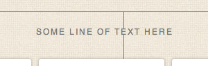
Two lines. One line above the element (text, in this case) extending to the next element above it, and one line below the element extending to the next element below it. The length of the lines shows the different spacing. That works, but the difference – especially when we’re talking about small units of pixels – isn’t as clear as it could be.
Then I switched to doing it like this:
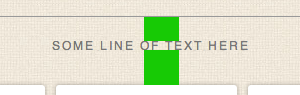
Blocks like this are easier to see than thin one pixels lines. This is an improvement. But it’s still not as clear as it could be because it’s not as easy to judge the comparative volume of a rectangle as it is a square. So…
This is how I do it now:
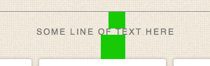
The same vertical distance is covered, but now, since both blocks are perfect squares, we have related horizontal distance which helps you see how much bigger the difference is.
Why not just say 24px vs 35px? Because I want to point out the physical difference, not the exact number of pixels. If we’re just talking numbers then it’s easy to assume 24px or 35px is right. But maybe the final size is 27px or 31px. I don’t want to get stuck on numbers when I provide feedback like this. The final number isn’t important as long as it’s the same (and it looks right).
I hope this was helpful.
I suppose this is my first SvN post, so by way of an introduction I thought I’d share a bit about creating the animated 37signals logo.
When I first came on as “the video guy,” I wanted to think about how to brand 37signals’ wide variety of content with an interesting and unifying bumper. We hadn’t had to deal much with incorporating our logo into video, so it was time we gave it a bit of motion.
37signals is all about building things—from building a business to building software. I wanted the logo to “build” itself to reveal the design.
I actually landed on the basic animation that would become the final product early on, but kept trying more and more complicated versions. I spent a week teaching myself new 3D software and countless hours tweaking every frame to get it just right, but as these things often go, we ended up back with a simple, clean design. The way the logo “builds” itself feels natural; it’s hard to imagine it moving any other way.
Not that it wasn’t worth it to challenge myself—I certainly enjoy learning new software and techniques, but it’s a good lesson to learn. More often than not, the simplest solution is often the best.
The chimes were a lucky coincidence. I needed some audio to give the animation a little more life. Using GarageBand and hitting four random keys on my keyboard, I came up with the chimes as a placeholder until someone with musical talent could get their ears on it. Like many things around here, it just worked—so we left it in the final version.
Here are a few of the different iterations we tossed around.

We’re happy to announce the first round of winners in our Basecamp Tell a Friend Contest:
iPad Winners:
Darren from Victoria, Australia uses Basecamp at all three of his businesses: Pro Blogger, Digital Photography School, and FeelGooder. JoAnne from Smithtown, NY uses Basecamp at Lighthaus Design, Inc. and Getting Real Health.
MacBook Air Winner:
Michael from New Hope, PA is a Basecamp fan, best-selling author, professional speaker, and entrepreneur.
Tell your friends about Basecamp for a chance to win
We still have 9 more iPads, 2 MacBook Airs, and $5,000 cash to give away. Every friend that you sign up for Basecamp also gets $10 off their first month. Here’s how it works:
- Sign up with your Basecamp account at https://tellafriend.37signals.com.
- We’ll give you a special link that you can tweet, share on Facebook, or email to your friends.
- Every person that signs up from your link for a paid Basecamp plan will get $10 off their first month.
- Every person you sign up counts as a chance to win one of our prizes.
This contest ends on January 2, 2012. Sign up today and start saving your friends $10 off their first month.