Mike Rohde did another great job drawing sketchnotes at the SEED 3 Conference on June 6th, 2008 (below). Sign up to get notified when we announce the next SEED.
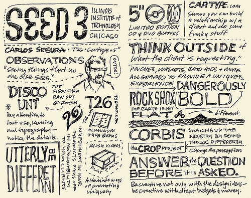
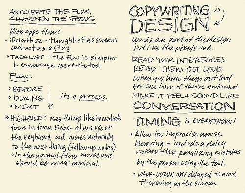
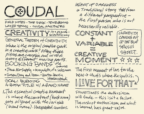
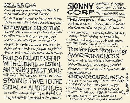
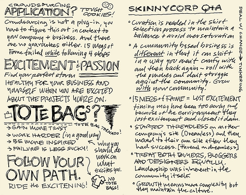
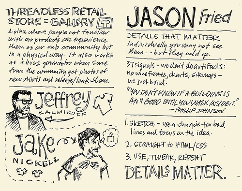
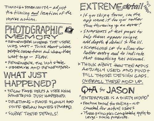
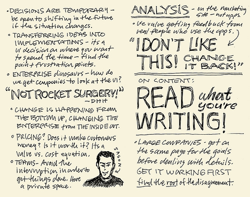
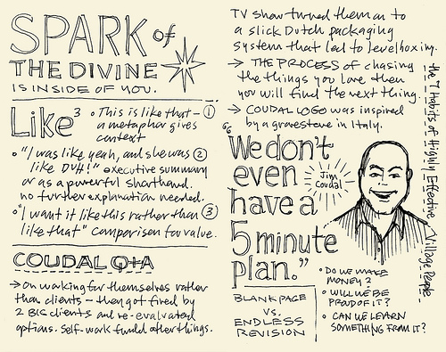
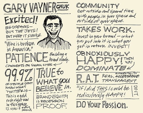
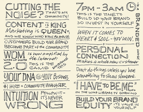
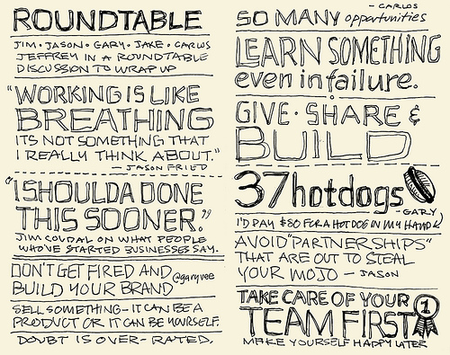
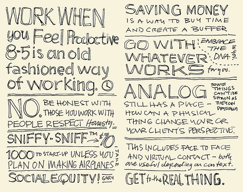
The Chicago Reader was also at SEED 3 and published this profile: “How to Make Money on the Internet: Do what you love, and other tips from the Web cowboys at the Seed Conference.” Includes this great quote from Gary V:
Don’t quit your job to become the queen of cheese. But if you’re doing something that blows and you hate it, go work at 7-Eleven to pay your bills and spend every other hour building your personal plan. If you work 9 AM to 6 PM and get home at 7, whatever you put in between 7 and 3 AM is what you’re gonna get in return. You want to watch Lost? Knock yourself out. I don’t watch shit. I don’t read shit. I’m all about my community and putting out content. I don’t consume. I put out.
Related: Mike Rohde’s SEED Conference 2007 sketchbook notes [SvN]
Peter Urban
on 25 Jun 08I always enjoy those sketch notes immensely. It’s a good work to focus on the essential messages and keep them on your mind. Keep up the good work.
Keith
on 25 Jun 08Sketches are awesome. I love how they flow together so well here. It reminds me of the Whiteboard segment on CBS’ Sunday Morning show.
Tim
on 25 Jun 08These notes are very impressive to me. They are extremely well done in different manners: they capture the messages very clearly and concisely while putting them out with great graphics and layout.
I’m very curious to know how he draws them. Is that really on the fly during the conference? That kind of results would usually require some thoughts on what was said to keep only the important message, and to lay it out in interesting ways.
He obviously does an excellent job of doing everything on the fly.
Matt Radel
on 25 Jun 08That’s unreal. I’m usually listening so intently that writing stuff down is a bit of an afterthought. Then I find myself struggling to remember details from a presentation/meeting. Rohde’s method work would great for me, as I’m much more visually oriented.
Great stuff.
PeteH
on 25 Jun 08I’d love to know what Corbis is doing differently. I haven’t used them in ages.
Don Schenck
on 25 Jun 08Looks like we have another Clarence Larkin. :-)
jgwong
on 25 Jun 08From his blog:
Instead, I took time to listen and analyze the talks, distilling and capturing the main ideas I was hearing. By doing a bit of on-the-fly processing, it forced me to boil down what was being said, then express it in ink on the page in a way that would be meaningful to me and to others who might read my sketchnotes later.
To make the notes interesting, I played with typography and images with the sketchnotes, to provide a little texture and depth beyond pages of gray text.
So, yes, it IS on the fly. The guy’s a genius. Respect.
Tanner Christensen
on 25 Jun 08Brilliant. Not only are the sketches beautiful (some may say that the handwriting looks like chicken scratch, I say it looks like art) but the messages are summarized nicely and are extremely inspiring.
Thanks for providing some useful stuff – as always – 37signals!
P.S. I’ll definitely be seeing you all at SEED 4.
Ani Jovanova
on 25 Jun 08This is great! I took some notes at the conference as well and many of them overlap with Mike’s, but mine are definitely not as cool looking as these.
It’s so good to be reminded about all the great talk that went on that day. It was hilarious and of tremendous value at the same time. I need that kind of inspiration more often.
Tim Walker
on 25 Jun 08Awesome. My buddy Austin Kleon does something similar - less typographical, more visual - with book and lecture notes.
Examples:
—Musicophilia by Oliver Sacks.
—Michael Chabon’s visit to BookPeople in Austin.
Full disclosure: that’s me pictured next to Austin in the bottom drawing of the Chabon notes. It was amazing to see him make these sketches on the fly as the event went on.
Troy K
on 26 Jun 08Mike kicks ass! We had him do our logo work - the experience and results are first class - nice to see him featured here on svn.
Mike Rohde
on 26 Jun 08Thanks everyone for your very kind words on the sketchnotes. I really appreciate the encouragement and am pleased you are all enjoying these sketchnotes.
@Tim, @jgwong is correct, I do these on the fly. Thanks for the kind words as well @jgwong! :-)
The style is built on many years of taking notes and sketching. About a year ago I tried this idea at an Adaptive Path UX workshop and liked the results, and have been iterating and refining the process ever since.
I have captured the Adaptive Path UX event 2007, SEED 1 2007, SXSW 2008, VizThink Workshop Chicago 2008 and now SEED 3 in 2008. I am planning to attend SXSW 2009. :-)
I don’t capture every detail, but I try to capture what’s useful, interesting, important or significant for myself and the others who may read these later on.
Now that I know others will likely view these later, I work hard to capture not only what I think is important but also what others might find useful too.
I encourage others to try doing these — it’s a little different but I think if you happen to be visual, this approach of mixing text and images may help you capture ideas passing through your head more clearly than notes alone.
@Don Now I need to do some research on Clarence Larkin!
@Tim Walker I love Austin Kleon’s stuff! We’ve come in contact and I really appreciate his approach to visual thinking.
@TroyK thanks for the shout out! I had a blast doing that logo.
Joseph Rueter
on 27 Jun 08Mike, I enjoyed these quite a lot. Schedules collided and I was not able to be there. THANKS FOR SHARING! This is not a live stream but it is really powerful. It reminds me that the new thing is not always necessarily the best or only way to accomplish the task of sharing or capturing ideas.
Lloyd Benedict
on 27 Jun 08Amazing! I was at this presentation and those notes flow perfectly with the discussions. Nice work, im going to try and save these pages. Thanks for the SEED refresher!
This discussion is closed.