Aza recently posted on modal overlays, those dialogs that pop up and disable the background behind them. You can click anywhere inside modal overlays, but you can’t click anything in background until the dialog goes away.
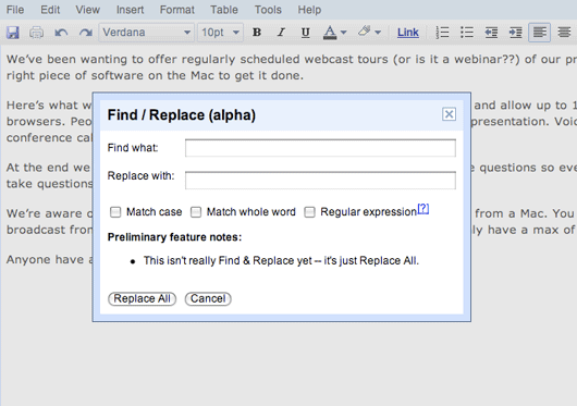
Usually when we think of modals, we think of dialog boxes like the one below from Google Documents. Aza’s critique applies to this kind of modal. After you call up the find/replace box, you can’t click anywhere but inside the dialog. That means you can’t scroll the document underneath the dialog or copy and paste a word from the document into the dialog box while the dialog box is displayed.

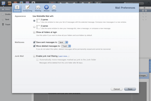
But that’s not the only kind of modal overlay. Check out this Preference pane from Apple’s Me.com. It has nothing to do with modifying the content behind it. It could just as well be a separate screen.
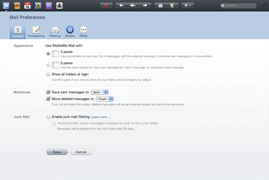
Actually, this fact that it could be a separate screen caught my interest. At 37 we never use modal overlays. All our settings screens are completely independent from the other screens in the app. In order to explore the difference between these two approaches, I mocked up an alternate version of Apple’s preference screen that fills the entire window like a typical web app might.
It’s interesting to compare these two versions. I have to admit I like the modal one a lot better. On the one hand it has more visual interest and depth. On the other, it raises some interesting questions about navigation.
Modals as alternatives to navigation
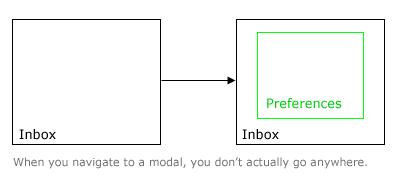
Two questions that often float in our minds when we use software are “Where am I?” and “How do I get back?” There are common techniques we use to ease these concerns like tabbed interfaces, breadcrumbs and “Cancel” links. We should think of the modal overlay as a tool in the same family. It is uniquely powerful at quieting these nervous questions. “Where am I?” is a non-starter because you never left the original screen. And “How do I get back?” is trivial when the original screen remains visible in the background.

Screen size as a reflection of importance
Another thing I like about the modal approach to Preferences is that the preference screen doesn’t feel equal to the other application screens. You get the feeling it didn’t deserve its own browser window’s worth of real estate.
When we design the UI for a particular screen we always try to make the important and frequently-used elements larger and more prominent than the lesser-used elements. It’s a good rule of thumb to think that if elements in the same context all have the same size, then they must be equally important. Apple’s Preferences modal applies the same principle to the scale of entire screens. The preferences screen is itself smaller than the browser window that plays host to the more important screens full of real data.
Modals aren’t all bad
While Aza’s critique still holds for modals like the Google docs example above, Me.com demonstrates that modal overlays do have a place as an alternative to navigating between independent screens. It’s also very interesting to consider which screens really deserve their own browserful of real estate and which should be reduced to substates of other screens. I suspect that when people praise applications for being particularly “Ajaxed” or “Desktop” in style, this lack of navigation between separate screens is a big part of the appeal. Apple has shown that it’s possible to bring desktop-style interactions into web apps without falling into the extreme of a desktop clone. It should be fun to see where other designers take the inspiration.


Jens Alfke
on 24 Jul 08eMusic’s brand-new redesign includes a bad example of a modal overlay: on the page for an album, the way to read the full text of the editorial review is by clicking a button that now brings up an overlay with the text in it. But what do you want to do while reading about how awesome particular tracks are? Listen to those tracks? Unfortunately you can’t, because the audio controls are on the main page behind the review. So you have to close the review first to start (or stop!) playing a track.
Ironically, this is a step backwards technologically. The previous incarnation of the page had a reasonably nice progressive-disclosure UI where the full-review button just expanded the review in place to reveal the full text. Oh well…
Chris Jones
on 24 Jul 08Great idea to mock up that pref’s screen to prove that the modal dialogue made sense in the me.com context. I think exploring the options this way instead of simply throwing them away because it doesn’t fit with your usual attitude shows a great deal of thought and consideration for your users.
Don’t just throw away an idea because it didn’t work before!
clifyt
on 24 Jul 08In your previous post about modal popups, ya’ll dismissed them pretty much outright.
I think this is a great reversal…it is ALWAYS a pain to lose context when you are working on something, need a change, but want to get back to what you were doing. Photo enlargement on a page is one of these areas…you don’t want to stop reading and lose your place, you want to get a better view of the photo and then go right back to where your eyes were a few moments earlier.
I’m just glad to see 37s reevaluating previous positions.
Chris Jones
on 24 Jul 08This is one of the things I love about 37 signals and getting real. It’s easy to say no and change your mind later, nothing wrong with that!
Taylor
on 24 Jul 08Not to mention that completely changing context but also giving the user a way to get back is an added complication for PROGRAMMERS that is simply precluded by using a modal.
Of course, manually adding modals to you application would be no trivial task. Luckily, we have a bumper crop of javascript UI/behavior frameworks out there to give us a hand!
Chad Allen
on 24 Jul 08Of course the Me.com modal is perfect. Apple is perfect.
37 Signals opinions are getting more and more watered down and WAY to predictable. Apple = amazing, Everything else = crap.
Respect: -1
-ch
David Andersen
on 24 Jul 08Chad -
Rumpelstiltskin called. He wants his peevishness back.
Rabbit
on 24 Jul 08I would like to point out that not all modal windows disable the background. Quite a few don’t. Some provide it as an option.
A perusal on the jQuery plugin page will demonstrate the differences.
http://plugins.jquery.com/project/Plugins/category/43
MB
on 24 Jul 08Somewhat of an about-face since your piece on lightboxing: http://www.37signals.com/svn/posts/592-been-lightboxed-lately
Browser interfaces that simulate a floating OS window too easily trigger the knee-jerk reaction of hitting the close window keyboard shortcut, which of course closes the entire page, not just the “modal”, or lightbox.
Ryan Cannon
on 24 Jul 08I hate Apple’s newfound love of modals. Check out their MobileMe support section. These pages have all of the problems of poorly done Flash: they break the back button and the location bar. Getting back to one support document requires remembering the path you took to get there. Combine that with the amount of broken links in this section, it makes the experience incredibly frustrating.
Modal dialogues make sense in an application context: when you are conducting a complex operation on the current document. But when you’re hyperlinking between two documents, for the love of Pete, use <a href=””>.
Nathan Bowers
on 24 Jul 08Agree with Ryan Cannon, breaking the back button is one of the seven deadly sins of web design.
Disagree with Ryan Singer re: “How do I get back?” being trivial. The Browser Back Button is trivial, universal, and always in the same place. The equivalent to the back button in modals is called “cancel” or “X” or “stop” or “back to previous” and the button’s placement and look varies wildly from site to site, and is often inconsistent within the same site.
Modals may have their place, like in desktop apps, and for when web apps positively, absolutely, have to hit you over the head to stop you in your tracks, but otherwise, they’re bad news.
RS
on 24 Jul 08Not at all. My complaint about lightboxes was that they create a strobe effect, flashing the page from dark grey to bright white and back as you click on screenshots on the Acorn website. There are no complaints in my previous post about the fact that they are modal overlays.
Brad
on 24 Jul 08Gotta throw my hat in with Ryan C. and Nathan here. Many other MobileMe users seem to feel that it is just .Mac with lipstick. Judging by their comments, I’d bet that Apple didn’t go through the exercise that Ryan just did.
Constant exposure to Doubleclick ads and automagic slideshows have already started building up my modal antibodies …
nickyP
on 24 Jul 08Also noteworthy is that Apple uses the ‘sheet’ dialogs (also modal) when editing a calendar event in MobileMe. The sheets slide in from the top and stick to the top. Also, the sheets do not flash the screen to gray at the edges.
Much nicer than the modal box for preferences, but the sheets do not allow for any navigation like the preferences. I guess that’s one of the reasons they don’t use them that way.
Scott Mallinson
on 24 Jul 08We have used modal popups before to enrich one of our applications. They have been used a contextualised help that are relevant to the content on the page you are currently on.
It has worked really well, as it removes the need for a popup window, or directing the user away from their current page to a separate help section.
Lars Fischer
on 24 Jul 08I have to admit that this is a very well written blog post!
Danny Hope
on 24 Jul 08This article mentions Larry Tesler’s “Don’t Mode Me In” t-shirt: http://www.folklore.org/StoryView.py?project=Macintosh&story=Joining_the_Mac_Group.txt
Jayr
on 24 Jul 08just wanted to say that facebook has some really nice, useful modal overlays. They are used for quick little things that do not require a full screen ( adding a friend, tagging photos etc ) and definately speed up the experience and add functionality without getting in the way. Infact i have been quietly impressed with all of facebook’s features and functionality.
Eugene Efimochkin
on 24 Jul 08You are only making a big awful mistake with search and replace dialog being shown modal (first figure). This is a bad practice and bad example from you, because user usually needs to:
1) access the most of found text inside the edit area (which is difficult to manage programmatically when you have it overlapped with the dialog)
2) adjust the find and replace parameters in the dialog on the go (as things may change while we go through the text). NEVER it should block out the editing area.
3) have an ability to correct or undo the changes done – each replace one by one. Again, no block out allowed for this point.
These three points along with today’s UI abilities make search and replace dialog absurd – a panel is better for this anyway. Illustrate the modal with some crytical confirmation
And about MobileMe preferences pane: I also think this should stay in modal overlay because of web app specifics – when you have Preferences open in another browser window, you cannot guarantee that each change (there are lots for Me.com) is applied on the fly. Even if you consider some dialog terminating button like OK, you still have to pass back to main window some signal that the changes were made. This also brings such a problem: if user was halfway editing something what should the app do? Break his editing and refresh the page (applying the new settings)? Try to apply them on the fly (what if some changes conflict with current mode)? Forget changes until user finishes editing (why hell did we need a separate window then)? What if a mean browser/extension silently blocks popup windows?
I think, the modal overlay is a nice compromiss here. It allows developers to be sure they can apply almost any changes on the fly (except for conflicting ones), it doesn’t completely break user’s context (though entering another mode obviously), and it’s hell stylish!
Keith
on 24 Jul 08I would love to see some actually numbers that demonstrate the success or failure of modals from a usability standpoint.
For designers it’s easy to think, well since i don’t have to have the user load another page to make this change they’ll love it.
For users, however, they may actually want that functionality on a separate page.
Finding the best practices based on research is really where this debate needs to go next. All the op-ed in the world isn’t going to get at the underlying usability implications.
Tim
on 24 Jul 08The problem with javascript popups/floats like this is the case when the users browser window is sized smaller than the popup.
Alejandro Moreno
on 24 Jul 08Google Find/Replace Modal = Bad Apple MobileMe Pref Modal = Good … maybe
But I must say that some of Apple’s choices in terms of web accessibility leave a lot to be desired.
Taylor
on 24 Jul 08Consensus in the comments seems to be that some modals are good, some modals are bad. Here’s an example of a bad modal from Apple:
http://taylorbarstow.com/perma/modal_bad.png
In my opinion this sucks because the only way to get back is to choose “OK” or “Cancel”. For one thing, this does not give one an intuitive sense of “going back”. Also, some changes don’t actually require an “OK” or “Cancel” (such as renewing DHCP lease). So the user is left to accept or cancel something that it really doesn’t make sense to accept or cancel simply to appease the user interface.
@Rabbit – you’re referring to dialogs in general. Some dialogs are modal (meaning the rest of the app is obscured/disabled) and some are not (meaning the rest of the app is still clickable and not obscured). But all modal dialogs by definition obscure and disable the rest of the app.
Wicks
on 24 Jul 08Since we’re on the topic, quicklook in the finder (hit the spacebar to get a larger preview) is a very useful feature, However the window pops up modal-style and the user is tricked into thinking that it’s an application window that can close to get back to the finder window. Hit command w and poof there goes the finder window.
rborn
on 24 Jul 08I think modal windows have their place in web design. The usability rules may be a little outdated… only because some techniques are new, and it needs a huge player on the market( apple ?) to make those “gurus” in usability accept something… anyway, a good designed modal window has 2 aspects:
first is the design itself – make the user feel it can navigate, so maybe some nice back,close,ok buttons will improve the usability
the second aspect would be the way is developed. It can be used some nice unobtrusive javascript that degrades in a correct way, so a non-js browser will still have access to the modal window content – I am talking here about ajax of course – maybe some “ajax history” or simple #label implemented so a browser back button won’t screw the user’s experience
of course this requires a lot of planning, work, but this does not mean the modal window is evil….
Rabbit
on 24 Jul 08... all modal dialogs by definition obscure and disable the rest of the app.
I can accept that. I stand corrected.
Michal
on 24 Jul 08When I think about modal vs modeless first question that jumps into mind is whether the user needs to interact with the base page while the dialog is open.
For the Google example – yes, I need to copy and paste words from the base page so the modality gets in the way.
For the Mobile.Me prefs – nope, I change the prefs first then go back to the base page to see the changes reflected. Another case why modal is often used for preferences is to show the user the preview of switching to a different skin/color scheme (base page changes to show the new skin).
@Eugene – when (and how) the prefs changes are reflected on the base page is a good question. It make sense to apply them as soon as possible else the user thinks the change did not work. Seamless change would be best, if not feasible you can warn the user to save the un-saved base page edits then reload the page to reflect new prefs settings.
Another issue I’m trying to get my head around is how to design prefs dialog with no vertical scrolls that you run into as the settings grow (tabs are already there :)
Ewan Makepeace
on 25 Jul 08This is all rather comical in that Apple were the ones who banned modes in software. Maybe not completely but when the first Mac launched around ‘84 the Human Interface Guidelines specifically warned developers against putting users into modes where only a subset of the application was available to them. For example word processors of the day (Wordstar, Word Perfect etc) typically had an edit mode (where the markup was visible) and a preview mode, which tried (but failed) to show what the printer would produce. In its day MacWrite was one of those jaw on the table revelations, in that you could actually edit the view that you would print – with all fonts and images right there in their correct position. [Ironically that 24 years later we are back to the old story with HTML for the most part?]
Anyway Apple correctly realised that every time the users options are restricted due to their current mode was a bad thing. Strange that they seem to be forgetting that lesson. On web sites I ALWAYS want the option to Command-Click a link and put it on another tab while I do something else, or check the results on another tab. Modal dialogs on web pages prevent this, and when completely unnecessary (like the Me.com one) are a bad thing.
[And another thing… The great Web 2.0 and rich internet application paradigm often also prevents me opening links in new tabs which I hate. Ajax is sometimes a trap…]
Miles
on 25 Jul 08Interesting discussion since there are pros and cons. One area we struggle with is with adding an item to a select box on an edit page. It seems to make sense to have a modal dialog to add the item fields, then update the select box on the main edit form rather than go to a new form page, add the item, and then back to the old form page and having to keep track of the previous input state. Interested in how others view this.
ABC
on 27 Jul 08It’s really case-by-case.
Sometimes you clearly want a modeless dialog, like Find and Replace—it takes work to make that Just Work, though.
Sometimes you have a form with tricky state in the background (e.g., a Compose Mail screen) and you want to preserve the state of the form and make sure the user knows you preserved it.
I agree with Ryan Cannon: “Modal dialogues make sense in an application context: when you are conducting a complex operation on the current document.”
There can be other, app-specific reasons to prefer one approach or the other. Perhaps you don’t want to leave the current URL because it’ll be slow to reload/restart when you come back. (Of course, without modal dialogs, you could use JS to give the appearance that you’ve navigated to a different page, as GMail does. But it might not be worth the sweat.)
@Jayr: Facebook’s dialogs aren’t technically modal because you can still click links behind the dialogs. I think you raise a good point, though—when the interaction is simple and quickly-dismissed enough, you might rather have it presented in a way that doesn’t require a Back or page transition after you’re done. (JavaScript clones of a Yes/No confirmation dialog are a good example.) Certainly doesn’t seem to deter people from using Facebook much. :)
I agree with @Keith that data on what’s usable would help here.
I also second and extend @Alejandro Moreno’s comment: Apple makes a lot of accessibility mistakes. Application font size can’t be changed (only screen resolution), and it’s generally harder use only the keyboard on a Mac as compared to a Windows or Linux machine.
mhw
on 28 Jul 08As others have observed, modal dialogues break the back button, but they also break all the other things that makes the web work because they don’t have URLs. You can’t bookmark them, you can’t refer to them in feeds, search engines probably won’t index them and you can’t send a link to the dialogue in an email or link to it from a knowledge base. Instead you’re back into ‘go to this page, then click on the ‘Settings’ link, then click on the ‘email’ tab’’ navigation.
Jim Ramsey
on 30 Jul 08When used correctly modal are extremely useful because they allow the user to take an action without interrupting their workflow.
I don’t necessarily agree that they break the back button because the action shouldn’t be perceived as being part of the browser history. Same thing goes for bookmarking.
Mint.com is a good example of the proper use of modals. They use modals to name and categorize transactions. It’s great that I can categorize a transaction without navigating away from my current listing view and I definitely don’t perceive it as a new page that would be included in my browsing history.
This discussion is closed.