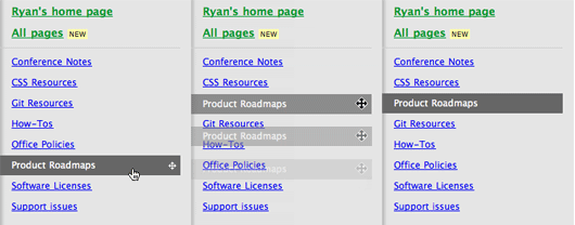
We’re excited to announce a new Backpack feature. Now you can reorder the pages linked in your sidebar. Sidebar links are no longer limited to alphabetical order. Our customers have been asking for this and we’re glad to deliver it today.
In the past, people have been using all kinds of tricks to keep their pages in a certain order. We’ve seen people numbering their pages or prepending them with funny symbols like * and # to force the pages to the top of the sidebar. Now all you have to do is hover over a page and drag to move it up or down.

Hover over a page link and you’ll see the drag icon on the right-hand side. Grab onto the icon and drag up and down to reorder the page. When you drop the page, the position is saved. It’s that easy.
We hope you enjoy taking control of your sidebar with this improvement to Backpack. Thanks for your continued support!

Ricky Irvine
on 08 Jan 09Nice!
Micah
on 08 Jan 09very cool! thanks, guys!
Dave Smay
on 08 Jan 09Awesome, guys!
I’m one of those users who had been doing all sorts of tricks and symbols to group and re-order my pages. While I was more than content w/ the way things were, this just shows how you’re constantly striving to improve your products and give back to your customer and fan base!
Thanks again! I appreciate it!
-DS ( http://twitter.com/dsmay )
Luis
on 08 Jan 09This is cool…however, in Opera when you drag, re-order, then drop the sidebar link it vanishes. I have to refresh the browser in order to see it.
Mr. Darcy Murphy
on 08 Jan 09It’s the little things that matter, thanks for paying attention to them.
Steve Erickson
on 08 Jan 09Sweet! This is great. Thanks.
Emil
on 08 Jan 09Interesting feeling to be so happy for a tiny little feature… small updates from time to time.. this is what I love about your product suit :-)
Jon
on 08 Jan 09I notices this this morning and was wondering when it was changed. very nice.
Andrea P
on 08 Jan 09Great feature!
The only “downside” is that too much freedom may lead to a total mess in my sidebar. I’ll be forced to search all my sidebar in order to find the page that i want.. and with 50+ pages is not an easy task :)
Other features that may improve this experience could be the ability to have a sort of “divider” in order to create different “zones” in the sidebar, or the ability to have different (max 8) colors for the name of the page.
thanks
Andrea
Mimo
on 08 Jan 09Why did it take you so long to implement this?
DHH
on 08 Jan 09Mimo, didn’t you get the memo? We only work every other full moon! Takes a while like that. But man, the mojitos on the beach are AWESOME!!!
Jonathan Smiley
on 08 Jan 09This is nitpicky, but if you can reorder the list up and down should the icon for that be an up/down arrow, rather than one that is also side to side? I only mention it because between the splash image and the screenshot that icon appears about 20 times ;)
I imagine, if there’s a convention, it would be that for objects you can move anywhere on the page (or to wells located on the sides) you would use that icon, and in this instance you’d use a simple up/down to drive home that you can go up in the list or down, but not off the list. Cool feature though so kudos!
Michael
on 08 Jan 09Very, very good. Makes use on iPhone better. Thanks!
Tim
on 08 Jan 09@DHH
Nice way to trash what is most likely a current paying customer.
Christoph
on 08 Jan 09@Tim:
”...Then you’re not beholden to anyone customer”.
Especally the dump one:
"Why did it take you so long to implement this?" Cause they were more important things than this one.flynn like
on 09 Jan 09good call david… yr onform today! great rails tip and now this… long live the full moon!!
Colin
on 09 Jan 09Awesome! Thanks for pushing a BP update that benefits the solo/personal user, not just small business/intranet users.
Keith
on 09 Jan 09This change makes my life much easier. Thanks for all the recent page management tool revisions in Backpack!
Don Wilson
on 09 Jan 09The icon on the left is beautiful!
Sean
on 09 Jan 09In your image showing the progression of steps taken to re-order the sidebar, it seems like the first and third images should be swapped. In backpack right now, the image gets more transparent as you drag it.
Fred Brunel
on 09 Jan 09It’s awesome! Thanks a lot guys.
Eran
on 09 Jan 09great new feature. would also be cool to be able to group pages by tags..
Mark
on 10 Jan 09For next full moon, consider adding dividers.
Daniel The Scheduling Wizzard
on 10 Jan 09It’s almost spooky. We’ve been discussing this feature couple of days ago for our own appointment scheduling service. And the solution is almost identical! Great minds think alike?
Jonathan Smiley: I think that they chose this icon because it is something that people are used to. The pros of usability probably outweighs the need to describe the movement 100% correctly.
Jochen
on 10 Jan 09incredible
Dennis Frank
on 10 Jan 09Cool and tiny feature. Like it.
But do I have to do reorder every new page if I want alphabetical order?
Dividers would be cool too.
Ryan Walker
on 10 Jan 09Have you guys changed your mind re: product road maps? http://www.37signals.com/svn/posts/694-you-dont-need-a-product-road-map ;)
RS
on 10 Jan 09No, those pages are mock data from a test account :)
Jeremy Britton
on 11 Jan 09The lack of this specific feature was one example I remember you guys using a couple years ago of building less and maintaining less mass. By not implementing it early on, you started with “no” and focused on features you could manage.
I sure hope there’s been more than a few mojitos between then and now, but what did it take as a company to get the point where you could support adding it to the Backpack product? Overwhelming repeat customer requests? Infrastructure and team? Or are you breaking any of those mantras now that you’re maintaining mature products rather than building new ones?
(Oh, and thanks for finally implementing this, by the way.)
This discussion is closed.