Audi is set to release the next version of their MMI (Multi Media Interface). The MMI powers their nav, radio, and car systems.
While I prefer Garmin’s UI simplicity, Audi’s Nav UI is my aesthetic favorite. They pay attention to type, proportions, opacity, shapes and shading in a way that says “we really care about how this looks.”
From an information design perspective, I’ve always been a fan of how they present and combine distance and time. I’ve used lots of nav systems and somehow, for me, Audi’s is the one that presents the right information at the right time in the right way. I do like Honda’s too.
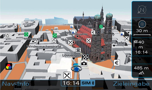
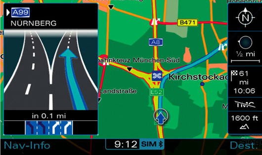
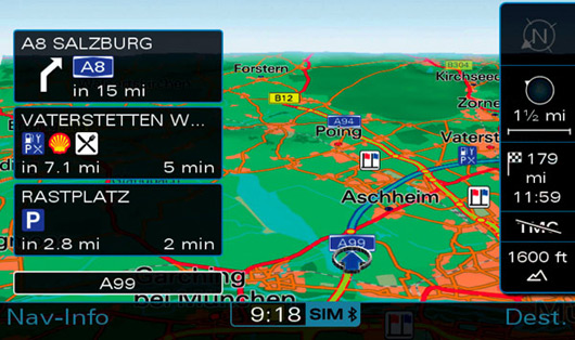
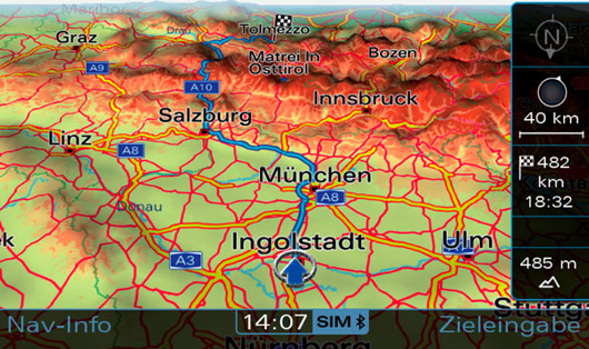
Here are some screenshots from Audi’s latest effort:
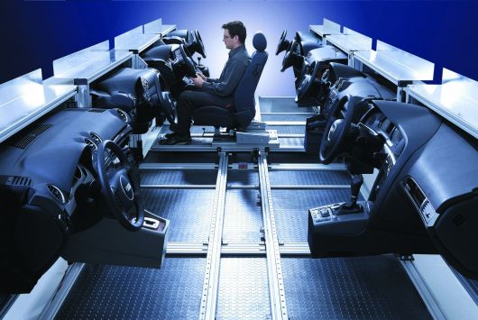
And here’s part of their lab where they test the designs. The different dashes are from different models.
Read more about the new MMI at Fourtitude or Audiworld.
Stephen
on 24 Jul 08Is there an RS4 owner at 37signals? I remember seeing one in the parking lot at SEED this June. Best car ever, I can see how someone at 37signals would appreciate the attention to detail that Audi puts into their designs.
-Stephen (the Mountain Dew and Franzia guy at SEED)
JF
on 24 Jul 08When do we get to taste the Mountain Dew Wine?
Richard Wilson
on 24 Jul 08Wow, this thing is beautiful!
Rick
on 24 Jul 08unrelated but I HATE the non “r” audi steering wheels. That shot of the dashes reminded me.
And, Stephen.. the RS4 in the parking lot across the highway at SEED? JF posts about Audis and Aston Martins… wonder why?
rick
on 24 Jul 08Also, where is the mt dew/wine offering??
Wade Meredith
on 24 Jul 08I love me some good information design and these Audi nav system shots look gorgeous and informative.
The most information I’ve had to tackle designing was for http://thewebdevelopersfieldguide.com. A massive directory of resources for web developers / designers.
I was pleased with the result. It’s not feature rich, but it’s workable and pretty. (I think) It seems that someone at Audi relishes a GUI design challenge, as well. Now, to start saving for my RS4…
John Topley
on 24 Jul 08There’s no doubting the aesthetic attractiveness of those displays, but it seems like an awful lot of information to take in during a quick glance away from looking at the road.
Devan
on 24 Jul 08Sorry, it still looks a bit too ‘cluttery’ for me. The first screenshot for example – the perspective would throw a lot of people.
If you are at road level amongst all those tall buildings and cathedrals, your field of vision will be vastly restricted. From your driving POV for instance, there is no way you can see that other gothic building behind the cathedral.
What I think would work better is if the perspective was at road level, but they twiddle the transparency of buildings immediately in front of you so that you can ‘see’ what is behind them.
In my view, either a straight ‘top down’ view or ‘drivers eye’ view work best. Take a look at modern aircraft ‘glass cockpit’ HSI’s etc. for how they deliver maximum information with minimum clutter.
Tinus Guichelaar
on 24 Jul 08It’s way to cluttered because it tries to offer all information in one screen. I only want to know where I should go.
Julian
on 24 Jul 08I don’t know why this should be good design. For example in the first image, the fonts are ugly and the street names just seem to not fit in there. You can’t even read some of them. Also it looks not anti-aliased very well. Sorry, but this is not “we really care about how this looks” for me.
Dave
on 24 Jul 08The use of the word “Porn” in the article title means I can’t share this with half the people I’d want to who work in companies with over-zealous internet proxy software.
Martin
on 24 Jul 08You really need the current altitude and compass taking space away on the display and adding information to filter?
Why would you want them in your standard “guide me from A to B view”?
Ivan
on 24 Jul 08This new MMI style is no longer utilitarian, it is art – colourful, stylish and even texturised and three-dimensional. But for what, I mean for whom? Maybe for a passenger, but not for driver, except he’s sitting at dealership watching glossy brochure pages. Because when you’re driving at 200 kmh by autobahn and entering a road flyover, or trying not to lost in рhug amount of traffic in city center, you prefer easily-understandable scheme, but not an anti-aliased picture of sight you passing by and watching right now in the windshield. Take a look on dashboard designs – those which very colourful and heavy-decorated are often unreadable…
Don Schenck
on 24 Jul 08I’m itching for a new car!! The MINI Cooper is my current auto-lust. But the A3 is a nice ride, too.
Decisions, decisions.
@Stephen: The RS4 probably belonged to an attendee. Unless Sarah used her corporate AmEx to get one! - laugh -
Don Schenck
on 24 Jul 08Audi has long been THE leader in automotive interior design, so I’m not really surprised. Impressed? Yes.
Matt Brown
on 24 Jul 08Another thing worth mentioning, is that there are actually two screens that work together in the Audi navigation system. There’s the main screen, which is showcased in this article, and then there’s a smaller dumbed-down screen in between the tachometer and speedometer. This smaller screen is worth its weight in gold in that it has a vertical progress bar that counts down when a turn is coming up. You know, when that progress bar gets to the bottom, you need to turn immediately. It has a large red arrow and other trip information too. It’s a nice compliment to the main screen.
I like the new 3D look in that screen shot. Can’t wait to upgrade!
Martin
on 24 Jul 08The HUD display in some BMW is quite nice. It just shows you the next turning point and the distance.
http://upload.wikimedia.org/wikipedia/commons/f/f3/E60hud.JPG
Damon
on 24 Jul 08I’m in the “too cluttered” camp. Some of it would do well as an interface to google maps (for example). But while driving? Just tell me where to go.
JF
on 24 Jul 08I’m in the “too cluttered” camp. Some of it would do well as an interface to google maps (for example). But while driving? Just tell me where to go.
It is telling you where to go. These screens are just examples of the functionality. They don’t always appear and the overlays aren’t always there. There’s a lot of contextual information when you need it and then it’s gone when you don’t.
Stephan Mönninghoff
on 24 Jul 08Who supplied the screenshots? Are Audi are getting nervous about the upcomung BMW GPS / Command system? The guy in the testing lab doesn’t look too thrilled IMHO. And…where are his colleagues? If that’s the testing atmosphere at Audi, I wouldn’t stay long either :-)
spl
on 24 Jul 08LOL. Nice change from “UI Porn…” to “UI Candy…”. hahahaha
JF
on 24 Jul 08LOL . Nice change from “UI Porn…” to “UI Candy…”. hahahaha
Too many emails about the post being blocked cause of the URL. ;)
carlivar
on 25 Jul 08As a classic car enthusiast, I can’t help but wonder how this built-in nav stuff will be considered 10, 15, 25 years in the future (in an old used car). I wonder if it will even work?
Stephen Jenkins
on 25 Jul 08Jason and Rick,
The Mountain Dew and Boxed Wine feature on WineTV will happen as soon as I can find a creative/tasteful way to direct/exploit the attention!
Back on Audi, has anyone been to Autoschadt in Wolfsburg? It’s a must if you are a VW/Audi geek. Imagine an amusement park that highlights each one of the VW brands in it’s own pavilion. That, and I got to drive the Toureg on a challege course before it came out in the States!
Joran
on 27 Jul 08What would happen if instead of saying “we really care about how this LOOKS”, Audi were to say “we really care about how this WORKS”?
What’s more important? Looks? Works? Age-old debate. Just a silly question.
JF
on 27 Jul 08Joran: Audi does care how it works. It works great. But it also looks great. The post was about the visuals, not the specifics.
Anonymous Coward
on 28 Jul 08looks like cluttered rubbish with terrible type what are you talking about, Audi fanboys
Que
on 28 Jul 08Is there that In the new a6 (facelifted)?
fiat 500
on 28 Jul 08and this piece will be installed on all cars audi?
This discussion is closed.