Some recent posts at the 37signals Product Blog:
Highrise
Highrise one of “Top 10 most useful webapps of 2008”
“Highrise became a big-small contender in the CRM space this year by adding Deal tracking and full data export. Not to mention, no CRM comes close to making it this easy to keep track of your contacts in detail. After falling off the wagon with Salesforce (multiple times), SugarCRM, and PipelineDeals, Highrise is the only one that became critical to my day-to-day activites at work.”
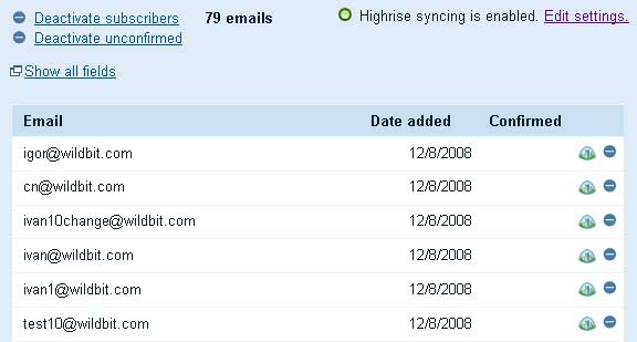
Newsberry, a service to send and track email newsletters, integrates with Highrise
“With Highrise Sync enabled, Newsberry will automatically sync contacts in Highrise to subscribers in your list. All changes in your Highrise account will be visible in your Newsberry contacts list in which you enabled Highrise Sync.”

New Highrise marketing site launches
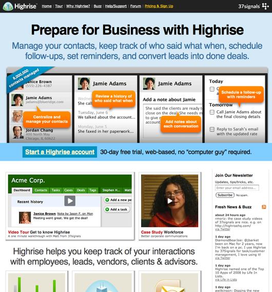
Check out the new Highrise marketing site.
Getting Real
Design studio owner inspired by Getting Real
“Reading your book has just given me the extra-Oumpf I needed and valuable tips about the launching phase.”
“Getting Real reminds small businesses why they shouldn’t try to overcomplicate things”
“From my own experience I know it’s really easy to overcomplicate things, as your company grows you start adding various control mechanisms, and before you know it your implementing controls mechanisms to control your control mechanisms. Getting Real reminds small businesses why they should stay lean and agile.”


Gilbert
on 23 Dec 08Sorry but the new Highrise site is a total mess. 1995 background shadows, Windows-like illustrations, too much colors, no clear visual style. And this is really embarrassing:
http://captainfunk.de/corner1.png
http://captainfunk.de/corner2.png
http://captainfunk.de/button.png
Please be more detailed about your design work. Thanks.
Shouldbe
on 23 Dec 08Gilbert, I’m glad you had the humility to point out that you are embarrassed about your comments.
Grant
on 23 Dec 08I really like the new Highrise site. Is it exactly what I would’ve done? No. Would I change some things? Yep. But for what Highrise is, and my understanding of the 37s brand, the site really fits them well and is more effective in communicating about the product than the old one.
As for the drop shadow corners? I think they’re part of the brand. They’ve been like that on the Basecamp product site forever. I like the quirkyness.
Stacy
on 23 Dec 08I’m sorry too, but the new design is simply one of the worst re-designs on the net. A total nightmare. Please change it back to the previous one – hurry!
Jesper
on 23 Dec 08I like the new design. If 37signals is going to go a little less “light” on the design, this is a good direction, although I agree that the start page looks a bit too cluttered. Four callouts and one corner ribbon just in the main banner.
I hope this is the first of what we’ll see from the new design direction by Jamie Dihiansan.
J
on 23 Dec 08If you load the actual Highrise site instead of looking at the screenshot above, you’ll see 37s is still making tweaks. They’ve toned down the drop shadows and mellowed the colors. Vintage 37s – launch and make changes over time.
Pretty darn good web designer
on 25 Dec 083 words describe the new Highrise site: worst. redesign. EVER.
I think 37signals is totally contradicting themselves – they always say do LESS and do things SIMPLE. Look at any Highrise page now – all i see is BIG text BOLD stuff and way too much color. The hierarchy of the information is so horrible and they try to fit way too much on one page.
Just a hint – try viewing this on a screen 1024×768 and you can see how horrible it looks.
I’ll say that I’m not always perfect with the sites I design, but I can see why 37signals is now out of the design business!
Cameron
on 25 Dec 08I don’t hate it, but I do think that maybe it is a bit too much info on the one page. My first glance was that there was soo much to look at that I ended up not looking at anything in particular focus. Just my 2 pence.
This discussion is closed.