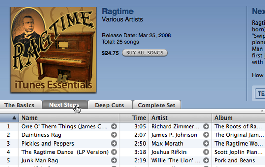
Neat how the iTunes music store lets you choose your level of depth in a genre (i.e. The Basics, Next Steps, Deep Cuts, or Complete Set). You can dip your toe or dive all the way in.
Reminds me of how video games allow players to compete at a beginner level or a more advanced level. That keeps people coming back for more. You can be a newbie or an expert and still get something out of it.
Apps, on the other hand, usually offer a one-size-fits-all interface. It’s a compromise that tries to find a decent meeting point that’s not too tough for beginners but not too dumbed-down experts. That’s a sweet spot that can be tough to find though.

Lis Hubert
on 18 Feb 09I first saw this here: http://musicovery.com/index.php?ct=us. If you look at the top where the heart is, the black area allows you to select your depth in genre as well. pretty great idea indeed.
JB
on 18 Feb 09This is tough for apps. I think its worth acknowledging though that people have tried to take this approach to apps in the past, usually with some type of a “mode” setting. “Expert Mode” vs. “Basic Mode”, etc.
When you look at how this works in practice, it points up a key difference between the “beginner”, “advanced”, etc. scale of video games: those changes in scale are valuable because the point of the game is always to provide new challenge, but not overwhelming challenge. Apps are tools one uses to do a job.
The problem with the mode switch on the apps is that its brutal to make the leap from beginner to expert, as you generally slide backwards in competence, and unlike in a game, this is a completely unappealing prospect in an app.
Keith
on 18 Feb 09I don’t think this necessarily means for the UI elements that are available. Think of the potential for a dashboard interface though. Giving a basic level of data and then allowing users to progressively get more in depth analysis.
Björn
on 18 Feb 09Where exactly to you find this in the store? What steps do you take? I must be a bit thick, I can’t find anything like it.
Kevin Milden
on 19 Feb 09Great idea Matt!
It would be cool to see plans based on the user’s expertise. They can choose to upgrade when they feel they they are ready to advance to more complex features and scenarios.
1. Beginner = Very simple feature set with lots of help 2. Average = 70% of what most people want to use it for 3. Genius = the other 30% people bitch about (Gantt charts, etc.)
1. Is what Jason wants 2. Is what the general public wants 3. Is what the experts want (a great live testing ground too.)
Everyone wins!
sensei
on 19 Feb 09I’ve always thought that video games (take a look at Zelda) have a really cool way of learning how to use their interface, and their world… they help you at every stage… from beginner to expert… giving you insight along the way, and unlocking new skills and features as you go. It’s way better than the way apps work. App learning interfaces suck quite a bit. Same with languages, and frameworks.
dusoft
on 19 Feb 09Xine interface offers options for Beginners, experts …. ending with the Master of the universe.
Problematic
on 19 Feb 09Microsoft already does this and we hate them for it. This approach result is an application that forces its user to make decisions about how it should function, and that’s really the developer’s job, no?
Justin
on 19 Feb 09What if a user knows he wants option X, but option X is hidden unless he’s in expert mode. But when he switches to expert mode, the program basically becomes unusable because the only thing he knows is option X. You are basically forced to make decisions on what levels of users will find what functionality important. I can almost guarantee that you WILL FAIL at this task for a large number of users.
I think what you really want is a simple to use program, that also offers the capability to work in complex ways. This is much more achievable through work-flows than hiding/exposing functionality based on a user’s “expertise”. Provide both simple work-flows (for beginners) and complex work-flows (for intermediates). Experts can then go without work-flows (or possibly define their own work-flows).
I think to when I use video encoding software. I don’t know what 95% of the options available mean. The software that is the most usable to me is ALWAYS the one that provides a step-by-step work-flow walking me through the process, with instructions and “acceptable” default options pre-selected. This way, the program helps me do what I immediately want to do, while also helping me to learn about the more complex options available.
Gary R Boodhoo
on 20 Feb 09The comparison between game UI and application UI is misleading. Games are experiential by nature. They reward progressive disclosure. Applications tend to be task oriented and progressive disclosure ends up feeling like inefficiency.
This discussion is closed.